|
| Group |
Round |
C/R |
Comment |
Date |
Image |
| 19 |
Jul 21 |
Reply |
Goodbye Carroll, I wish you well. |
Jul 29th |
| 19 |
Jul 21 |
Comment |
Hi Stan,
Wow! Strong impact. The majestic pose of the heron, the texture in the nest, the sunlight creating nice shadows on the nest and bird, the colors of the subject against the blue sky, and the sharp details resulted in a perfect image. |
Jul 12th |
| 19 |
Jul 21 |
Comment |
Hi Carroll,
Another beautiful portrait. You captured the twinkle in their eyes. Good luck with your other pursuits. |
Jul 11th |
| 19 |
Jul 21 |
Comment |
Hi Marcela,
You captured a nice shot of the bluebird on a branch. I try and they don't stand still very long. Good composition and colors. I seeing you lightened the background, it is bright, fresh, and airy. I do like it. However,I wonder if a darker background( darker than original) would work too. Would it bring more focus to the bluebird? Just a thought. |
Jul 7th |
| 19 |
Jul 21 |
Comment |
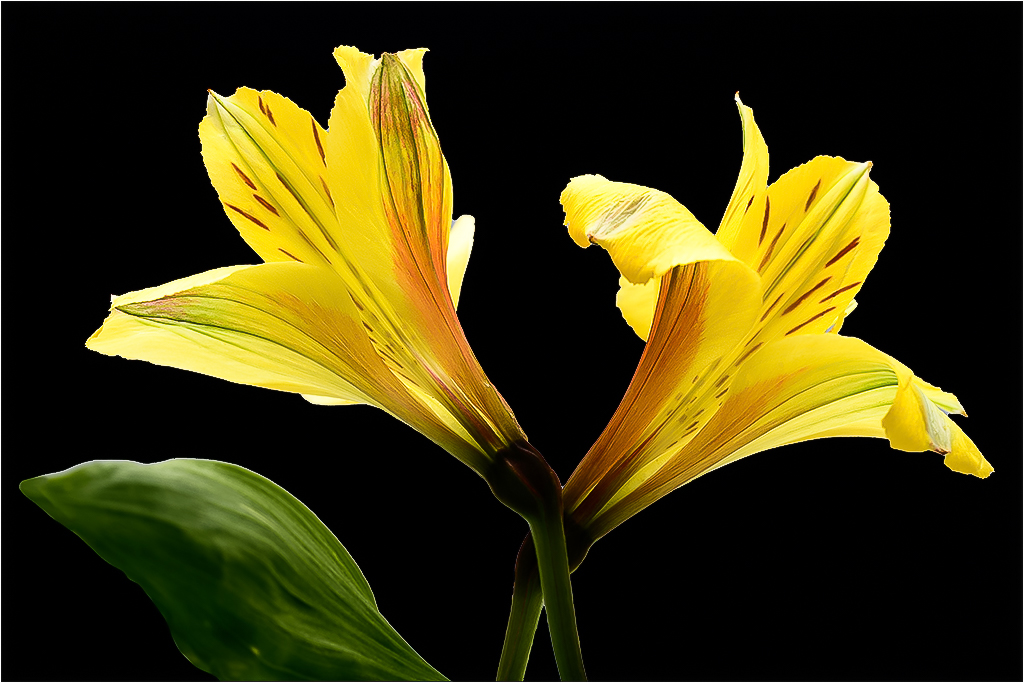
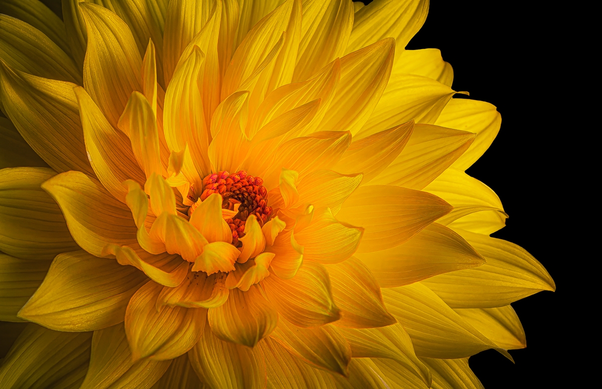
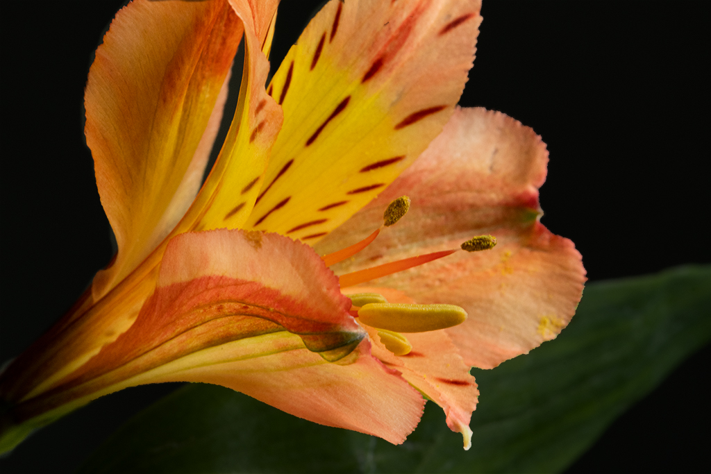
Hi Norm,
Lovely image. Well exposed. Beautiful shades of color within the daylily. The green background complements the flower. Well done. |
Jul 7th |
| 19 |
Jul 21 |
Comment |
Hi Harriet,
Another beautiful family portrait. I like it. My only suggestion would be to darken the background a bit. |
Jul 7th |
| 19 |
Jul 21 |
Comment |
Hi John,
Great composition. Well exposed and good DOF. Nice texture on the shed and on the ground. The red roof and dramatic sky adds impact to the image. Perfect. |
Jul 7th |
6 comments - 1 reply for Group 19
|
| 63 |
Jul 21 |
Comment |
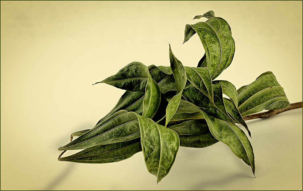
Hi Priscilla,
I am not familiar with Smart Photo Editor. I like the green leaf against the white background, but I think your original image is sharper. I'm not sure if you applied a filter from the new editor. Sometimes when I try to apply filters from the Nik Collection I find that they blur my images a bit. |
Jul 11th |
| 63 |
Jul 21 |
Comment |
Hi Murphy,
Well done indeed. I like the composition. Sharp details on these lovely flowers. Nice colors against the green background. I do agree with Neal to increase the vibrancy to make the flowers pop a little more. |
Jul 11th |
| 63 |
Jul 21 |
Comment |
Hi Gary,
Nice shot. Good composition and beautiful colors. The little bug is looking at you. The background color complements the subject. I'm really impressed with Topaz Denoise and Sharpen that Stuart used too. I've seen it used on other images with incredible results, and I think I'm going to give it a try. |
Jul 11th |
| 63 |
Jul 21 |
Comment |
Hi Neal,
Great subject. You managed to capture sharp details and lots of texture in the apple. Well exposed and nice colors. I see the little worm too. You presented this wormy apple in its finest light. |
Jul 11th |
4 comments - 0 replies for Group 63
|
| 95 |
Jul 21 |
Comment |
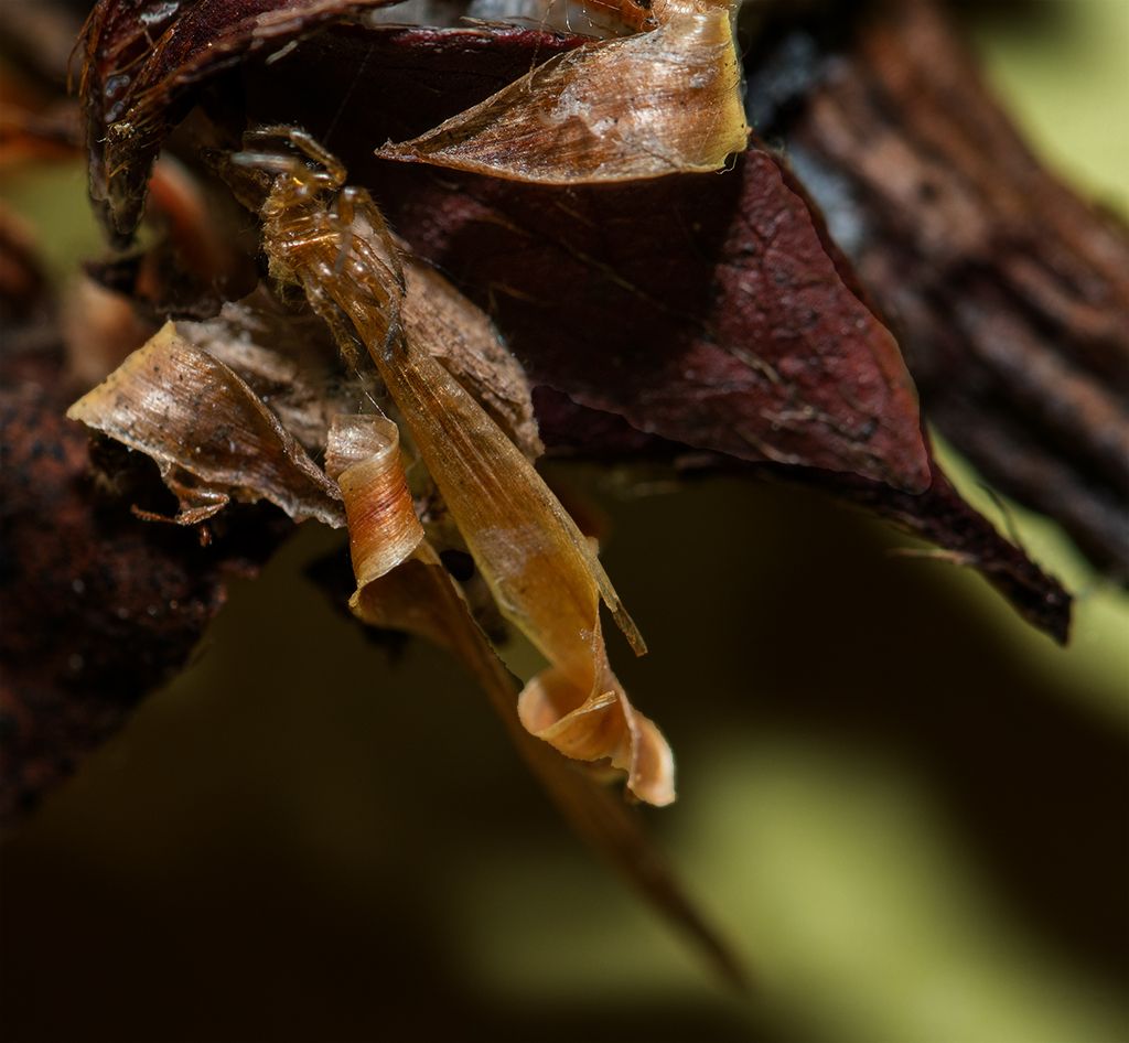
Hi Tom,
Incredible. I would never have thought this was a spider. You have created a work of art. It appears to be a piece of stained glass. Sharp details. I like it. |
Jul 5th |
1 comment - 0 replies for Group 95
|
| 99 |
Jul 21 |
Comment |
Hi Leanne,
Nice subject. It appears like a star in a dark sky. Good lines and texture on the plant. However, the image appears to be soft on my computer. |
Jul 8th |
| 99 |
Jul 21 |
Reply |
Thank you. I will introduce the cars back b
into the image and try different crops. |
Jul 8th |
| 99 |
Jul 21 |
Reply |
You improved the image. I like it. |
Jul 8th |
| 99 |
Jul 21 |
Reply |
Gerard,
Thank you for your insight. Initially, I thought the image was cluttered but I liked the sky. I tried to use the cars but I see that it didn't work well. So I eliminated all the cars in the parking lot and focused on the sky. I darkened the tree tops too. I attached edited image. Thoughts? |
Jul 8th |
 |
| 99 |
Jul 21 |
Reply |
I didn't notice it was tilted. Thanks to you and Peter for your sharp eyes. I straightened it. |
Jul 7th |
| 99 |
Jul 21 |
Comment |
Hi Randy,
Sad story. You captured his thoughtful eyes. Good composition as the branches frame the subject nicely. Black and white works well, but I prefer the color version. The beautiful color of the monkey stands out and is complemented by the brown branches. |
Jul 7th |
| 99 |
Jul 21 |
Reply |
Hi Peter
You did a good job of removing the noise. I've never tried Topaz Denoise but it worked nicely. |
Jul 7th |
| 99 |
Jul 21 |
Comment |
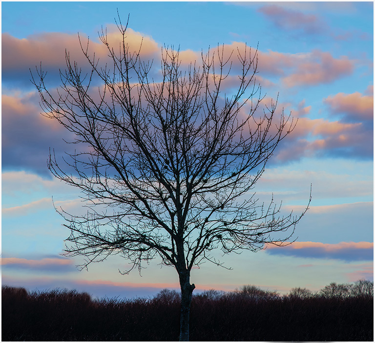
Hi Michael,
Nice composition. Black and white improves the image. Great contrast of the tree against the sky. I do agree with Peter that the base is too dark. I might lighten the foreground a bit to show more texture in the earth. |
Jul 7th |
| 99 |
Jul 21 |
Comment |
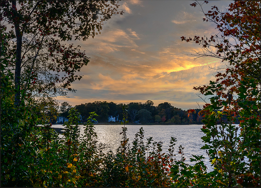
Hi Linda,
Nice work. You transformed the original into a a lovely, peaceful landscape image. Good contrasting tones. I really like the sky. |
Jul 7th |
| 99 |
Jul 21 |
Comment |
Hi Peter,
This is a good street photography image. Good contrasting tones on the tv and floor. My only suggestion would be to darken the background behind the man, or darken his clothes. It may give more focus on the man, as he seems to blend into the background and needs more contrast. |
Jul 6th |
| 99 |
Jul 21 |
Comment |
Hi Gerard,
You managed to create a story with these two interesting subjects. They do look like robots. The texture, letters, and numbers on these implements are tack sharp. Well exposed. The tone and texture of the background complement the subjects. Good contrasting tones. Well done and very creative.
|
Jul 6th |
6 comments - 5 replies for Group 99
|
17 comments - 6 replies Total
|