|
| Group |
Round |
C/R |
Comment |
Date |
Image |
| 96 |
Jan 25 |
Reply |
Thank you, Robert, for your comments and attempts.
I wanted to balance the two trees by distance and tone. But it sounded like it did not work for you.
Your idea of cropping the top would work better, it cuts complication of the first tree. It made it simplified.
Thank you again for your comments. |
Jan 18th |
| 96 |
Jan 25 |
Comment |
Hi Bruce,
Happy New Year!
Thank you for sharing.
Wow, this is very powerful message/documentally image. I like the composition, which emphasize the line dramatically, and the color is very unique. Very good image.
You might have tried this but my suggestion is to BW conversion. The clarity is a bit strong for me, so I might reduce the clarity and turned the image look a bit dull....
|
Jan 16th |
| 96 |
Jan 25 |
Comment |
Hi Viren,
Happy New Year!
Thank you for sharing.
I like your attempt - the color is beautiful, and it has great sun rays. You captured this at the best timing, the sun is still behind the mountain but it gives a beautiful color and sun rays. Good shot!
Since it is shooting to the sun, the image turned out to be a bit dark for me. It might be better to brighten up the foregound since it is backlit by the sun rise. Unfortunately there was not cloud action but I need to keep the space for the image to breath in my opinion. Here is my attempt.
My person opinion, though. |
Jan 16th |
 |
| 96 |
Jan 25 |
Comment |
Hi Rick,
Happy New Year!
Thank you for sharing beautiful image.
Nice long exposure shot! The line of light is well captured. I guess you tried a lot of experiments and arrived this shot. I like the length of the line of light. And it is captured at the best of the day so the sky is not too dark, still keep the nice blue colors. One suggestion may be the space of the sky. For me it is a bit too wide upper right. I might crop 16x9 as attached. By doing that, my eyes will go to the line of light easier. |
Jan 16th |
 |
| 96 |
Jan 25 |
Comment |
Hi Kenneth,
Happy new year!
Thank you for sharing.
I like the tone of the image. It looks like a painting((Impressionism). Or the very old color photo. I like it very much.?My preference is to have a bit of space in left side. But still it works good. Well done. |
Jan 16th |
| 96 |
Jan 25 |
Comment |
Hi Robert, Happy New Year!
Thank you for sharing.
It is a good shot. I like the color palette and texture. I think your intempt of conbining 2 images turned out to be successful. It looks better from original in my opinion.
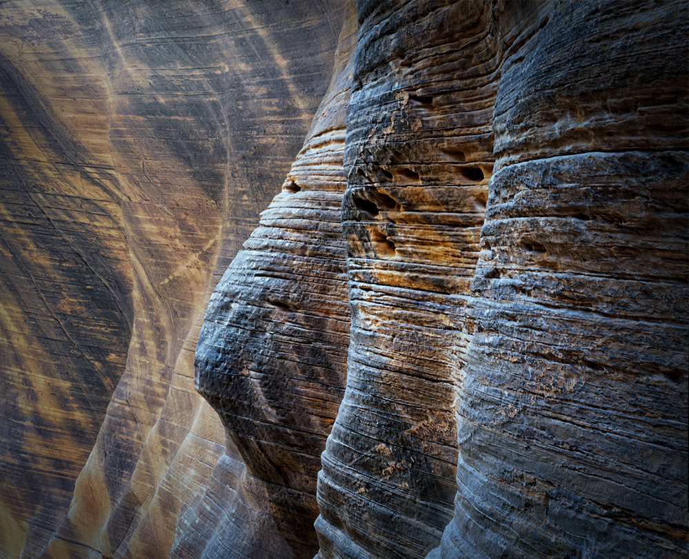
It is my personal opinion but the triangle shape rock in bottom left is distraction for me. It carries the tone and color from original and it looks stand out. And the beauty of the background is the layers of line of rocks and it stops the flow in my view. So my suggestion is crop a bit to eliminate the rock as attached. I added the light on 3 wise man a bit. |
Jan 16th |
 |
5 comments - 1 reply for Group 96
|
5 comments - 1 reply Total
|