|
| Group |
Round |
C/R |
Comment |
Date |
Image |
| 74 |
Sep 24 |
Comment |
Hi Stacey,
Thank you for sharing.
Your question was a bit challenging for me.
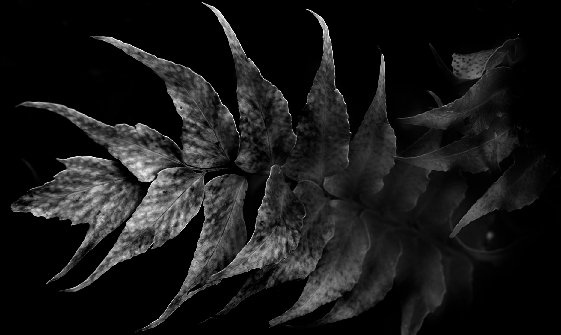
First, what I like about the image is the shape of the leaves. It looks like a crab claw. Also I like the pattern of the leaves. On the other hand, I feel a bit of busy of the right hand side leaves. So I cropped just the main leaf to emphasize the shape and pattern. And darken down significantly. This is my best what I can do for now and I do not think it is well done. Sorry! |
Sep 10th |
 |
| 74 |
Sep 24 |
Comment |
Hi Melissa,
Thank you for sharing.
Powerful image with a ship and the falls. I like the way you captured the details of the fall. It looks very powerful stream. The composition is well structured in my eye but I might try to crop in 16x9, so that the powerfulness of waterfall would increase. I feel that the sky is a bit too wide for me.
And I would lighten up the ship a bit to show more detais and texture. |
Sep 10th |
| 74 |
Sep 24 |
Reply |
Thank you, Melissa for your kind words.
I appreciated your input. |
Sep 9th |
| 74 |
Sep 24 |
Comment |
Hi Ed,
Thank you for sharing.
I found it is interesting. The composition is simple but powerful. For me, center of attention is the piano. I like the tone of the piano. It gives me an impression of "history". A nice capture!
It looks over done in contrast in my eye. The greens/plants looks too tight for me. |
Sep 9th |
| 74 |
Sep 24 |
Comment |
Hi Trevor,
Nice!
I like the BW version better.
The dramatic cloud action is well presented. So your goal looks achieved well.
The texture and detail of the cloud is well captured. And overall tone is well managed. So I do not have any comments for improvement.
I was a bit curious why you placed the building in left. |
Sep 9th |
4 comments - 1 reply for Group 74
|
| 96 |
Sep 24 |
Comment |
Hi Howard,
Thank you for sharing.
It is a peaceful image. Very nice.
The tree branches guide my eyes to the fountain as you expected. So it is structured well in my view.
Top of the fountain does not overlap with the bridge, which looks good as well. I fell the level is off looking at the cercle of the fountain. I might be wrong.
My suggestion is to use slower SS, so that it would add a different charactor in the image. |
Sep 10th |
| 96 |
Sep 24 |
Comment |
Hi Rick,
Thank you for sharing.
It looks very nice.
Each window looks compsitionally excellent and has its own story. with all 4 windows together, it created another story.
Nice finding! well done! |
Sep 10th |
| 96 |
Sep 24 |
Comment |
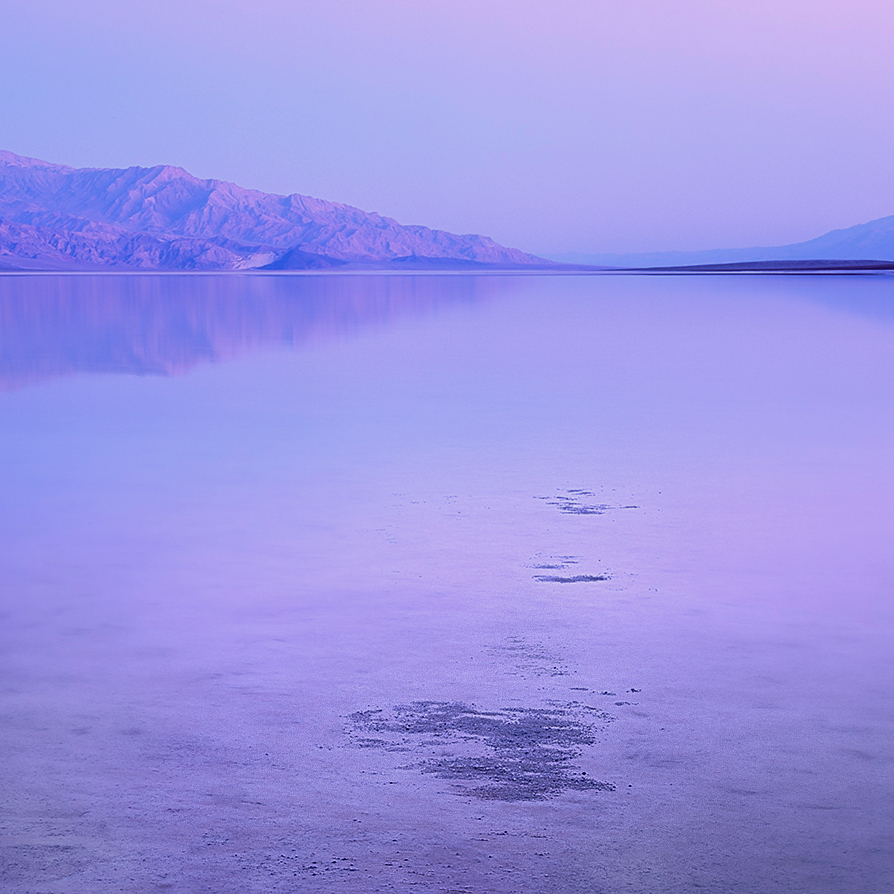
Hi Robert,
Thank you for sharing.
It is a very peaceful and pleasing image. It calm my emotions.
I like the subtlety of the colors. Nothing is too contrasty, nothing expresses strongly. I feel like I am spending precious time sitting at the shore and enjoy a cup of morning coffee. I feel great.
2 things.
1. The colors - for me it is a bit too purple casted. I might try to increase blue but reduce the magenta. But it might be a personal preference.
2. The patches of salt - It creats the rhythm and bring my eye to the background, which is very nice. And again, it is not too strong foreground and matches the atmosphere of the image. So it works well as a foreground. The reflection on top right is off-setted against the patches of salt so it is balanced compositionally. Not bad. Now my question is the space on left bottom. I do not say which is better but please compare the one attached. The foreground might look functioning well to my eye. You might not like the format of 1x1 though. |
Sep 10th |
 |
3 comments - 0 replies for Group 96
|
7 comments - 1 reply Total
|


