|
| Group |
Round |
C/R |
Comment |
Date |
Image |
| 74 |
Aug 24 |
Reply |
Thank you for the suggestion. I will take a look. |
Aug 9th |
| 74 |
Aug 24 |
Reply |
Thank you for the suggestion. I will take a look. |
Aug 8th |
| 74 |
Aug 24 |
Reply |
Thank you, Ed for your comments.
Yes, it is now my challenge to create simpller image but with a big punch. I got what you are saying. |
Aug 8th |
| 74 |
Aug 24 |
Reply |
Thank you, Stacey for answering my questions one by one.
All your points are well-taken. I understand all the issues. |
Aug 8th |
| 74 |
Aug 24 |
Reply |
Thank you, Melissa.
I got all my questions answered. Appreciate your comments.
|
Aug 8th |
| 74 |
Aug 24 |
Comment |
Hi Ed,
Thank you for sharing. I like both images. They are nice.
But I like the color version better, it looks enjoyable with different colors, blues, whites, red and yellow, which are all lost in BW version (naturally). I might try to brighten up a bit on red and blue boat in BW version. Currently it is migralted in the background. |
Aug 8th |
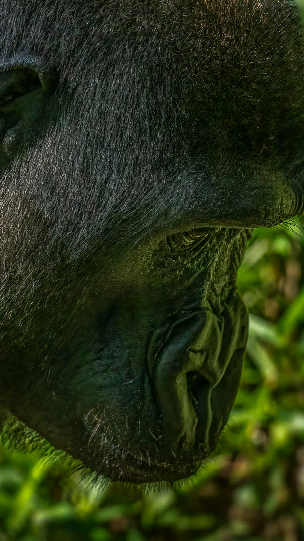
| 74 |
Aug 24 |
Comment |
Hi Ed,
Thank you for sharing. Nice images. I like both.
Each has its own charactor.
But I like color version better.
I like the texture, details, and especially the way the face gots reflections of the greens.
And the highlight for me is the eye. That's super well captured! I do not have a complaint on the current composition but I might try more agreesive crop to highlight the eye. I am not sure you use 16x9 through. |
Aug 8th |
 |
| 74 |
Aug 24 |
Comment |
Hi Giovanna,
Thank you for sharing.
Very interesting snapshot!
I like the BW version better. It creates interesting stories, i.e. people on left, staffs on the shore, smooth seam, and little action on the sky. It make me think what is the situation... It got my attentions. |
Aug 8th |
| 74 |
Aug 24 |
Comment |
Hi Stacey,
Thank you for sharing. I like BW better. The color version looks real world. The BW version take me to the unliality world, that's what I like about. The Spanish Moss adds nice atmosphere as well.
Composiitonally I am fine with this. You have a big anchor tree on left so I think it would need a space to balance in right side. So balance wise, I feel good.
Only the point I would like to make is that the Spanish moss in center overlaps with the background. That reduces the punch in this image in my view. If you could not get around the overlaps in shooting, then I would try the background blurred to make the Spanish Moss outstanding. Currently the background is shown too detailed as much as the Spanish moss. That confuse my eye currently.
Finally the spanish moss on right(the big one) looks a bit too birght for me. It took my eye away from the center.
Anyway, nice try!
|
Aug 8th |
4 comments - 5 replies for Group 74
|
| 96 |
Aug 24 |
Comment |
Hi Bruce,
Thank you for sharing. Looks very beautiful scene! Very nice.
Great leading line created by the path and as my eye travel, I can enjoy beautiful flowers. It is well structured.
I like the idea of cropping a bit. Unlike the idea by Robert, I would try to crop from the bottom. I would start from the yellow flowers in right. I need a space in the top so I would not touch it. Sorry, I might confulse you a bit by presenting a different idea. |
Aug 16th |
| 96 |
Aug 24 |
Reply |
Thank you, Robert, for your suggestion and eits.
I understand where you are going in cropping. I like your crop verion posted, but I feel the right side looks a bit tight for me. But on the other hand, the main subject would become much clearer. I will play around a bit more. Thank you again for your advice. |
Aug 16th |
| 96 |
Aug 24 |
Reply |
Thank you, Rick for your comments. yes, the balance of subtlety vs. contrast, which I was struggling. I would play around a bit more. |
Aug 16th |
| 96 |
Aug 24 |
Comment |
Hi Robert,
Thank you for sharing.
This is an interesting secne. I like the details and texture of the salt stained the soil at the edge. It is well captured. The edits looks natural to my eye. So no worries. I like the color subtlety. Your attempt of showing leading line looks work and it is pictorially beautiful. But I was wondering if it could have been made more powerful.
I examined this for a long time. It looks 3D as you planned, which is good.
It looks good with the sweeping leading line in the frame. We could argue that the line could start from a bit from left corner, but it is a small point I guess. For me there are 2 highlights, one leading line and 2nd, the mountain with cloud action at the back. But there is a big space in the center less interesting (I am not saying "nothing to see"). How far was your camera from the ground? It looks a shot from eye level although it is 24mm equivalent shot.
I might try to set camera really close to stain of salt. By lowering the camera position, you might be able to reduce the center space a bit. And further more, I would try to include the layers of mountain at the back. That looks interesting for me (currently it is captured partially at the back) and it would give more depth in the image in my opinion.
|
Aug 16th |
| 96 |
Aug 24 |
Comment |
Hi Rick,
Thank you for sharing beautiful image.
Wow, this is nice! If you keep encountering such secne all the time, I like to follow you also.
I like the details captured, cloud actions, sun beams, mountains. really nice. And strong contrast to add drama in the image.
I am with Robert in that cropping the water reflection (I like what Robert did). I see the highlight in the image is heavy weighted on the top half and especially lower left corner looks empty space with not so much going-on.
Or, If I would like to keep the reflection, I might try portrait frame. That way the empty space is reduce to some extent and the sun rays become strong straight lines.
But again you captured the great secne. |
Aug 16th |
3 comments - 2 replies for Group 96
|
7 comments - 7 replies Total
|


