|
| Group |
Round |
C/R |
Comment |
Date |
Image |
| 74 |
Jul 24 |
Comment |
Hi Ed,
Nice portrait!
I like both version but not the one at the last, I am afraid. It looks a bit busy for me.
The original color version looks real, i.e. texture and color.
I like the eye in BW better, it frightened me a bit.
|
Jul 15th |
| 74 |
Jul 24 |
Comment |
Hi Melissa,
Thank you for sharing.
Very nice view. I like the composition.
The tone and texture of the entire picture reminds me an old day in US.
I like BW better. The cloud does not show up outstanding in BW compared with the color ver. which I like a lot.
I do not mind the position of the horse, it looks hinting something. |
Jul 15th |
| 74 |
Jul 24 |
Comment |
Hi Trevor,
Nice!
You found a good view. Sharp from front to back and texture is well captured.
Done well. I like BW version better.
You might want to increase the contrast a bit.
|
Jul 15th |
3 comments - 0 replies for Group 74
|
| 96 |
Jul 24 |
Comment |
|
Jul 19th |
| 96 |
Jul 24 |
Reply |
Thank you for your comments. Good luck on your next photo journey. |
Jul 19th |
| 96 |
Jul 24 |
Reply |
Thank you for your comments.
|
Jul 19th |
| 96 |
Jul 24 |
Reply |
Thank you for your comments and edits. I got your points. |
Jul 19th |
| 96 |
Jul 24 |
Reply |
Thank you for your commnts. Appreciate it. |
Jul 19th |
| 96 |
Jul 24 |
Reply |
Hi Bob,
Maybe my comments were not clear enough, I am afraid. Please see the trees in front. It looks noise because of my monitor though.
The prints might shows the 5 layers better compared with the one on the screen. As far as I see it on the screen, it has big whites in upper left. It does not work well for me without surgery.
|
Jul 19th |
| 96 |
Jul 24 |
Comment |
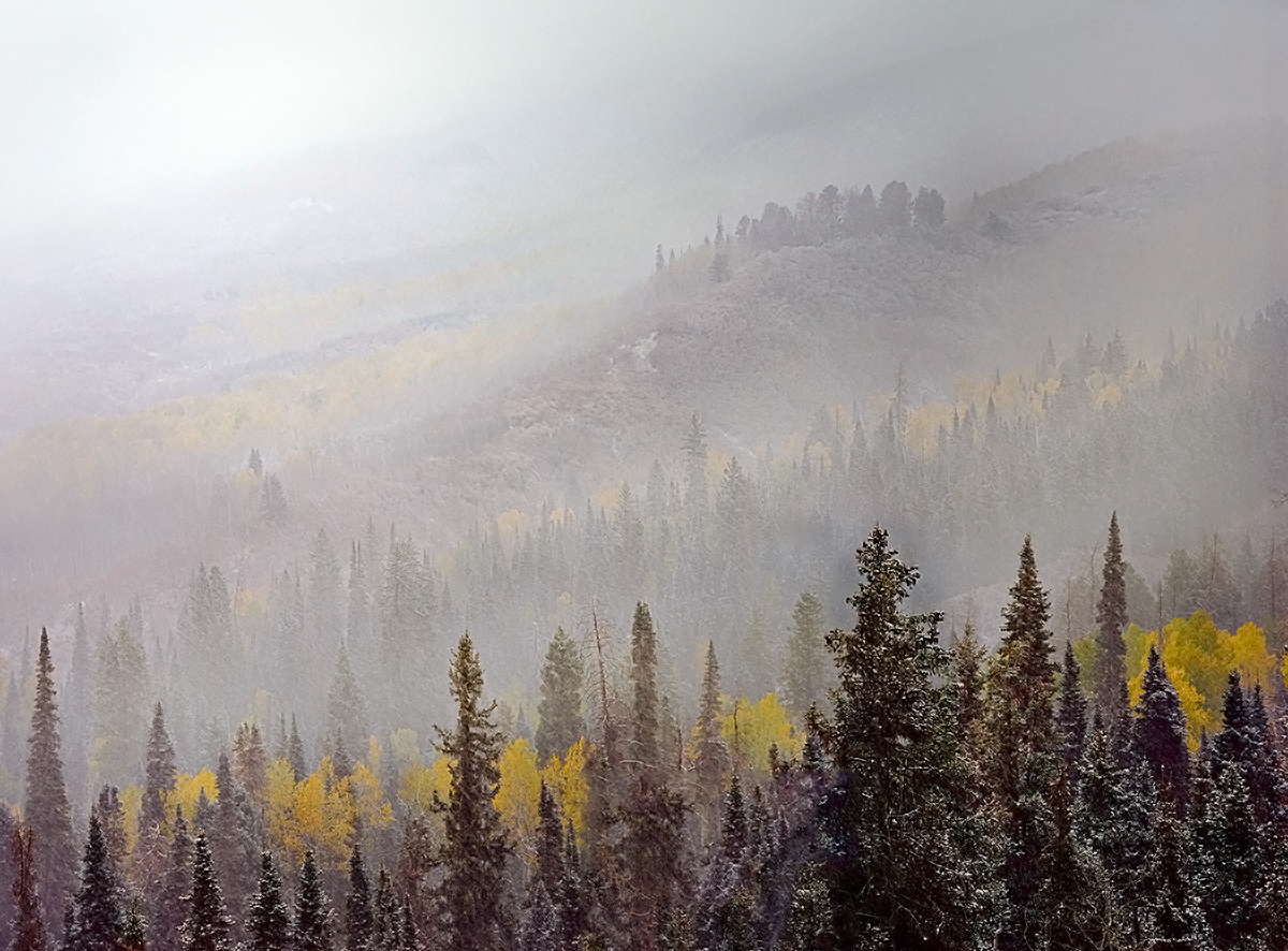
Hi Robert,
Thank you for sharing.
I envy you facing fantastic view with great condition.
I think you captured the scene of layers beatifully. Composition wise, I see it perfect.
I might try re-edit some point though.
Currently, my eyes cannot recognize 5 yellow layers, maybe 3+.
Also I cannot detect the mountain right far back. So I looks big white empty space in upper left but it should not be looked lik that. That space actually captured another layers of canyon and flowers, which are hided now.
Finally you might want to run nise reduction just a bit.
|
Jul 18th |
 |
| 96 |
Jul 24 |
Comment |
Welcome to the group,Rick.
A great shot!
It is "The moment" of the city.
I like the contrast of tight texture vs. soft texture of the cloud. It is balanced well. The diagonal line created by the cloud add the uniqueness to the image. It looks like a phoenix is flying out through the sky. Nice!
On the other hand, it looks heavy in right side, I feel good space in left side looking distribution of the building. I am not sure what's there in right side but I need more space in right, may be the same volume of the space in left. If I looked at the edited version by Robert, it looks too tight after cut of left. I feel it needs space to breathe in right.
|
Jul 15th |
| 96 |
Jul 24 |
Comment |
Hi Gloria, thank you for sharing.
You were there at the right timing!
It captured great colors, indeed. I like the texture and details of the rocks.
Refection on the water - not bad, but you could have done better using a tripod and slow SS. That way you could deliver "calm" feeling stronger.
Too bad any clouds in the sky - you might want to crop down a bit.
|
Jul 15th |
| 96 |
Jul 24 |
Comment |
Hi Howard,
Nice colors!
You captured at the right timing! Well done.
I prefer to see a bit more space below the first bird in the foreground. |
Jul 15th |
5 comments - 5 replies for Group 96
|
8 comments - 5 replies Total
|


