|
| Group |
Round |
C/R |
Comment |
Date |
Image |
| 74 |
Jun 24 |
Reply |
Thank you for your comments. Understood your points. |
Jun 17th |
| 74 |
Jun 24 |
Reply |
Thank you for your comments. Sorry that it does not work for you. |
Jun 17th |
| 74 |
Jun 24 |
Reply |
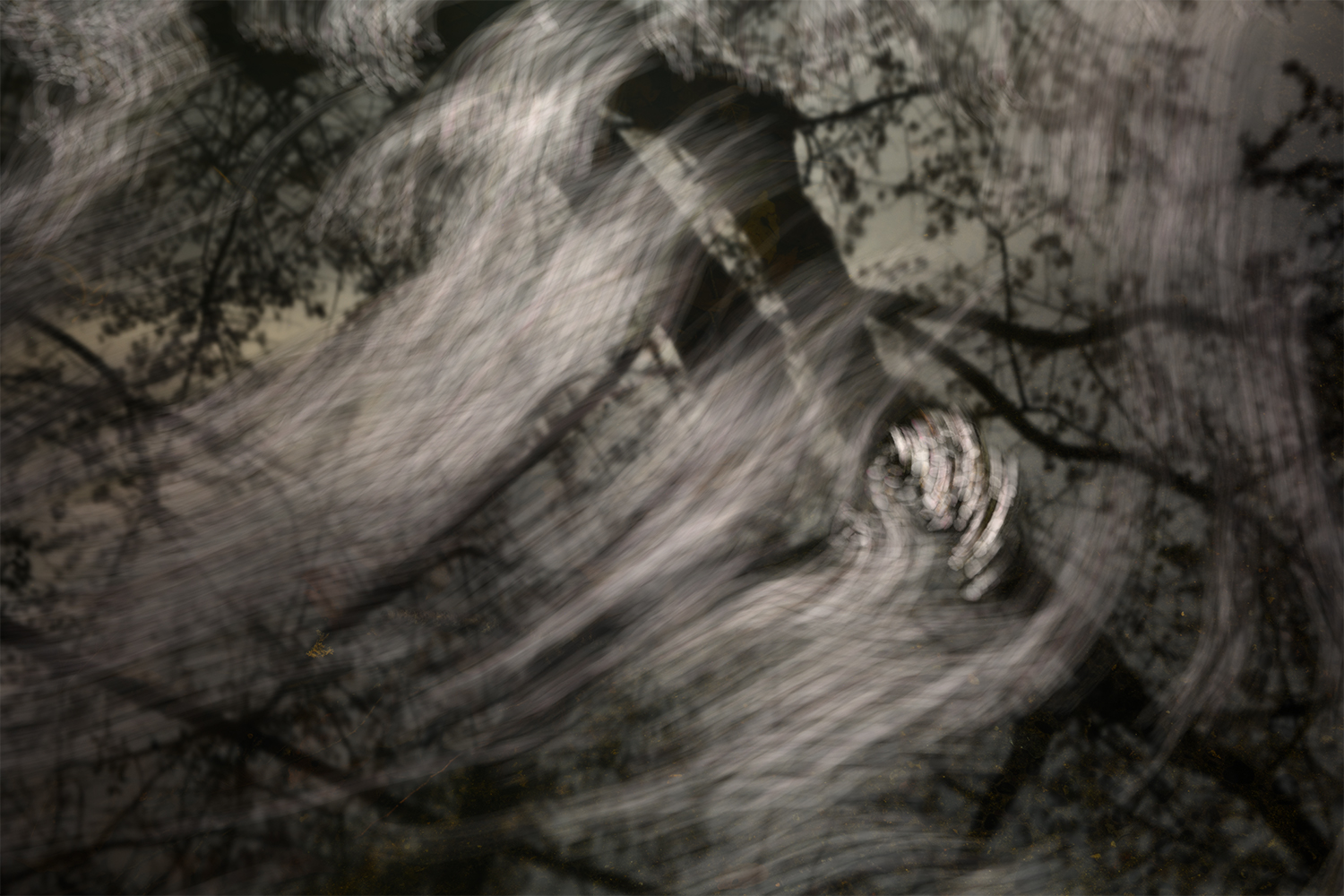
Thank you for your comments, Stacey.
I got my questions answered.
I have many version of this. I did slected this version because I did not want to make it abstract image.
I have another version for long exposure(posted here). The shot was simple. Once you set up composition, you just keep shooting until you get the satisfactory result. It all depend on the wind, how fast the wind move the petals on the pond. The tree is reflection on the poind.
I use zoom in/out technique sometimes but not this one. In this scene, the wind makes things blur so I do not necessary to make blur manually. |
Jun 14th |
 |
| 74 |
Jun 24 |
Comment |
Hi Ed,
Thank you for sharing.
I like both, BW and color version. I am not sure about the Washi printed version. I could not see what you are intened to pint on washi.
To be honest, I like the color vesion better, it has mood, it looks more 3D, and the color of the sky enhances the story for me.
But I like the silhouetted direction. Also the composition works for me as well. |
Jun 13th |
| 74 |
Jun 24 |
Comment |
Hi Stacey,
Thank you for sharing.
It looks like "a trick art". This reminds me Maurits Escher, in view of the world/ambiance/mood. Thank you for inspiring me. |
Jun 13th |
| 74 |
Jun 24 |
Comment |
Hi Ed,
Thank you for sharing.
Nice BW conversion!
The levels are fixed, good contrast to stand out the details, and darker background is also good to highlight the ship. Only the comment is to have a bit more space in left side. It looks a bit tight for me. |
Jun 13th |
| 74 |
Jun 24 |
Comment |
Hi Trevor,
Thank you for sharing.
I like BW better. The clouds looks like a fire around the building.
Nice conversion! |
Jun 13th |
| 74 |
Jun 24 |
Comment |
Hi Melissa,
Thank you for sharing.
I think your crop is good on direction. I feel a bit tight but that might be a personal preference.
By making it BW, the pattern of the skin became outstanding. And the eye looks more frightening in BW version.
|
Jun 13th |
| 74 |
Jun 24 |
Comment |
Hi Giovanna,
Thank you for sharing the wonderful shot.
The reflection looks super! Nice observation!
I have a question - what is your intended center of attention, reflection or the musician? The title says "Musicisan". So I thought your center of attention was the musician originally.
I enjoy reflection better in color version - It has greens, and brouwn buildings, etc. And it is distiguished by the focus and the colors.
On the other hand, in BW version, the background is a bit distraction to focus on the reflections. I perfer to have more blurred background.
|
Jun 13th |
6 comments - 3 replies for Group 74
|
| 96 |
Jun 24 |
Comment |
Hi Bruce,
Thank you for sharing.
I was wondering what was your motivation to shoot this scene.
I would ask you next time that you might want to describe your thought on the image, what you were moved, what messages you want to deliver, etc. That will help us reviewers to make right comments.
In this image, I cannot tell what is your center of attention, I am afraid.
I am looking forward to next months. |
Jun 15th |
| 96 |
Jun 24 |
Comment |
Hi Gloria,
Thank you for sharing.
It is powerful image as it is. I would like to see a bit more foreground personally. But the cloud action is well taken with the right SS (I think 1/100 is good for capturing the details in the scene). Maybe you might want to increase the contrast a bit in the sky. That would give more powerful cloud action, I imagine.
If you have another occation to shoot cloud action, please test ND filter to slower SS. Try 10sec, 20 sec, 30 sec, and more and compare which one you like better. |
Jun 15th |
| 96 |
Jun 24 |
Comment |
Hi Howard,
Thank you for sharing.
I think the composition is fine for me.
I prefer to have sharper image in this case. You used f4 but I would try highter f value. That would give you longer SS, which gives smoothing water.
As for high contrast image, what I would do is to take a couple of shot with different brightness (bracketing) and merge in Photoshop in HDR. That way shadows would be open up better in my view. |
Jun 15th |
| 96 |
Jun 24 |
Comment |
Hi Robert,
Thank you for sharing. It is another beautiful scene.
I am fine with the color adjustment.
It looks pictorial beautiful, but I am not sure what you want to present here. Let me ask you, what your intended center of attention - the salt shore, or refection of mountains, or mountains at the back? I could not understand your intention looking at this image. It is pictorially beautiful but....
So my feedback would be depended on what you are aiming to this image. Currently salt shore in the foreground guide my eyes to the reflections. Naturally my eye goes toward upper left. There are some beauties to look at - reflections and mountains. But in that eye travel, there no path to see the middle/upper right. And actually there is not so much attractions there.
1. If your center of attention is salt foreground, then you need to closer to the shore and use wide lense to emphasize that. Maybe the original framing with the cloud looks better for me. But in that case, the big area of lower left would become empty space.
2. If your center of attention is the reflection/mountains, then, you need to shoot a bit from left. That way I would imagine that you might be able to reduce the enmpty space in upper right. And you need a more zoom lense to show it bigger to the audience. I tried but I do not think that this will be resolved by cropping in my opinion.
Finally, as for postprocessing, I feel that burning the edge is too strong for me.
|
Jun 15th |
4 comments - 0 replies for Group 96
|
10 comments - 3 replies Total
|


