|
| Group |
Round |
C/R |
Comment |
Date |
Image |
| 40 |
May 24 |
Comment |
Hi Don,
Let me jump in.
Nice fog image. I like pano style. It looks better than original.
2 suggestion at this point.
1. I might try BW conversion.
2. The detail of the water is too strong for me compared with the tone and overall atmosphere. I might try to smoothen the detail just a bit.
But overall I like the image very much.
|
May 11th |
1 comment - 0 replies for Group 40
|
| 74 |
May 24 |
Reply |
Thank you for your comments and suggestion.
|
May 11th |
| 74 |
May 24 |
Reply |
Thank you for your kind words, Ed. |
May 11th |
| 74 |
May 24 |
Reply |
Hi Stacy,
Thank you for answering to my questions. Appreciate that.
Rotating left (your suggestion) sounds worth trying. I will try that.
Your comments about peaceful feeling was interesting. I was expecting a different comments.
Thank you again.
|
May 11th |
| 74 |
May 24 |
Reply |
Hi Melissa,
Thank you for your kind words. |
May 11th |
| 74 |
May 24 |
Reply |
Hi Don,
Thank you for dropping by.
Appreciate your comments and suggestion. |
May 11th |
| 74 |
May 24 |
Reply |
Thank you, Trevor for your kind comments. |
May 11th |
| 74 |
May 24 |
Reply |
Thank you, Stacy, for the detailed clarification. Appreciate it.
In looking at the guitarist images, my interest always goes straight to the hands, how he is playing. And the face is secondary for me. Maybe it is because of me.
I do not think the back ground is too bright. The main subject is so well presented and powerful so that I rather welcome that brightness of the background. Again, personal opinion though. |
May 11th |
| 74 |
May 24 |
Comment |
Hi Stacey,
Thank you for sharing nice image.
I like what you did - the composition works well. It adds drama in the image expecially for the people who play bands before.
One question; did you blur on purpose the left hand?
|
May 11th |
| 74 |
May 24 |
Comment |
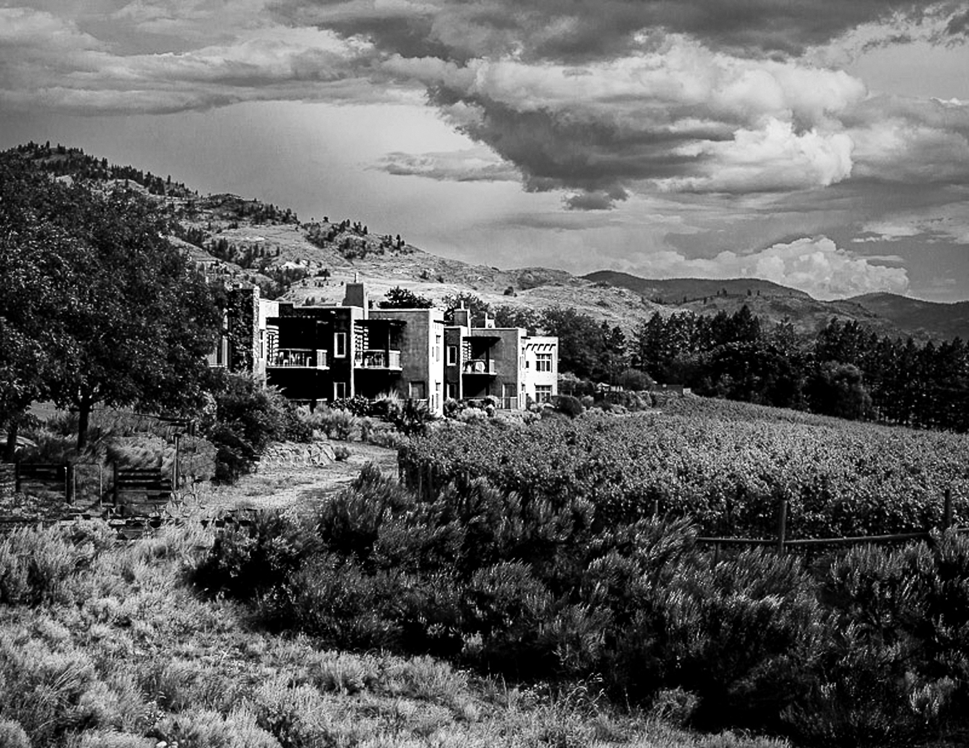
Hi Ed,
Thank you for sharing.
I think your cropping was successful. It balances well between the building vs. clouds shape. And it has a good leading line toward the building. Nice composition.
My only suggestion is to increase the contrast. It does not have whites in the frame and overall it looks dull.
Here is my quick and dirty attempt.
|
May 11th |
 |
| 74 |
May 24 |
Comment |
Thank you, Ed, for sharing the interesting image.
I pefer BW to color version. BW tells a story for me but not in the color. First impression of BW was "a goast" as the scanned portion migrates well in the room. It looks horrifying and it got my attention.
|
May 11th |
| 74 |
May 24 |
Comment |
Hi Trevor,
Thank you for sharing.
I definitely like BW better. It has a mood, which I like a lot.
Hazing the edge works well. I might find this in a fairy tale illustration.
I would not change anything, it works well as it is for me.
Well done.
|
May 10th |
| 74 |
May 24 |
Comment |
Nice choice, Melissa for BW conversion.
I like BW better. The whites in hair add stronger impression in BW.
AND I like texture of the face.
It is good as it is but I might tone down the white area in the background.
A bit distraction for my eye.
|
May 10th |
| 74 |
May 24 |
Comment |
Hi Giovanna,
Thank you for sharing the nice image.
Looks very elegant and powerful.
People in the frame shows sense of scale, which I like a lot.
As Stacy commented, you can use Lightroom to fix the distortion.
Or you might want to try pano stitch - use 50mm vertical several shots to cover the whole scene and stitch in Lightroom. In this case the issue is people moving.
If you want to erase the people moving, then, use ND filter to slow SS, i.e. 30sec.
You can erase the people moving.
Anyway, a great shot! |
May 10th |
6 comments - 7 replies for Group 74
|
| 96 |
May 24 |
Comment |
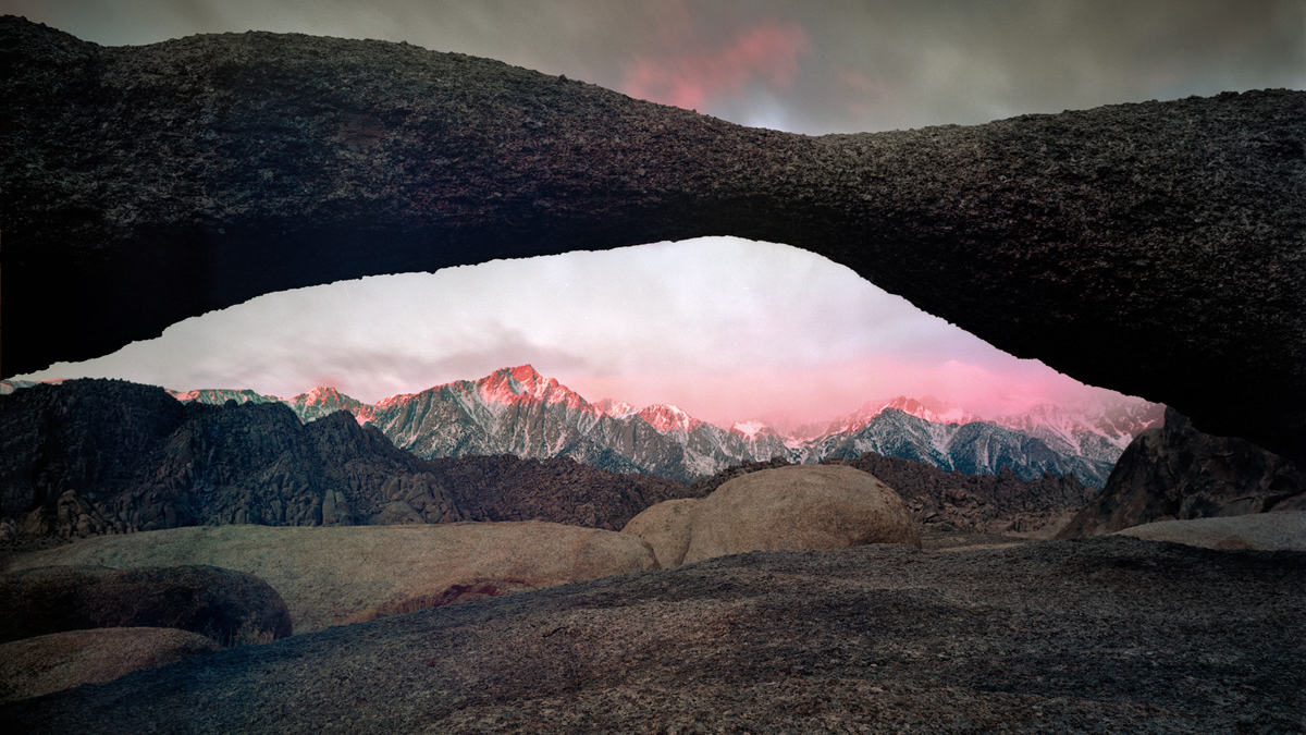
Hi Robert,
Thank you for sharing.
For me it looks nice. The mountains at the back is well taken through the arch (nice framing composition).
I think it is fine as it is.
2 points.
1. colors - it looks over-done. It looks very unnatural, especailly red and blue. Overall blue casted and magenta casted. It looks weired to my eye.
2. foreground - the space of foreground is too spacious for me. Maybe it is a personal tastel but for me it is too big for me without so much to see.
Here is my rough attempt. I cropped down to 16x9 and muted the colors especially blue and red in tone curve in PS. The red colors are still looks wierd in my eye but you would be able to fix that from the original.
|
May 17th |
 |
| 96 |
May 24 |
Comment |
Hi Howerd,
Thank you for sharing. Nice sea scape image.
I like the cloud actions - it looks dramatic and dynamic. The detail of the clouds is well captured. Did you edit the image?
Secondly, the wave ations is well captured as well..
Only my suggestion is the format of the image.
It is holizontally long and middle layer of the sea is too wide. On the other words, there were big space between the wave and clouds actions without so much too see. And it continues long in holizontally.
So my suggestion is to crop to 1x1 or portrait style (I would crop out left side) so that my eyes goes easier to focus on the highlights of the image. |
May 17th |
| 96 |
May 24 |
Comment |
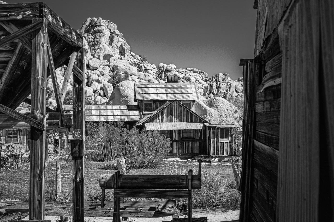
Hi Bruce,
Thank you for sharing.
I do not shoot ranches so much so my comments might be irrelevant. So please excuse me. I guess your center of attention is the ranch. It is well taken using the framing composition technique. Composition wise, it looks good.
However, the blue sky is so powerful and the roof has similar blue tint. Also the brown color of woods is here and there so the similar colors distract my eye to arrive the ranch.
So my attempt is to make BW conversion and reduce the brightness in the edges. That way my eyes would arrive easier to arrive at the ranch.
|
May 17th |
 |
| 96 |
May 24 |
Comment |
Hi Robert,
Thank you for sharing.
Nice BW image. The dishes create the rhythm in the image, which looks very pleasant. The cloud actions add the mood as well. The small cloud in upper right corner is good to keep the eye in the frame.
The darkness of the sky is darker than dishes which makes dishes outstanding.
However, if I looking this image, the clouds gets attention first, second the ground(grasses), and lastly dishes. It is because of the brightness. I was wonder if it is possible to make dishes brighter but grasses darker, so that my eyes can easily arrive the dishes in the frame. |
May 17th |
| 96 |
May 24 |
Comment |
Hi Gloria,
Thank you for sharing.
Nice cloud action. And you captured 2 birds at the right timing. That's nice as well.
1x1 format is good for me - not too wide, not too tight. I like that.
2 things.
1. The level looks off.
2. Overall it is magenta casted. You might want to adjust it with tempreture. |
May 17th |
5 comments - 0 replies for Group 96
|
12 comments - 7 replies Total
|


