|
| Group |
Round |
C/R |
Comment |
Date |
Image |
| 74 |
Aug 23 |
Reply |
Thank you, Don for your comments. It sounds like you have looked my images long enough to get sense what I am aiming at. I will work on the Stacey's suggestion. |
Aug 10th |
| 74 |
Aug 23 |
Reply |
Thank you, Stacey for your suggestion. Appreciate it. |
Aug 9th |
| 74 |
Aug 23 |
Reply |
Thank you, Ed for your edits. It has another character indeed. |
Aug 9th |
| 74 |
Aug 23 |
Reply |
Thank you, Melissa. I got your points. |
Aug 9th |
| 74 |
Aug 23 |
Comment |
Hi Stacey,
Thank you for sharing. I like what you did in conversion.
It carries the softness of the atmosphere, texture, and the mood. I would not crop out anything. I like as it is. The window plays a important role in the image in my view.
Only my question is the crack on the wall - is it intended kept?
|
Aug 9th |
| 74 |
Aug 23 |
Comment |
Hi Ed, Thank you for sharing the image and story. It is interesting story and it helps to get you know better.
I like the image posted. It looks mood and I sense the history. The original is well captured given the condition you mentioned. |
Aug 9th |
| 74 |
Aug 23 |
Comment |
Hi Don,
Thank you for sharing.
I like as it is. It is a good low key image.
What changes did you get in inspiration? The images in last 2 month changes dramatically from what you posted in the late years. Awakening in inspiration?
Anyway, I do not think you need to show all the details in my view. The title "Quack Quack" helps. And by not showing the details, the viewers would stay longer in the image. So I take it positive.
Well done. Another masterpiece. |
Aug 9th |
| 74 |
Aug 23 |
Comment |
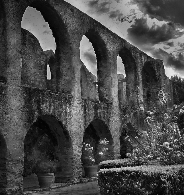
Hi Melissa,
Thank you for sharing. This is a difficult shot to shoot because of high contrast scene. Sky would easily be blown out and actually the sky of the original is blown out.
In my opinion, there are couple of points.
As Stacey said, it looks flat because of the tones. The tone of the plants and the bridge fall into the same range of tone. So plants are migrated in the bridge and does not feel the depth.
Also light and shadow of the bridge is not well-presented. So It does not look 3D.
I am attaching my attempt here. It is a really rough edit from original trying to show you what I would do.
I also would crop out the left. It looks just a repetition and there is nothing to get attention for me, I am afraid.
But I like the details of the bridge. It is well captured. I would be very cautious not to increase too much clarity though. |
Aug 9th |
 |
| 74 |
Aug 23 |
Comment |
Hi Trevor,
Thank you for sharing.
I think this is a good conversion try.
I like the replacement of the sky. It adds the mood and story. The replaced sky matches with the character of the rocks in the foreground. You might want to try to increase the whites a bit.
On the other hand, the the rocks in the foreground (the one the closest) does not have a interesting character for my eye, but the spiky rocks in the mid ground has interesting character. I would carefully choose which rocks to be in the foreground especially when you shoot from low with a wide angle. Then the image would become more powerful in my opinion. ã�¬�¬ |
Aug 9th |
5 comments - 4 replies for Group 74
|
| 96 |
Aug 23 |
Comment |
Hi Viren,
Thank you for sharing.
Sorry to be late for commenting.
I like the sky - nice cloud action. I also like your attempt to highlight the bridge by both building framing.
I might try to show the street. Currently a lot of vertical lines and there is no place to my eyes to settle. Street view might offset the lines and it might help to settle my eyes. I am saying without looking at what you captured.
If you want to highlight the patterns, I might try BW with heavier contrast. |
Aug 26th |
| 96 |
Aug 23 |
Reply |
Thank you, Bob, for your comments.
Looking at your edits without the tree at the back, I feel it looks empty in that section. Lower half have a lot of things to look at but there is nothing in upper half. So It looks unblanced for me. Don't you think? |
Aug 15th |
| 96 |
Aug 23 |
Comment |
Hi Dan,
Thank you for sharing.
For me, this is an degital art so I guess I am supposed to comment on the impression on the art.
Personally I like the subdued colors so it match with my taste. The degree of bring out the details of the clouds and adding the bule/purpule tint set the mood and give hint of time base. It does not have strong warm colors so it gives a feel of coldness, loneliness, and sadness overall. I looks as if I were a tree looking myself at the pond in the mirros, and the reflection is not clear as expected, then I would despair for my future. This is my impression on the art.
I would say the story-told would be vary by the viewers depending on the interpretation. It made me think for a while.
|
Aug 14th |
| 96 |
Aug 23 |
Comment |
Hi Ye, Thank you for sharing beautiful city site.
I like the contrast of sharpness vs motion blurred. Also I lke the color palette. It looks very beautiful. I like to see the images of the fireworks how it is merged in the city view.
As for composition, my eyes are guided either on the left egg-shaped lighted house or the ferris wheel on right. Maybe because those have a charactor. And my eyes would not go to the center area. If the fireworks are captured in the center of the view, it would make different story though.
|
Aug 14th |
| 96 |
Aug 23 |
Comment |
Hi Bob,
Thank you for sharing.
Let me answer to the questions.
The answers would depend upon what story would you like to tell in my opinion.
As for people, I do not know where they stand and how they are captured so I can not make definate comments. If you think the people would strengthen the story, then I would bring them back. If not, I would keep it out.
I like the second version better for rainbow. It makes the color clearer.
Regarding the composition, I feel it is cropped too tight even in the second version. I like to see the foreground a bit more too.
White box - I do not think it bother me a lot. Or I would say, it would not ruin the story in my opinion. It migrated in the tower.
The second version looks better better for me overall. It looks like it is captured in the evening. The light hitting on the tower looks warm as well as the light hitting on the ground looks warm. I might try to add blue tint toward upper left corner - using gradient filter by controling the tempreture just a bit. Then this has blue in the upper left vs. orange lower right.
This is what I have been told many time from PSA mentors especially when you are considering to apply for a contest - please pay attention on the small distructions - see the white bits and pieces on the ground. I would clone it out.
Hope this helps.
|
Aug 14th |
| 96 |
Aug 23 |
Reply |
Thank you, Dan. I got your points. Appreciate it. |
Aug 11th |
| 96 |
Aug 23 |
Reply |
Hi Dan, thank you for your comments.
I am asking the same questions not because I was not satisfied with the comments, but I posted the image with the different structure and the intention.
The image last month - my intention was to make evergreen tree to be the center of attention. But not many people could recognize the green tree to be the center of attention. And the consensus of the group was "busy", "too complicated". I understand that points.
This month image - center of attention is the white trunk with red flowers. The evergreen tree was used to give a sense of depth. I thought it would not be distracting your eye because of the fog. I shot the same composition without the fog but the green tree was big distraction as you said.
By asking the same question, I like to understand your eye travel, if or not the eye is guided as I structured. Also, is this still busy? That's my question. I got your answers to the questions. Thank you.
The questions would become universal in positing going forward. I would like to keep asking "what you see", "is it simple enough". That's my critical success factor for me to improve for now. So I would ask for your help in that sense.
Hope this explanation helps to clarifying your doubt,Dan. |
Aug 10th |
4 comments - 3 replies for Group 96
|
9 comments - 7 replies Total
|


