|
| Group |
Round |
C/R |
Comment |
Date |
Image |
| 74 |
Jul 23 |
Comment |
Hi Trevor,
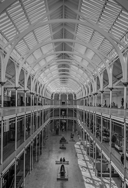
Thank you for sharing. I like the original shot very much. I like soft lighting, the structure of the building, and subtle colors. And the conversion is well managed, i.e. tone control, lighting, and the clean up the businesses (I guess you try to add story).
If I may, I would like to emphasize the story of 2 people in the bench. It is currently small compared with the whole frame for my eye.
So I would do this;
Crop tight to portrait - It helps to simplifying the structure and easier to notice the 2 people on the bench
Diffuse the ceiling - make it soft light to add soft mood.
Highlight the 2 people on the bench - help to guide the eye to the people.
Here is my attempt. Might be a bit too obvious in highlighting 2 people though.
But again, I like your shots very much!!!! Well done!!!!! |
Jul 8th |
 |
| 74 |
Jul 23 |
Comment |
Hi Don,
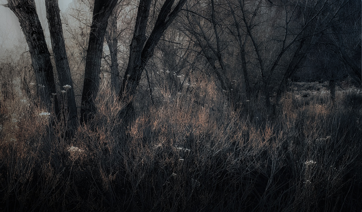
I have been looking at your images for a long time, but this is one the best conversion ever for me!
You have a great eye to find the good subject for the BW conversion. Good for you!
It looks like "paintings", does not look like "photograph" in a good way. The blurred subject turned out to be positive in this case as well. Your cropping is spot on, showing beautiful pattern well-presented.
Sorry, I do not have any suggestion for improvements.
I would frame it and hang it on the wall.
It is simple but powerful BW art. Well-done! |
Jul 8th |
| 74 |
Jul 23 |
Comment |
Hi Ed,
Thank you for sharing. I like the shot very much and I think your attempt is a good one.
When I review the BW image, I start with the original always. Since I was not there at the time, I try to understand the situation at the time of the shot, i.e. motivation of the shot, emotional feeling, etc. My understanding might be wrong. But based on my assessment, I go back to the BW image and start structure my comments. In a nut shell, my comments are always based on my assumptions and observations got from the original, which might be totally different from your actual motivation or feeling at the spot. So my comments could turned out to be irrelevant.
Having said that (sorry for the long introduction), looking at the original, The center of the image is the church. And it looks peaceful cloudy afternoon with the soft light. If I flip the image to BW, your center of attention changed to the cloud actions. And the sky in BW looks really strong and powerful. That's I guess because the clouds include the brightest part of the image and the contrast is strong. And church is not bright enough so it is not well-highlighted. The details of the trees are well captured in the original but it is not well presented in the BW version. At the end, the image turned out to be flat overall in my opinion.
I would suggest;
1. Lighten up the main subject to highlight it (I would use luminosity mask to increase the whites).
2. Soften the contrast of the sky to the level of the original (you have a great sky texture in the original)
3. Open up the shadow just a bit to show a bit details of the tree (again luminosity mask would do well).
Well, again this is a personal opinion though.
|
Jul 8th |
3 comments - 0 replies for Group 74
|
| 96 |
Jul 23 |
Reply |
Thank you, Bob.
Yes, one of the factor confused viewers might be colors. It has too many colors to look at. I visited there at the best season of the azalea full-bloomed. It added too much colors in the frame. Your edit and Robert's edit are sending the same message, "it works effectively without colors".
Thank you for your comments. |
Jul 16th |
| 96 |
Jul 23 |
Reply |
Thank you, Robert, for your comments and the attempt.
Yes, I was intended to have "king tree" center of attention. Rather than showing the details, I was wondering I could make the silhouette to be the center of attention. I thought the shape was outstanding. But I was careless to include the tree on the right, that was my mistake.
Your edit is a good inspirational direction. I will work on this scene again.
As for leaning, your edit cropped in the 3 tree in the center so I guess it looks leaning. |
Jul 15th |
| 96 |
Jul 23 |
Reply |
Thank you, Gloria, for your comments. Appreciate it.
|
Jul 15th |
| 96 |
Jul 23 |
Comment |
Hi Ye,
Thank you for sharing.
I like what it is. It looks like paintings. I like it hanging on the living room. It looks peaceful, gentle, and rousesã�¬�¬calm feeling. The blurriness of the reflection works good for me, it add gentle mood in the image.
Also the cloud looks very nice. Not strong, not weak, but it also adds value to the image in my opinion. |
Jul 15th |
| 96 |
Jul 23 |
Comment |
Hi Dan
Thank you for sharing.
This reminds me of the old days in grandpa's house. It occurs to me nostalgic feeling. It is more sad story. The subjects with the subtle tone and color works very well for me.
I would like to see the tree on left, what it looks like. Maybe you did not include that because it was not so looking good.
Anyway, I like the image very much. |
Jul 15th |
| 96 |
Jul 23 |
Comment |
Hi Robert,
Thank you for sharing. I have never tried to shoot other than the Arches there. Maybe I will look around things other than the Arches next.
I like your attempt. Also I guess I understand what you want to deliver. I have several winter forest images to deliver similar story but am still working on those. So I am struggling, too.
So I am not sure that I can help you on this but let me try.
This is my personal opinion, but looking at this image, I have 3 points.
1. The light source is on upper left. My brain expects that the luminosity of backlighted branches would be different in the bush in the center(foreground) vs. the background (on upper right). But overall, the brightness looks even here and there. So I could not feel the DOF.
2. Some part of the bush might be lit directly. In fact the bush on the left edge looks really bright, maybe because the sun-light hit the bush directly. But that part distracts my eyes. It is too bright for me.
3 The trunks of the trees on left looks too bright. When shooting to the sun, I am not sure that the eyes catches the details of the trunk with that brightness. By darkening down, the shape is better highlighted and would looks better in couple of similar pattern in my opinion.
My edits might be irrelevant since I was not there. But let me try for my practice. I imagine what you saw looks much brighter than this.
First, reduce the exposure of the image globally. Locally, hazed the light source significantly, darken down the trees on left, add blue tint in upper right, and paint touches of light on the main bush. And finally desaturate globally slightly.
I am not sure this is in align with what you are heading to though�� |
Jul 15th |
 |
| 96 |
Jul 23 |
Comment |
Hi Gloria,
Thank you for sharing the culture in Italy. I learned a lot from you!
What I like about the image is "whites town and different color of the sea". I would like to see that more in bigger size.
Currently you spare 50% of the image on sky, which does not attract to me.
So I would spend much more portion to present unique culture of Italy. That way my eyes can stay long in the image.
Looking forward to see next Italy culture image next month!
|
Jul 12th |
| 96 |
Jul 23 |
Comment |
Hi Viren,
Thank you for sharing the beautiful architecture.
Setting aside technical points, I like the overall tones of the image. I guess this comes from personal style and preference. These total values used created calm and soft feeling. And you did not increased clarity nor contrast so much, smooth texture added atmosphere and mood as well.
I have not been there, so I do not know how dark was it inside the church. As far as I see from the image, the light sources are side window and the ceiling. And it looks that all right sources are structured to light the podium in the bottom. Naturally the ceiling become comparatively dark as you edited. So your edits are believable for my eye.
If you would edit to increase the contrast (adding the whites), my suggestion is to use luminosity mask to lighten up the light source, or the part lit by the light source in the local adjustment. I tried myself but global adjustment did not work.
Anyway, I like this as it is. |
Jul 12th |
| 96 |
Jul 23 |
Reply |
Thank you, Bob for clarification. I understand. |
Jul 11th |
| 96 |
Jul 23 |
Comment |
Hi Bob, Thank you for showing us the experiments of AI.
Please help me to understand this better, as I do not know well about the arena - let me ask you, How would you let AI learn your personal style or preferences for editing? 2. The foreground of sea- is this added by AI? The foreground looks extended.
Currently I myself do not use even edit-presets nor add-inns but edit manually from scratch one by one. Using AI is a big jump for me but if I am combined that AI adds benefit for my own, I would like to consider it.
Anyway, the sky replacement works for me, it is better than the original. But the image is a bit over saturated especially in blue in my eye.
|
Jul 10th |
| 96 |
Jul 23 |
Reply |
Thank you, Dan, for your thoughtful comments. Understood your points well. I will try again and comeback here. |
Jul 10th |
| 96 |
Jul 23 |
Reply |
Thank you, Bob. I got your message. Appreciate your comments. |
Jul 7th |
6 comments - 6 replies for Group 96
|
9 comments - 6 replies Total
|