|
| Group |
Round |
C/R |
Comment |
Date |
Image |
| 74 |
Jun 23 |
Comment |
Hi Ed,
Thank you for sharing.
I like the tone of the BW image. Also details and texture is well presented. The eyes are a bit dark for me, I might try to brighten up the shadow of the eyes.
I feel that framing is a bit of tight. I need a bit more space to breeze, but it is personal opinion.
But I think it is a good BW conversion. |
Jun 10th |
| 74 |
Jun 23 |
Comment |
Hi Trevor,
Nice portrait.
Only the comment I could make is that main subject is a bit to bright compared to the background so it looks the person get spotlighted. A bit obvious for my eye.
Other than that, well done! |
Jun 10th |
| 74 |
Jun 23 |
Comment |
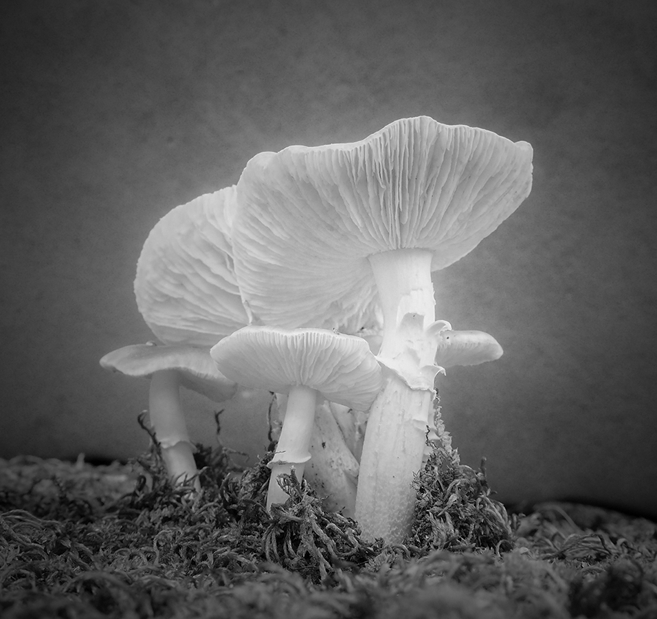
Hi, Melissa
Thank you for sharing.
I like the idea of shooting from low position.
If I look at the original, the mushrooms looks very soft, delicate, and gentle. It create calm emotion for me.
Whereas BW image provide me with the opposite emotion. If that is your intention, you achieved your goal. Yes, I notice the halo as Trevor pointed out, maybe because you increased the contrast or increased clarity.
If I were to convert to BW, I would succeed the atmosphere of the original image as attached. But it is personal taste and preference.
Also I feel it is cropped too tight.
|
Jun 10th |
 |
| 74 |
Jun 23 |
Reply |
Thank you for your comments and suggestion, Ed. Appreciate it! |
Jun 10th |
| 74 |
Jun 23 |
Reply |
Thank you for your comments, Don. |
Jun 10th |
| 74 |
Jun 23 |
Reply |
Thank you for your comments, Melissa. |
Jun 10th |
| 74 |
Jun 23 |
Reply |
Thank you for your comments, Trevor. |
Jun 10th |
| 74 |
Jun 23 |
Reply |
Hi Lance,
Thank you for your comments.
Yes, I admit that I should have used higher ISO to stop the motion of the main subject. I was shooting the different still subjects and happened to find this scene. So I quickly turn the camera without changing the camera setting. So It is my mistake... It could not recover "blurred the main subject" in the post processing.
I have read about your article. I understand your point.
Thank you for dropping by. |
Jun 10th |
| 74 |
Jun 23 |
Reply |
Hi Stephan,
Thank you for dropping in. Appreciate your comments.
Yes, your cropping might work as well . I just wanted use the space to add the depth and dynamics in the image.
|
Jun 3rd |
3 comments - 6 replies for Group 74
|
| 96 |
Jun 23 |
Reply |
Thank you, Robert. Appreciate your honest comments. I understand your points. I will try again this year. |
Jun 26th |
| 96 |
Jun 23 |
Reply |
Thank you, Dan, for your comments. Appreciate it. |
Jun 17th |
| 96 |
Jun 23 |
Reply |
Thank you, Bob, for your comments and edits. I understand your points. Let me work on what I can do. |
Jun 17th |
| 96 |
Jun 23 |
Reply |
Thank you, Gloria, for your comments. It helps a lot. |
Jun 17th |
| 96 |
Jun 23 |
Comment |
Hi Robert,
Thank you for sharing.
Sorry to be late for commenting. I was watching this image again and again and played around with Photoshop to figure out how I could contribute to add value to your image.
Here is comments purely based on my personal preference.
1. I like the mood created by sepia color and overall light toning. It makes me warm, nostalgic, and peaceful. Pure Black and White conversion would not achieve that in my view.
2. The layers of mountains are well described. A bit of fog/mist and the soft tonality of the ridge add to the mood as well.
3. The birds also adds the story well. It fits well with the atmosphere and mood. And the position of the 3 birds looks good as well. Your post-processing brought a lot of fruits in my view.
On the other hand, I feel that 3 trees in dark tones are too strong in my eye (especially the biggest tree on the left). It occupies the large portion of the image and I think that it might reduce the mood of entire image, or it makes less outstanding/noticeable of the main subject. I might try to brighten up the trees just a bit. Again, my personal opinion.
Finally, you might want to do dust spot patrol.
But overall, this is an amazing image. I am looking forward to see your next monochrome image. |
Jun 17th |
| 96 |
Jun 23 |
Comment |
Hi Dan,
Thank you for sharing.
I looked at the image first and then, refer to the description. Honestly, I could not connect "fish tank" with the image. I could not recognized that this is a landscape image neither. Rather, the image grab me and take me to the internal organ, e.g. inside of stomach. It give me an feel that I am in the stomach, looking at the color, texture, and the folds. |
Jun 15th |
| 96 |
Jun 23 |
Comment |
Hi Gloria,
Thank you for sharing this. It is a good culture learning for me. Yes, this image helps me to understand the beautiful town of Italy. It looks beautiful town. What I like about this image is the contrast of colors, vivid blue/red color vs. subtle colors of the old buildings. It is a nice mixture of history and modern culture.
Composition wise, the depth is well-presented.
If the boats are well-organized and structured in the frame, the image would become more powerful in my opinion. |
Jun 15th |
| 96 |
Jun 23 |
Comment |
Hi Ye,
Thank you for sharing a beautiful image.
First of all, the title, "Twilight" fits very well in the image. What I like about this image is the color. You managed well to maintain the detail and texture of the sky. I also like the decent orange color reflection on the water. When I see this in the thumbnail, I looks exceptionally beautiful, but my eyes wonder what to see when it comes to see the detail closer in the image. It is a bit busy for me.
I would like to handing on the wall in the living room for relaxation.
As for composition, my eyes settle well with the flipped version as Bob edited. |
Jun 15th |
| 96 |
Jun 23 |
Comment |
Hi Bob,
Thank you for sharing.
I am not sure that what created the motives as you said.
Setting it aside, I like the original better. I like the color of the mountain, the sun is hitting the diagonal edges of the mountain, and the clouds action adds the mood. I would keep the original with color as it is.
But If I were to convert this to BW, I would highlight the layers and make the ridge a bit strong and powerful. How far you go with the contrast/clarity - That's personal choice and preference in my view. Here is my attempt. |
Jun 10th |
 |
5 comments - 4 replies for Group 96
|
8 comments - 10 replies Total
|


