|
| Group |
Round |
C/R |
Comment |
Date |
Image |
| 74 |
Apr 23 |
Reply |
Thank you, Melissa, for your comments.
And thank you for mentioning "subtlety". It was one of the goal to achieve in the image. Sounds like majority is for the color version. Maybe right... |
Apr 9th |
| 74 |
Apr 23 |
Reply |
Thank you, Don, for your comments and edits. It helps. |
Apr 8th |
| 74 |
Apr 23 |
Reply |
Thank you, Trevor, for your honest feedback. Appreciate it. |
Apr 8th |
| 74 |
Apr 23 |
Reply |
Yes, your crop might be better, Don.
|
Apr 8th |
| 74 |
Apr 23 |
Comment |
Hi Trevor,
Wow, you produced this BW from the original? This is too good.
How can you manage the sharpness and texture after heavy cropping? This is amazing...
You are really good at this type of image (I always kept saying this). The tone is great, texture is well presented.
I like how you cropped as well.
Only the point is that the eyes of the player facing the camera. I would like to open up the shadow a bit. I cannot see it well in the original though... Maybe this might be the side effect of heavy cropping.... |
Apr 8th |
| 74 |
Apr 23 |
Comment |
Hi Melissa,
Thank you for taking over the admin task from Arne. Appreciate it.
First of all, I would like to see the "Original Mono" image before you edit it. That way I would be able to provide better comments I guess.
For me this is a great story telling image and you are successful in that point.
From the composition point of view, the path curves to left guides my eye out of the frame.
Second, the white fence is too bright and it distract my eyes. And I agree to Don that contrast is raised too high judging from the clouds and haro in horizon. |
Apr 8th |
| 74 |
Apr 23 |
Comment |
Hi Giovanna
This is marvelous! A great story telling image.
Great depth, texture, and atmosphere. I really like this.
The cropping was really successful and regaining the sky/clouds adds the story. Tonality control is well-managed in my opinion.
There are not so many comments for improvement but, if I may, I would darken down the white cloth of the woman sitting on the bench.
It is too bright for me and it grab my eye away.
But again, great image. Well-done. |
Apr 8th |
| 74 |
Apr 23 |
Comment |
And second option is wider crop to include the tree in right.
This would become a semi-pano style.
Edit is a bit rough due to limited pixels. |
Apr 8th |
 |
| 74 |
Apr 23 |
Comment |
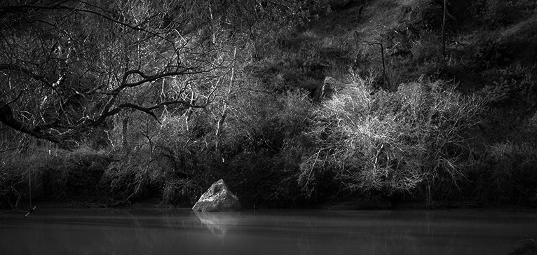
Hi Don,
I like what you were trying to do. This is a good one.
For me, the highlight of this image is the rock with reflection and the trees with beautiful lighted branches.
The reflection is beautifully shown and the lighted branches are well-represented. So I think this is a good attempt.
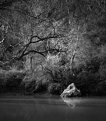
But for me stone is placed too centered in cropping and I need more space the breath the trees.
I would go with 2 ways.
One is to crop tight and make it simple, Just the stone and the tree in left. Here is my attempt. |
Apr 8th |
 |
5 comments - 4 replies for Group 74
|
| 96 |
Apr 23 |
Reply |
Thank you, Robert for your comments.
I will try your suggestion next year. Hope it will turn out to be better. |
Apr 23rd |
| 96 |
Apr 23 |
Reply |
Thank you, Cheryl for your comments.
I got good feedbacks from everyone to be incorporated in the next round. |
Apr 19th |
| 96 |
Apr 23 |
Reply |
Hi Bob,
Thank you for your comments.
I increased the blue of icicles tying to differentiate from the main subject.
but yes, you might be right that the main subject should be a bit bigger. I should have zoomed a bit more in the frame. |
Apr 19th |
| 96 |
Apr 23 |
Reply |
Hi Gloria,
Thank you for your comments and suggestion. Yes, I should have used wide aperture. I will try that next year... |
Apr 19th |
| 96 |
Apr 23 |
Comment |
Hi Cheryl,
Thank you for sharing.
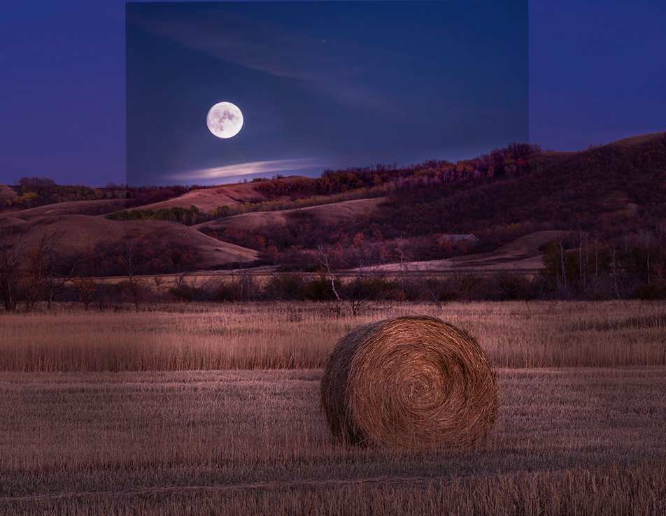
I really like this scene. It reminds me of "Summer, The Gleaners" of Millet. I especially like the mood and texture.
Let me answer to your questions one by one.
As for brightness of the moon, I do not think the moon itself is too bright. But If you glance at the entire scene in the wide view, the brightness of the moon and luminosity/exposure of the hill/field does not look balanced. I might try to increase the luminosity in the hill/field. But this is really a minor thing for me. More importantly, what makes me the whole scene look unnatural is the saturation in my eye. It is over done in my opinion.
Lastly, regarding the crop, I feel it is cropped too tight. I need a space to breath a bit more. Currently the moon is too highlighted in size because you have enlarged the moon from the original, and cropped tight from original. I said "Wow" when I saw it first but soon next, I started thinking "is this real?".
I tried 5x4 crop and the placed the moon in 1/3 upper corner. By adding the space left/right, the size of the moon is neutralized in my view. It looks stable for me. (attached - I combined layers PS but did not match the color of sky, so it has funny line. Please ignore that.)
|
Apr 19th |
 |
| 96 |
Apr 23 |
Comment |
Hi Dan,
Thank you for sharing. I always enjoy your creativity.
Honestly, I have a mixture of feeling. Shadow of the tree and purple casted color gives a ominous feel but on the other hand, I feel somewhat relieved. And net net, overall impression is somewhat "transition for better future". Some bad incident happened(past tense not future tense) but it is resolved and it is transitioning better for the future.
I thought it is better to comment on what I feel looking at this image but I am not sure I explained well here with my poor English. |
Apr 18th |
| 96 |
Apr 23 |
Reply |
I got it, Bob. Thank you for replying. |
Apr 10th |
| 96 |
Apr 23 |
Comment |
Hi Gloria,
Thank you for taking me though nice culture travel. Your country has a great sense of harmonize "history" and "modern life". This image makes me feel that "I would like to run in this track arena there". A great story telling image.
I might suggest to reduce the potion of the sky a bit. That way my eyes can focus to see the highlights (lower part of frame) better.
Regarding the bright reflector in the center, I would just burn the light source and reduce the brightness.
I guess one of the value of the image (in my view) is that it is taken in the evening and the reflectors are lighting the ground. If I drop the exposure/highlight, I see some part of ground is lighted. For me that is a part of the story. So personally I do not mind having the bright light source in the frame. I just reduce the brightness by burning the part.
Again thank you for sharing your culture here, I learned a lot from this image. |
Apr 9th |
| 96 |
Apr 23 |
Comment |
Hi Bob,
Thank you for sharing your experience and good memories here.
Your views and perspectives are really new to me so it stimulate my inspiration always.
I am with you on trying to capture the valley with the foreground. You had a good cloud actions as well. I can guess you encountered a nice moment looking at this image.
Looking at this image, I have a temptation to step left and see the valley more in the frame. Celtic cross is in the center of the frame and it give me an impression that blocks my sight. I might suggest to step left a bit to show the viewers the valley in shooting. I am commenting without knowing the place if that is possible though.
Yellow casted processing makes me feel that is "good old days" feel. |
Apr 9th |
| 96 |
Apr 23 |
Reply |
Thank you, Dan, for your suggestions. I will bear it in mind when I visit there next year. |
Apr 8th |
| 96 |
Apr 23 |
Comment |
Hi Robert,
Thank you for sharing.
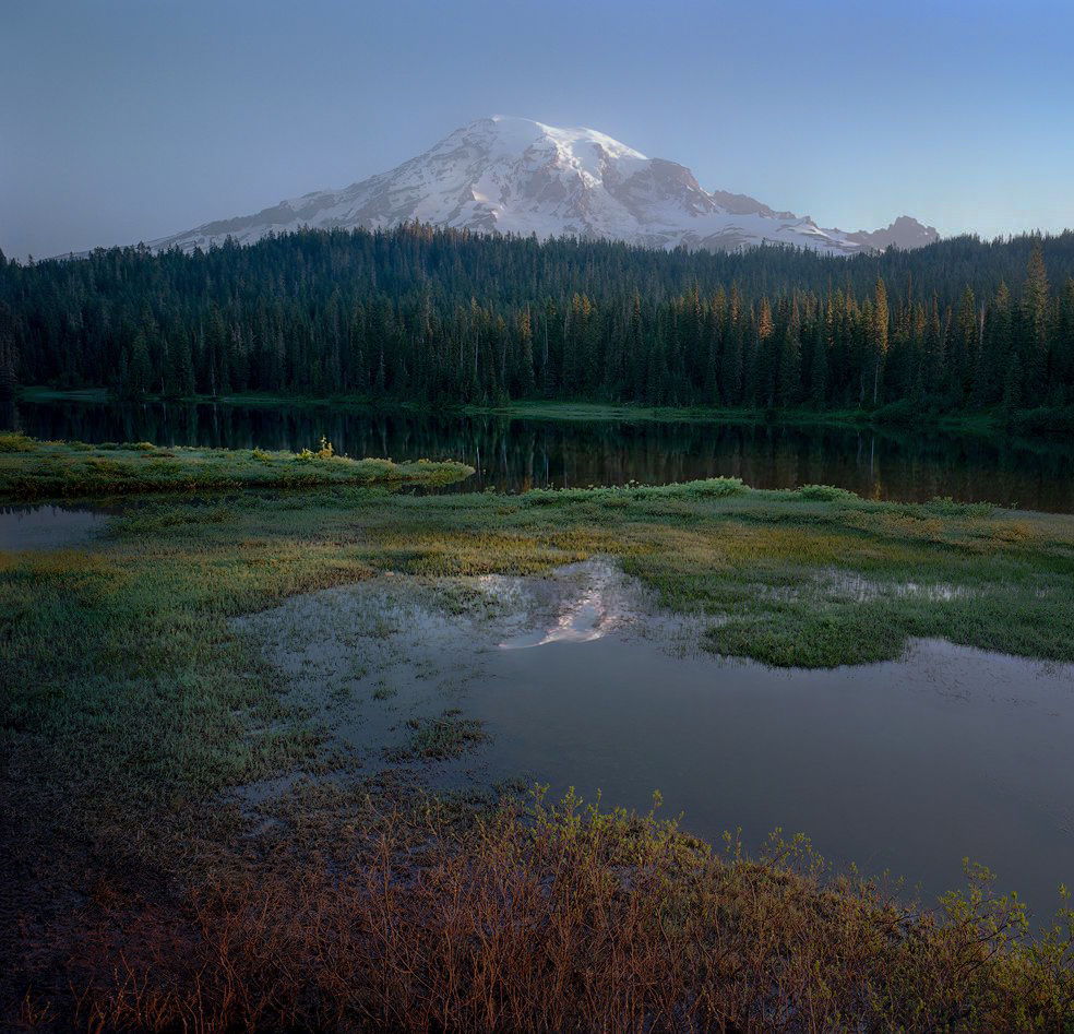
It is a nice scene with a soft light and good color palette. It give me a calm feeling. Overall, I like this image very much.
For me the highlight of the image is the reflection of the mountain and the forest first, then, Mt. Rainier. The leading line from lower right guides my eyes to the highlights. It is nicely structured.
In my opinion, there are lot of space in the lower right in the water, where for me there is nothing to see. That space reduces the impact of the image in my view.
So, I would crop out the right a bit. You might not like the 1x1 format though.
After cropping, it still maintains the leading line. Also, I would add clarity to the reflections, but reduce the clarity on forest and Mt. Rainier. That way, my eyes catch the highlights easier.
Here is my attempt. |
Apr 8th |
 |
5 comments - 6 replies for Group 96
|
10 comments - 10 replies Total
|