|
| Group |
Round |
C/R |
Comment |
Date |
Image |
| 74 |
Jan 23 |
Reply |
Thank you, Don for your comments and edits. Appreciate it. |
Jan 24th |
| 74 |
Jan 23 |
Reply |
Oh, sorry, Arne. I misunderstood your comments. Then, your take is as I expected. Thank you again. |
Jan 9th |
| 74 |
Jan 23 |
Reply |
Thank you for your comments.
I dare not to include what the photographer is taking. I thought it would enhance the viewer's imagination. |
Jan 8th |
| 74 |
Jan 23 |
Comment |
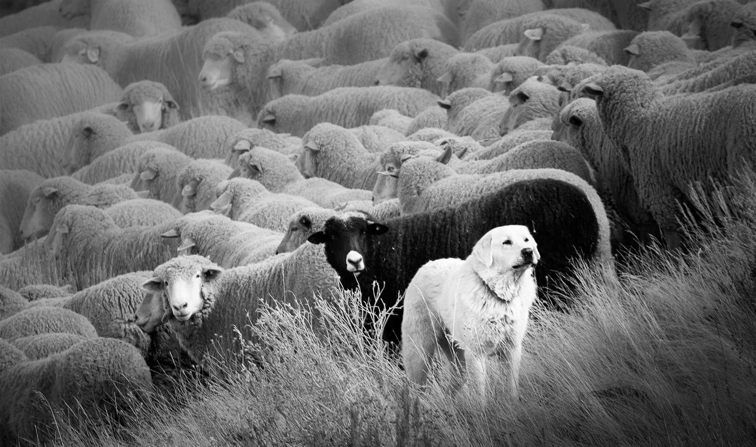
Hi Lisa,
Thank you for sharing.
It is a interesting image. I like your attempt. At first glance, it looked like a pattern shot but after careful observation, I found it has a interesting story.
For me, the interesting part is 3 animal facing into the camera direction. I would highlight that. Other sheep plays an roll of background.
Sorry to repeat here and there but I am not a big fan of tight texture (too much clarity or contrast). This again is a personal taste.
If I would reedit to improve (based on my taste), I would crop tight and eliminate the background bush. Placing the dog 1/3 from right and lighten up 2 sheep and the dog. Blurred the sheep in the background to make the center of attention outstanding. I try to present the softness of wool of sheep.
This is purely my taste and for my practice of PS. Here is my attempt.
|
Jan 8th |
 |
| 74 |
Jan 23 |
Comment |
Hi Arne,
Thank you for sharing.
This is a nice city scape. Initially it looked busy but as I look at it, I can enjoy watching the scene.
There a couple of things I like about this image;
1. Tonality - I like overall tone. It does not give me strong first punch but it makes me calm.
2. I like the zig-zag wave cloud actions it helps my eye to travel. I might suggest to put a bit more contrast to make it outstanding, but not too much.
3. Also the road helps my eyes to travel through the scene.
Only the issue for me is the lower left part - the car pool or something, the snow is too bright and it distract my eyes. That's only the point from me.
But it is well structured and I enjoyed a lot!
Well done! |
Jan 7th |
| 74 |
Jan 23 |
Comment |
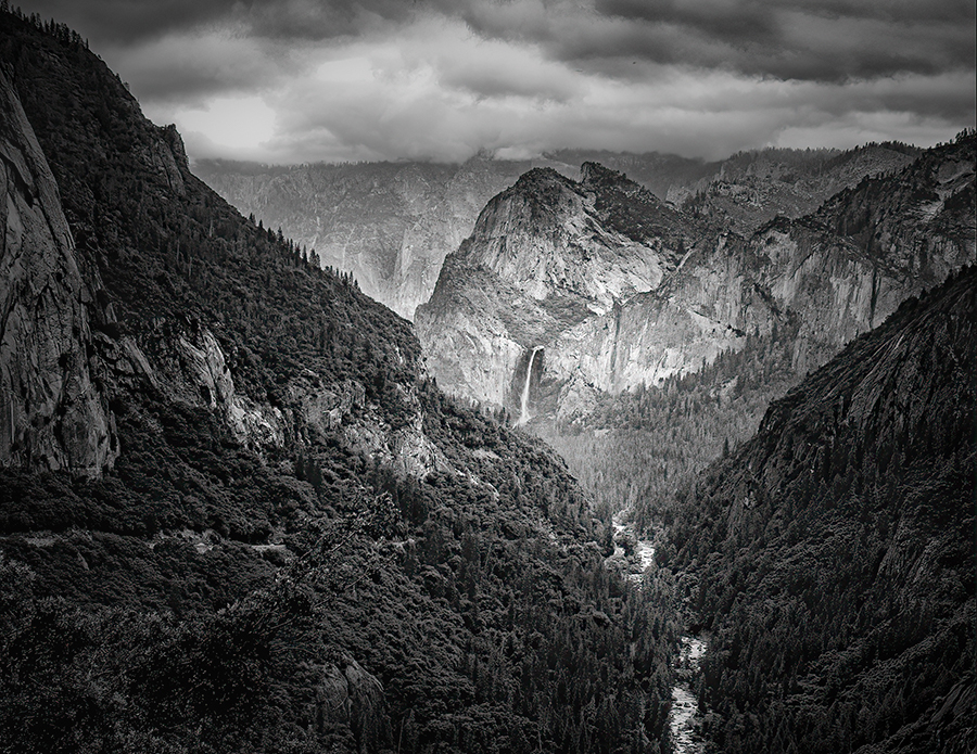
Hi Tevor,
Thank you for sharing.
This is a good BW image. I enjoyed watching it.
I like the composition - the river take my eye to the mountain at the back. It works well.
I like the texture of the bush.
Your edit has a unique character and it works well as it is.
The post processing is pretty much depending on your style and your expression of the scene.
For example, Don likes high clarity images I suppose. On the other hand, I prefer to express texture as natural as possible being a landscape photographer.
So for me, I like to reduce clarity in the bush, smoothen the river, and brighten up the river and the path I want viewers eye to follow. Here is my attempt.
That's again personal opinion.
|
Jan 7th |
 |
| 74 |
Jan 23 |
Comment |
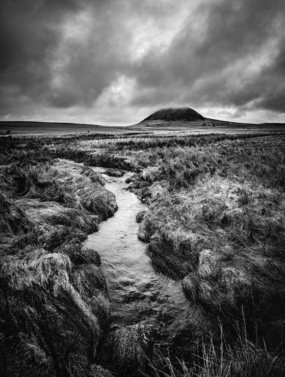
Hi Don,
Thank you for sharing. Good for you to be there on your birthday. I envy you!
I have been there for a couple of times, but I could not encounter good condition as this.
I think composition looks good. portion of the sky, right place for the main subject, and it is good to have good amount of foreground.
Also you did a good job on post processing. I feel I would like to have more whites but I like this tonality overall.
This is my personal taste and style but I like less "clarity" on forest/trees. It looks too tight to my eye.
If I would comments for improvement, I would brighten up the center of attention (mountain and fall) carefully (the fall is blown out already) , also I would lighten up the river path to guide to the center. By doing that, my eye travel easier on the right path.
Here is my attempt
For my personal taste, I decreased clarity of the trees and blurred background to add depth/distance in the image.
|
Jan 6th |
 |
4 comments - 3 replies for Group 74
|
| 96 |
Jan 23 |
Reply |
Hi Bob,
For me, your edit enable me to focus on the stream and rainbow without the sky better.
I were to crop, I would try to crop the sky first. I would not crop both sky and foreground. That's my personal opinion.
|
Jan 19th |
| 96 |
Jan 23 |
Reply |
I like this version better. I might end up cropping this as you suggested.
I appreciate all your effort on this. Appreciate it!
It helps me a lot. |
Jan 19th |
| 96 |
Jan 23 |
Reply |
Thank you, Robert for your comments and edits.
I now understand all the issues. I will keep working on this trying to make it better. |
Jan 19th |
| 96 |
Jan 23 |
Reply |
Thank you, Bob for your comments and edits. I got your points. |
Jan 19th |
| 96 |
Jan 23 |
Reply |
I meant the snow patch, Robert. Sorry, it was not clear. |
Jan 18th |
| 96 |
Jan 23 |
Reply |
Thank you for your comments, Kate. Everyone has different way to appreciate this, it seems. |
Jan 18th |
| 96 |
Jan 23 |
Reply |
Thank you, Gloria, for your comments. It helps. Thank you. |
Jan 14th |
| 96 |
Jan 23 |
Reply |
Yes, It helps. Thank you. |
Jan 9th |
| 96 |
Jan 23 |
Reply |
Maybe I did not explain well enough in my comments but I just was trying to read between the line of your description, " weather change coming, etc." in editing, Kate. I am now clear what your emotion was. Thank you for mentioning that. |
Jan 9th |
| 96 |
Jan 23 |
Comment |
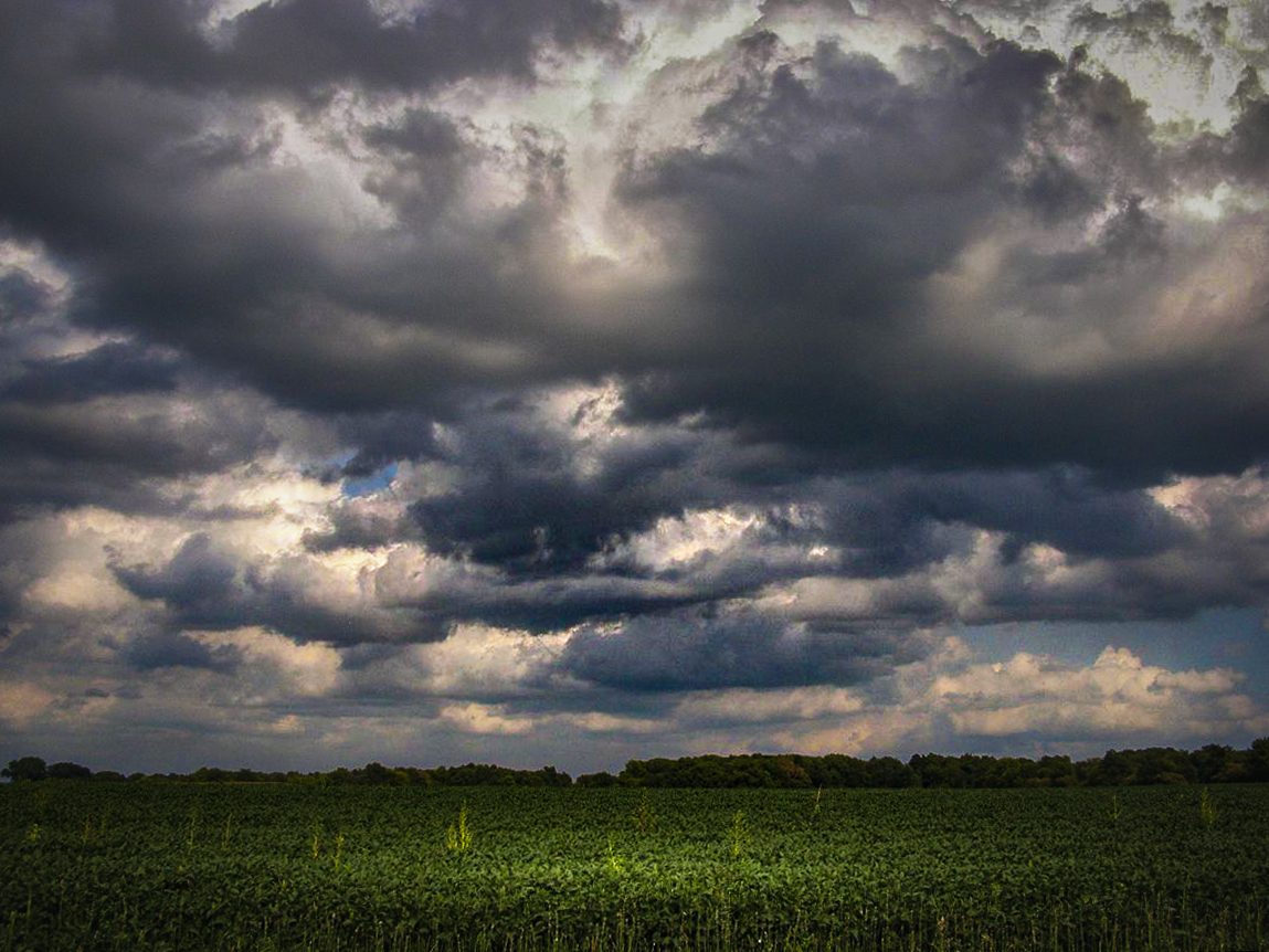
Hi Kate,
Thank you for sharing.
I understand what you are trying to do. I like what you did - spend majority space on the sky and show a bit of foreground/midground. I think that's a good idea, especially when you see the dynamic cloud actions. What's missing here is the subject to hold my eye. The clouds are interesting to watch but there is no object to settle my eye. If there is some interesting foreground in the bush, I would like to see it as well.
In the post processing, I think it is pretty much depending on what emotions you want to convey. Based on the color and tone of the image, I see it "peaceful afternoon field shot" - there might be a bit of shower later but still easy-going and relaxed afternoon. That's my impression of the image.
If I were to emphasize "uneasiness or trepidations emotions of the weather change", I would approach differently. I am attaching my attempt. I exaggerated in editing for easier understanding what I am saying.
|
Jan 8th |
 |
| 96 |
Jan 23 |
Comment |
Hi Robert,
Thank you for sharing.
For me this is one of the best image since I have seen your works so far. Maybe because my taste is skewed to "subtlety-color world". I am a big fan of the image like this. I like the color tone and softness of the image. I have seen a lot of "high clarity" images recently so this relieves me a lot. It gives me "piece of mind", "calm", and "hope for the future".
It looks natural to my eye and cannot detect any discrepancy in the detail. As long as I see it in 1200 pixels, it looks fine in my eye.
Although I loaded this image in PS trying to re-edit myself for practice, I could not find any change for improvement.
If I may, only my suggestion is to clone out the white stone in lower left edge. It became distraction to my eye.
Again, thank you for posting this image. I love this a lot. |
Jan 8th |
| 96 |
Jan 23 |
Comment |
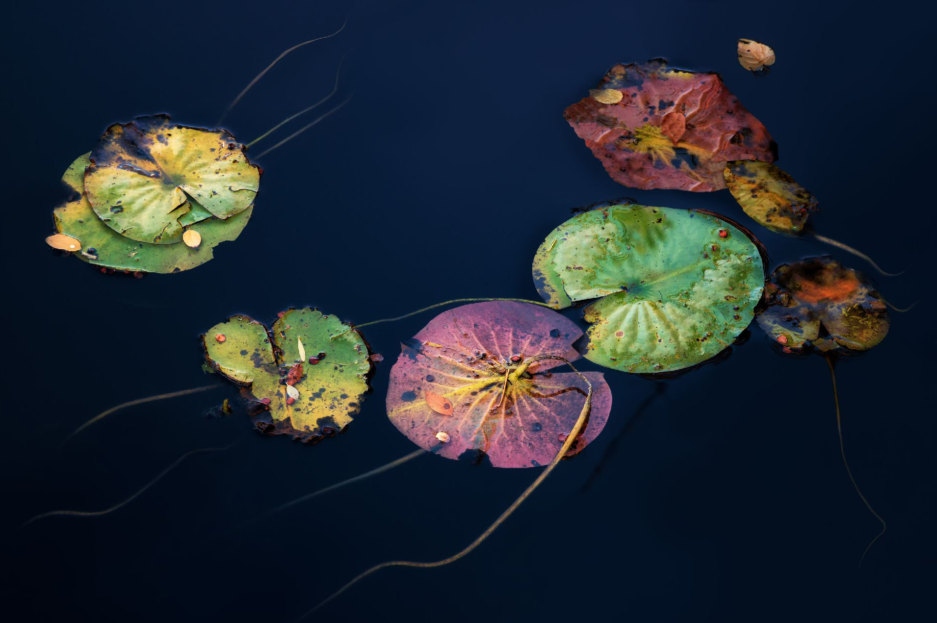
Hi Dan,
Thank you for sharing. This is another "wow". At first glance, it looked like a digital art. It maybe because the details of water was all removed so it gives me an impression of that. I am not sure that you aimed at it or not sure that that comments are pleasing you or not.
But I like the details/texture of the leaves and the luminosity (light and shadow) on the plants. Also I like the color pallet. The lily pads looks like jelly fish.
As for composition, I would imagine that you keep the leaf on upper right corner on purpose. Although it kept in dark, but I prefer not it be there. Also I would question about the space on lower left corner. I feel it is a bit too spacious.
For comparison purpose, I clone out the leaf on right and crop left and bottom a bit. Is this too "inside-the-box"? |
Jan 8th |
 |
| 96 |
Jan 23 |
Comment |
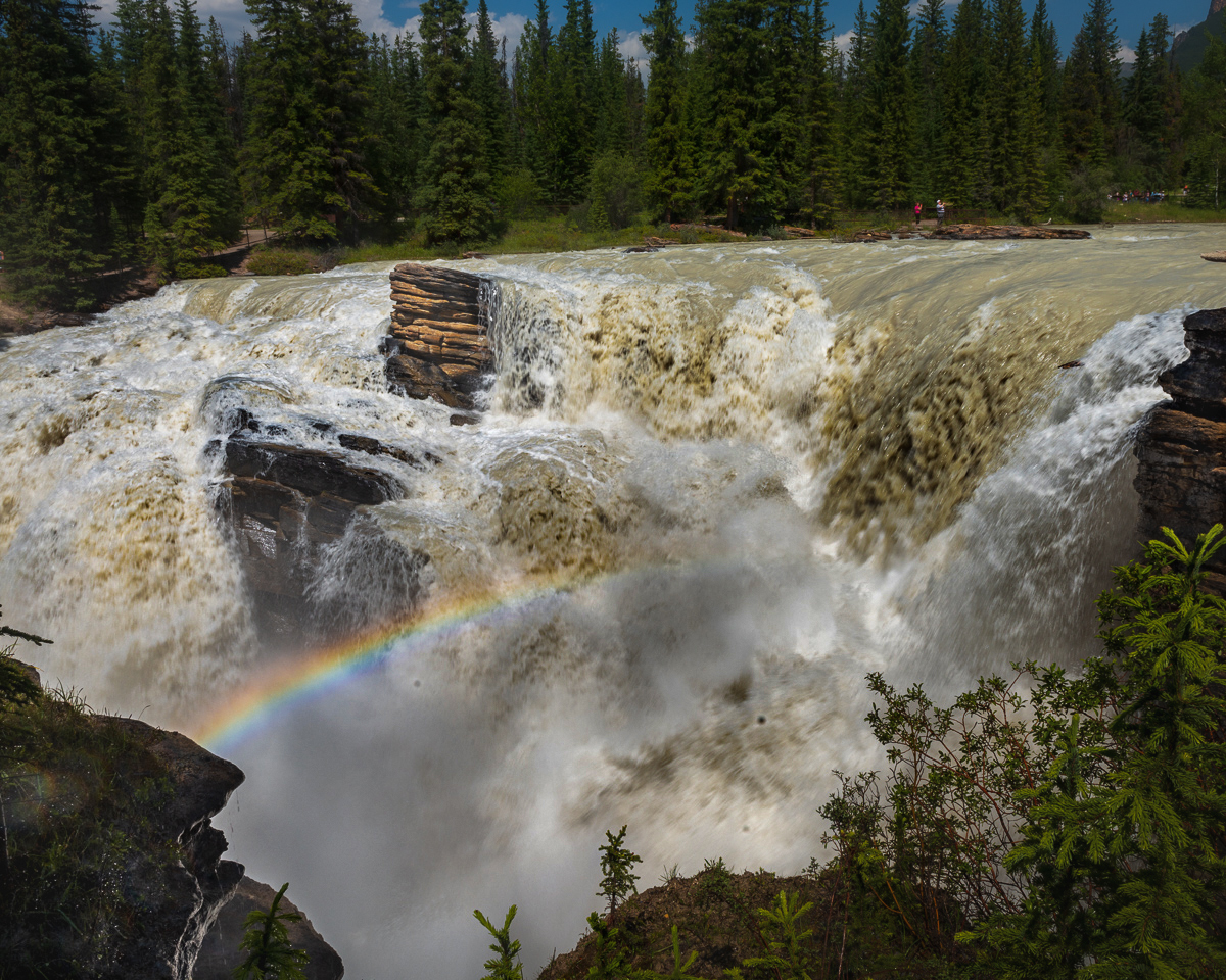
Hi Bob, Hope you get well soon.
Thank you for sharing. This is a wonderful shot.
I think this is one of the best shots I have seen of your images recently. Although I have shot a lot of waterfalls, I rarely encountered rainbows. So, you were there at the right time.
I like how you structure the image - the rainbow is in the center of attention yet showing the powerful water movement with right shutter speed in my view. Portion of the background (trees and sky) is appropriate in my eye. I see the people at the back, which give me a sense of scale.
So, composition wise, you did well in my opinion.
Now as for post processing, I would do a couple of things.
1. I feel highlights/whites are too strong especially in the center of the image. It looks flat. I would add more contrast to make the rainbow outstanding.
2. The foreground on the lower right corner looks busy, so I would darken down a bit. I tried to crop out, but I decided not to.
3. Opened the shadow of the rock on lower left corner to see more details.
4. This is purely personal taste, but I blurred the trees in the background to give a feel of depth.
Here is my attempt.
|
Jan 8th |
 |
4 comments - 9 replies for Group 96
|
8 comments - 12 replies Total
|


