|
| Group |
Round |
C/R |
Comment |
Date |
Image |
| 74 |
Dec 22 |
Reply |
Thank you, Arne, for your edits and inputs. Understand you points. It is very helpful. |
Dec 9th |
| 74 |
Dec 22 |
Reply |
Thank you, Don. Got your points.
Appreciate your comments. |
Dec 8th |
| 74 |
Dec 22 |
Reply |
Thanks, Arne.
Are you looking for this type of edit when you say "rim light all the way around"? Is this close to what you are imagining?
|
Dec 8th |
 |
| 74 |
Dec 22 |
Comment |
Hi Arne,
Thank you for sharing.
As always you are good at shooting architectures. I enjoy your work so much.
The camera angle is good and it is sharp focused. The 100M pixels camera fits well for presenting details and texture of old architectures I think.
As for post processing, you have done well - good representation of all tones and contrast. Burning the people in the foreground is well-managed for my eye.
This is my personal opinion but I do not enjoy the beam of light added in the post processing. It just turned out to be distraction to my eye.
I prefer to have darker background without a beam of light - That would become more dramatic for me and I can focus to see the details of the architectures straight.
|
Dec 7th |
| 74 |
Dec 22 |
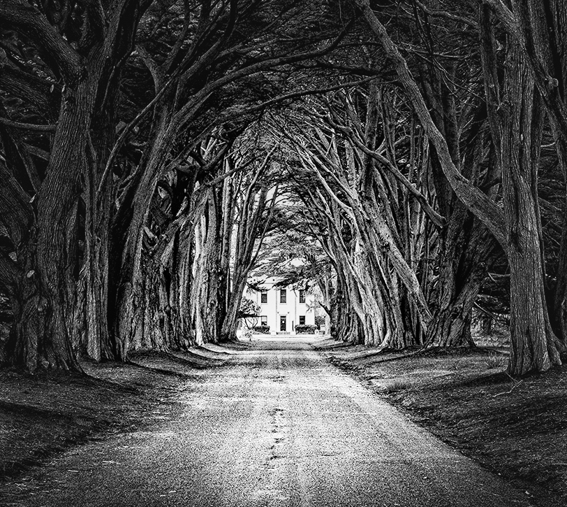
Comment |
Hi Don,
Thank you for sharing.
I like how you structure the image. Nice leading line of roads, tree tunnel, and the bright building at the back.
It is a nice shot. Well done!
I think how you present the texture is personal preference. For me, it is too tight, or clarity is too strong but again that's personal style.
If I would comment for improvement, there are 2 things I would try;
1. Line of trees are too much and complicated for my eye. Attention need to go to the tree tunnel but not line of trees in my view - I would crop the left/right and start with the trees with good characters.
2. I would put vignetting to highlight the center. It would help to direct my eye to the center of attention.
Here is my attempt (just cropping and vignetting on your BW). |
Dec 7th |
 |
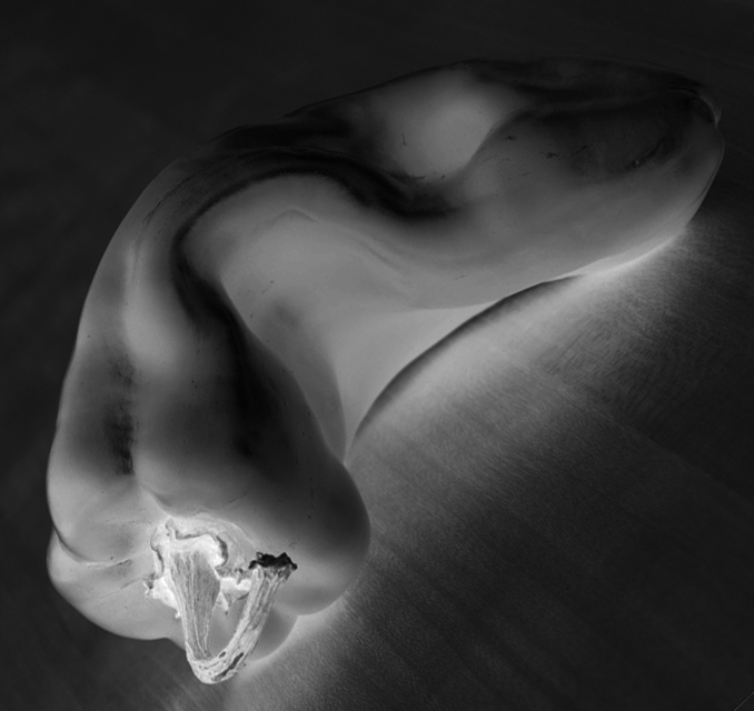
| 74 |
Dec 22 |
Comment |
Hi Dick,
Thank you for posting this. I looked up Edward's peppers works. His works inspire you well it seems.
Setting aside of Edward's image, this is what I like about your image;
1. tone - I like the level of tone you gave in conversion. It looks gentle - is it reflection of your personality?
2. texture - it looks very fresh pepper although it is converted to BW. Clarity is not too tight, contrast is not too strong.
3. good lighting - I imagine it was challenging to put the appropriate lighting. I like the direction of light coming through. But it is very soft. That's what I like .
I am commenting now from my personal taste and style.
I like to lighten up the hull a bit more. For me the shape of this paper does not have so strong character as Edward's peppers, so I would like to see the details of full to catch attention. And I would rotate the image a bit. That way I can present more depth in the image. That's all my personal taste. I am attaching my attempt here. This is what I would do in conversion from the original.
But again, it is well done. A good BW pepper.
|
Dec 7th |
 |
3 comments - 3 replies for Group 74
|
| 96 |
Dec 22 |
Reply |
Thank you, Robert. I need to think again how to simplify the scene. Based on the majority of comments, it sounds like everyone see the waterfall as center of attention, which might be wrong from first place. Maybe it is because of composition, placing the stream in the center. That need to be fixed. I will visit this place again in a month time so if my next shot turn out to be fine, then I will post again here. Thank you again for your input and edit. |
Dec 18th |
| 96 |
Dec 22 |
Reply |
Hi Cheryl,
Thank you for your comments and demonstrating your suggestion in editing.
I will work on the highlights and shadows as you suggested.
yes, your edits looks a bit too blueish to my eye, but I got your point. Thank you again. |
Dec 17th |
| 96 |
Dec 22 |
Reply |
Thank you, Dan for your comments.
I will think how to simplifying things here. I would try adding luminosity to help the eye travel better. |
Dec 17th |
| 96 |
Dec 22 |
Reply |
HI Bob,
Thank you for that. You and Cheryl arrived at the same crop. That's shows something. I am not a big fan of unnatural colors in my image, which I think you know that. But thank you for your suggestions.
|
Dec 17th |
| 96 |
Dec 22 |
Reply |
Thank you, Kate for your comments. |
Dec 17th |
| 96 |
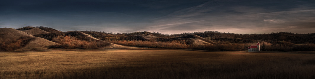
Dec 22 |
Comment |
Hi Cheryl,
Thank you for sharing.
First, let me answer to your question,
I do not feel lonely from the image. I think it is because the image is filled with warm colors and the image itself is bright enough. That gives me a feeling of "warm fine autumn afternoon, while I am basking in the sun" I am filled with joy, happiness, satisfaction, those of which are far from "lonely" for me.
On the other hand, I could see this "lonely" from a "space" point of view. So, I would not crop closer. Since you used long focus point, the distance from foreground is condensed. The only way to show the "loneliness" in space is horizontal space, which you wanted to present here. And there is beautiful rolling hills in left corner, So I would not crop those.
So, this is what I would do... VERY PERSONAL OPINION though...
I would change the scene in the sun set. Half of the frame gets dark; the other half gets the last sunlight (so rolling hills still get the light). That would give an impression of "dark night" is coming soon. The church will be standing in a vast land alone in dark. Would it give you a "loneliness" feeling?
Did I do too much? |
Dec 13th |
 |
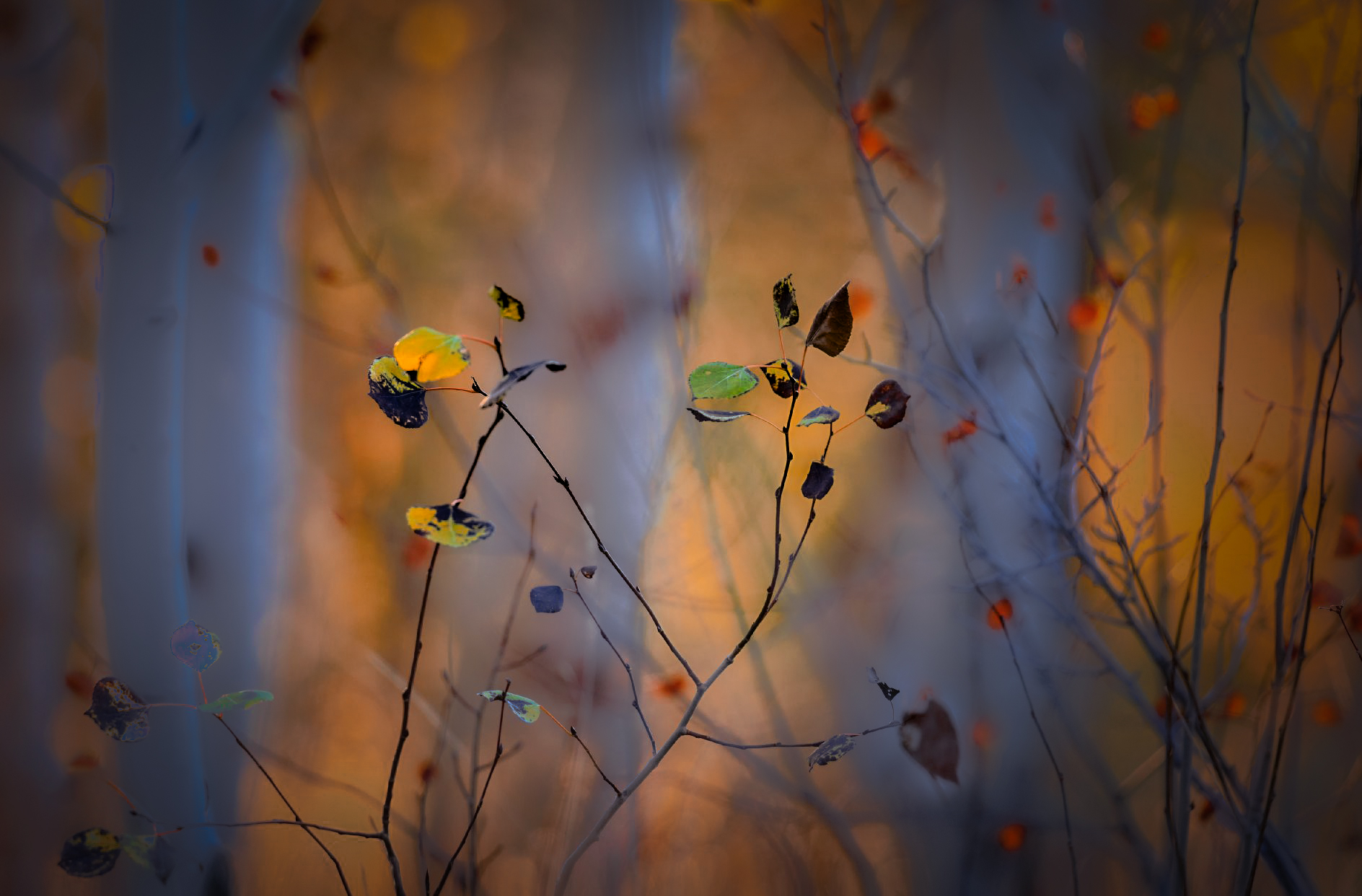
| 96 |
Dec 22 |
Comment |
Hi Dan,
Thank you for sharing.
I have mixed feelings about this image.
Please excuse me for making comments not pleasing you so much in advance.
At a glance, it looks pretty. The color combination of white birch tree vs. orange color background - That's super!
But once you look into details, my eyes are confused.
Sharp focus is on the foreground small branches and a couple of leaves. But the birch trees get more attention because they are brighter and more powerful in the frame, my eyes try to see the birch trees. But since the birch trees are blurred, my eyes go back to whatever is focused. But focused subject is very limited in the frame. So, my eyes travel to search for the place to settle. Especially the birch tree on the left is powerful and steals my eye away but it does not allow my eye to rest. And this goes on and on and my eyes get tired.
The level of blurriness varies here and there - i.e. some small branches look motion blurred (although it is captured with 1/640 sec). . So, my brain is also confused.
Sorry, these are my personal comments.
I am attaching my attempt, but it still does not look good. I wish I could do better in PS.
|
Dec 13th |
 |
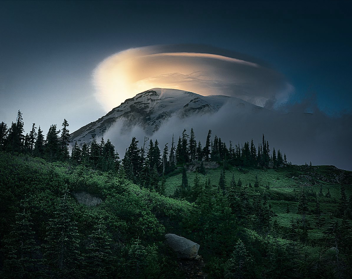
| 96 |
Dec 22 |
Comment |
Hi Robert,
First of all, this was a good excise for me. I pulled up 2 images on the screen, looking at from the desk, stepping back, and go back.
Here is my personal opinion but overall, it looks much much better than the previous one.
Let me start with the goods.
1. "a strong diagonal in the foreground" - the image look much much better. It makes the image more powerful.
2. I like the texture and details of mountain better. This one looks more natural to my eye.
3. I feel the space on top is good enough to breathe.
4. I like yellowish color better. I prefer a bit orange side yellow better though.
Points for improvement.
1. The greens look over-saturated in my eye.
2. The green portion looks a bit flat - I would open the shadows and show more details. Pine trees on the lower left corner are migrated in shadows. Also, would add a light with luminosity mask.
3. The stone is a bit bright to my eye - It could become a distraction. I would dark down slightly.
I am attaching my attempt here.
Overall, again, it became a more powerful image.
I wish I could create an image like this. |
Dec 12th |
 |
| 96 |
Dec 22 |
Comment |
Hi Bob,
Thank you for sharing.
Fantastic! I like this a lot. I can get the feeling of joy walking around the town. It makes me cheerful.
I am not sure how you arrived at this tone and texture. Maybe you used art filters? But it is completely different from what you have posted in the past. I am guessing that I touch a bit of your personality from here.
Personally, I want to see the road on the right side just a bit more. That's my personal taste though.
Again, excellent, and well done, Bob!
|
Dec 12th |
4 comments - 5 replies for Group 96
|
7 comments - 8 replies Total
|


