|
| Group |
Round |
C/R |
Comment |
Date |
Image |
| 74 |
Nov 22 |
Reply |
I did it in Photoshop, Don. |
Nov 13th |
| 74 |
Nov 22 |
Comment |
Hi Lisa,
You must be a new member of the group. Welcome.
This is incredible. Tone, mood, lighting, and texture - there is nothing I can comments for improvements. It looks like I am looking at the well-preserved-pictures of ancestors.
Well done! |
Nov 11th |
| 74 |
Nov 22 |
Comment |
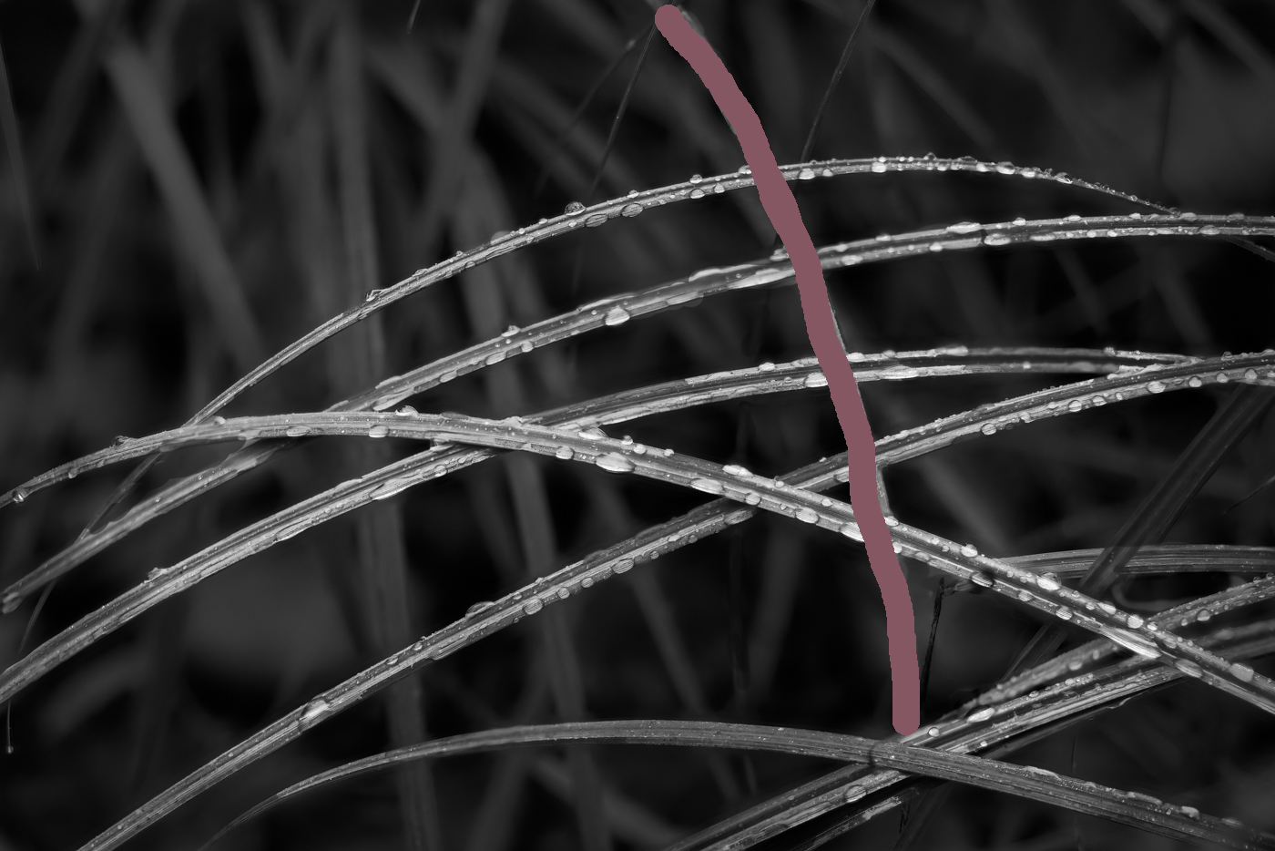
Hi Dick,
Thank you for sharing.
I am not sure that I follow the technical attempt you mentioned but what I can comment is that the first version works better for me. I like the horizontal lines. Also I like the dew on the leaves. It is well captured and well described.
The second version has a leaf coming down from the top vertically (as painted), which distracts my eyes. I prefer to have horizontal leaf lines and vertical blurred lines across as background.
Also the luminosity of the leaves in the first version is better for me. Second version looks too dark.
Hope it helps. |
Nov 11th |
 |
| 74 |
Nov 22 |
Comment |
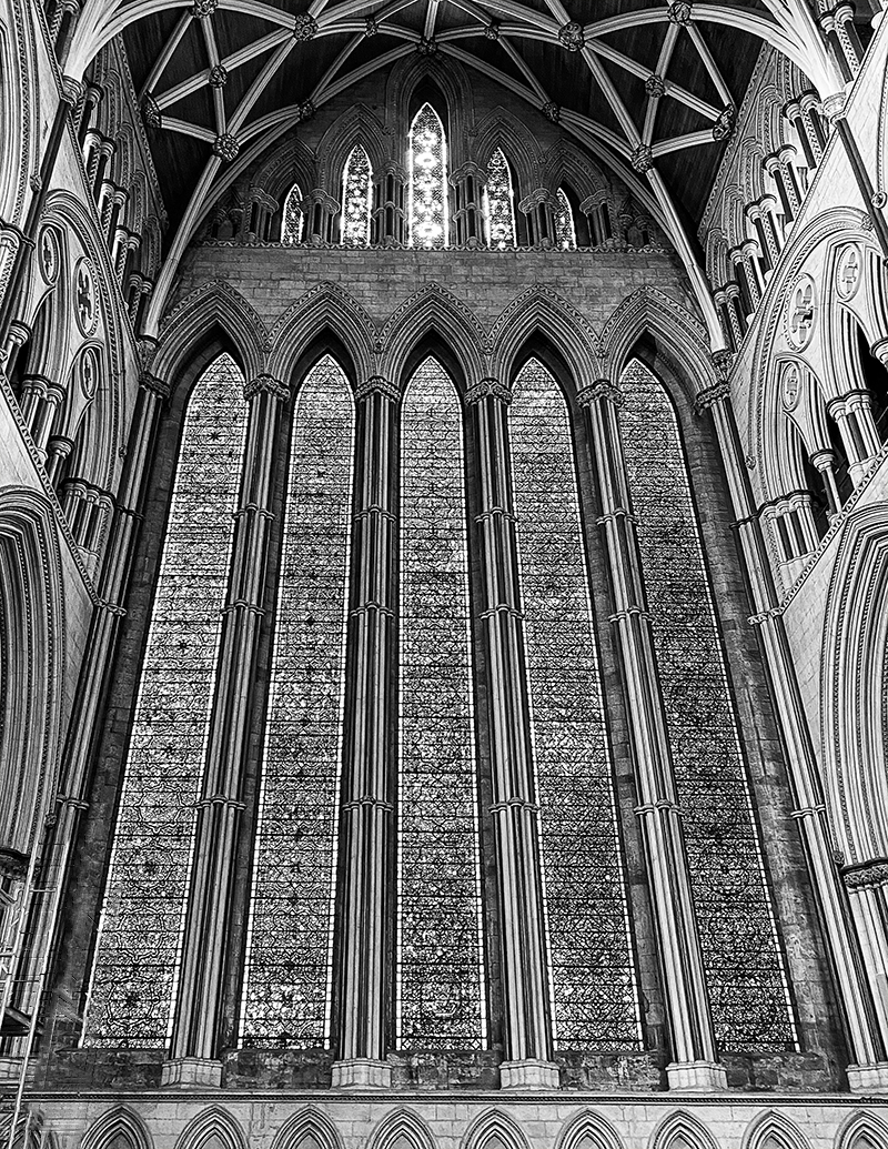
Hi Don,
A beautiful image.
These architecture is really good for BW showing patterns. Also I love to see in colors, too. Please post the color version here....
I did rough edit to remove the scaffold. I did it very rough but if you do it precise with enough time, you would take it out nicely. I did it contents aware in PS. You cannot do it at once, you just do piece by piece. I do not do this so much in landscape photography so I am not good at this type. But Arne might be good at. |
Nov 11th |
 |
| 74 |
Nov 22 |
Comment |
Hi Arne,
Thank you for sharing.
You are really good at architecture shots. I admire that.
Yes, I agree with you that BW is expressed better in my opinion. The texture of the building is super! Also I like the mood created by the lighting, which is also presented well in BW.
One thing I do not like about this image is that 2 sticks overlap with the building. Currently, my eye recognizes the sticks are the center of attention and the building serves as background.
If there is no overlap, then, my eye will recognize the sticks being foreground and the building is the center of attention, which I would expect in this case.
|
Nov 11th |
| 74 |
Nov 22 |
Reply |
Thank you, Don for your comments and edits. Your crop might be another way to go. |
Nov 11th |
4 comments - 2 replies for Group 74
|
| 96 |
Nov 22 |
Reply |
Thank you, Bob for your comments and edit.
There were too many rocks and it was challenging for me to simplify the composition. Your crop gives me a hint for simplifying things. I will bring it with me in the next visit. |
Nov 23rd |
| 96 |
Nov 22 |
Reply |
I understand your points,Dan. Thank you for replying.
|
Nov 23rd |
| 96 |
Nov 22 |
Reply |
Yes, it might be too strong in vignetting. I was a bit careless. Thank you for mentioning, Bob. Appreciate it. |
Nov 23rd |
| 96 |
Nov 22 |
Reply |
Thank you, Kate for your comments. |
Nov 23rd |
| 96 |
Nov 22 |
Reply |
Thank you, Cheryl, for your comments and edit.
I am now clear what needs to be improved. Thank you, again. Appreciate it!
|
Nov 23rd |
| 96 |
Nov 22 |
Reply |
Thank you, Gloria. I appreciate your input.
|
Nov 23rd |
| 96 |
Nov 22 |
Reply |
Thank you, Robert, for your comments and edit.
I will revisit this place in Mar trying to shoot it with fill moon. I will remind your advice then.
Will post if the shot turned out to be better. Thank you, again.
|
Nov 23rd |
| 96 |
Nov 22 |
Reply |
Please excuse me, Bob again. I would like to replace the edit. This is more like what I wanted to present.
yes, still looks anime feels but it look much smoother. |
Nov 11th |
 |
| 96 |
Nov 22 |
Comment |
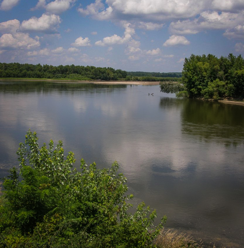
Hi Kate,
Thank you for sharing. Good to see what it is like the Mississippi river for the person like me who have not visited there.
Your goal to deliver "calm and peacefulness" is met in my opinion. I think you captured the good components - reflection, foreground, and good background with cloud actions. I feel the bush in the foreground is essential to balance out the bush in the midground. So it plays a important roll in my opinion.
Unfortunately as Cheryl mentioned, the frame splits in half. So my eye wonder and cannot travel well now.
My suggestion would be to crop the sky in half and have viewers look the Mississippi. That's the direction I would approach. I would not increase the contrast, nor saturation. Just keep as it is...
Here is my attempt.
|
Nov 11th |
 |
| 96 |
Nov 22 |
Comment |
Great Capture, Gloria! Nicely done.
I always struggle to shoot the coast line scape but you managed well. Your composition works well - foreground to get interest, midground to look into, and nice cloud action for the back.
yes, I agree in that Cheryl's edit is excellent. It provided a punch in the image.
But overall, your framing works for me. It is a good capture. |
Nov 11th |
| 96 |
Nov 22 |
Comment |
Hi Robert,
Thank you for sharing.
I like the image very much!
A couple of words popped up looking at the image - "A calm and refreshing morning", "(dead) silence", or "promising for the future".
Those words, I guess, come from the tones and colors of the image. This makes me feel "I'm glad to be alive"
For me, the foreground trees are well managed, not too dark but still maintain the detail.
One small thing - I feel the lower left corner is a empty space for me. And I would like to reduce the "dark" section a bit from the frame so that my eye can travel easier to the center of attention (lighter part). Maybe I would crop the bottom a bit, not as much as Bob did though.
But well done! I like this a lot. |
Nov 11th |
| 96 |
Nov 22 |
Comment |
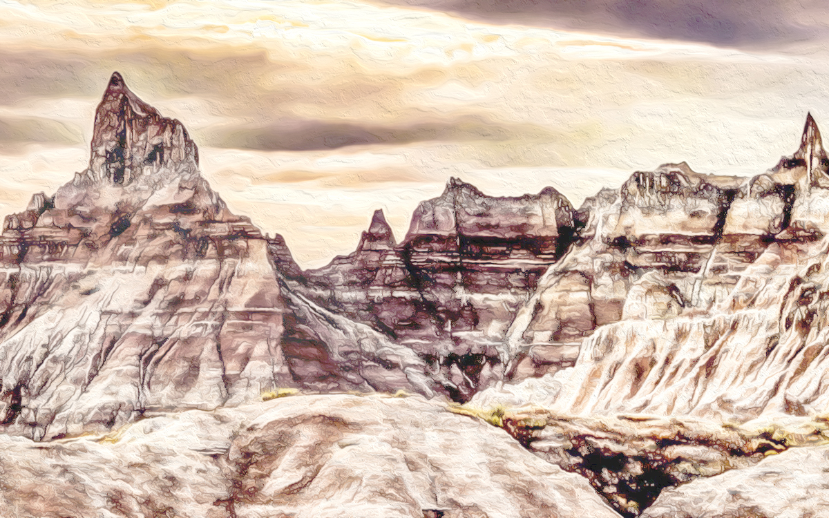
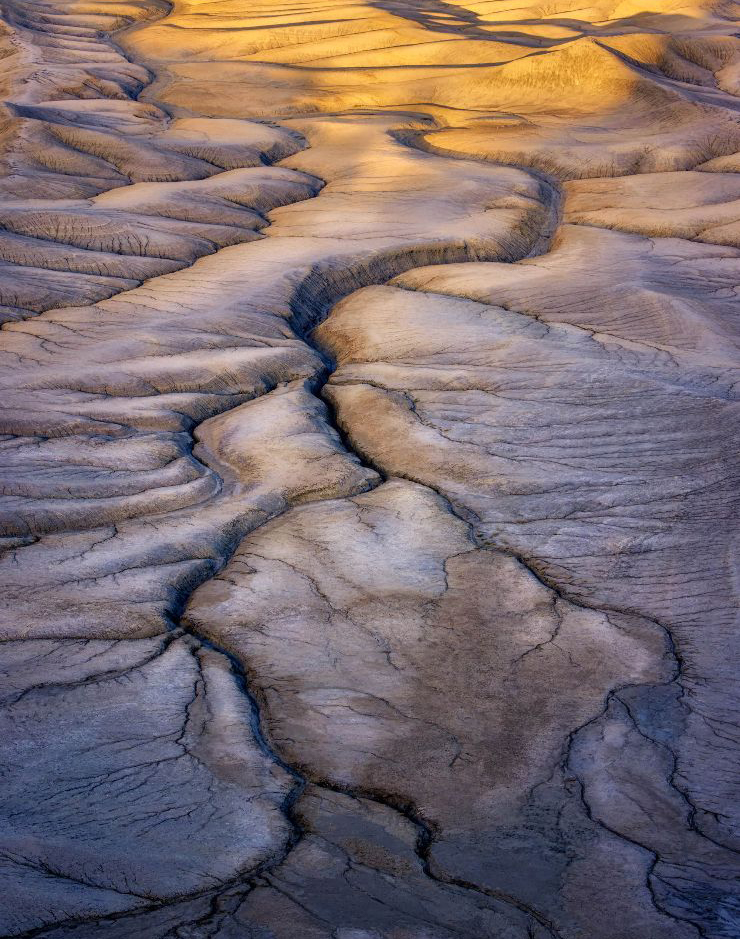
Hi Dan,
Another gorgeous image! Thank you for sharing. I am truly glad to see the images from Utah, where is my second home state.
It captured great leading lines, helping my eye to look through the details. I like the color combination, too.
For me, it looks like blood vessels rather than a tree.
I do not feel that you need vignetting for this image in my opinion. I would like to see the detail throughout the image rather than hide the edge. It is filled with quality of "texture" here and there.
Rather, I feel I would like to condense a bit in the frame. My interest reside in the purple color part more and yellow part steal my eyes away from the purple color section easily. But I would not like to crop out entirely. I do not want to lose the color supplement.
So I would crop the top and bottom a bit trying to help my eyes travel easier throughout the image.
Here is my attempt of cropping. |
Nov 11th |
 |
| 96 |
Nov 22 |
Reply |
Thank you, Dan for your comments.
As mentioned in Bob's reply, I have a portrait version. Do you think it is better than the original? |
Nov 11th |
| 96 |
Nov 22 |
Reply |
Thank you, Bob for your comments and edits.
I have a different portrait version, which look similar to your suggestion.
Do you think this is better? |
Nov 11th |
 |
| 96 |
Nov 22 |
Comment |
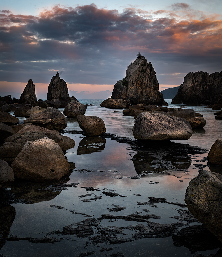
Hi Bob,
Thank you for sharing.
Your images always make me think. Thank you for that.
The composition would be good with layers of mountains and canyon. You have interesting cloud actions which attract my eyes.
On the other hand, I have 2 issues for my eye;
1. The contrast is too strong and my eyes can not stay at the image long. Maybe it expresses your anger to some extent.
2. The mountain and canyon looks flat. We need lighting to make it look 3D.
So I took a liberty to play around a bit with this image.
This is what I ended up. It completely changed the story and it is far from what you are expecting, I am sure.
|
Nov 11th |
| 96 |
Nov 22 |
Reply |
Hi Cheryl,
Let me comment in replying your re-edit dialogue.
I like this version much better.
The composition is simple but powerful. And when I shoot toward the sun, I always wonder how much open shadows. But this case, it looks very natural. Well done.
I do not have any major points for improvements from me.
But If I could pick one minor points, I prefer to not to overlap of the man's head and the seashore. I like to see the clear separation of man from the seashore. That way it become more powerful in the story telling for me. But it might be the minor points.
BTW, I love to have the man and the dog in the scene. |
Nov 11th |
5 comments - 11 replies for Group 96
|
9 comments - 13 replies Total
|


