|
| Group |
Round |
C/R |
Comment |
Date |
Image |
| 74 |
Oct 22 |
Comment |
Hi Tevor,
Thank you for sharing. I would like to participate in commenting, if you do not mind.
This is very nice portrait. I like her confession. She looks very calm and relaxing. She looks like she finished painting with satisfaction rather than "ready to paint". That's my impression getting from this image.
Also I like the way you put the lighting. It is soft and very pleasing light. Very nice job.
As Arne said, I find the things on left corner distracting.
I would also suggest that you would put more stronger vignetting.
Here is my attempt.
|
Oct 22nd |
 |
| 74 |
Oct 22 |
Comment |
Hi Arne,
Sorry that I could not submit the image this month.
Although I did not submit the image, I would like to participate in commenting on the image if you do not mind.
To start with, what I like about this image is strong pattern of the building. That is well highlighted after cropping. And also, the cloud action is well managed in conversion, which does not distract the eye from the pattern.
I also like the camera angle in shooting. It emphasize the height very well.
On thing I would suggest is the way burn the image.
For me it is too strong in vignetting. Of cause the center of attention is the strong vertical pattern, but I found it's interesting in the strange shape rocks, which for me good contrast of artificial creation vs. nature. So I would like to see a bit more of the detail of the rocks. Currently strong vignette hide the details. I would suggest to show a bit more details of the rocks.
By doing that, it might change the story of the image though....
Just a thought. |
Oct 22nd |
2 comments - 0 replies for Group 74
|
| 96 |
Oct 22 |
Reply |
Hi Robert,
It looks much better. It tells the story you wanted now in my eye.
Well done! |
Oct 27th |
| 96 |
Oct 22 |
Reply |
Sorry, Robert, I could not help you a lot.
But I like the color pallet and tones. |
Oct 15th |
| 96 |
Oct 22 |
Reply |
Yes, agree to all you mentioned. Issue is how to make it action properly. That's a difficult part for me. |
Oct 15th |
| 96 |
Oct 22 |
Reply |
Thank you, Robert.
Hmmm..... That's a good feedback.
I have to think how to solve the issue. But thank you for that. |
Oct 15th |
| 96 |
Oct 22 |
Reply |
Hi Bob,
Thank you for your attempt.
I might be trapped to have everything sharp in shooting. You are right that I shall try shallow DOF to just focus on the main subject. Then I do not necessary to clone out things. |
Oct 14th |
| 96 |
Oct 22 |
Comment |
Hi Kate,
Welcome to our Group.
I would agree to most of the comments by others, i.e. "nose room", BW, and especially Bob's comments on eyes. I like the way you captured the eyes.
Cropping is purely personal preference but I would crop this way. As Bob mentioned, I finished to have viewer's eyes focus on the eye.
Now you have several possible versions. Hope it helps. |
Oct 14th |
 |
| 96 |
Oct 22 |
Reply |
Thank you for your comments, Kate.
|
Oct 11th |
| 96 |
Oct 22 |
Comment |
Hi Gloria,
Thank you for sharing.
It is a peaceful image. It makes me calm.
I like the overall tone and luminosity of the image. The color looks very natural.
The boats(?) on the water distracts my eyes, so you might want to clean up a bit.
What I like most about this image is the relationship of the flying bird vs. the sun.
Currently, the space of the sky is so big that my eye is hard to catch the flying bird.
I would crop the 2/3 of the sky and make it pano style, then the bird flying toward the sun would become the star of the image.
You were there at the right timing�� Congratulations.
|
Oct 11th |
| 96 |
Oct 22 |
Comment |
Hi Bob,
Thank you for posting.
I assume you were trying to soften the water by using Lensbaby, while still maintaining the sharpness of the center subject. If that is the case, I do not think this turned out to be what you were looking for, I am afraid.
I suspect it is because of the f stop (there is no data, so not sure).
I have not used the Lensbaby so this is only from my knowledge not based on my experience, but Lensbaby is good for shooting flowers in my understanding.
If I would apply to the scapes, I would try city scapes or landscape where you want to make dreamy story.
I like to know more information about the place. Also I like to understand what you want to tell to us rather than the technology you used. It would help me to provide better comments.
|
Oct 11th |
| 96 |
Oct 22 |
Comment |
Hi Dan,
Thank you for sharing.
This is a amazing shot. There is no overlap between the rocks. I imagine it would not so easy to find such composition.
The texture of rocks, balance of rock position, and the cloud actions, all are well presented. I do not have any critique for improvement.
If I could add one thing, I felt it is over-saturated in the sky judging from the color of the blue in my eye.
But again it is well presented.
|
Oct 11th |
| 96 |
Oct 22 |
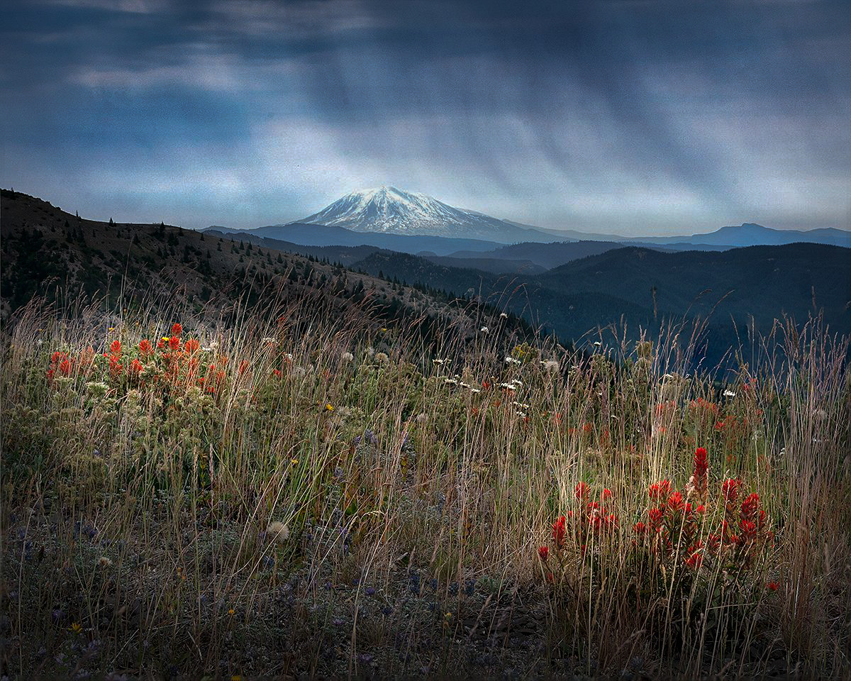
Comment |
Hi Robert,
Thank you for sharing.
I understand your technical challenges as I have encountered such situations in the past. But you got over it and make it work. Congratulations.
This is what I observed in the image;
1. Compositionally, I like the way you put Mt. Rainier and 2 bunch of red flowers in triangle position. It balances well. I wish there were less reeds in the ground but that's uncontrollable.
2. I like the layers of mountains and hills. It give sense of distance nicely.
3. Coming back to your point of emotion, tension, I am not sure that the image provides strong tension to the viewers, at least for my eyes. Maybe it is because the image is dominated by the subdued colors and less contrast tones. It is soft and comfortable image for me.
Now from here, this is strictly personal opinion but this is what I would do to enhance the story;
I would provide the tension by comparing the "Storm expected(storm clouds in the sky)" vs "peacefulness (flowers in the foreground). So I would darken down the sky a bit and increase the contrast of clouds. That way it provides the definitive impression of "storm is coming". On the other hand, I would keep subdued colors and luminosity of the foreground to present "peace".
I did some edit for my practice. Let me post it here. It might not be in alignment with what you were looking for.
|
Oct 10th |
 |
| 96 |
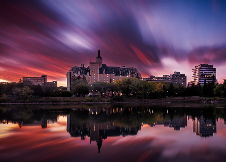
Oct 22 |
Comment |
Hi Cheryl,
You keep challenging one after another. I admire that spirit.
I like the concept of contrast of stillness(buildings) and motions(cloud actions). In that sense, I feel that the movement is good enough to present the motion. It give a dramatic impact on the image.
Having said that, I have a couple of points to mention;
1. There is a big hole of space without cloud action. The actions are skewed to left. So it give me a left heavy impression.
2. I like your pano style image however in this case, the building far right is stealing my eye away from the center of the building. I feel too many buildings without the definitive character.
3. I like the tone myself. This is a personal taste but in this case, the tone in the sky and the building looks similar, so the building looks migrated in the sky. That's my impression.
I edited this for my practice; cropped the right building, darken down the cloud actions and highlight the center building. This has changed the impression of the image though. So it might be off from what you are trying to achieve. |
Oct 10th |
 |
| 96 |
Oct 22 |
Reply |
Hi Robert,
Thank you for your comments. Appreciate it.
Setting aside of the camera angle issue or composition issue, I tried to clean up the distractions (Posted on Dan's reply). Please let me know if this will change your impression on the image. |
Oct 10th |
| 96 |
Oct 22 |
Reply |
Hi Dan,
Thank you for your comments and suggestion.
I re-edited based on your suggestions. I would appreciate it if you could let me know if it works better now.
|
Oct 10th |
 |
6 comments - 8 replies for Group 96
|
8 comments - 8 replies Total
|


