|
| Group |
Round |
C/R |
Comment |
Date |
Image |
| 74 |
Sep 22 |
Reply |
Thank you for your comment and suggestion. I will give it a try. |
Sep 17th |
| 74 |
Sep 22 |
Reply |
Thank you, Dick, for your comments. I will try to incorporate your points.
Yes, I shot with different SS and chose this one for my preference. |
Sep 13th |
| 74 |
Sep 22 |
Reply |
Thank you, Dick, for your comments. I will try to incorporate your points.
Yes, I shot with different SS and chose this one for my preference. |
Sep 12th |
| 74 |
Sep 22 |
Reply |
Thank you, Don. |
Sep 12th |
| 74 |
Sep 22 |
Reply |
I like it better, Arne. Nice work! |
Sep 12th |
| 74 |
Sep 22 |
Comment |
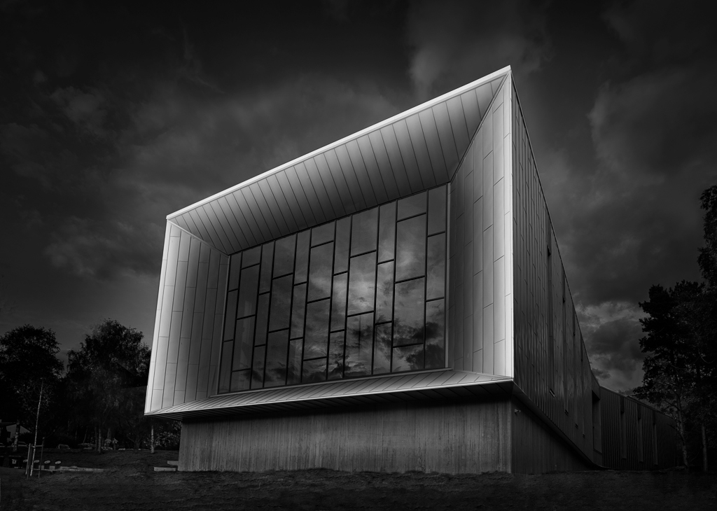
Hi Arne,
Thank you for sharing.
I like the composition. As Don said, I like the angle of the building. And as always your post processing is excellent.
I like the way you brighten up the frame of the building.
On thing though, I would do is to give a punch on the reflection. Currently it looks flat.
Also I would show a bit more details of the foreground.
These are personal preference.
Here is my attempt. |
Sep 10th |
 |
| 74 |
Sep 22 |
Comment |
Hi Dick,
Thank you for sharing.
First of all, you found a interesting subject to shoot. You have a good eye! How nice!
Lighting is good to see the mountain and canyon 3D outlook.
I think you did a good job of transition from color to BW.
Here is a couple of food for thought.
1. I guess the center of attention would be the canyon outlook through the window. Currently it is not well-highlighted. I would brighten up more to distinguish from the rock window.
2. The rock itself looks flat. I would add a contrast.
3. It is debatable about the space upper right/left corner. I guess you wanted show the entire rock formation from the the top. Currently brightness of the upper left/right space is nearly the same as the canyon, my eyes are distracted by the space. You might want to consider darken down the space a bit or you crop down the top of the window rock to reduce the space, which I guess that's not what you wanted.
|
Sep 9th |
| 74 |
Sep 22 |
Comment |
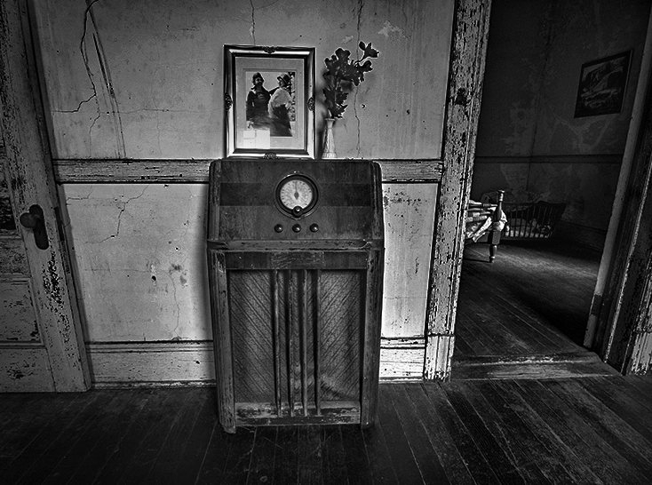
Hi Don,
Thank you for sharing.
I like your shots of old facilities. You always capture the scenes with a story, which is nice.
These are what I like about the BW image;
1. the brightness of next room (peeking into) is perfect for me. It is dark but still maintain the details of the room. And the ray of light is super.
2. The way you added the dust/dirt of the wall in the front room is excellent. It gives a feeling of old restored building.
3. The tones are well spread out from black to white. It is well balanced.
Having said that, These are my personal comments;
1. for me, it is cropped too tight. I like to see the picture on the wall in the next room in my view.
2. I like a bit dark tone in the radio. It would give more profound feeling.
These are my personal opinion. Here is my attempt. |
Sep 9th |
 |
| 74 |
Sep 22 |
Comment |
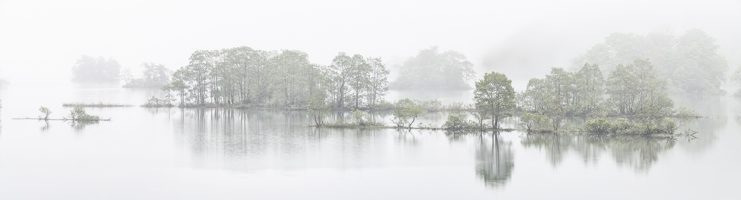
Hi Tevor,
Thank you for sharing.
You captured a nice scene. I like that.
You are always good at capturing nice sky actions. This is the case as well. it has nice texture and details of clouds. Also it adds mood, too.
As for composition, you kept the castle stacks below the horizon. That is a win in shooting the scene in my view. On the other hand, I prefer to see more foreground. That way it gives more sense of depth better, and also the wide space of sky would be justified.
As for post processing - this is very challenging task.
1. The castle is captured in dark, I imagine you needed to brighten up the blacks/shadows significantly. But if you do it too much, it looks unnatural because you are shooting into sun. The degree you did was good enough but castle and rocks looks very flat. And left side of castle is too dark to see the details.
What I would do is to add light with luminosity mask on to some part of the rock and some part of castle. I would help to avoid flat look.
2. In the original, the sea looks smooth due to long SS (30sec). But BW looks different. I prefer to see smooth sea as captured in original, because the rock face is very rough. I like to see the contrast of smooth sea vs. rough rock. |
Sep 9th |
4 comments - 5 replies for Group 74
|
| 96 |
Sep 22 |
Reply |
Hi Bob,
Thank you. I am not sure how much I allow myself to manipulate the components in the image. I just want to respect what I saw as much as possible. But I understand your point. It looks better. Appreciate your comments and edit.
|
Sep 16th |
| 96 |
Sep 22 |
Reply |
Thank you, Cheryl, for trying to make it better.
Yes, this is difficult to solve... For now I would just clone out the very edge of the island. |
Sep 16th |
 |
| 96 |
Sep 22 |
Comment |
Hi Gloria,
Thank you for sharing another wonderful sun set image.
I envy you being there at the right spot at right timing.
Nice shooting!
I could not catch the rainbow and the color looks too saturated in my eye.
Most of my edit suggestion is covered by others so I am not repeating here.
I like what Bob did - take out the middle boat. That way my eye can focus on the white boat.
I just played around myself using the image. I completely changed the story. |
Sep 16th |
 |
| 96 |
Sep 22 |
Comment |
Hi Cheryl,
You keep challenging another new arena. Good for you!
I do not have so much experience to shoot buildings, so my comment might not relevant.
I like the combination of mirrors/window vs. reflections on the windows. Also I like the clouds flowing horizontally. It works well with the straight vertical lines, and now building is well-highlighted.
Tone wise, for me it looks flat. you might want to try to increase the contrast a bit more.
As for cropping, the bottom of left building is chopped vs. there is a enough space in right bottom. It looks unbalanced in my eye.
I always get nervous on the distortion of the building caused by the lens.
I do not have the answer what is right in shooting buildings.... Sorry.... |
Sep 15th |
| 96 |
Sep 22 |
Reply |
Thank you, Cheryl, for your comments and edits.
Looking at the image cloned out the left island, I feel something is missing in left side to balance against heavy right side. I am bit worried about the space in left lower side. It looks empty space in my eye. What do you think? |
Sep 15th |
| 96 |
Sep 22 |
Reply |
Thank you, Bob, for your comments.
I did not detect the "slight right lean". I just relied on the leveling tool. But as I shoot multiple shots for pano, it might became off. You might be right. |
Sep 15th |
| 96 |
Sep 22 |
Reply |
Hi Robert,
Thank you for your comments and edits.
I like your edit better than my edit. It represent what I was visioning better.
As for left edge, I understand what you are coming from. Let me work on this.
Thank you again for all your inputs. Appreciate it! |
Sep 13th |
| 96 |
Sep 22 |
Comment |
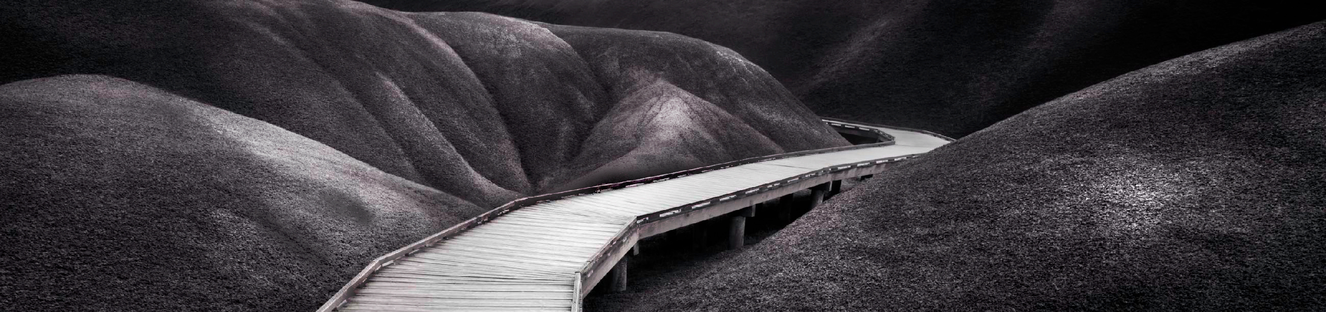
Hi Dan,
Thank you for sharing.
I understand what you are trying to achieve here reading the description.
This is purely a personal opinion but here is my observation;
1. Overall, the image looks dull in lower half, especially the lower right hill.
2. Although my eye follow the path well along with the beautiful S shape curve, but once my eye arrived at the end of the path, there is nowhere to go. There is nothing to pull my eyes back to the image. And my eye cannot stay long in the image.
3. Your approach of "a near-blown out white" does not work for me. The hills looks sharp vs. the path looks blurred. It does not look natural for my eye.
4. For me, majority of highlight reside in the top half. The upper left hills looks interesting in my eye.
I would imagine that you would not like to crop the image based on what you are trying to do here. But let me present what I would do even though it might be against your intention.
|
Sep 10th |
 |
| 96 |
Sep 22 |
Comment |
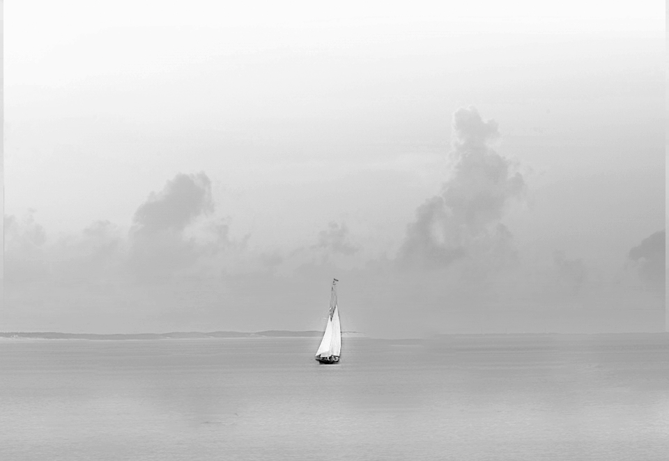
Hi Bob,
Thank you for sharing.
I like the image very much. Composition wise, it has a big triangle line and vertical/horizontal line mixed. But there is one round shape in the image, which caught my attention although it is dark tone. So, it is well-structured in my opinion.
The only critique is that the image is pink casted. Because of that, it looks like an old, printed picture. If that is your intention, your goal is met.
It is not a tourist shot; it is well-calculated to make it unique in my view. |
Sep 10th |
| 96 |
Sep 22 |
Reply |
Hi David,
Thank you for dropping by.
I had 2 directions in BW conversion - one is the way I edited and the other is pretty similar of what you have done.
I happened to choose the first one, but definitely your direction is one way to go.
Thank you for your comments and edits.
|
Sep 10th |
| 96 |
Sep 22 |
Comment |
Hi Robert,
Wow! This is an amazing shot!
You were at the right spot at the right timing.
Overall, I like the composition. I do not feel it is too tight. I cannot make decisive comment without looking the original but it is ok as it is in my view.
As for post processing, partially I agree with you - brightening up too far. It looks almost blown out, especially in the peak of the mountain and the some part of clouds.
But as for darks, it does not look so bad (maybe a bit better to brighten up to show the details especially trees) in my eye.
In anyway, this would be a life-time super shot.
Well done!
|
Sep 10th |
| 96 |
Sep 22 |
Reply |
Thank you, Stephen, for your comments.
Your input is valuable. |
Sep 5th |
5 comments - 7 replies for Group 96
|
9 comments - 12 replies Total
|


