|
| Group |
Round |
C/R |
Comment |
Date |
Image |
| 74 |
Aug 22 |
Reply |
Hi Don,
Thank you for your comments always.
I do not know the category. Or I would say I do not care the category. I just edit based on my inspiration.
Anyway, I appreciate your support. |
Aug 9th |
| 74 |
Aug 22 |
Reply |
Thank you, Arne for your comments and advice.
1/30 was the best I could select with 24mm lens. I used continuous shooting trying to avoid blur. I am not good at handheld actually.
I will try to brighten up a bit to show contours. |
Aug 7th |
| 74 |
Aug 22 |
Comment |
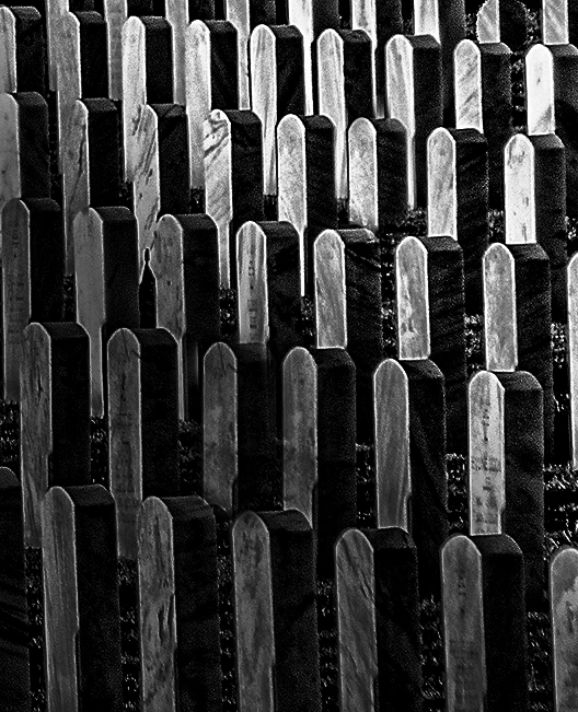
So this is what I would try;
Crop out the rectangular area, clone the headstone to fill the missing part, and change the luminosity to guide the viewers attention to the specific part. In this case, I darken down the half left by gradient filter.
that way my eye would be easier to follow the patterns of headstones. I guess this is similar to what Arne had in mind. |
Aug 7th |
 |
| 74 |
Aug 22 |
Comment |
Hi Don,
Thank you for sharing. Nice creativity and motivation but your attempt is very challenging.
When you shoot this type of subject, the patterns are easily break from left to right or top to down. In this case, if you look the image with squinted eye and try just to see the whites, you will see the patterns are different in rectangular area vs. and circled area. In the rectangular area, each headstones are not well separated and overlapped. My eye have a hard time to look through the image from right to left or left to right because this inconsistency.
Personally, I like the circled area because the headstones are well separated and looks pattern. But there are some missing headstones here and there. |
Aug 7th |
 |
| 74 |
Aug 22 |
Comment |
Hi Tevor,
Thank you for sharing.
As always, you are good at people. This is the case as well.
I like the texture and details of the man. The facial expression tells his characters.
One thing I would change - I prefer to see wider space in left side. Currently the man is placed in the middle of the frame, but having wider space where the man is looking would be more comfortable to see for me.
But this is excellent image to tell a story! Well done. |
Aug 7th |
| 74 |
Aug 22 |
Comment |
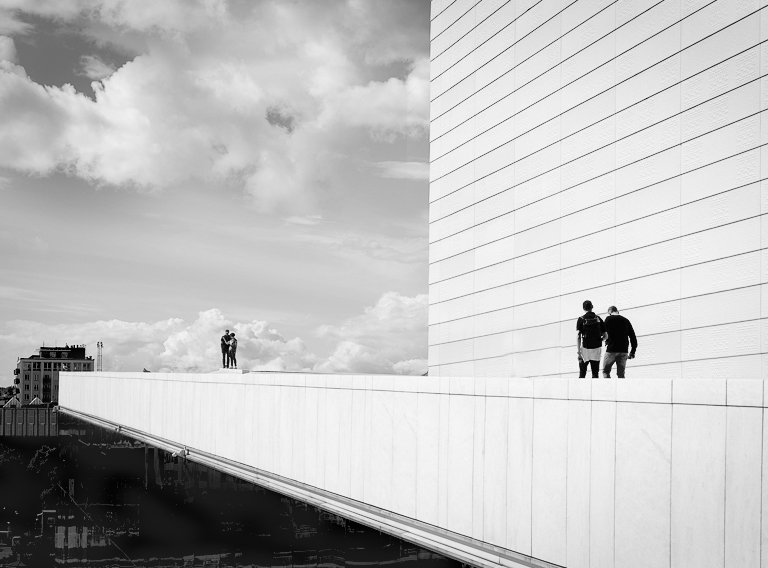
Hi Arne,
Thank you for sharing.
I always amaze your good eye to capture the scene.
I think the composition is good enough to convey what you want to achieve.
But there would be a couple of points to strengthen the theme in my view.
1. For me the strong horizontal lines (especially the roof from right to left) would be the strength of the image but the image is in portrait. Currently the straight line of building looks stronger supported by the portrait style. My eye needs wider width to support the lines.
2. You captured the nice cloud action a bit skewed to top part. It catch an attention. But there is just a blue sky between the cloud action and people on the roof edge. For me that looks unbalanced.
3. I prefer to see less people in the scene.
For my practice, I edited the original to strengthen the lines but pursuit minimalism as much as possible.
Cloned the clouds and move down, Cropped down the top to highlight the horizontal line, reduced the people in the scene, and decreased contrast to make a kind of "high-key" style overall. I do not want to get so much attention on the cloud action. This way, my eyes catch the people in right and left. I think the building in background is a key element to tell a story. This is just my personal opinion though.
|
Aug 7th |
 |
4 comments - 2 replies for Group 74
|
| 96 |
Aug 22 |
Reply |
Thank you, Cheryl, for your comments and suggestion.
I will remove the blemishes. |
Aug 21st |
| 96 |
Aug 22 |
Reply |
Thank you, Gloria, for your comments. I got your points. |
Aug 20th |
| 96 |
Aug 22 |
Reply |
Thank you, Robert, for your edit.
Yes, your edit looks better. It has more punch.
I will try it myself. |
Aug 20th |
| 96 |
Aug 22 |
Comment |
Hi Bob,
Dan is right. I lost the red color.
Let me post another attempt in case I keep the color. Replaced the sky and used the building as a frame.
This is a good practice for me. Thank you for providing me an opportunity to think. I think other members would have different perspectives and ideas.
|
Aug 10th |
 |
| 96 |
Aug 22 |
Comment |
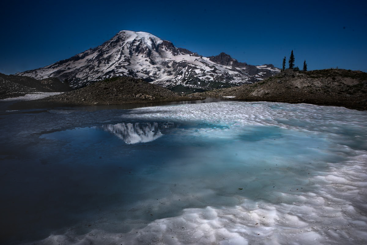
Hi Robert,
Wow, I like the scene. I would like to be there in such a condition.
I like what you like - leading line of the now at the edge of the tarn, details of half frozen lake, and beautiful reflection of the mountain. These are the highlights for me. They are beautifully captured.
Now, let me answer to your questions one by one. Please excuse me if it is too direct. It is because of my English level.
Q1. I was working with rather harsh light - does the image hold up despite that?
A. I do not think It ruins the image but the post-processing becomes the key. Currently it looks flat in my eye.
Q2. I've warmed the snow to provide contrast to the blues and particularly the turquoise - have I gone too far?
A. I think it is too much. First of all, the snow does not look like snow. It looks dirty. The original captured the beauty of "white snow". It is not "fresh" snow but still keep beauty of white. Second, why do you need orange light on the snow? It is obvious that the scene is not shot at sun rise or sun set judging from the sky. By adding the color on the snow, mountain, and hills, now it looks unnatural to my eye. If you replace the sky with evening sky, then it might work. I think the image has enough brown color balanced out the blue without painting.
Q3. I've similarly painted in some light to enhance the sweeping leading line around the tarn - does this still look natural?
A. No. I like the concept of adding the light around the tarn. But I am not sure that warm colors are appropriate.
Q4. I am not sure I got things perfectly level (the trees are the clue - or they just could have been crooked themselves) as this was handheld. I don't want to rotate the scene to correct this though as I lose too much on the edges (snow in front). Does it bother folks that the trees are not perfectly vertical?
A. It does not bother me at all.
Currently, the image looks flat to my eye.
For my practice, I edited the original. I did not replace the sky. I did not crop out anything. My attempt is how can I make the image looks 3D. I kept the white of snow, kept beautiful turquoise/light blue color, and make the reflection outstanding. I did not remove black dots in the lake. Here is my attempt.
|
Aug 9th |
 |
| 96 |
Aug 22 |
Reply |
Thank you, Dan. This looks much simpler.
Please be open to share your eye with me. I would like to learn from you. I respect your good eye and perspectives.
|
Aug 4th |
 |
| 96 |
Aug 22 |
Reply |
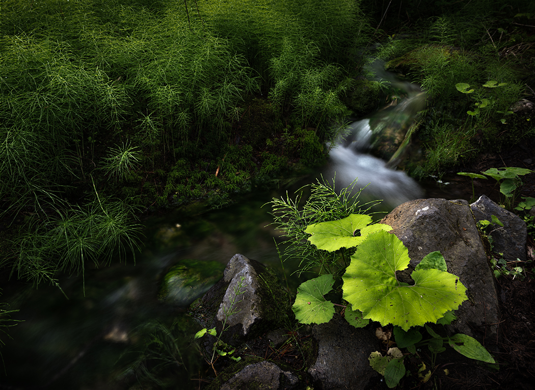
Hi Dan,
Thank you for your comments.
I shot 2 version (as mentioned in description). I am attaching the landscape version here.
As you suggested, I dropped down the saturation and darkened down the horsetail a little bit.
How about this for your eye now? |
Aug 3rd |
 |
| 96 |
Aug 22 |
Comment |
Hi Bob,
Thank you for sharing.
Well, I am not sure where to start with this one... But let me comment one by one.
I imagine that you wanted to place the interesting tile roof as center of attention..
I see the statue (I guess it is Chinese statue or something) lower right corner, which show only a part.
The bush lower left does not add any value to the image for me.
If you have another chance to visit here, I would shoot from left to capture the entire statue looking through the frame of pillars. Then you can develop the story by connecting unique roof with Chinese character (statue). I am saying without knowing if it is possible to shoot from left.
But currently there is no connection between the building, bush, and a bit of cloud in the sky. I do not see any story here.
So that makes me very hard to edit to be honest.
I like the unique tile roof. I like the red unique frame (just under the roof) which shows Chinese character. The big bush on left balanced well against the roof, which means I should not crop out the bush.
I might be able to squeeze a bit of texture and detail of clouds.
So for me, highlights of the image would be 1. tile roof, 2. Chinese shape frame, and 3 Texture of clouds.
In such case, I do not need any colors. Just to focus on detail and texture of each components.
That's how I arrived at the editing decision to BW conversion.
After BW conversion, I wanted add some warm colors, so I added "fallcolors" in Color lookup (adjustment layers) in PS.
I guess this is the best I can do for now.
|
Aug 3rd |
 |
| 96 |
Aug 22 |
Comment |
Hi Dan,
Thank you for sharing your experience.
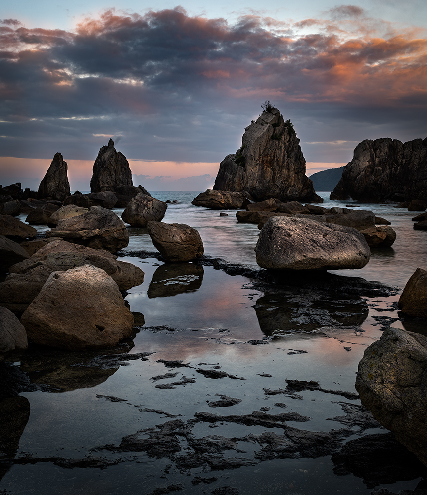
Sometimes we get unexpected gift. In such case, I rush and rush to capture it but always I end up missing the opportunity. That's have been my life. But you captured it well here.ã�¬�¬A good adaptability.
As always your image is simple but provide strong impact. This is the case as well.
I like the rock island between the sea stack in center. It gives sense of depth.
For me, the vignette is too strong. Especially upper right corner. It hides the detail of cloud and the sea stack on right.
You might have already tried this but I tried portrait version.
This way my eye can arrive at the sea stack easier by following along the leading line of sand.
|
Aug 3rd |
 |
| 96 |
Aug 22 |
Comment |
Here is my attempt of BW |
Aug 3rd |
 |
| 96 |
Aug 22 |
Comment |
Hi Gloria,
Great sunset with interesting colors.
I have never encounter such colors in sunset. Amazing!
I like the tone of colors, subtle and light pastel.
Regarding composition, I agree with Dan on the foreground.
I prefer to see more skyscrapers in the foreground.
For the editing, my eyes are pulled to the brightest part in right side. It might be balanced with the bright part in bottom left. But for me, it still distract my eyes. So this is what I would do.
Crop out the bright portion on the right. Increase the contrast without loosing the subtle colors as much as possible. I would focus on presenting "storm", so I would edit to make the bottom left corner be the brightest part and direct your eye to the skyscrapers, where just about to rain.
Here is my attempt.
I also did BW conversion. I did not mind to abandon the color but just to focus on presenting textures. |
Aug 3rd |
 |
| 96 |
Aug 22 |
Comment |
So this is what I would do.
Hide the upper left in shadow and highlight the key 4 elements. That way viewers can focus on the key elements without getting lost. I put an extreme luminosity change for shadow to show my intention clearer. |
Aug 3rd |
 |
| 96 |
Aug 22 |
Comment |
Hi Cheryl,
Thank you for sharing.
Looking at this, Although it is beautiful but it looks busy in my eye.
I like the composition, especially you included the stone in left lower corner. I feel that the stone plays an important role in the garden to add depth. Also I think it balance out the brown colored tree well in the composition.
On the other hand, as Dan mentioned, Upper left section does not add so much value to the scene for me. But I do not want to crop out the stone left corner.
Now, for me the key components in the garden (in the composition) are 4 features circled.
I think those are key highlights in the garden in my eye.
(the fern looks blurred though)
|
Aug 3rd |
 |
8 comments - 5 replies for Group 96
|
12 comments - 7 replies Total
|


