|
| Group |
Round |
C/R |
Comment |
Date |
Image |
| 74 |
Jul 22 |
Reply |
Hi Lance,
Thank you, again, for dropping by.
Your comments always encourage me a lot.
I will play around a bit to capture your suggestion.
Thank you again. |
Jul 9th |
| 74 |
Jul 22 |
Reply |
Thank you, Arne, for your comments.
I will reedit this as you said.
|
Jul 9th |
| 74 |
Jul 22 |
Reply |
Thank you, Don, for your comments.
It is my first time to hear that you like BW version better.
Glad to hear that.
Yes, I normally play around with the shutter speed until I find the right speed. |
Jul 9th |
| 74 |
Jul 22 |
Reply |
Thank you, Tevor. |
Jul 9th |
| 74 |
Jul 22 |
Comment |
Hi Arne,
Thank you for sharing,
It is amazing how you structure the composition and shot instantly on the spot. A excellent skill....
The tree and airplane is balancing each other, and the cloud action adds the mood. It is simple but powerful. I like that.
I think conversion is also done successfully.
Addition of light by circle gradation filter works - not too obvious but adequately added. Erasing the cloud on right bottom was a good decision in my eyes.
One thing though - I might try to show just a little details of the tree. Currently there is little area to rest my eyes. |
Jul 8th |
| 74 |
Jul 22 |
Comment |
Hi Dick,
Thank you for sharing.
This would be big challenge, forest photography.
But I think you captured the right elements with right composition.
The rest is how to make those elements stand out in post processing. That's my opinion.
First, flipping left to right is right decision in my view.
It helps my eye to flow easier than before.
For me, the strength of components are;
1. mossy logs - it create the leading line
2. beautiful pattern of shapes of leaves in foreground - that's need to be brighten up to catch the eyes
3. beautiful ferns at the back - especially the bigger fern on right need to be make outstanding. Eventually those ferns will become the point of arrival for the eyes.
So my eyes catch the interesting pattern of leaves in foreground, followed by the mossy log, and arrive at the ferns. That's how I would structure to guide the viewer's eyes into the scene.
In that eye travel, the bright patchy sky will become destruction, so I would crop out those spots.
Hope this helps. |
Jul 8th |
 |
| 74 |
Jul 22 |
Comment |
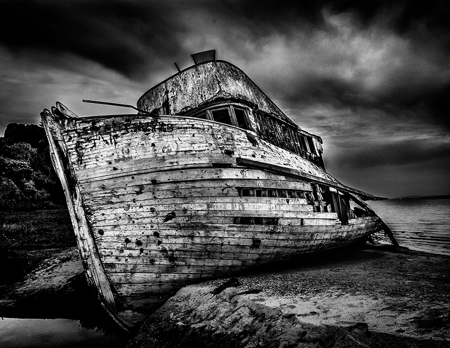
Hi Don,
Yes, you are light. There are halos here and there.
I just wanted to show you how the story would be changed by the luminosity and contrast.
In fact, I like your edit better - it is perfect edit for preserve shot of the ship. As I said, the all tones are covered evenly and the detail and texture is well presented. It is a BW text book level of edits.
But if you want to deliver the story of demolished ship and instability, my edit might be better. My message was "your story determine the direction of the edit".
Hope it makes sense. |
Jul 7th |
| 74 |
Jul 22 |
Comment |
Hi Don,
Thank you for sharing.
Very nice composition for me. It is simple but the angle of the camera makes the image dynamic.
As for BW conversion, it is converted perfectly in my eye. The all tones are covered and details and well described. I like the texture of clouds and level of contrast. I think all are excellent and it is a good work.
One thing though -
I am attaching one edit - I edited a bit extreme way to show you a difference.
I guess the story would become different.
Just a food for thought. |
Jul 6th |
 |
4 comments - 4 replies for Group 74
|
| 96 |
Jul 22 |
Comment |
Thank you, Marti, for your edits.
Yes, the cherry tree became star of the image now.
Thank you again for your effort. Appreciate it! |
Jul 18th |
| 96 |
Jul 22 |
Reply |
Thank you, Marti, for your comments.
I am glad that you see the cherry tree as focal point, which was my intention.
I will try to brighten up the flowers a bit more in color version.
Thank you again for visiting us. |
Jul 17th |
| 96 |
Jul 22 |
Reply |
Thank you, Bob for your comments.
Your comments summary the Group's consensus, it seems.
Being a Japanese, cultural emotion blind me sometimes.
I need to train my eye and brain. I will keep making effort on that part.
|
Jul 12th |
| 96 |
Jul 22 |
Reply |
Thank you for your comments, Cheryl.
I will think how to take my emotions away in structure the image to better suit for international customers.
Appreciated your answers to my questions. |
Jul 12th |
| 96 |
Jul 22 |
Reply |
Hi Bob,
I thought so�� I get used to California coast too much. Then, my edit is off. Cheryl's and your tone would be more appropriate.
Sorry, pls ignore my edits. |
Jul 12th |
| 96 |
Jul 22 |
Comment |
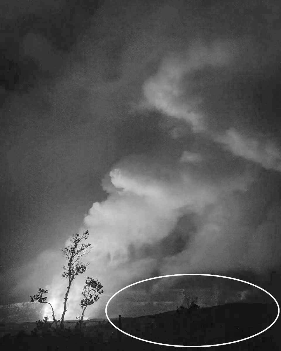
Hi Robert,
Thank you for sharing.
Honestly, I do not think this image has a lot of problems as you mentioned in my view.
First issued raised: balance - It has a good balance of dark part and bright part. The bright part is skewed to half right triangle area, but I understand that the smoke is moving by the wind. So my brain see it natural. Also I feel the wind.
Second issues: noise - I do not see it an issue. Given the shot is at night and low light condition, this look natural to my eye.
I like the cloud action with beautiful color. The cloud action is really dynamic and you captured it at the right timing. And the color is just my taste. Well done in that sense.
If I can point out one for improvement, I would open shadow of lower right corner (circled in attached. Pls ignore it is BW. There is no intention). Currently my eyes cannot stay long in the image. I guess it is because there is little area to look into. My eye have a tendency to stay long at sharp detail section, which does not have so much in the image. Majority of blight part is in smoke and all others are dark without details.
I tried to open the shadows in PS but I could not do it with this level of pixels. I think you might want to try it with RAW file.
The benefit of brightening up the canyon is to bring sense of depth/distance in the image as well. Currently I cannot distinguish the foreground from canyon well because it is too dark. |
Jul 10th |
 |
| 96 |
Jul 22 |
Comment |
Hi Dan,
Thank you for sharing.
It is surprised to hear that it is taken by iPhone.
I am not experienced in this arena so my comments might be irrelevant. So please excuse me.
This image reminds me a horror film - something bad is happening on the other side of the door.
As a image, the flame of the door is so powerful (brightness and patterns) compared to the hand, my eyes cannot travel to the hand from door frame easily.
But details of the hand is well described with shadow and details - looks 3D - so that helps my eyes to stay for a while. I might be nice to show wrist a bit to make it vivid in my view.
To reduce the power of the door and help my eye to travel better to the hand, I might hide the half of the frame. Here is my attempt. |
Jul 9th |
 |
| 96 |
Jul 22 |
Reply |
Hi Robert,
Thank you for your comments and edits. Really appreciate it.
To answer to your question first - yes, the poles are holding branches of the tree. In Japan, there are thousands of cherry trees with more than 100+ years history, so holding branches by poles can be seen everywhere in Japan. So it is common sense for Japanese but not for other in other countries I suppose.
What I am struggling is how to present "country beauties(Cherry blossom in this case)" to the viewers who does not stand in common ground culturally.
Photography is universal. I hope in the near future, I would like to see the image of cherry blossom (as a center of attention) wins the international landscape photography contest.
Your edit version looks great. Definitely it works better than mine. The balance is good and it is simple to see.
Again, thank you for all your effort to edit this. |
Jul 9th |
| 96 |
Jul 22 |
Comment |
Hi Cheryl,
Thank you for sharing.
This is a really unique and interesting approach.
To be honest, the painterly effect on this image does not work for me. Especially for me, who have weak sight due to the age, all the elements looks blurred in my eye and my eyes keep trying to search the sharp elements or trying to focus the subjects and tired eventually without appreciating it for a long time.
Sorry, maybe it is because of my handicaps.
I think I would do the same crop if I were to crop from the original. The strength of the shot is tree shape/details and flowers. So your cropping works best in my view.
I examined a couple of different edits but only edit I would show you here is BW conversion. It is a bit busy so I think it's better to take out the color factor to make it simpler.
You might have tried but this was the only way to stand out the tree and flowers so far.
I cropped out the sky a bit.
Sorry, this is where I am at....
|
Jul 8th |
 |
| 96 |
Jul 22 |
Reply |
Thank you, Don. |
Jul 7th |
| 96 |
Jul 22 |
Reply |
Hi Don,
Yes, The title said "original" but it is BW edit from the color version(submitted image). Does it make sense now?
Then, I will ask you - which version do you prefer? |
Jul 7th |
| 96 |
Jul 22 |
Reply |
Hi Dan,
Thank you for your message. But that is not what I am looking for.
Regardless of the photographer's emotion, I expect the group to judge the image and comment objectively. The comment could be harsh, but I pay respect those comments and digest them for my improvements.
I really count on the honest system here in the group and trust the expertise of each member. |
Jul 7th |
| 96 |
Jul 22 |
Comment |
Hi Gloria
Nice image! Well done.
You captured the right moment. And your execution was good, too. The red color in the sun a bit too saturated for me, I am fine with the tone of the foreground and layers of the mountain. It is beautiful and looks natural to my eye.
For improvement -
You might want to try cropping top/bottom to make pano style. That way, my eye will be much more focused on the sun and it give me more powerful/dynamic impression.
but again it is a good shot. |
Jul 6th |
| 96 |
Jul 22 |
Comment |
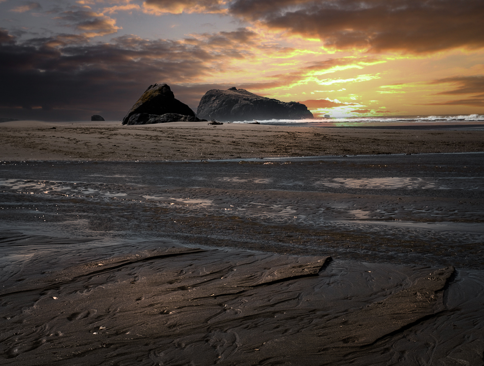
Hi Bob,
Thank you for sharing.
I have never been to Oregon myself. I only know that Oregon is famous for the Pino wines. I have tasted a dozen of Oregon Pino and they all tasted really good.
I like your cropping. You have a good foreground and a good focal point. The cloud actions add mood in the image. It's a bit purple casted, which I do not find it in the original. So other than the color factor, you did a very good job in my view.
To make it better -
For me, if I look original, one of the strength is the diagonals in the sea shore (foreground). I would include it as much as possible when cropping.
Then, I would use different sky. This is purely a personal taste. I like warm colors in the scene.
So I replaced with the sunset sky and paint sea shore with very light orange for the reflections. This will give you different mood and emotion.
I am not sure that a blue cool image or a orange warm image fits better in Oregon coast - Maybe blue cool image... You were there and selected that way... Maybe I could be a bit off...
|
Jul 6th |
 |
6 comments - 8 replies for Group 96
|
10 comments - 12 replies Total
|


