|
| Group |
Round |
C/R |
Comment |
Date |
Image |
| 45 |
Apr 22 |
Comment |
Hi David, Let me jump in.
This is very beautiful image.
I really like the color pallet and tones, not so saturated colors and gentle contrast with adequate back-lighting. Nice choice of condition. Also cropping strategy works in my eye.
Composition: Positioned the center a bit left so there is a bit of room in right hand side, which makes me comfortable.
It is a bit disadvantage that the leaf vein is somewhat white and the stalk of pistil is also white (light color) and overlap each other. which makes my eye tough to look and feel 3D (depth).
But overall it is a good nature image!
|
Apr 6th |
1 comment - 0 replies for Group 45
|
| 74 |
Apr 22 |
Reply |
It sounded like I did not explain well and my message did not get trough.
I should have been clear in the message.
My message was "composition does not work for me", the moon and lighthouse is not positioned right in my eye, so I do not get a story from this one.
That's nothing to do with my interest on digital art.
Hope this is clear. |
Apr 11th |
| 74 |
Apr 22 |
Comment |
Hi Arne,
Thank you for sharing.
This is a excellent BW image with incredibly fine details and tone. The lighting is perfect for me. Your ability of producing BW is incredible and I respect on that.
When I look back the original, it provides more profound and richness in the mood and atmosphere in my eye, which I guess is due to the colors unfortunately.
But again, a excellent job on the conversion!
|
Apr 8th |
| 74 |
Apr 22 |
Reply |
Thank you, Dick for your nice message.
I appreciate it a lot! |
Apr 8th |
| 74 |
Apr 22 |
Comment |
Hi Jeff,
You are stepping into digital art arena. Good for you!
To be honest, I feel a bit uneasy to see this image.
This is basically digital creation, which mean you can do anything you want, am I right? Which means that you can change the size of the moon and positioning of the moon�� That's my understanding.
Given that is right, I am sorry to say that I do not see any connection between the moon and the lighthouse. They do not seem to be migrated in one image to deliver a story. I cannot read your intention why you place the moon there in the position with that size and why the light house is lightening, I am afraid.
Maybe because of that, my emotion does not reach to the level of "wow" when I see this image, although it has a good components inside.
That's all my personal opinion though��.
That's all from me. |
Apr 5th |
| 74 |
Apr 22 |
Reply |
Hi Jeff,
Thank you for your comments.
I understand your point, but if this image cropped as you did, it will become just a snapshot in my view. Photography is how you structure to guide viewer's eye to the main subject. That's the beauty of composition. And it is challenging.
That's the interesting part of the photography for me.
I guess what you are saying is "this composition does not work, the splash is a distraction". Your message is taken.
Thank you for your feedback again. |
Apr 5th |
| 74 |
Apr 22 |
Reply |
Thank you, David.
I think suggestion is valid. Your version looks simple and better to hilight the key components of the image. I appreciate your edit, too. Yes, maybe the contrast is a bit too strong for me though.
Talk to you next month! |
Apr 5th |
| 74 |
Apr 22 |
Comment |
HI Don,
Thank you for sharing.
I do not shoot cityscape so my comment might be irrelevant.
For me, the side building is distracting my eye. It has complicated pattern which is similar to the main building. So my eyes gets stuck with the side building before arriving at the building at the back.
You might want to burn the side building so that my eye will go directly to the center of attention.
That's only the suggestion from me, Maybe Arne could provide better suggestion as he is experienced in this arena. |
Apr 4th |
| 74 |
Apr 22 |
Comment |
HI Dick,
Thanks for sharing.
I would say that your strategy of cropping is going to the right direction. I guess you are trying to use the foreground tree as a frame and also use the S curve path helps the eye to the tree at the back. That's a good strategy and strength of the image in my view.
Then next question is what is your main subject..
If your answer is the tree at the back, then, the tree need to be shine. Currently it is too dark and migrated in the background. And the tree is overlapped with the foreground tree and it takes time to recognize the whole picture.
My eye gets lost where to look at without having the bright area to focus.
But it is a good attempt. |
Apr 4th |
| 74 |
Apr 22 |
Reply |
Thank you, Dan, for your honest feedback. Appreciate it a lot. |
Apr 4th |
4 comments - 5 replies for Group 74
|
| 96 |
Apr 22 |
Reply |
Hi Robert,
For me, I like this version better. Let me explain why.
When I look at the image first (without reading your description), my first reaction was "wow, what a beautiful capture of water". Then, I read the description. Your theme is "lava battling with the water to come to the surface". So your main subject should be lava (or at least lava need to have a presence). This is my understanding - "This is a volcano shot in Hawaii". When I look at the image again, then lava does not have details. Unless I read description I could not figure out what I am looking at. That's why I commented as such.
By adding the background of cliff, it helps me toã�¬�¬understand the context and it has a details to see (I like the mountain edges as well which provide feel of distance in the image). It help my eye to rest and travel back to the main portion. So it helps to solving my 2 issues, no details of lava and no place to rest for my eye.
Without it, the splash overpowers the lava and the image end up showing just "the power of the wave", not "Lava battling with the power of water".
Of course, if the lava have clear details and firm presence in the original image, then I do not think I need such expository background (cliff with lava).
Hope you understand what I am saying. Well, this is purely my personal perspective though.....
|
Apr 29th |
| 96 |
Apr 22 |
Reply |
Hi Bob,
For me, I learned a lot from this discussion. Your image helped me a lot. In that sense, I really appreciate you posting this image.
Now about this cropped image, it does not work for me. It hurts the image in my view. The edge of the cliff create excellent leading line toward the fall and the mountain. And the tree on left frame mountain nicely together with the trees on right. So cutting those elements from the image hurt the image great deal. That's my personal opinion though. |
Apr 12th |
| 96 |
Apr 22 |
Reply |
Bob, I think it is not a "shooting time of the day" issue nor a technical issues, but a composition issue. If you want to make the fall the subject, then you need to open the view of the fall and make the fall dominant in the frame, which is lacking with this composition. As I mentioned, you need to shoot from right to show the fall. But I understand that you could not move to right. Then, I would need to think a different approach. How could I make the fall the subject? Could I use telephoto lens to close up the part of the fall? Or shoot down the river to capture the rapid stream, etc.
Thank you for sharing the image - this became a trigger to make me think about the composition in shooting canyon.
But I still think this is a good image, Bob. |
Apr 10th |
| 96 |
Apr 22 |
Reply |
Sorry, Robert. I did not mean to put you in the spot to do a torturous process.
I wanted to understand what factors made you think the mountain is not the subject. The mountain consists of nearly half of the frame and it has presence to some extent. But your eye did not recognize it as "the subject". Is the issue lacking full view, lighting, hazing, or something else. I wanted to understand the factors. I now got the answer. This version looks the mountain more dominant and become the subject in my eye.
In shooting canyon, I would encounter similar cases going forward. Your comments and inputs alert me a lot in setting up the composition. Thank you for all your time and effort in answering my question. Appreciate it!
|
Apr 10th |
| 96 |
Apr 22 |
Reply |
Hi Robert,
Sorry, let me jump in. I have a question.
I found your comments interesting about "lack of main subject".
Is there anyway to make the mountain "the subject"?
If we edit the mountain clear not blurred, would it work as main subject?
Or
Even after edit, the mountain is still remained as a background and cannot become the subject since the mountain is not separated and does not have a full view?
I would appreciate your thought on this. |
Apr 9th |
| 96 |
Apr 22 |
Reply |
Hi Robert,
Thank you for your comments and edits.
Reading the feedbacks received from this group, It sounds like the swirl is too outstanding and distract the eye from the main subject. Personally I still believe that the swirl adds value to the image but balance was not right as you mentioned. I like your edit - the waterfall is still the star and good balance of light and shadows.
I will rework on this based on the inputs from you.
Thank you again for your precious feedback. |
Apr 9th |
| 96 |
Apr 22 |
Reply |
Thank you, Bob for your attempt.
Yes, I always try BW most of my image. I did this too.
But I stopped doing it because I did not want to lose excellent autumn colors from the frame. Conversion is sometimes successful if the image does not work in color. That's based on my experience. |
Apr 9th |
| 96 |
Apr 22 |
Reply |
Hi Bob,
Thank you for your message.
You might be right that swirl is too blight and too saturated so it gets instant attention. I could not detect when I edited this image. I need to train my eye....
I think I will rework on this image based on the direction you are suggesting. Your edit looks better. I think the tree in upper left is a bit too bright still though... |
Apr 9th |
| 96 |
Apr 22 |
Reply |
Hi LuAnn,
Thank you for your message. I appreciate your answer to my question. It helps me a lot.
No, I have not realize the two animal faces in the fall - would you help me to identify? |
Apr 5th |
| 96 |
Apr 22 |
Comment |
Hi Dr. Wimborne.
Being a Japanese, I felt I should be the one who kick off the comment.
First of all, thank you for visiting Hiroshima and learn about what happened in Hiroshima. Also thank you for choosing this image for PSA group. This would be a good propaganda for every one here.
Unfortunately this image does not convey "constant warning of the consequences of nuclear war". The building looks very clean/neat and looks newly built in some part - this does not deliver the feeling of "disaster caused by atomic bomb". And the sky looks blown out and it does not add value to the image (I think the sky is a very important component to create a mood or add messages in my view).
And this composition is standard for snapshots, (I would say) 9 out of 10 tourists would post the similar shot in their Social Media, I am afraid.
Technically, the dust is left in the sky here and there. I would pay much attention on the edge - we call it "edge control or patrol".
Thank you again for sharing. |
Apr 5th |
| 96 |
Apr 22 |
Comment |
Hi Robert,
Thank you for sharing. Every month each image (from Hawaii) shows the different character and mood.
Obviously this image demonstrates "revealed power", not "hidden power". The splash of the wave together with the fire is frightening. The cloud action also help to strengthen the mood. The image make me feel danger of life.
This is really a dynamic and powerful shot. The splash is well captured in texture and details. However, because of less back/dark tones in the image, it is difficult for my eye to travel throughout the image (from light to dark, dark to light), and vivid red color hold my eye. Then, soon my eye is tired without having the place to rest.
Finally, maybe this is the personal preference but I could not figure out where does the red come from without reading your description. My eyes were seeking the clue/hint to understand this is the fire from the volcano. |
Apr 5th |
| 96 |
Apr 22 |
Reply |
Thank you, Cheryl for your comments.
I really appreciate your description of the eye pathway how you follow the image. Mum.... Sometimes the concept of "filling the frame" could turn out to be negative...
You are welcome to come here... I will guide you to this fall.
|
Apr 5th |
| 96 |
Apr 22 |
Reply |
Hi Cheryl,
Thank you for explaining how you shot the image.
It did not look like you shot from the ground.
I am not sure that It is because of the lens itself or because of the angle of the lens.
But I cannot help repeating but I like this image very much!
It has a mood. |
Apr 5th |
| 96 |
Apr 22 |
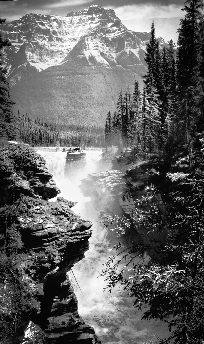
Comment |
Hi Bob,
Thank you for sharing. I have stayed Jasper long time ago. This reminds me of beautiful Canadian Rockies scenery. Good old days...
First of all, the composition is great. Nice combination of cliff and powerful waterflows with the Rockies at the background. This is super. The cliff is blocking the sight of the fall a bit, so I would step right to open up the sight of stream a bit(if you could). I guess you can recover the details of waterflow from the RAW file (if you shot in RAW) - some part of stream looks blown out.
Nevertheless, I like the image best out of your images I have seen in the past.
Now as for post processing, I like your attempt. You did a good job of BW transition in my view. You open up the blacks so the image now looks powerful.
As for improvement, I have 2 suggestions;
1. I feel the image is not leveled. It is because the edge of the forest does not match with horizontal line. I might be wrong.
2. I would increase the contrast. The mountain and sky looks dull in my eye. I would bring out the details more.
I am attaching my attempt for your reference. I touched level, increase the contrast and dodge a bit for lighting. |
Apr 1st |
 |
| 96 |
Apr 22 |
Comment |
Hi Cheryl,
I understand your feeling. This winter, I also wanted to shoot "ice bubbles" (I guess it equals to "methane bubbles") but I could not due to heavy snow (in my case, heavy snow cracked the lake ice and the bubble was gone). I spent all resources to get the shot but it did not happen. The nature is uncontrollable unfortunately. That's too bad.
But you brought us a good shot. I like what you captured.
I like the blue tint, the excellent cloud actions, and the cracked ground. Crack of the ice creates a nice leading line towards the hutch and the main mountain. My eye follows the line and arrive at the center of attention smoothly. All in all, this is a great shot. For me this gives me an impression of "freezing world". But this gives me less "feeling of isolation", I am afraid.
I guess it all depend on how you express "isolation" in the image. I assume that you used sky (space) for "isolation". On the other hand, I would use "distance" to express "isolation".
In that case, I would compose this a bit differently (sorry, this cannot be done by cropping of this image);
1. choose portrait and include only main mountain and the hutch in the frame. No left side forest, no right side mountain.
2. Get closer to the crack of the ice and shoot as foreground (use wide lens and shoot closest from the ground)
By doing this, the image would emphasize the crack and it creating good leading line (as you did) to the hutch. But due to distortion of the lens, the hutch looks far away in the distance. I would spend 2/3 of the frame for ground. By emphasizing the "distance" to the hutch, I would give a impression of "isolation". Hope it make sense. This is just my personal opinion though.
|
Apr 1st |
4 comments - 11 replies for Group 96
|
9 comments - 16 replies Total
|


