|
| Group |
Round |
C/R |
Comment |
Date |
Image |
| 74 |
Mar 22 |
Comment |
Hi Arne,
Thank you for sharing.
This is great transition to BW. The rusty gear is now transformed to new/shining star! This is done well.
Texture and details are well described. I like it very much.
In addition, the side light (back left/right of gear) is well added. It almost create an atmosphere that shot was taken at night with spotlight.
Excellent job! |
Mar 6th |
| 74 |
Mar 22 |
Comment |
Hi Tevor
Now you came back to landscape photography. Good for you!
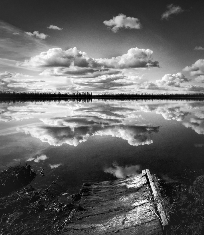
This is a nice image. This is a bit tricky image because it has a reflection and a foreground.
The question is "does the foreground married well with the reflection?".
2 suggestions for improvement for my eye;
1. I would increase the whites. Currently white tones does not well-represented. See the gap in the histogram. Bring up white tones would give a pop and a punch in the image.
2. Composition - the bush in foreground in right corner is a dead space, that area does not add value to the image. The board in foreground lead the eye to the center but the board itself is not strong enough for catching attention. (in addition, it is dark) But the image has very strong cloud action and reflection, so my eye can go straight to the reflection without a help of foreground leading line. So currently the big foreground neutralize the power of the reflection. It is a bit pity.
So I would go either way - I would crop out as attached (I brightened up the board) or I would completely crop out the foreground and make it pano style.
That's my personal opinion.
Hope this helps.
|
Mar 6th |
 |
| 74 |
Mar 22 |
Comment |
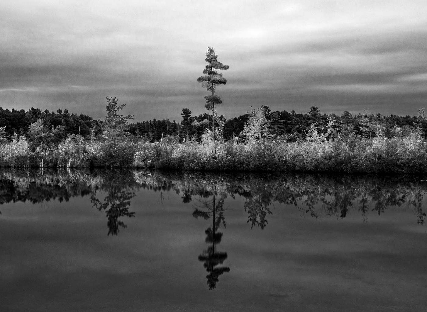
Hi Dick,
This is nice BW conversion. Your tone control is good with contrast. It is pleasing my eye.
2 suggestions for improvement in my eye.
1. composition - Island in the center is overlapped with the mountain at the background. That's a pity for structure point of view.
2. Lighting on the island - original has beautiful light hitting on the island. It is not well-described in BW. Especially the island on right. I value the lighting very much in BW. So if you can reveal the light, the image is going to be more powerful in my view.
But overall good attempt.
Thank you for sharing. |
Mar 6th |
| 74 |
Mar 22 |
Reply |
Hi Dan,
I like this edit.
I think it is leveled and center of attention is clear.
Great! |
Mar 6th |
| 74 |
Mar 22 |
Comment |
Hi Don,
Thank you for sharing.
It looks great. What I like about this is the detail and texture of the wheels. I like your tone control.
On thing I would do to improve is to burn the edge. If the center of attention is the wheels, then other components need to be darker than the wheel. Currently it is too bright and distracts my eye. |
Mar 3rd |
| 74 |
Mar 22 |
Comment |
Hi Tracy,
Thank you for sharing.
Your composition is spot on for the reflection image. Please check the level in the image again.
Tone management is getting better now. It has a good contrast with tone spread. But still you have rooms to stretch - If you look at the histogram, it has a space in right. I would bring up the whites with level adjustment in PS easily. That would make a big change.
The strength of the image is the bush/tree hit by sun light reflected in the water in my view. I would highlight that section more. That would give punch in the image. As for moodiness, I would use clouds. I would bring up more details (which you can do with RAW file) and make stronger contrast. I would do it with sky as well as the sky in the water. That would add the mood in the scene I think.
Just for my practice, I played around a bit (see attached). I adjusted levels and dodge the bush/tree and reflection with luminosity mask. I did not touch the sky though. Hope this helps. |
Mar 2nd |
 |
5 comments - 1 reply for Group 74
|
| 96 |
Mar 22 |
Reply |
Hi Cheryl,
Yes, I think it is good directionally. I would add light in the forest though. It is too dark for me. |
Mar 13th |
| 96 |
Mar 22 |
Reply |
Thank you again, Robert, for your suggestion.
Yes, this is far better than my image.
Cropping version is one way to go, but still keep this composition in back pocket for next shooting.
I would have different condition next time, condition of cycles, lighting, and volume of the water.
I really appreciate your time and effort to help me out here.
|
Mar 12th |
| 96 |
Mar 22 |
Reply |
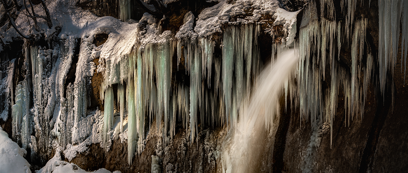
Thank you, Robert, for your suggestions. Appreciate it a lot.
Yes, the main subject should be the fall. I was struggling because the water volume is so small that icicles around were outstanding.
After I posted the images, I have been playing around if I could make it work by cropping. I arrived at 2 cropped versions for now, one is nearly similar to your cropping suggestion, and the other is the pano style version (attached). The issues of pano version is that I can not feel depth, although actual scene has huge depth. I need to find the solution how to solve that. Your suggestion is better - the fall is the star of the image and convey the sense of depth and scale. I will play further to fix the color issues.
Thank you, again. This is a great help in my vision creation for next shoot. |
Mar 12th |
 |
| 96 |
Mar 22 |
Reply |
Thank you, Robert for sharing the RAW file. Really appreciate it.
Please accept my apology. Yes, the color in the image originated from the color in RAW file. I need to reset my color sense. Sorry.
Looking at your RAW file, I would suggest to bring up shadows of the wave and the rock, especially the wave in foreground (it has nice details captured). It would help to make your story enhanced, hidden vs. revealed power.
|
Mar 12th |
| 96 |
Mar 22 |
Comment |
Welcome, Dr. Wimborne.
I do not shoot cityscape so I do not know much about that arena. So my comments might be irrelevant. Please excuse me in that sense.
First of all, I could not get what story would you like to convey from the image. What is the theme? Maybe you might want to describe your goal in the description section next month. Then, I can reconcile it and can comment if your goal is met or not.
I am not a big fan of nearly half of the frame is covered by blue sky. It does not help me translation of the image.
Second, I feel the image is too blueish. Maybe it is because of my monitor.
finally, the building looks distorted. Is the inclination is a real or is it because of the lens, which I could not figure it out. |
Mar 11th |
| 96 |
Mar 22 |
Comment |
Hi Gloria,
Thank you for sharing.
If you ask me if I get a sense of calm or coziness from the image, I would answer "No", I am afraid. In my view, emotion comes from the sympathy of the scene. The scene does not resonate with my experience nor any part of my life. I do not see any connection between the shells(which comes from nature) and putting them on the veranda(which is artificial manmade). There is no story around them or at least I cannot read the story from the image.
In terms of technicality, what bothers me is the background. although it is blurred, the ships sparkle here and there and really distract my eye. And for me, 3/4 of the space is spent nothing adds values to the image. I understand why Bob cropped out as such. The issues is not selecting which f stop to used, but the composition itself.
I guess this comes from the fact that you used tripod. That limited you to move flexible to compose the image. You need to walk around, dance up and down till fixing the composition, which I do not think you did it enough. Besides, you do not need tripod to shoot with 1/2500 sec.
I think I said enough. Sorry. |
Mar 11th |
| 96 |
Mar 22 |
Comment |
Hi Robert,
Thank you for sharing another nice Hawaii nature image.
I think your theme of "hidden power" is delivered though this image. My imagination is expanded because the lava is not revealed entirely. That trigger me to look into the image. That's positive.
If I see the wave action in the center foreground (like the one in the left bottom corner), that would make the theme "hidden power" outstanding by contrasting "hidden lava" vs "wave motion(obvious)" in my view.
Only my claim is the color - orangish/pinkish red color - is this the nature color from the original? I could be wrong but at first glance, I feel this color is not in the nature. But If it comes from nature, I am sorry. I am wrong. |
Mar 9th |
| 96 |
Mar 22 |
Comment |
Hi Dan,
Thank you for posting another beautiful image.
As always, a beautiful finish.
I like the color pallet, especially the gradation of warm color to cool color.
Clouds action also adds power to the image. But I am not sure that I feel calm through this, but feel more hidden energy and power.
2 things - What I noted in the image - 1. I could not get your intention why you keep so wide space in the bottom. 2. Background bush/trees on left is heavy. I tried to balance it out by placing the stick a bit right. But that did not resolve the issues.
|
Mar 9th |
| 96 |
Mar 22 |
Reply |
Thank you, Bob for your comments and suggestions.
I did not even think about cropping the fall out from the frame. What an idea!
After getting others comments and suggestions, I will restructure the vision.
That's will become a good preparation next year. |
Mar 9th |
| 96 |
Mar 22 |
Reply |
Thank you, Dan, for your words.
Yes, let's wait for others comments for a while. I will have nearly 10months to prepare for the next visit. I will nail this down next time. |
Mar 5th |
| 96 |
Mar 22 |
Reply |
Thank you, Dan for your comments. Appreciate it.
My mentors say the same things as you said. Understand that.
What I would like to hear from the group is "Is there any room to make this composition work? If yes, how could I do that? Or you could say "Haru, this composition will never work, so give it up and shoot with long lens"(I guess that's what you are saying). Then I would accept that and look for other composition and subjects with long lens next.
I would like to make progress and produce better image when I return that place next. The weather uncontrollable, but I can control the degree of preparations for the field work.
Sorry for my poor English. Hope it makes sense.
Thank you again for all your support, Dan. I really count on your inputs. |
Mar 3rd |
| 96 |
Mar 22 |
Comment |
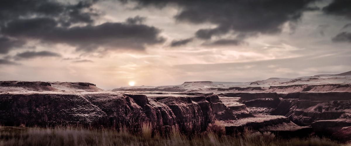
Hi Bob,
I totally agree with Dan on the creativity you have been presenting. This image is the case as well. Your image inspires me sometimes.
I checked Palouse Fall on the Web. Definitely I would go straight to the fall and shoot hundreds of images. I would never find such a composition myself. Actually I like the composition. It has depth with layers of canyon. Also it look better with cloud actions.
What I do not enjoy is the color. It is too reddish. I cannot keep watching it.
I tried BW conversion but it turned out to be boring in my eye.
at the end, I arrived at the version attached. I significantly desaturated the color. And then, repainted the new color in the sky and to the canyon to add the lights.
|
Mar 3rd |
 |
| 96 |
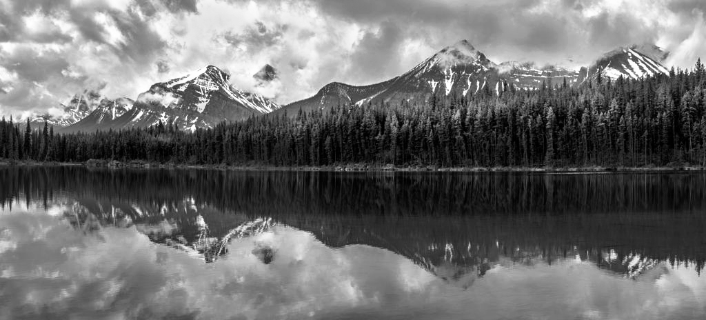
Mar 22 |
Comment |
Hi Cheryl,
Another great pano image! Excellent composition with fine reflection.
I do not think the clouds action is busy in my eye, either.
That adds drama in the scene. So I take it positive.
Only one improvement point - the image looks dull. It does not have a punch although it has nice components, snow covered mountain, good cloud actions, and reflection. I assume it is because of white tone is lacking and do not have enough contrast.
For my practice, I edited a bit in PS based on the BW image (see attached).
I bumped up the white tones and add contrast. Then, lighten up the reflection a bit and add the light in the forest.
Hope this helps. |
Mar 3rd |
 |
6 comments - 7 replies for Group 96
|
11 comments - 8 replies Total
|


