|
| Group |
Round |
C/R |
Comment |
Date |
Image |
| 74 |
Feb 22 |
Comment |
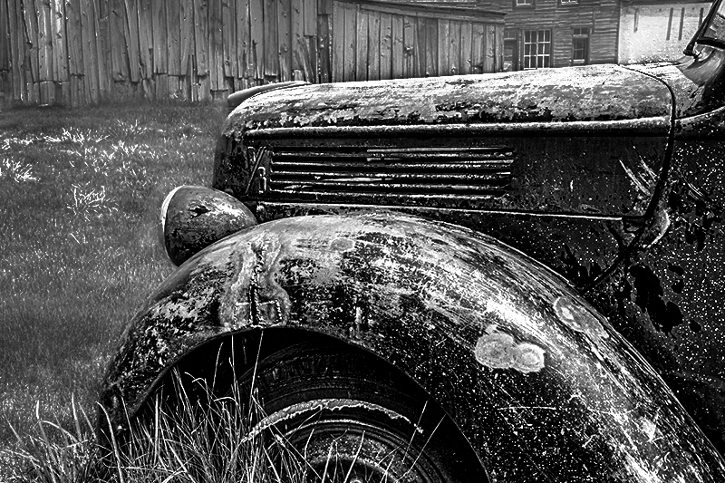
Hi Don,
Thank you for sharing. You did a good challenge.
I think the sun located overhead is good for BW photography (but not good for landscape photography). So lighting is no problem.
Please take a look my attempt. This was a bit challenging edit for me, too. I do not use DXO's Silver Efex so all are done manually.
What I did was;
1. I increased great degree of clarity before the BW conversion. And blur the background. background is a bit busy.
2. After conversion, I increased the "whites" by tone curve and level adjustment.
3. Finally dodge and burn to bring the eye to the center of attention.
By doing this, you might be able to bring out the rust better. All in all, the key is "contrast". I am not sure this is what you are looking for though.
Now, talking about the composition, please be careful on the followings when you shoot next;
1. try to select simple background - the background in this image is too busy and the tone is very similar to the car. If you have no choice, then, try to blur the background. Then the eye can focus on the car.
2. try to create the depth of the car. This image does not have depth in composition. You might want to go around the car to think which angle give the best depth. I would shoot a couple of easy shot by mobile here and there first, and then look back those. After I decide which one is the best, I would go with serious shots. That's I would do if I were you. I am not sure if you have enough time to do this process though.
Anyway, good luck on the next visit. Please post it when you did. Looking forward to see the next shot.
|
Feb 9th |
 |
| 74 |
Feb 22 |
Comment |
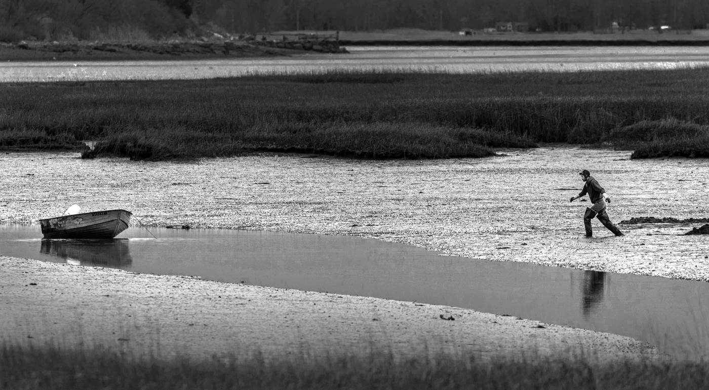
You are really good at this arena, Tevor.
I like the tone and texture.
The man looks about to move out of the frame.
Excellent!
|
Feb 6th |
| 74 |
Feb 22 |
Comment |
This is a unique concept, Dick.
BW conversion turned out to be fine. Good detail description.
I would be vignetting heavy to guide the eye to the center.
I prefer the original better personally, it gets stronger attention.
My eye did not move trying to find out what it is.
Thank you for sharing. |
Feb 6th |
| 74 |
Feb 22 |
Reply |
Thank you, David for your nice comments.
It encourages me a lot. |
Feb 5th |
| 74 |
Feb 22 |
Comment |
Hi Arne,
Thank you for sharing.
You chose the subject which I wanted to cover this winter. I think I would miss the subject this season since I am chasing too much falls, icicles, and snows now. So this would be a great opportunity to learn "waves" here.
What I like about this image is the texture of the splash of the wave. You captured the right moment with good lighting. Then, you injected a life in the post-processing. It is perfectly done in my eye. Congratulation!
But when I look at the image twice, it looks weird and I am not comfortable. It comes from composition and tone management in my view.
Strong contrast make the wave outstanding - which is good - but everything else is dark and I cannot see the rocks well enough to recognize it as "a rock". It is migrated in the wave because the rock and ocean is in the same range of tone with little presence.
So in my eye, I looks as if the wave splash suddenly gushes out from the ocean which makes me feel weird.
I think the same applies to the wave in the foreground. And it is not well connected with the splash behind.
Center of attention is wave crashing against the rock - that's obvious - but I like to see the story, wave crash against the rock, in my opinion. |
Feb 2nd |
| 74 |
Feb 22 |
Comment |
Hi Tracy,
Thank you for sharing.
Nice story telling image. The selection of pano strengthen the story in my view.
Just a couple of point;
1. narrow(small) contrast - that makes the image looks dull for me. There is no blacks and whites.
2. The branch sticking out from the water - that's distraction and take attention away from the story.
3. The lighten up the center and vignette the edge would help the eye to focus in the center.
3. I prefer to have a bit of space in left - I would keep the same space as it as in right between the man and the edge.
for my practice, I converted from original. This is the way I would go. Hope this helps. |
Feb 2nd |
 |
5 comments - 1 reply for Group 74
|
| 96 |
Feb 22 |
Comment |
Hi Gloria,
First of all, congratulation on making the huge progress from the last image as everyone here in our group recognized.
Although everyone notes your progress, I am not sure that I would put it on the wall at this point. Your photography journey has just started and if you keep revisiting this place, you will be able to produce much better image in the future.
For me, there are lot of interest features concentrated in lower 1/3 of the frame, whereas there are not so many interesting features on the middle of the frame.
If you keep visiting, you might encounter better sky than this image. You might be able to find better composition by walking around.
I envy you have such a nice spot nearby. You have a good opportunity to make it better in short period of time by frequent visit.
You now grasped how much smoothness would be realized by 25sec. SS. That's a great learning and achievement. Step by step you will become better. All you need is to keep shooting. Good luck! |
Feb 9th |
| 96 |
Feb 22 |
Comment |
Wow, what a creativity! Good for you, Bob!
This is just like the image I would use it for standby screen of mobile or PC.
It has strong impact but I do not mind putting it on the screen for long time.
Only one issue though - my eye cannot find the edge of the moon (lower side).
Upper side has clear edge but not lower part. Maybe because of my monitor.
Since my eye cannot recognize the edge, It looks as if moon is ellipse or funny shape. That's only thing.
I appreciate your creativity very much. Great work. |
Feb 9th |
| 96 |
Feb 22 |
Comment |
I wish I were there with you, Robert.
I can imagine that It would be a big challenge to shoot this subject from the boat, composition setting, technicality overcome, timing of flames, etc.
My first impression is wow. I looked at it as "picture(art)" rather than a land scape image at first glance. It has layers of subtle colors and it looks like abstract in some part. This is an "art" for me. I would not change anything.
I would frame up and hanging on the wall - this preserve unforgettable memory in Hawaii. Please show it to the visitors at home. This image tells the story. |
Feb 9th |
| 96 |
Feb 22 |
Comment |
Hi Cheryl,
I like this pano very much!
The tone, subtle colors, reflection, foggy air, etc, all come together in harmony.
If this is my town, I definitely frame up and hanging on the wall in my office.
I do not think you cooked too much in my eye.
I wish I can produce pano images as good as this.
Well done! |
Feb 9th |
| 96 |
Feb 22 |
Comment |
Hi Dan,
Thank you for sharing.
Personally I like the images make me calm and peace of my mind, just like the image here.
I could not think of any points for improvement on this image, I am afraid.
Composition, tone and colors, all are my type.
I would like to test Orton Effect myself.
|
Feb 9th |
| 96 |
Feb 22 |
Reply |
Thank you, Cheryl, for your comments and edits.
Minor adjustments bring big positive impact on a image. Your suggestions really count. Thank you again. |
Feb 9th |
| 96 |
Feb 22 |
Reply |
Thank you, Robert, for your comments and suggestion.
It sounds like sky is a bit issue. I will look for better shooting spot so that I do not necessary to eliminate nor clone out the sky from the frame.
|
Feb 9th |
| 96 |
Feb 22 |
Reply |
Thank you, Bob, for your comments.
I thought this provide energy to the viewer compared the one posted 2 month ago.
I learned a lot from your comments.
Thank you again.
Hope you get back the PC soon. |
Feb 6th |
| 96 |
Feb 22 |
Reply |
Hi Dan,
Thank you for your comments. Appreciate it!
Yes, I cropped the top/bottom slightly to reduce the sky and eliminate the reflection of the sky on the water. |
Feb 2nd |
5 comments - 4 replies for Group 96
|
10 comments - 5 replies Total
|


