|
| Group |
Round |
C/R |
Comment |
Date |
Image |
| 74 |
Dec 21 |
Reply |
Thank you, Trevor, for your comments. |
Dec 8th |
| 74 |
Dec 21 |
Reply |
Thank you, Trevor, for your comments. |
Dec 8th |
| 74 |
Dec 21 |
Reply |
Thank you for your comments, Arne.
I try your idea to see what it become to look like.
Appreciate your idea. |
Dec 8th |
| 74 |
Dec 21 |
Reply |
Thank you for your comments. I thought I need to brighten up the bird enough to compete the sky and reflection. Center of attention needs to be the brightest in my view. |
Dec 8th |
| 74 |
Dec 21 |
Reply |
Thank you for your comments. I thought I need to brighten up the bird enough to compete the sky and reflection.
I should have burned the whites in the water a bit as you detected. |
Dec 8th |
| 74 |
Dec 21 |
Reply |
Thank you, Don for your kind words. Appreciate it. |
Dec 8th |
| 74 |
Dec 21 |
Comment |
Hi Tevor,
Excellent! Well done.
I like all the details of the hands.
I do not have any critique from my ends.
Thank you for sharing beautiful image. |
Dec 7th |
| 74 |
Dec 21 |
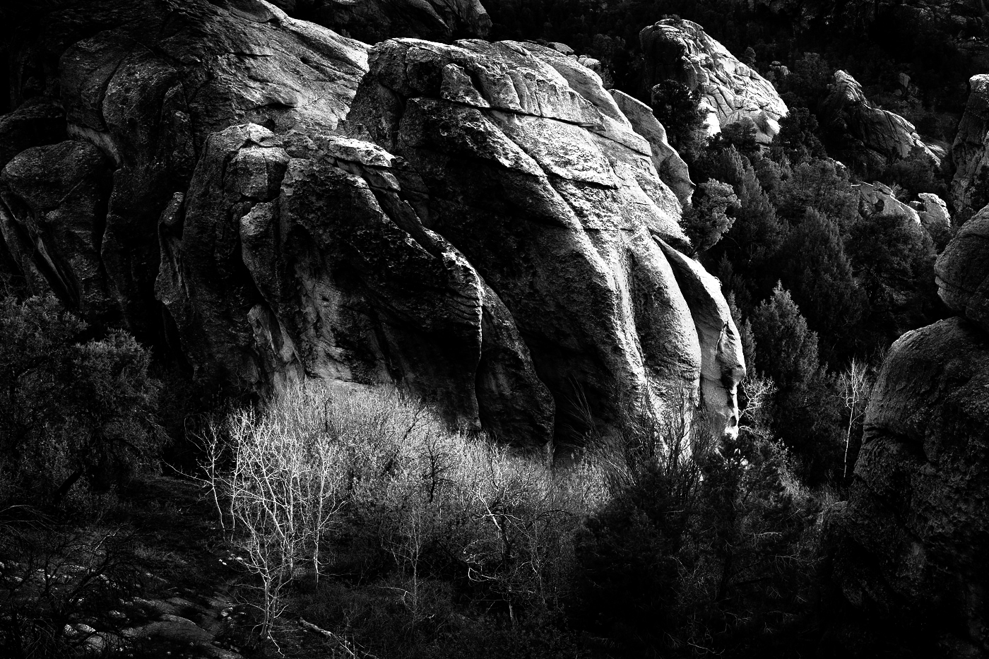
Comment |
Hi Tracy,
Thank you for sharing.
It is interesting rock shape. It is framed well to highlight the curve of the rock. In that sense, your goal is met half.
On the other hand, the upper fall looks blown out and lost the detail of the stream.
As for composition, I would step left to show better water flows of upper fall and crop out the lower fall.
Or I would look for better position to show lower fall better. Currently both falls does not standout as you intended. |
Dec 7th |
| 74 |
Dec 21 |
Comment |
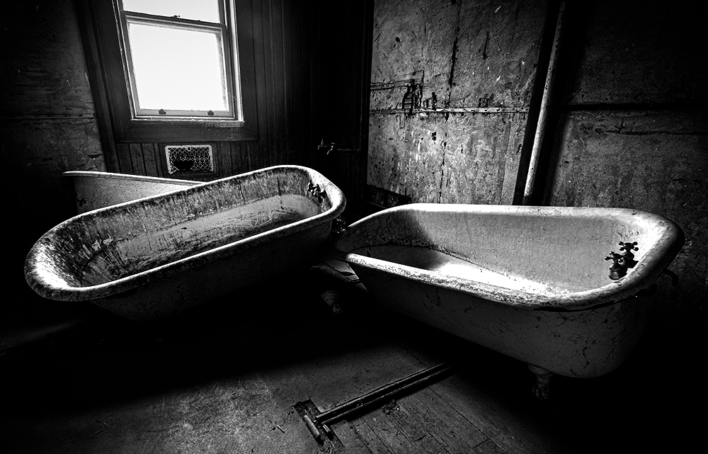
Hi Dick,
Thank you for sharing. This is a good exercise to me, too.
I feel this is a good exercise to convert to BW and this image is a good subject for that purpose in my view.
You captured a good afternoon light, which makes the subject look 3D and it is essential in BW images. So the image has a key component for BW landscape photo.
Looking at the BW image, I feel it looks flat. It does not look like the evening light is hitting on the subjects. I like to highlight the edge of trees shined by evening light. That's the beauty of this image. I did very quick and dirty attempt.
I did not use luminosity mask but just used exposure/highlight sliders. If you use luminosity mask, it will turn out to be better I think.
Lastly, I would not crop right. The main subject needs to breath in my view.
I left the right space as it is in original. Hope this helps.
|
Dec 3rd |
 |
| 74 |
Dec 21 |
Reply |
Thank you, Lance, for your comments.
Yes, I will visit this location regularly in different season. I am working on another BW image taken at the same spot with different time. Maybe next month. |
Dec 3rd |
| 74 |
Dec 21 |
Comment |
Hi Arne,
Thank you for sharing.
I admire your decision to use portrait rather than landscape.
I would easily pick landscape to show the horizontal depth, but you did not.
By choosing portrait, your goal of "figures stretching to the light" is effectively presented here. So nice choice.
Now talking about your goal, I think your goal is met. But I would look for better composition. Unfortunately, the 2nd figure from front is heavily overlapped with the figure in 3rd front.(Hope you understand what I mean). The figure at the back, 2nd one from the back, and 3rd one from the back - they are clearly separated. And then, the figure starts overlap and it does not clear separation each other. I observe the statue is placed closely together but I would a step left and shoot. By doing that I would imagine that the head of 3rd person from front would make a better separation. That would make the image more impactful in my view.
That's all comments without understanding the situation of shooting spot. So if this is not feasible, please ignore this comments.
Lastly, I would increase the contrast. I am attaching what I did.
Sorry for the long comments.
|
Dec 3rd |
 |
| 74 |
Dec 21 |
Comment |
Hi Don. Thank you for sharing.
You found a very good object to practice shooting.
Shooting a subject in a room with natural light is good practice I think. And you did a good job.
Post processing wise, too, it is well-processed and tone control is super. It covers all the tones and detail is well described. It is nicely done.
This is excellent BW image as it is, but I present a bit different perspective to you.
I tried to present what it was like in the room. If there was no electric light in the room and the natural light was the only source of light, I would imagine it looked like this - it would have dark shadows and the light hit the subjects partially.
I could go darker version, but I did not go extreme. You could play around by tone curve adjustment to see how it will give impact on the tones.
I cropped the bottom a bit. this is purely a personal taste though.
anyway, well done. |
Dec 3rd |
 |
5 comments - 7 replies for Group 74
|
| 96 |
Dec 21 |
Reply |
Hi Cheryl,
Thank you for sharing the re-edited version.
I like this better in terms of number of star trails. But on the other hand, it became less impactful. I would look for longer trails to make it more impact in this case.
I understand now that the key for success is number of big star tail vs. the length of the trails (number of shots combined). I guess it requires tremendous try and error process��.. Maybe seeking the right balance would be one of the fun part of sky photography, I presume��
But this helps me a lot to learn the sky photography. Appreciate it! |
Dec 12th |
| 96 |
Dec 21 |
Comment |
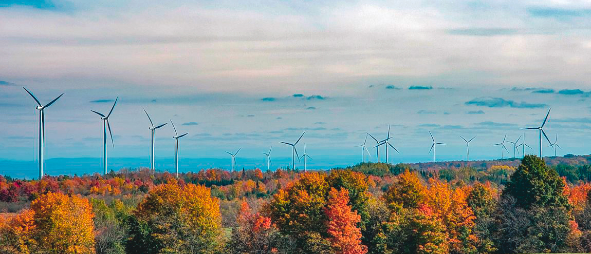
Hi Emily,
Thank you for sharing. Nice shot!
I like the composition you chose. 3-layer structure and the turbines make the image feel great depth.
Also I like the mountains appeared just a part of it. Is it covered by cloud or fog? (Sorry I am not familiar with the place - the clouds still remain at 1.33 pm ?)
As for colors, the autumn color in the foreground looks very natural (maybe you can add saturation just a bit), where as the color in the sky looks unnatural to me.
Anyway, If I strengthen the values of the shot mentioned above, I might go with pano style. I am attaching what it would look like...
Just to present the different perspectives. Hope this help. |
Dec 11th |
 |
| 96 |
Dec 21 |
Comment |
Hi Gloria,
Welcome!
Thank you for sharing the beautiful sky image.
I like what you did - skyscrapers in the silhouette and spend majority in sky.
I would crop out the buildings bottom right as Bob did.
I would not increase the contrast so much. You captured beautiful details of color of reflection in the water, which will be damaged if you increase the contrast too much. The color presented look natural to me.
My question is why the cloud is so soft focus?
Is it because the clouds moving so fast? |
Dec 11th |
| 96 |
Dec 21 |
Reply |
Yes, Bob. I realized now that white spots are more obvious in BW version. I will burn those...
Thank you for mentioning that. |
Dec 7th |
| 96 |
Dec 21 |
Reply |
Thank you for your comments, Cheryl.
I never thought about putting the bird off center.
Thank you for broaden my perspective. Appreciate it. |
Dec 7th |
| 96 |
Dec 21 |
Reply |
Thank you for your comments, Bob.
Yes, I should have burned the whites in the water. It distract the eyes to some extent. |
Dec 7th |
| 96 |
Dec 21 |
Reply |
Thank you for your comments, Dan. Appreciate it! |
Dec 7th |
| 96 |
Dec 21 |
Comment |
Hi Dan. Thank you for sharing the beautiful image.
My first impression was "Wow, it's beautiful"....
What I like most in the image is that it has a great story. By including the 2 people in the frame, the image step up another ladder in my view. I would not be touched so much without the people in the frame.
Other values of the image are (in my opinion);
1. details of sand ripples in the foreground - Lower position and decent wide lens choice contribute a lot.
2. reflection of sun light
3. foggy coast - it adds mood
Those are well captured and values in the image for me.
On the other hand, there are some minuses in my eyes. The more I am drawn into this scene, the more they reveal to me;
1. The rock in left - for me it is too bright. I think I would not be able to see such clear details of the rock if I was facing to the sun rise.... So that gives me an impression that it looks unnatural
2. There are red halo around the sun - Is it natural thing or is it caused by the post-processing? Overall, it is a bit oversaturated especially red/yellow in my eyes...Maybe because I like de-saturated tone image overall and am not get used to HDR images.
I have long tried to exclude people in shooting landscape photograph since I started. These days I proactively include "life" (wildlife or human being) in the shots if it adds story to the scene. This image encourages my direction as well. In that sense, I appreciate your posting the image here. Thank you! |
Dec 7th |
| 96 |
Dec 21 |
Comment |
Hi Bob,
I am commenting without reading others comments.
I will read them after my submission.
First of all, to answer to your question if it provides an emotional response, I will say yes.
For me it gave me a nostalgic old days - That's I guess come from the yellowish color tone and overlook of mountain.
But if you step back and analyze the image, I would say the strengths of the image are;
1. Layers of mountain framed in the trees in right and left.
2. Cloud Action in the sky
3. Evening light hitting in the trees
On the other hand, the weakness of the images are;
1. Too yellowish tone - looks unnatural
2. imperfect sun beam - that's bother my eye negatively
3. the foreground grasses does not add so much value to the scene.
Having said that, my alternative is to convert to BW and highlight the strength of the image above.
Crop tight and make 2 trees frame the mountain layers. Increase the contrast in the sky and erase the sun beam as much as possible. By making it to monochrome, viewers can now focus on the light/shadows better.
That's my suggestion. |
Dec 7th |
 |
| 96 |
Dec 21 |
Comment |
How! Another excellent night sky image. Well don and good try!
I envy you in that you can visit a spot without light prolusion.
Again, I do not have rich experience on the night sky so bear with me.
I am commenting just looking the image as a 3rd party viewer.
I am not sure why you blended 71 shots? Is it a rule of thumb in night sky photography? As mentioned in the previous month, I feel too many stars traces and looks busy for me. What would happen if you reduce to 50 shots or less? Would it become less busy? Or you just pick only the big stars to make traces?
Sorry, it might be a silly question for the experienced photographer.
And another question is why the foreground is turned out to be so soft focus?
I imagine that it is a separate shot so I might be caused by light volume.
I do not mean it is too soft, but was wondering how I could improve the sharpness of the foreground.
Those 2 points are the curious from me.
As for Bob's edit, I like the color of the sky but the traces are too bright for me.... It looks unnatural to my eye. Sorry, Bob. |
Dec 7th |
5 comments - 5 replies for Group 96
|
10 comments - 12 replies Total
|


