|
| Group |
Round |
C/R |
Comment |
Date |
Image |
| 74 |
Oct 21 |
Reply |
Thank you for replying.
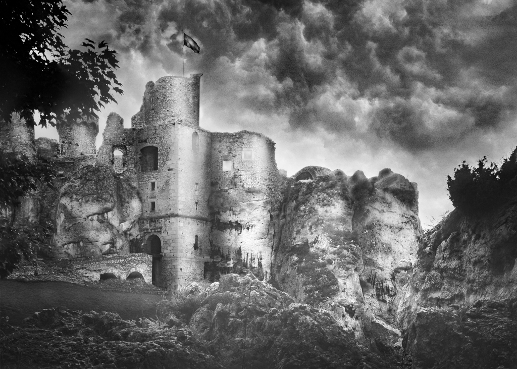
This is just my personal opinion, but the current clouds fits well in the image.
The castle is strong and powerful, so I prefer to have powerful cloud actions to tell a horrendous or frightening story.
Well, It all depends on what story do you want to convey, though�� |
Oct 11th |
| 74 |
Oct 21 |
Reply |
Thank you for replying.
This is just my personal opinion, but the current clouds fits well in the image.
The castle is strong and powerful, so I prefer to have powerful cloud actions to tell a horrendous or frightening story.
Well, It all depends on what story do you want to convey, though�� |
Oct 11th |
| 74 |
Oct 21 |
Comment |
Hi Tracy,
Thank you for sharing.
I think that the conversion works well. The pattern of zebras stand out in BW.
Blurriness of the background - is it natural blur or is it post-processed blur? |
Oct 6th |
| 74 |
Oct 21 |
Comment |
Hi Don,
Welcome to the group.
For me I think the first one is better - it has a good tone range and good contrast balance. Second one looks go too far for me. The image has the character and mood. It now looks old rusty building door by conversion to BW. If that's your intention, then, your goal is met.
One question - why did you take out the number? I thought that image with number has more story to tell in my view.
Lastly I am attaching my practice edit here. Please excuse me - It is really quick and dirty finish. My intention is to highlight the door and sign. Since you mentioned that green color frame looked interesting, I darken down the frame to make it stand out.
I just wanted to present another idea.
|
Oct 6th |
 |
| 74 |
Oct 21 |
Comment |
Hi Arne,
Thank you for sharing.
This is amazing how the original converted to the BW with completely different impression.
Your cropping and replacing the sky are successful.
By replacing the sky, it gives me an impression of something horrendous is happening.
Looking at the image, although the composition is well structured, my eye can not stay long in the image. I guess that is because the overall tone is in the same range.
I think it is personal preference about the haziness of the image.
If your intention is to make the image dreamy and imaginary story telling outlook, then your goal is met I think.
But personally I like the image which my eyes can enjoy and stay long, I would take a different approach.
For my practice, I edited myself. (Thank you for providing me an opportunity to try at least)
I prefer to see the castle clearly and added big clarity. Also I increased contrast dramatically to make the mood. I am attaching the outcome just for your reference.
This is all my personal taste though....
|
Oct 5th |
 |
| 74 |
Oct 21 |
Comment |
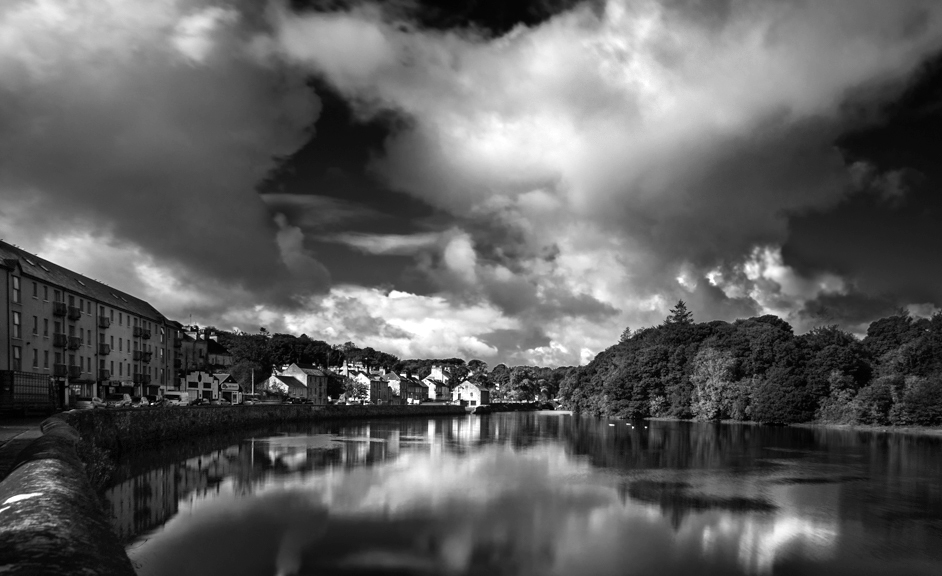
Hi Tevor,
Thank you for sharing.
This is a great shot - great clouds action, nice depth, nice balance between the reflection vs. real cloud, etc..
Also your thought process of transition to BW is a good one.
Now when it comes to the BW conversion, I feel that it is a bit too dark overall. This does not have whites. If you look at the histogram, you will notice that there is no whites. If I were you, I would re-edit the following;
1. I would like to see the detail of the building on left.
2. I would like to see gradation of greens/trees on right shore
3. for me, the space on right is a bit too spacious and loose the balance over left. So I would crop a bit.
4. Using level adjustment in PS, I would fill the gap of whites and make contrast.
I am attaching the result. It is really quick and dirty edit so bear with me in that sense.
|
Oct 4th |
 |
| 74 |
Oct 21 |
Comment |
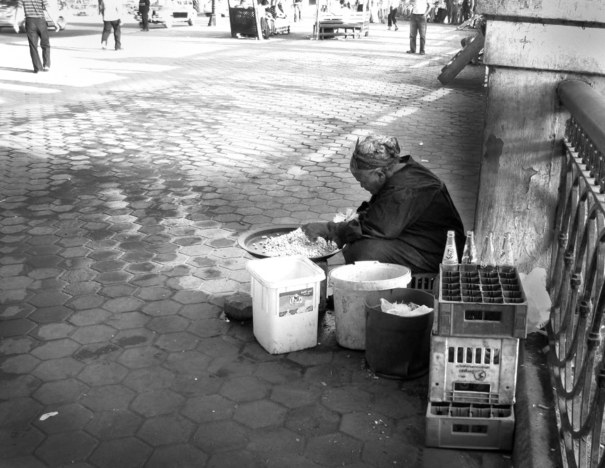
Hi Ata,
Thank you for sharing.
I am always amazed by your portrait/street photography.
You always present the sorrows/sadness of life. You have a good eye to catching it.
I like the pattern of the sidewalk. By converting to BW, it adds stronger impression on the image.
Also the details are well described.
For my practice, I edit the original myself (really quick and dirty).
See the attached.
I crop down the bottom and right to place the lady in 1/3 line from right(I did not crop the street people above). By showing the street people, it become obvious that her business is not busy.
I made contrast on shade vs light on the sidewalk, by doing that viewers understand that lady is sitting in the shade.
This would become completely different story you wanted to present though.
|
Oct 4th |
 |
5 comments - 2 replies for Group 74
|
| 96 |
Oct 21 |
Reply |
Thank you, Emily for your comments.
I am glad to hear that this image gives serene and still feeling while commuting. It is very nice comments for me! |
Oct 20th |
| 96 |
Oct 21 |
Reply |
Thank you, Dan.
I appreciate your comments understanding my intention.
I will make separation of waterfall vs tree branches when I get back in Nov. next time..
I will submit fall image next month. |
Oct 20th |
| 96 |
Oct 21 |
Comment |
Hi Emily,
I like your attempt. Focus on the color of the sky and everything else is in silhouette format.
In this case, one of the main subject is the color of the sky.
As Robert says it is over saturated in my eyes, too, and it looks unnatural.
The silhouette of the bridge is clear, but the tree in center does not looks like tree.
So this image has pluses and minuses.
When it comes to present the image, those minuses disturb to deliver the story.
That's why Bob tried to sort out the components and I would go that direction in post processing.
I guess simplicity is the key for success��
|
Oct 19th |
| 96 |
Oct 21 |
Comment |
Hi Bob
Welcome!
I like the structure of this image - leading line by stone path from bottom left to the statue, good eye catching of bush in foreground, and wide space in left, which hint some story. Really simple but it is well-structured.
Like previous 2 comments above, I prefer to have some cloud action in the sky... That's only the point to improve in my view.
That is well done! |
Oct 9th |
| 96 |
Oct 21 |
Reply |
Hi Cheryl,
Thank you for all your effort to make this work. I really appreciate it.
I will wait for others comments but it sounds like the composition does not work as it is...
There are other better composition just to focus on the waterfall. I challenged to highlight both waterfall and unique tree trunk.
Yes, I will go back this place in Nov for autumn colors.
Thank you again for all your attempt.
|
Oct 9th |
| 96 |
Oct 21 |
Reply |
Thank you, Robert, for your comments and edits trying to make it work.
Based on your comments, I regrettably realized now that I was not careful enough to review my image. I paid so much attention to the sky, worried that is distracting viewer's eyes, then overlooked other items.
Really a bad excuse though....
|
Oct 8th |
| 96 |
Oct 21 |
Reply |
Thank you for your comments and edit, Bob.
Your edit is better than mine....
Appreciate your efforts. |
Oct 8th |
| 96 |
Oct 21 |
Reply |
Thank you for your comment, Bob.
Appreciate it. |
Oct 8th |
| 96 |
Oct 21 |
Comment |
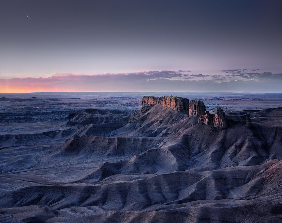
Hi Robert,
Thank you for sharing wonderful image.
I really like the composition - the edge of the hills guides my eyes to the peak of the mountain. That's very nice. And details are well-described. It is well done.
As for the moon, it would be debatable. For me it is fine to keep the moon because the peak is facing to the moon. So, my eyes will follow to the moon and recognize it easily.
Also, I think that it is worth to spend 1/3 space to the sky. You also have dramatic light and cloud action, so, the moon + light + cloud action = worth to spare the space in my view.
Now what I am uncomfortable is the color.
For me, it is too saturated. Dominant color is blue, and I would say it represents more than 80% in the image. If you use color picker in PS, there are lot of spots showing saturation value of more than 80%. 80% is not that bad but if those spots exist here and there, you need warm color to offset it. Since there is little space showing warm colors, my eyes will be tired quickly and cannot stay in the image very long.
For my practice, I edited it myself. This is purely personal taste though.
I de-saturated blue but increased red saturation. Then, I pick the color of red in the peak (made it a bit darker) and brush in the hills very slightly.
|
Oct 6th |
 |
| 96 |
Oct 21 |
Reply |
Thank you, Bob for your comment. I have been struggling to structure the story for years, too.
Now I am trying to think why I picked up THE subject. In your case, why did you pick red dahlia as a subject. You would have many other subjects to shoot around you. But you picked this flower. What interests you? That might be a starting point to come up with a story.....I might be wrong though.....
I personally respect your ability to broaden others perspectives by proving different outlook/cropping/advice/suggestions. It is really helpful for me to think differently. |
Oct 5th |
| 96 |
Oct 21 |
Reply |
I am very sorry to hear that, Bob, you have constant pain. I do hope that you recover from it soon..... |
Oct 1st |
| 96 |
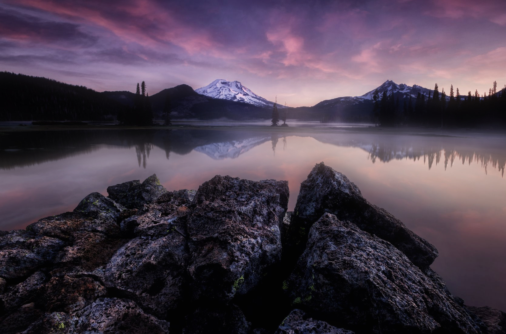
Oct 21 |
Comment |
Wow! This is excellent, Dan. Well done.
This is just like a winning images I have seen in the landscape photo contest in the past.. It is sharp throughout, crystal clear, best light, and good compositions.
The foreground rocks shows triangle/diagonal line to the mountain and you have 4 layers to enjoy my eyes - foreground, reflections, mountain, and cloud actions. It is filled with unique components but structured nicely.
I admire your patience of revisiting again and again to wait for the best scene. I think your effort now bear fruits. Congrats.
Having said that, starting from here, this is just my personal preference, so please bear with me for a moment.
At first, I am a bit uncomfortable to have a wider space in lower right. So I would crop a bit.
Second, for me, the contrast/clarity is a bit strong. Especially the clouds has very strong impact. I like the fog/mist at the back and would extend it to the pond by Gaussian Blur. Also I would desaturate the sky and soften it. This would deliver a different story. I am attaching my attempt here.
I am just manipulating it without being at the spot so my comments might not be valid.
|
Oct 1st |
 |
| 96 |
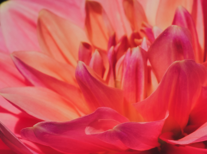
Oct 21 |
Comment |
Hi Bob,
Thank you for sharing.
I agree with keeping the color in the case.
For me, it is important what story would you like to deliver through the image. When I looked at your image, it looks old, not fresh flower because it has a lot of dark shade. If that was your intention, then, you are successful in that sense. (Maybe you might want to describe it - then we can tell you that your goal has met or not)
But when I looked at the original, it looks very beautiful.
The color is delicate and sensitive pink.
So if I were you, I would keep the delicate and subtle color as much as possible.
I would not increase the contrast, nor clarity, rather, I would decrease the contrast and desaturate it a bit.
In terms of cropping, I like your cropping. It emphasizes the beautiful petal side by side and it looks 3D.
I am attaching my attempt here, overall, I make it more fantasy...
This is just my personal taste. |
Oct 1st |
 |
| 96 |
Oct 21 |
Comment |
Hi Cheryl,
Thank you for sharing. This is very interesting.
I admire your challenge spirit.
This is my first time to hear/look this photography but I do like the concept personally.
I think your intention of get attention on the tree at the back by guiding the eye along the path is successfully done here in my view. I particularly like the S curve of green path just before the tree at the back. Since the vertical trees are reasonably blurred, it does not look so busy in my eyes.
Having said that I have a couple of points here for improvement in my eye;
1. vertical line is blocking the path (as illustrated attached)
2. I prefer to see trees in left side in foreground, which balance the white trees in right side (as illustrated attached)
3. Yellow portion in middle left is distracting my eye in guiding to the main tree at the back. Maybe it is too bright.
But overall, your first trial has good potentials. |
Oct 1st |
 |
6 comments - 8 replies for Group 96
|
11 comments - 10 replies Total
|


