|
| Group |
Round |
C/R |
Comment |
Date |
Image |
| 96 |
Aug 20 |
Reply |
Thanks. I did crop some off the left from the original, trying to balance the large dark element of the rocks with the lighter distant landscape. It maybe could use some more tightening. |
Aug 16th |
| 96 |
Aug 20 |
Comment |
This is a nicely balanced, very satisfying scene, beautifully seen and rendered. The bold colors in the sky complement the grays of the church and the muted hues in the meadow. I think the tonality is very natural and pleasing. Not to get too metaphorical, but it could be interpreted as the church being a bridge to the glorious heavens above.
Did you also get any photos of the comet? |
Aug 16th |
| 96 |
Aug 20 |
Comment |
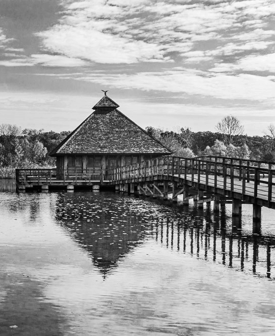
I love the patterns and textures and the bold graphic elements of the rock, water and pier. The perspective and dominant lines in the rocks do lead my eye to the strong line of the pier, then to the structure at the end. But it's so close to the edge that I'm led right out of the picture. The very bright sky at upper left combined with the dark upper right also draws my view to that part of the image and off the edge. I'm always hesitant to get into "what ifs" but I wonder if there's a location just to the left where the lines of the rock would lead to the right and the line of the pier would circle back to the left with the pier more centered. |
Aug 16th |
| 96 |
Aug 20 |
Comment |
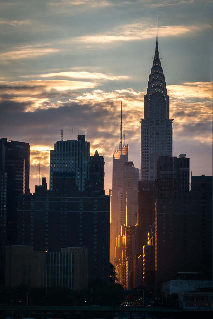
Nicely done. I do love cityscapes at night, New York City never disappoints on that score! I particularly like the quality of the reflections on the water. There's a lot going on in this image, pretty much unavoidable with such scenes: bridges, skyline, isolated tower, water reflections, all begging for attention. This photo brings it together well, but they are all so strong it's a little hard to decide where to look. I agree with the previous comments, the large areas of blank sky at the top right are distracting though and the suggested crops are an improvement. One small detail that's distracting to me is the slight tilt of the tower on the right, easily straightened in most post-processing software. I'm also struggling with the dark bridge pier at the left. I realize cropping the image from that side would also remove part of the Brooklyn Bridge but that big dark element does draw my eye away from the light. |
Aug 16th |
| 96 |
Aug 20 |
Comment |
I like the mood of this photo, a calm and pleasing scene with some nice textures. I agree with the comments so far about the tonality -- it's a bit flat.
However, I might go in a different direction with the composition. While I like the quality of trees and reflections on the left, I feel the relatively large areas of blank sky at upper left and water on the lower left draws attention from the main subject, the cabin and walkway leading to it. I might consider a different (radical?) crop that concentrates attention on the subject and adds interest with the clouds in the sky and quality of the water. That also makes the walkway a very strong leading line.
I also wonder if in the B&W conversion there might be some room to enhance the contrast in the sky and water by adjusting the luminance in the color channels, primarily the blue and aqua likely. |
Aug 16th |
 |
| 96 |
Aug 20 |
Comment |
Nicely done! It all works well together. The golden aspens shining through the darker forest and misty snowfall is magical. I like the strong diagonal composition and vertical trees leading our eye to that clearer outcrop with the lovely texture and topped by a darker stand of trees. Can't think of much I'd change, though somehow I want to stretch it out horizontally a little into a more panoramic aspect (but maybe always starting with the 3:2 rather than 4:5 aspect ratio is messing with my mind). |
Aug 4th |
5 comments - 1 reply for Group 96
|
5 comments - 1 reply Total
|