|
| Group |
Round |
C/R |
Comment |
Date |
Image |
| 6 |
May 20 |
Comment |
Love the color of those flowers! And the diving bee is fun. I agree that it would be cool to zoom in more on the bee, and maybe see its head instead of its backside -- but they don't seem to take direction well. I like Janet's crop. I think it could stand to use some brightening too. |
May 12th |
| 6 |
May 20 |
Comment |
Thanks for the comments. Knocking down those highlights certainly improves it. I'm trying to decide about the cropping. Losing the bright corner is an improvement, but I still like seeing a bit more more of the leaf.
Alas we moved from the house with that pond. We built one at our new house too, but haven't had frog babies yet. |
May 10th |
| 6 |
May 20 |
Comment |
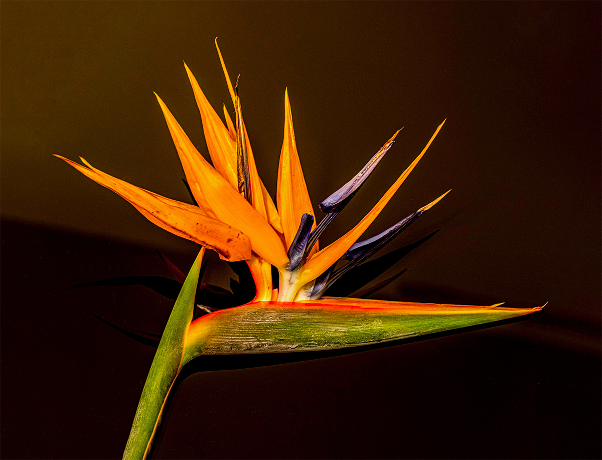
Nice portrait of an amazing flower, I can't resist birds of paradise! I mostly agree with the comments already mentioned. I think the orientation is good but I feel the flower is crowding the edge a little, I'd like to see a little more room around it.
Not sure what you're using to edit. The clone stamp and spot healing brush tools in Photoshop worked pretty well to remove the distracting elements in the background. In addition, the crop tool expanded the edges using the content-aware fill option, which worked kinda like magic with almost no additional manipulation because the background is simple. Lightroom spot removal ought to work as well, but it wouldn't do the edge fill so well. |
May 10th |
 |
| 6 |
May 20 |
Comment |
I like this, I can almost taste the sprouts (which I like but too lazy to do myself) and nicely composed and presented. I'd agree with Dick's comments, certainly strengthens to remove the bottom of the jar. I'm struggling a bit with the cloth backdrop; it's a great pattern and provides a nice complement of form and color, on the other hand it's a little busy and distracting.
What was the lighting? Seems a little flat and bright in the center. |
May 10th |
| 6 |
May 20 |
Comment |
Nicely done. I love the sharpness and precision, which matches the subject well. One doesn't even need to know what this is, there is a sculptural quality to many tools which is a great example of the blending of form and function.
I do feel the image overall is a bit busy, not sure where my eye should land; maybe try it on a plain background? Also, a couple of distractions are the writing on the bottom and the green detail at the top which draw my eye out of the frame. |
May 10th |
| 6 |
May 20 |
Comment |
This is lovely, the black background makes the forms and color really pop. |
May 10th |
6 comments - 0 replies for Group 6
|
| 27 |
May 20 |
Comment |
I love the idea of this. It's a difficult shot technically because of the very low light. Death Valley is an amazing place with incredibly dark skies since it's remote and dry and provides the opportunity to juxtapose the dramatic landscape with starry skies. Looks like you had some moonlight or remnants of twilight to illuminate the landscape, which is balanced nicely in composition and tonality though the light is fairly flat. Even the clouds add a sense of depth and mystery.
I think overall this would be more effective if it were left darker though, so that it would appear as night or deep dusk rather than looking like it's daylight. That would likely reduce the prominence of the noise too, which is unavoidable in low light with high ISO and long exposures. I'd also try some noise reduction in post-processing; the latest versions in Lightroom and other software are surprisingly effective. Some DSLRs include options for in-camera noise reduction, and there are techniques such as image stacking that Becca mentioned, which can also help but adds complexity in the field and post-processing.
But bringing down the brightness would also increase the overall contrast, which I think would make for a more dramatic rendering and make the stars pop out even more clearly in the sky. It can be difficult to balance the tonality of the sky and landscape but is certainly possible in Lightroom, etc. using brushes, etc. Let me know if you want me to provide an example of some adjustments.
And I like your comment at the end, I try to make photos with a night sky backdrop behind dramatic landscapes to hint at our place in the universe.
(I'm not a member of this group but Becca asked me to comment.) |
May 8th |
1 comment - 0 replies for Group 27
|
| 96 |
May 20 |
Comment |
Lovely image. Yosemite is such a magical place and you captured a feeling there beautifully. The light on the leaves make them pop from the misty background and the colors are terrific. I agree with most of the comments above. In the original crop, the top of the tree feels chopped off, but I agree that leaving the sky doesn't work so well, and the tree on the right is pulling us out of the frame. I like Cheryl's crop; I'd rather that was accomplished by reframing in the field rather than Photoshop magic, but of course that is not practical. |
May 10th |
| 96 |
May 20 |
Comment |
I like this very much, great mood of the stormy weather and the retro feel, well seen and rendered. And what a terrific grain elevator -- it's weathered a lot of storms. I also like the balance between the large elevator and the smaller buildings, gives a nice sense of scale. I'm not usually a fan of fancy borders but this feels appropriate. I am struggling a little with the telephone pole on the right edge, it upsets the balance a little and draws me out of the frame. Part of me wants more space to make it a more integral part of the scene, another part wants it cropped out, but I guess that would have no place for the wires to go, but that's all rather minor. I love the reflection, though I wonder about darkening the sky a little there, it seems just a bit unnatural for the reflection to be the same tonality as the sky. |
May 10th |
| 96 |
May 20 |
Comment |
I don't really have much to add, I agree with most of the comments above. I like the scene overall and the mood of the serene sunrise. I too feel the color is fairly monochromatic (mostly a result of the strongly filtered sunlight) and tonality a bit flat. My eye is drawn to the details on the left side, boat and dock, which I feel are not really helpful for the main idea of the image; I like Cheryl's suggested crop. |
May 10th |
| 96 |
May 20 |
Comment |
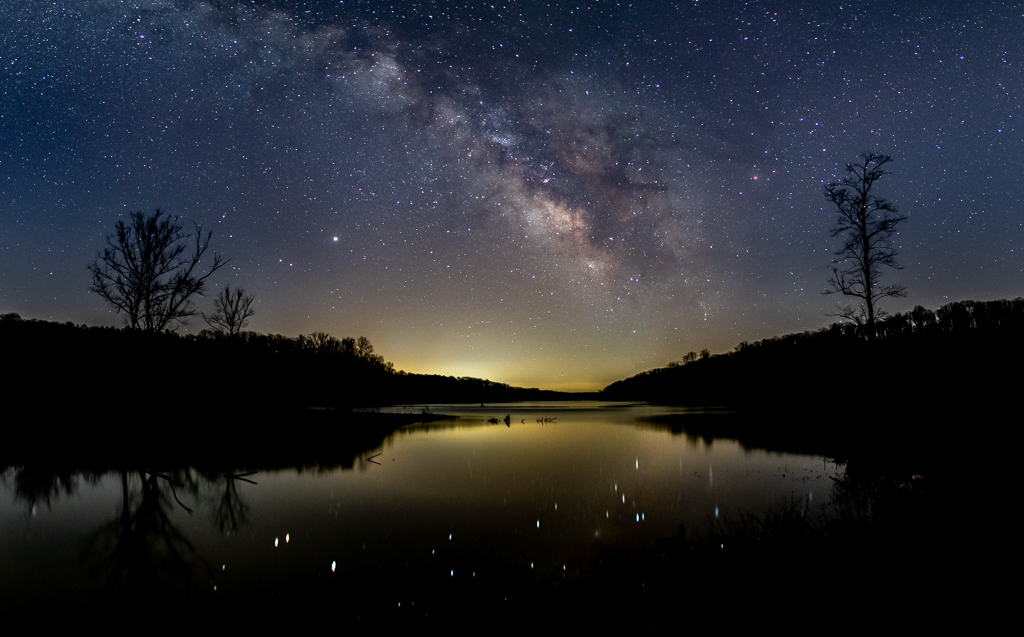
Thanks for the comments, I pretty much agree with all the suggestions, will take that into account for the future. These are of course rather difficult to process without going too far. The Milky Way is marginal at best from this location so requires fairly aggressive adjustments. |
May 10th |
4 comments - 0 replies for Group 96
|
11 comments - 0 replies Total
|
