|
| Group |
Round |
C/R |
Comment |
Date |
Image |
| 40 |
Dec 20 |
Comment |
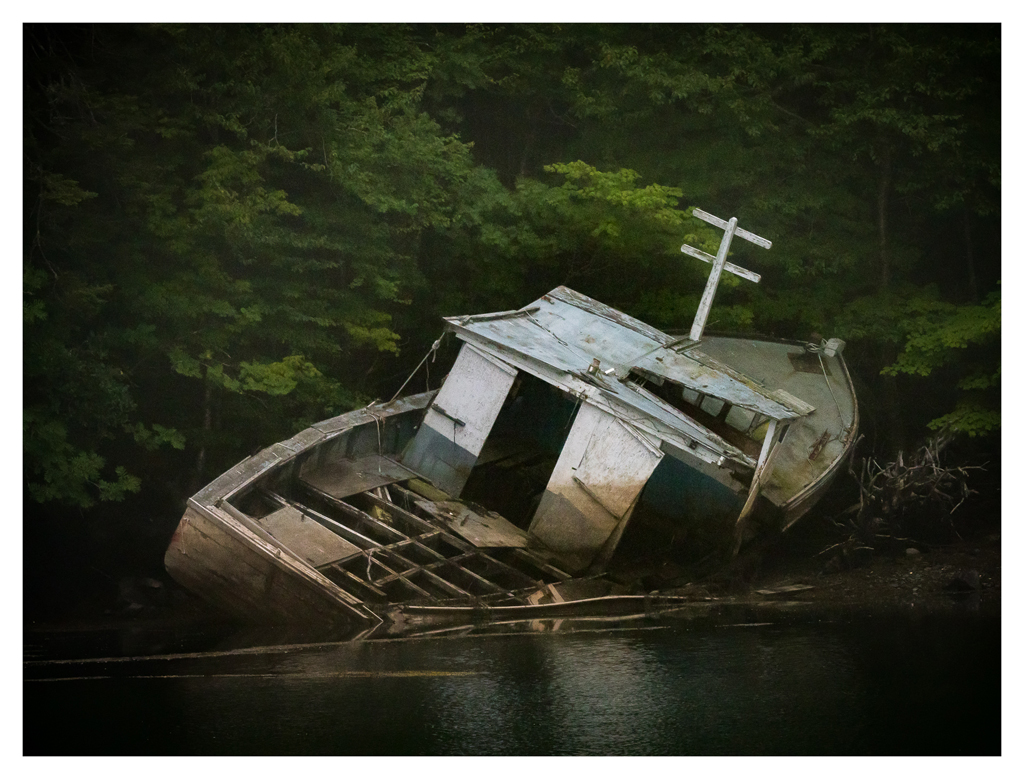
Hello Catherine you have chosen another nice abstract. The pastel colors create a soothing scene. I like that you didn't place the horizon in the center, it is much more interesting this way. I am a bit distracted by the reeds. Perhaps try and long exposure version and see if you like the blur, or content-aware clone the reeds out. |
Dec 20th |
| 40 |
Dec 20 |
Comment |
Hi Jamie! What immediately grabbed me the most in this photograph was the warm color scheme. The composition and color scheme is very moody--love that! I really like this scene. The only little nit picky thing I would add is a slight bit more ground on the bottom. |
Dec 20th |
| 40 |
Dec 20 |
Reply |
Thank you |
Dec 20th |
| 40 |
Dec 20 |
Reply |
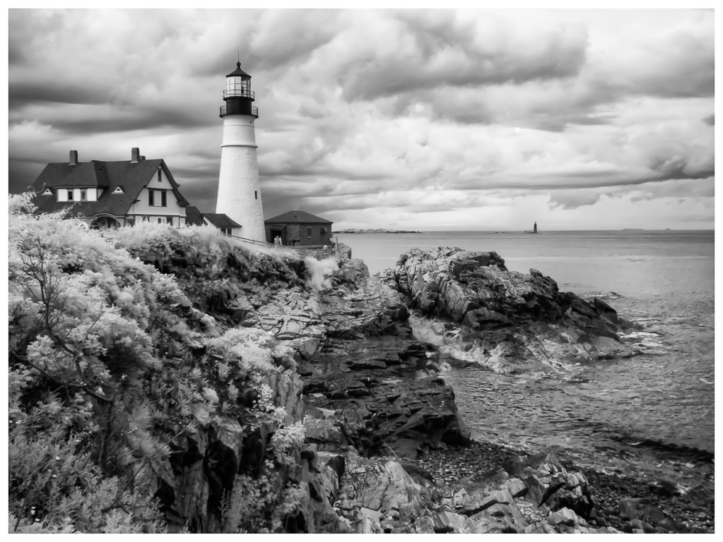
I think the composition needs more sky like you said. I hope I can get back and do a vertical pano. |
Dec 20th |
| 40 |
Dec 20 |
Reply |
I definitely agree on the shadows. |
Dec 20th |
| 40 |
Dec 20 |
Reply |
Hello Andrew! You are right about the image being quite pale. I think I need to go back to the original and adjust black and white levels. I am going to a post re-do this winter. Yes, need to remove the red spots too. It is so easy to go to far especially when you are new to photography, those sliders are quite tempting LOL! |
Dec 14th |
| 40 |
Dec 20 |
Reply |
Hi Henry! I totally agree with you that this photo is over sharpened. Being new to digital photography when I took this, I took editing too far (over sharpened). I hope to go back to this location now that I have more knowledge. |
Dec 14th |
| 40 |
Dec 20 |
Comment |
Hello Henry. I like that this image tells a story and that the story is not too difficult to understand. I immediately knew the location and the event, a good thing. It did hold my interest as there was a lot to look at, also good. I agree that including the tower would improve the composition, but also I feel that cutting off the subjects feet adds a bit of tension. Like the image I submitted, I think this might have been a good one to do a vertical pano and stitch it together. Personally I often struggle and get overwhelmed by a busy scene and in the excitement to capture it, I do not take the time to think about what options I have that would improve it, yup hindsight is 20/20! I am a little distracted by the yellow objects on the railing of the foreground walkway. Maybe you could desaturate the yellow of them? Not any easy fix, but perhaps others could suggest solutions. The other thing I would try when shooting a large and busy scene try using a larger aperture say f4 and focus on the main subject (the person with the green costume). If possible bracket the aperture so you can choose later in post which one really works best. I think bracketing is an option we don't use as much and it does have its merits. For me, I would like to see more separation between a very busy background and the main subject. By using a large aperture, the viewer would focus on the subject more. A slightly out of focus background would still give enough detail as to the location, but it would also make the main subject pop more. I bet you had a lot of fun in Venice and saw lots of interesting scenes. |
Dec 3rd |
| 40 |
Dec 20 |
Comment |
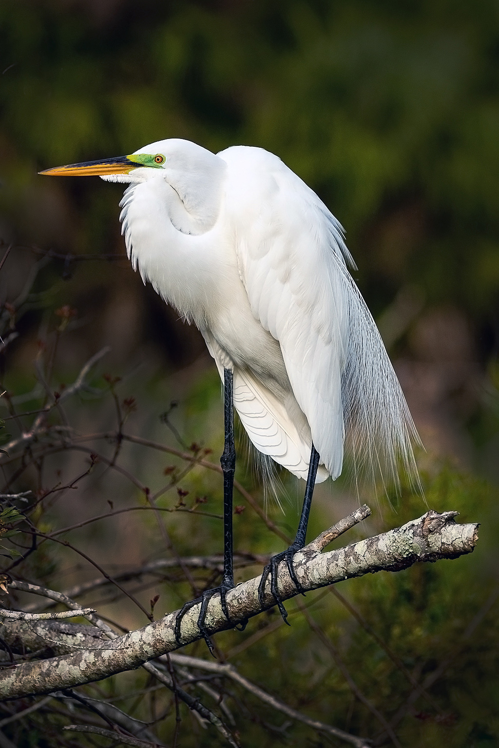
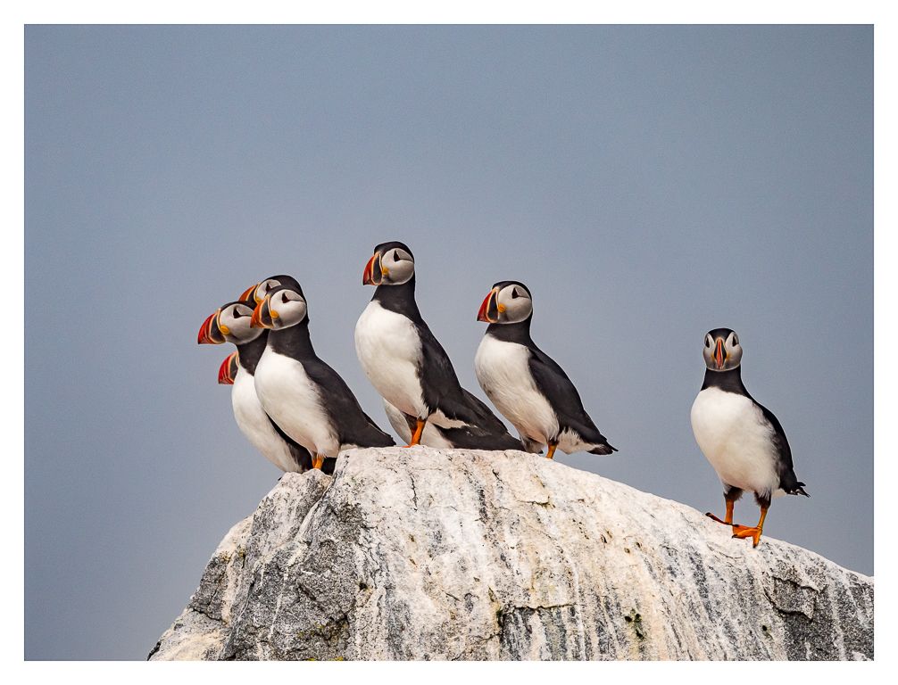
Hello Andrew. Love that you captured the interaction of this interesting seabird. I have not seen this variety. We have Gannets in the Northeast, but they are different from these. I do know they can be quite noisy! I feel like the image is a bit contrasty. Did you use any particular filter? There is some detail lost in the texture of the feathers and I wasn't sure if this was from a skylight filter that softened the image because you do have a fairly high shutter speed and that should have made the details more sharp. Sometimes cheap filter soften images. Unfortunately, good filters are quite pricey. I would try a polarizing filter or ND filter to cut down the contrast. The color looks good and very natural. Have you tried to bring down the highlights on the birds themselves? Perhaps try adding structure or texture to the birds? Are you a PS user or LR? I do agree that they are cropped too tightly, it adds tension to the image when the objects are so close to the edges especially with wildlife. Give them some flying room would be my suggestion. I really like the choice of subject. |
Dec 3rd |
4 comments - 5 replies for Group 40
|
4 comments - 5 replies Total
|