|
| Group |
Round |
C/R |
Comment |
Date |
Image |
| 40 |
Nov 20 |
Reply |
Hi Julie and thanks for your comments. I attached a second cropped image and also darkened the blacks. I really like both images for different reasons. |
Nov 24th |
| 40 |
Nov 20 |
Reply |
Thank you Jamie! I do love to break the rules lol!
|
Nov 24th |
| 40 |
Nov 20 |
Reply |
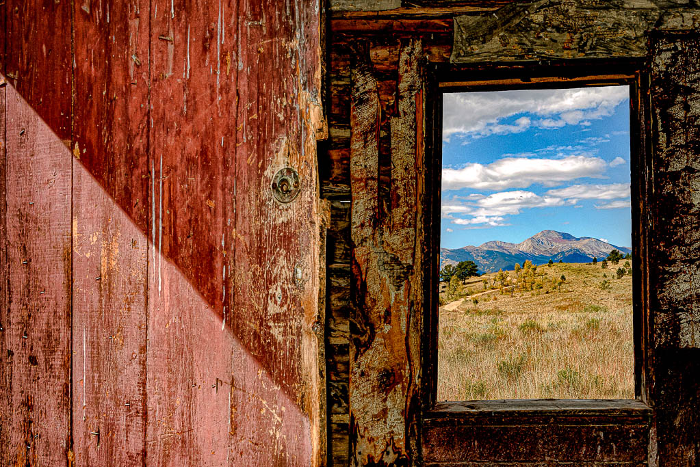
Hello Andrew and thank you for your comments. Here is another version of the same image only I increased the blacks. As you can see, I cropped this one differently. Personally, I like both for different reasons. I think I will print both of them and see which one wins me over. |
Nov 24th |
 |
| 40 |
Nov 20 |
Reply |
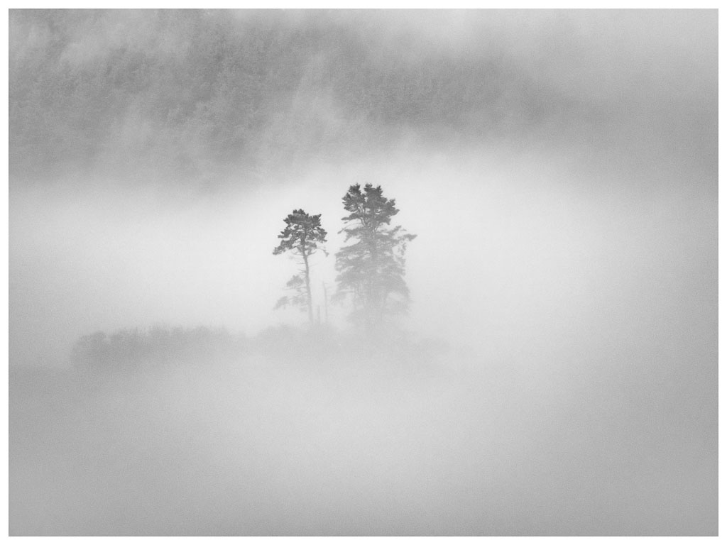
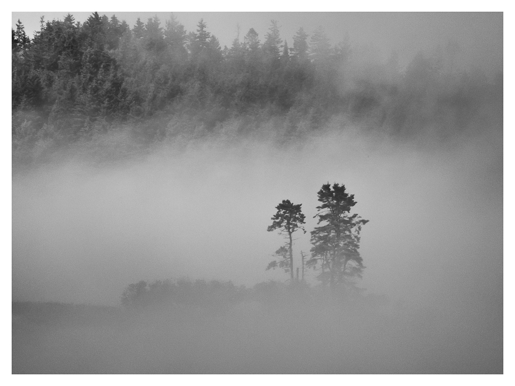
Thank you for your comments. I did not chose to vignette this particular composition since it was already dark. I guess I am not concerned about the image being a bit flat since that is natural for a foggy scene. I was focused more on the mood the fog contributed to the whole. |
Nov 24th |
| 40 |
Nov 20 |
Comment |
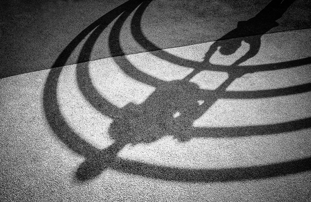
Love this abstraction! I think what also makes this a very interesting image is the juxtaposition of warm and cool colors. Like Henry said, this image has a very impressionistic style. Well done. |
Nov 18th |
| 40 |
Nov 20 |
Comment |
Love this! I am a big fan of backlight compositions as well as very graphic images. I really think warming the image up worked well for you. I think this is one of your stronger images. Nice job! |
Nov 18th |
| 40 |
Nov 20 |
Comment |
Hi Jamie, I have seen many photographs of the Palouse and I hope to visit the region in the next couple of years. I love the composition! I also agree with Catherine and Henry about bringing the exposure up. I wouldn't vignette this photo either. I would also play around with the vibrance slider. Was it a bit smoky out there? I know this past year there have been many wildfires out west and the smoke has even traveled far east of there. You might also play with the white and black points to see if you increase the depth. The smokiness makes the photo a bit flat. I bet you got lots of nice shots out there. Love to see some others in future.
|
Nov 18th |
| 40 |
Nov 20 |
Comment |
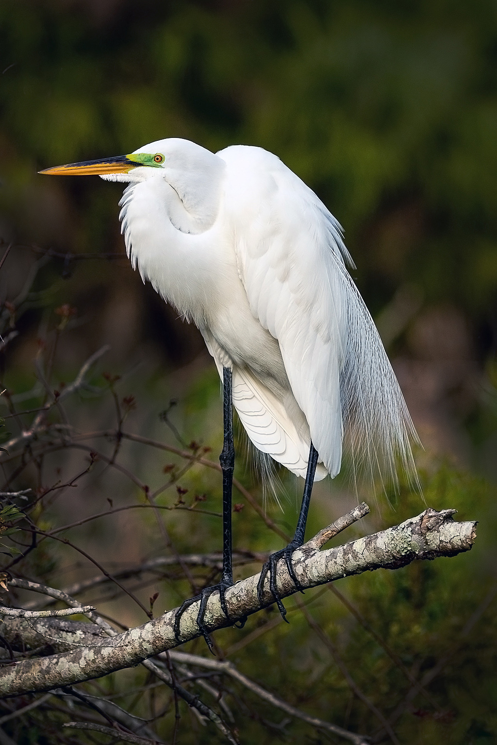
Hi Henry, What a pretty Orchid you captured. The color is great. The details appear sharp and the lighting even. I wonder if you tried to content aware the part of the leaf that is in the frame on the bottom. I think it might be stronger without it, or if you photographed the entire leaf, maybe include it as well.
What is a Contax Digital backed camera? |
Nov 18th |
| 40 |
Nov 20 |
Comment |
Hi Julie, I love that you captured some of the Spoonbills personality and behavior. All white or all black objects are tough to control the lighting, but you did a fairly good job. I might bring down the highlights a little bit to see if you can bring back some for the detail. I would use a large aperture in order to blur the background of the net if you shoot them again. You did a great job getting the birds eyes in sharp detail. |
Nov 18th |
| 40 |
Nov 20 |
Comment |
Hi Andrew, I agree with both Catherine and Henry about the red valve being a distraction and the crop being too tight. Are you familiar with the content aware clone tool in PS? Perhaps, you might try cloning it out, if that does work make it a selection and drop the saturation. |
Nov 18th |
| 40 |
Nov 20 |
Reply |
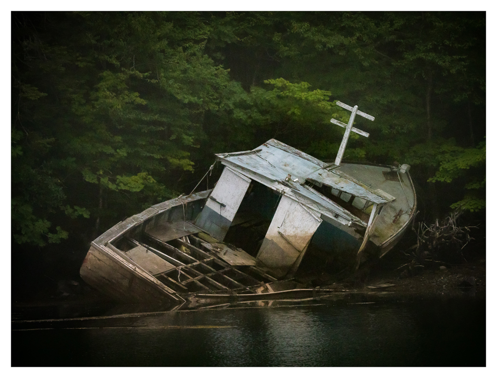
Thank you. I am going to go back in and edit the crop a bit. |
Nov 18th |
| 40 |
Nov 20 |
Reply |
Thank you. I too wish the trees were not centered. |
Nov 18th |
6 comments - 6 replies for Group 40
|
6 comments - 6 replies Total
|