|
| Group |
Round |
C/R |
Comment |
Date |
Image |
| 40 |
May 20 |
Comment |
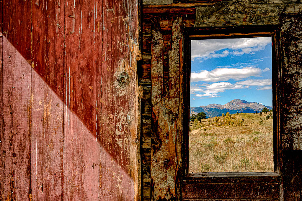
Hello Catherine! Your abstract photo is very interesting. I am torn between the black and white and the color, but I am leaning towards the color. I love the muted colors in the color version. I love the rhythm and motion of this image created by the diagonals. Henry had a good suggestion about using a tighter crop. I would agree with him. Fun image! |
May 20th |
| 40 |
May 20 |
Reply |
Hi Catherine! I am going to re-edit this photo and bring up the exposure to see if I like it better. |
May 20th |
| 40 |
May 20 |
Reply |
Thank you! |
May 20th |
| 40 |
May 20 |
Reply |
Hi Linda! Thank you for kind words. I edited this image almost three years ago and wish I could remember what filter I used. I need to start adding notes to images I edit. |
May 20th |
| 40 |
May 20 |
Reply |
Thank you for your input. I may re-rework this image over the next few weeks and will see what it looks like if I add a bit more brightness. |
May 20th |
| 40 |
May 20 |
Comment |
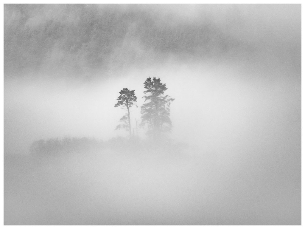
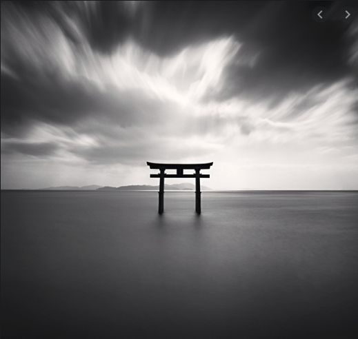
Hi Jamie! Being a graphic designer, I am very drawn to this compostion because of its graphic qualities. I definitely think it is much stronger in black and white than color. Love the low horizon and the drama to the clouds. I also like the lone tree in the bottom left-hand third. The landscape format works well for me. I wonder if you took out the rock and replaced it with more grass using the clone tool or rubber stamp, that it might make your composition stronger. Odd numbers of subjects are typically more interesting than even. Take a look at English photograper Michael Kenna's work in black and white, your compostion reminds me of his work with lone subjects. I am attaching one of his more popular photographs from his 'Japan' series. He is hands down my favorite photographer. Nice job.
Photo credit Michael Kenna |
May 7th |
 |
| 40 |
May 20 |
Comment |
Hello Henry! What an exquisite orchid with an attractive color. I would like to see more separation between foreground and background. I suggest a few ways to achieve this when you can go back and reshoot it. Try adding a vignette to the edges, and in PS add a blur to the background. You might also try using a flash to light the orchid. If you own a macro lens you would be able to get more separation. Being quarantined we are limited and it is not always easy to find new subjects we are excited about, but this is a super subject would revisit over and over. Love, love, love Orchids. |
May 7th |
| 40 |
May 20 |
Comment |
Hi Julie! I like the perspective of the scene and the use of a vanishing point. Love the soft pastel colors. I am distracted by the green tree in the upper left foreground, perhaps removing it would be of value. I have also wanted to try this line art filter in Topaz. The geometric buildings seem like a good choice for the line art effect. Can you remove the diagonal lines in the top part of the compostion? Overall, I like what is going on and the line art gives the composition a pop art feel. |
May 7th |
| 40 |
May 20 |
Comment |
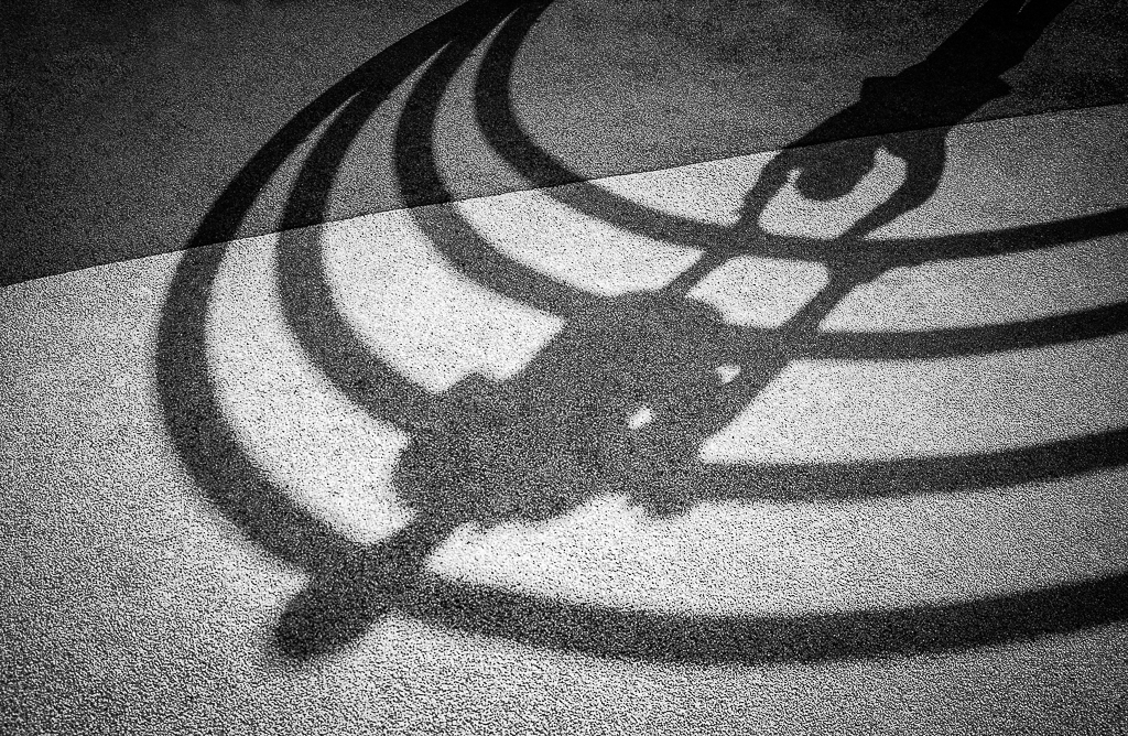
Hello Andrew! How lucky to have visited Keukenhof last year. I hear it is amazing. Your image is an interesting abstract composition. I like the division of sections. I am a bit distracted though by the far right. I think I might crop out the sky and and tree. The organic shape of the tree doesn't seem to fit in with the geometric design going on and the lighter sky tends to draw my eye to it. The main interest is certainly the geometric patterns. If you did crop out the far right then you would have three main areas of interest and as you know three is more interesting in a composition than four. Another thing I like is how long the composition keeps my attention. Love how the shadows create another shape. There is a nice 3-d effect with depth created by the shadows and wood beams. You have a good eye for design! |
May 7th |
| 40 |
May 20 |
Reply |
Hello Julie! Thank you for your input. As far as the border I needed something to define the composition in space since the background is dark against the black background. I do tend to add a white border to all my photos, I could make it smaller though. I think the fog softened the image overall. Your comments are valid and I suppose it is why I am kind of torn about this image. Thank you. |
May 7th |
5 comments - 5 replies for Group 40
|
5 comments - 5 replies Total
|