|
| Group |
Round |
C/R |
Comment |
Date |
Image |
| 75 |
Oct 23 |
Comment |
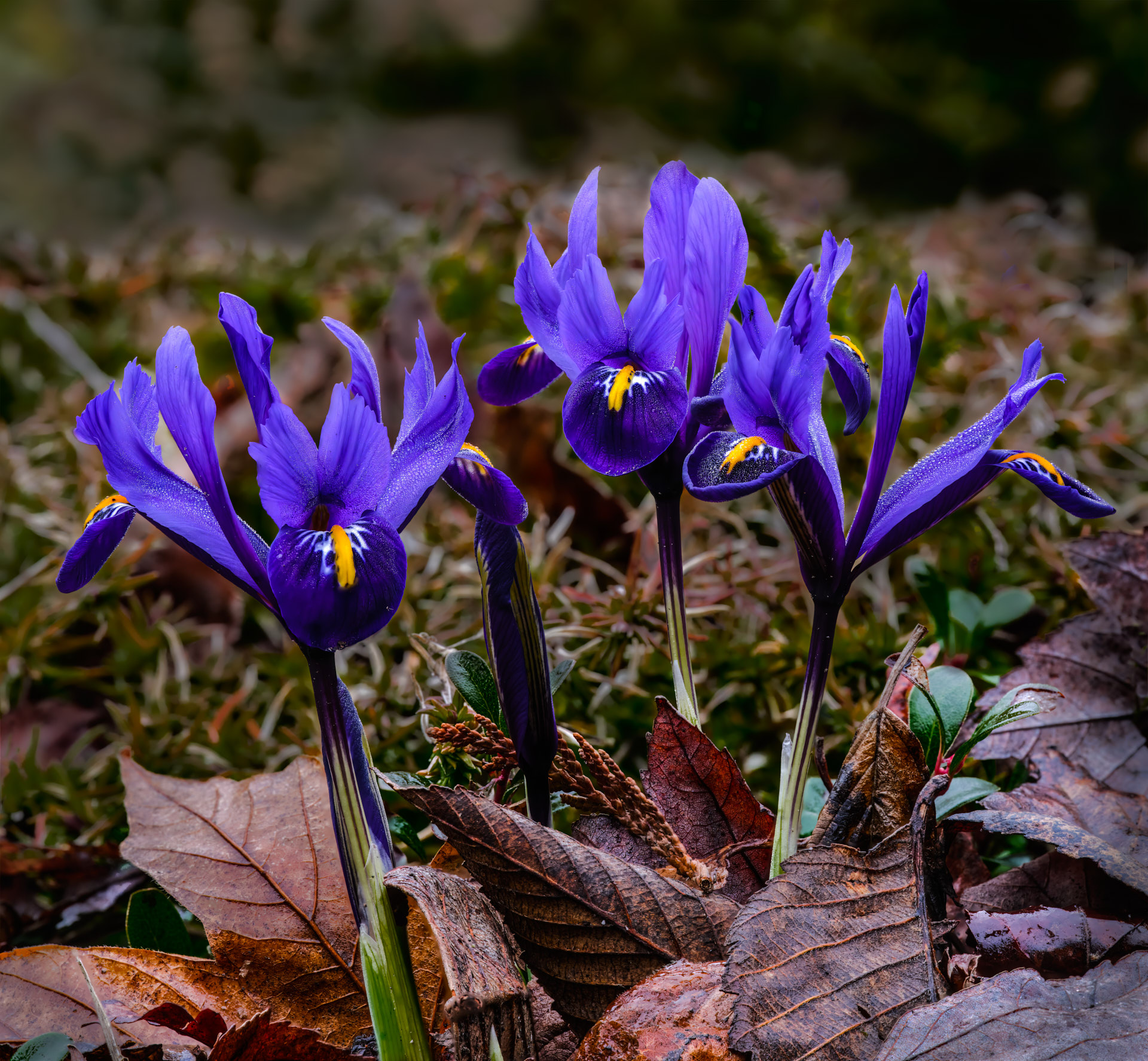
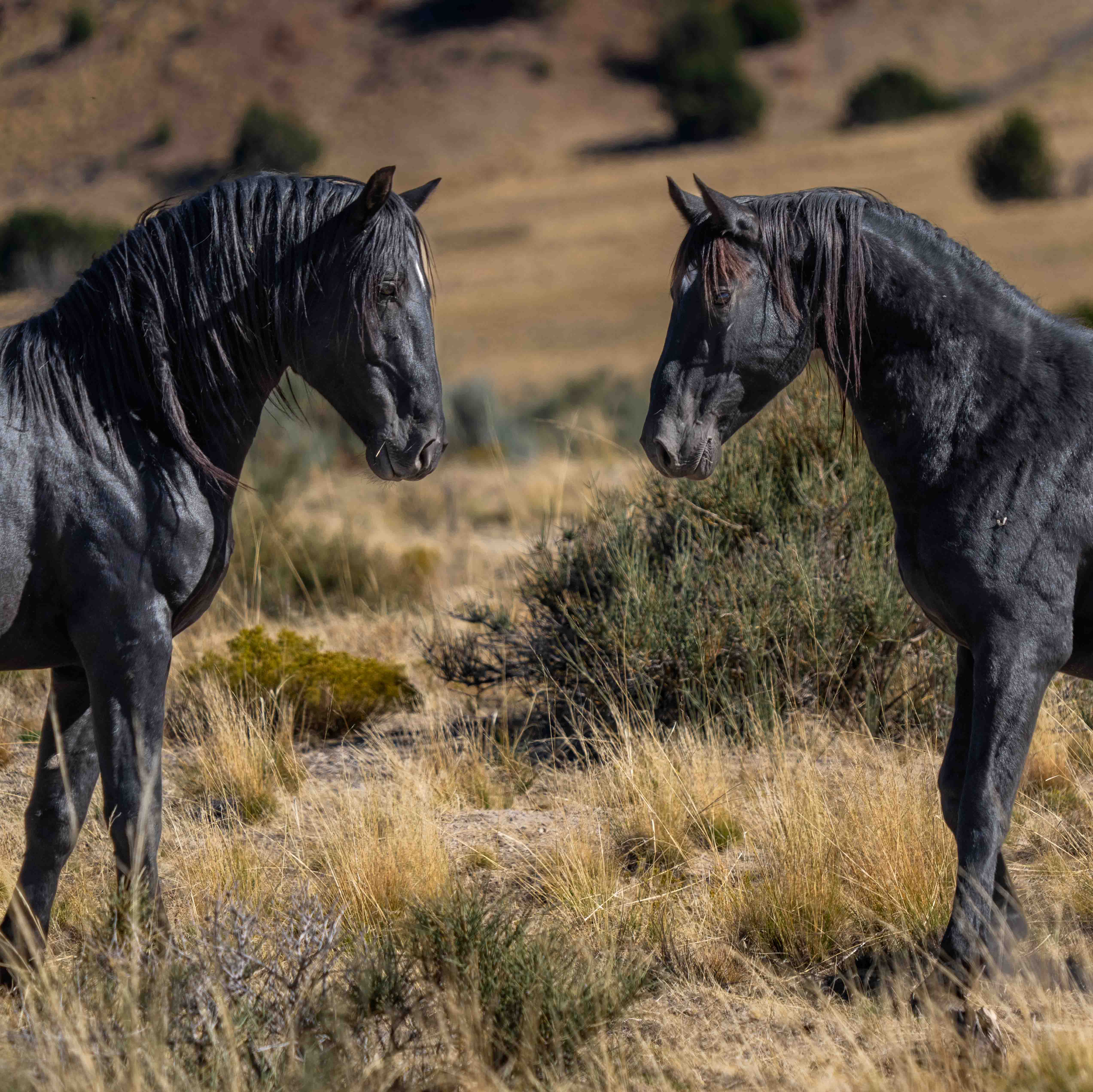
Thank you Vincent. I chose to keep some luminous in the background to add more of a dimensional frame. Choices and choices who knows which is best. |
Oct 23rd |
| 75 |
Oct 23 |
Comment |
Thank you Vincent. I chose to keep some luminous in the background to add more of a dimensional frame. Choices and choices who knows which is best. |
Oct 22nd |
| 75 |
Oct 23 |
Reply |
Makes sense Murphy. |
Oct 18th |
| 75 |
Oct 23 |
Reply |
Makes sense Murphy. |
Oct 16th |
| 75 |
Oct 23 |
Reply |
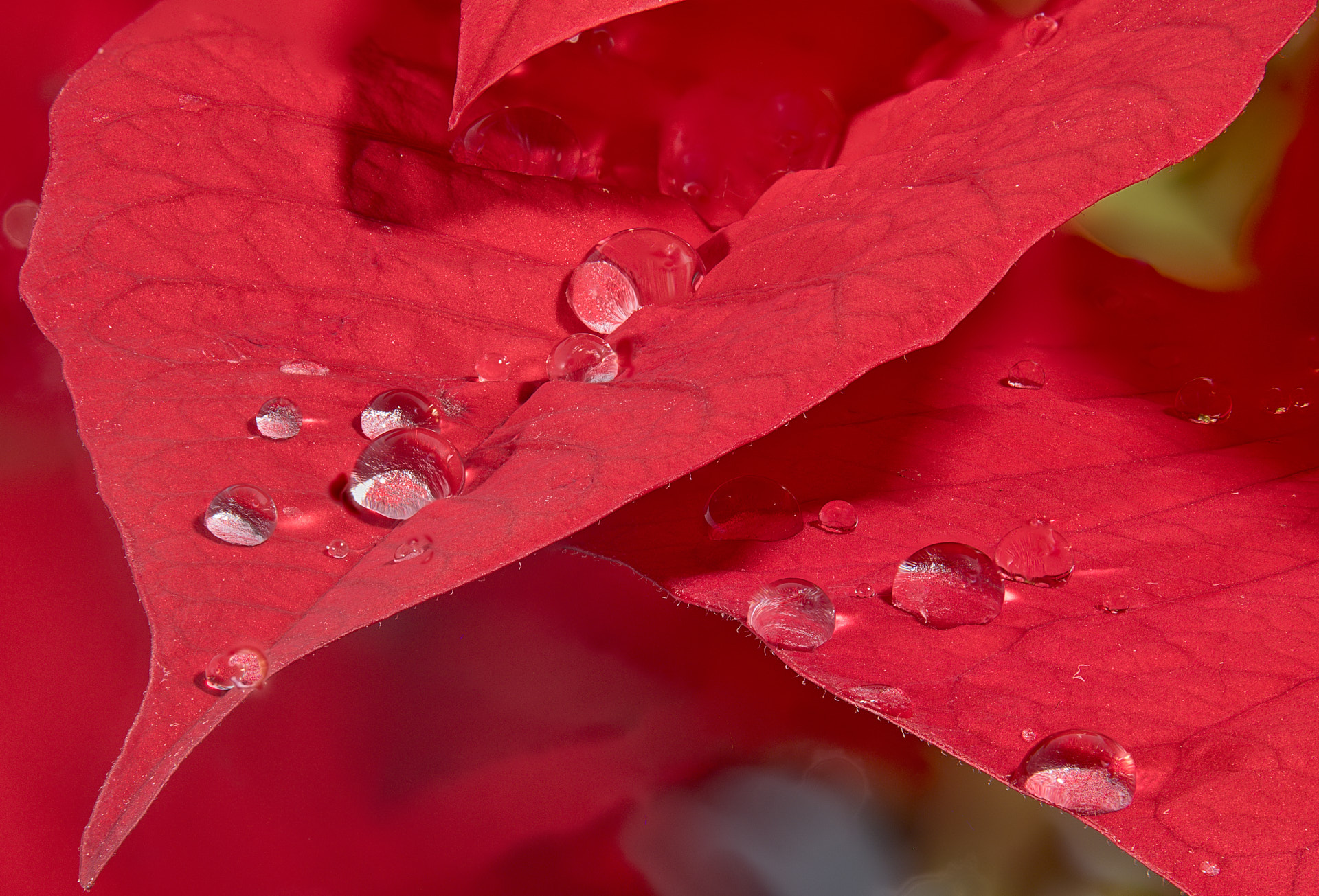
I think the jpg compression over saturated the red because my Tiff is closer to your rendition and the background is smoother without the blotches. That is my guess unless someone can add some better insight. |
Oct 13th |
| 75 |
Oct 23 |
Comment |
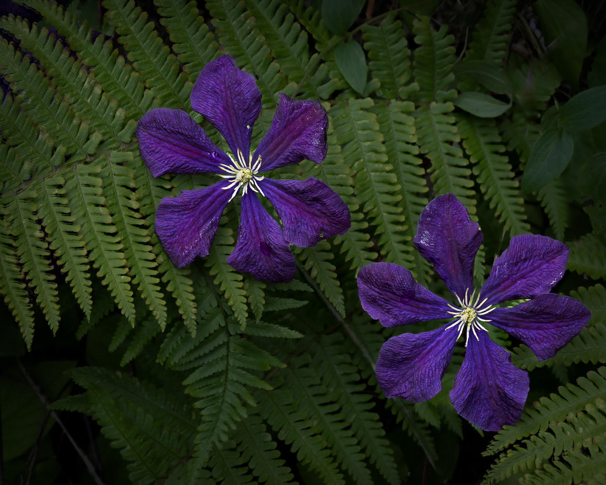
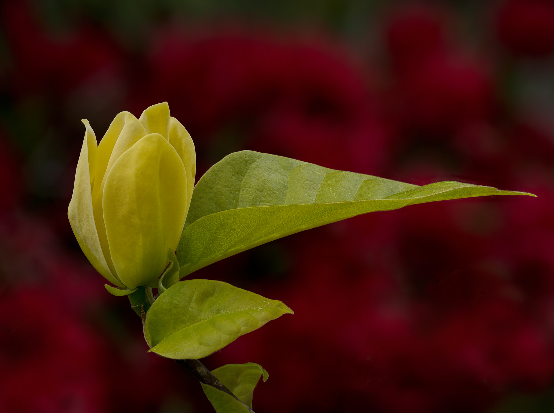
I agree this is very creative and your techniques are quite advanced. I would also classify this work as an abstract and very well done. I would never have guessed this is a rose of sharon bloom, but that is okay too. |
Oct 8th |
| 75 |
Oct 23 |
Comment |
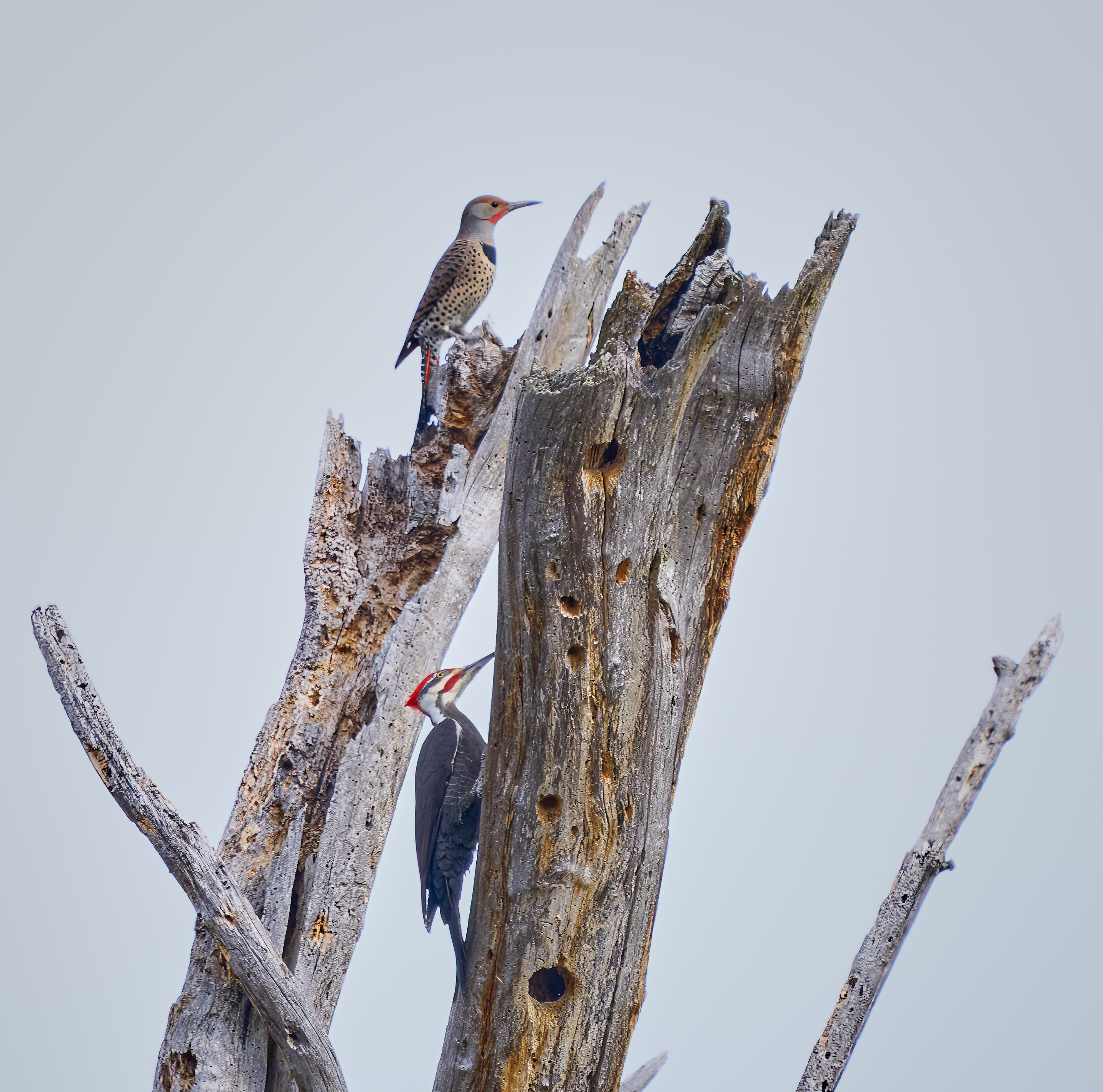
Raymond, for me the disconnection is a little distracting as I do not know which group to look at. I do see some slight background foliage, but do not see any of the stems If you could connect the two groups I think the image would have more impact. Right now it is more of a abstract, which is fine if that is your end goal. |
Oct 8th |
| 75 |
Oct 23 |
Comment |
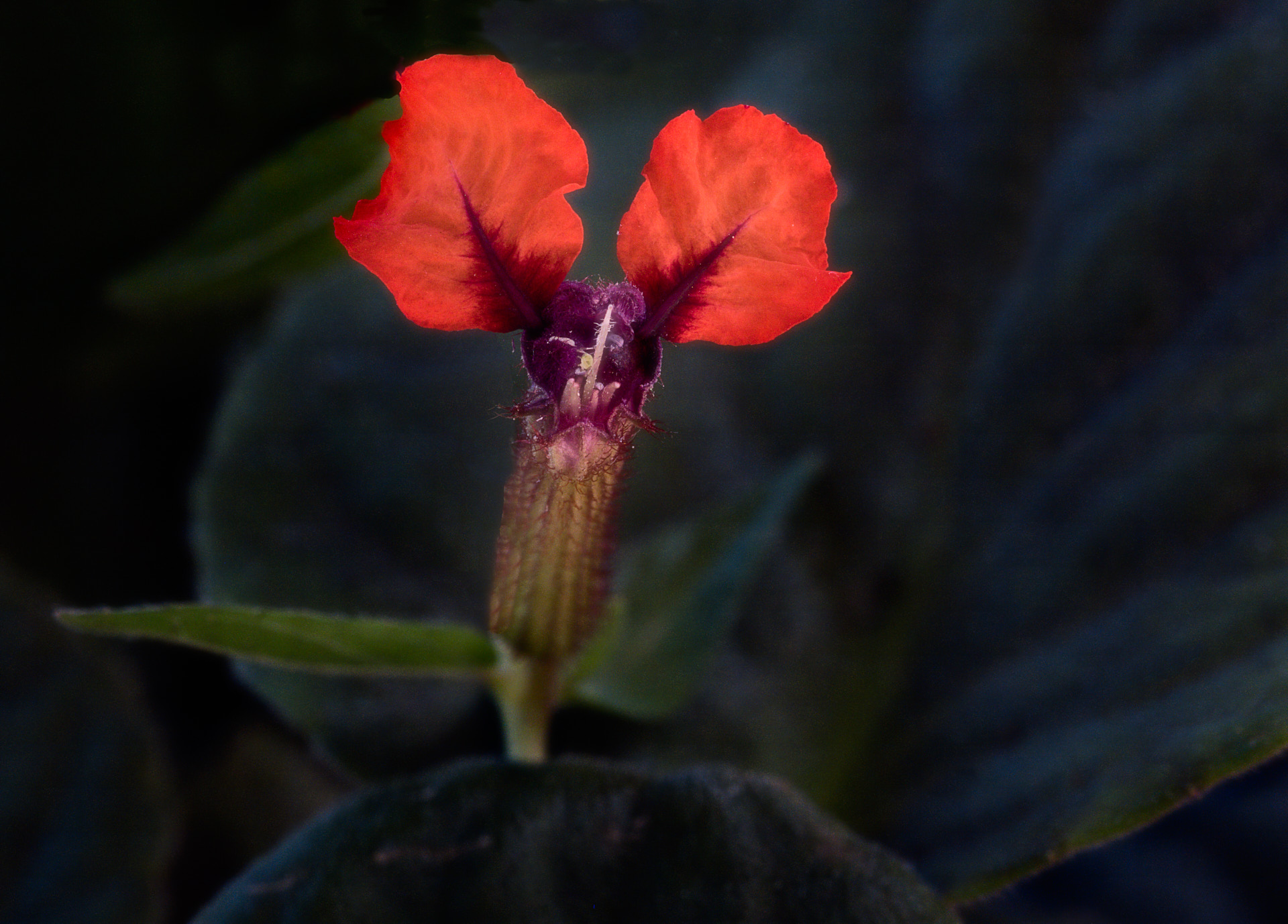
Gaetan, I tend to agree that more dof would be desirable for this flower portrait. In the past, I have used a flash with a focus stack for indoor projects, although you should always do several sets, as the lighting can be marginally different during the stack series and will make the assembly difficult in post. Well executed project. |
Oct 8th |
| 75 |
Oct 23 |
Comment |
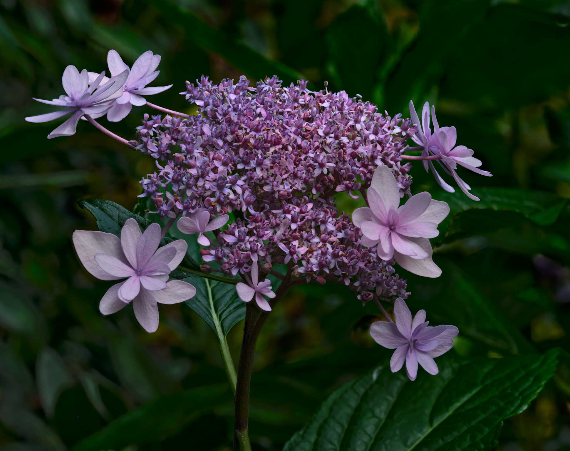
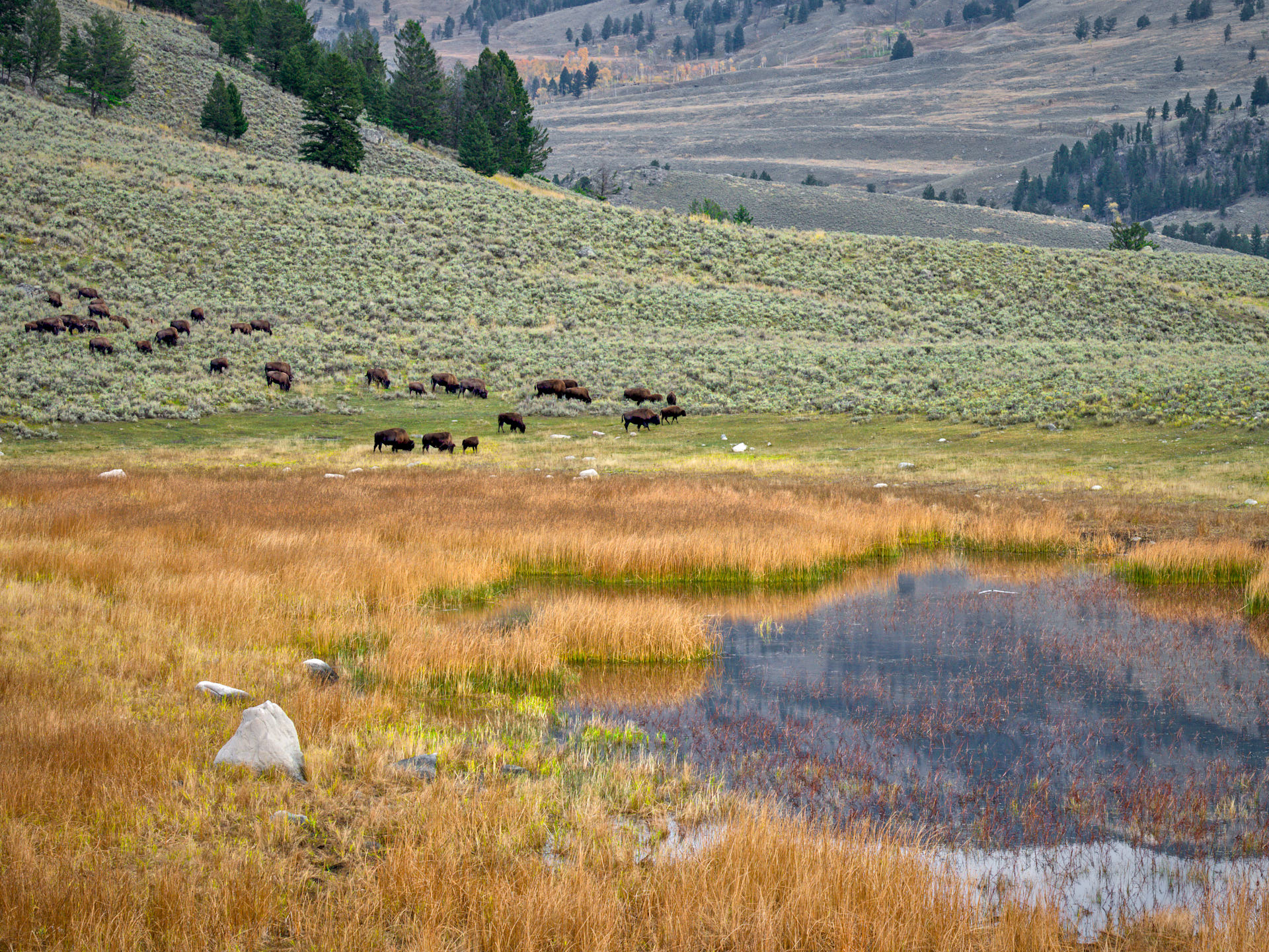
Well done Murphy and I like the effect of having a more natural grouping of blossoms. We often tend to get comfortable, at least I do, of capturing single blooms and seeing a more natural composition of very pleasing. Well executed lighting control wit hreh Photoflex. |
Oct 8th |
| 75 |
Oct 23 |
Comment |
I agree with Murphy and Raymond's suggestions and would add that the removal along the top of the spots and object would improve the nicely executed image. |
Oct 8th |
7 comments - 3 replies for Group 75
|
| 90 |
Oct 23 |
Reply |
Yes I use B& S, I guess I am referencing when I started and Palladium was very cheap compared to Platinum and since you used very little the cost per print was not significant |
Oct 13th |
| 90 |
Oct 23 |
Reply |
Thank you. No the colors were achieved by exp increase and contrast increase. I left the background bland to provide a blank canvas for the subject. |
Oct 13th |
| 90 |
Oct 23 |
Comment |
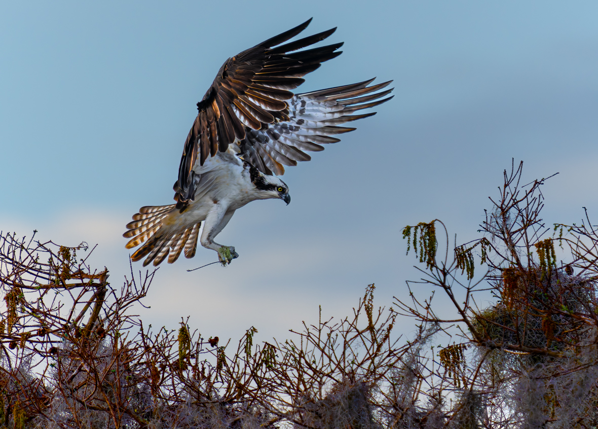
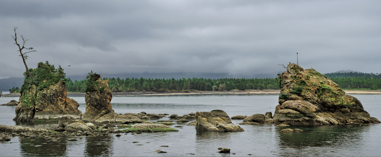
I think it is a great composition and well focused. My only minor suggestion is to perhaps give a little more space on the left for the flock to fly into. Well done. |
Oct 8th |
| 90 |
Oct 23 |
Comment |
I too am a P & P printer and also do some cyanotypes, although with the price of Palladium I have reduced my active work. I also like to do cym digital prints and then do a P & P with a digital negative registered on top to add the blacks and grays. Very nice composition and presentation. |
Oct 8th |
| 90 |
Oct 23 |
Comment |
Very nice portrait that creates a nice storyline. I am not sure the foreground left adds to the image and could be removed IMO. |
Oct 8th |
| 90 |
Oct 23 |
Comment |
Glad to hear you are on the mend. I like the composition and focus. A slight darkening of the background would add to the image IMO. Could be easily done in LR. Take it easy on the recovery. |
Oct 8th |
4 comments - 2 replies for Group 90
|
11 comments - 5 replies Total
|