|
| Group |
Round |
C/R |
Comment |
Date |
Image |
| 75 |
Sep 23 |
Reply |
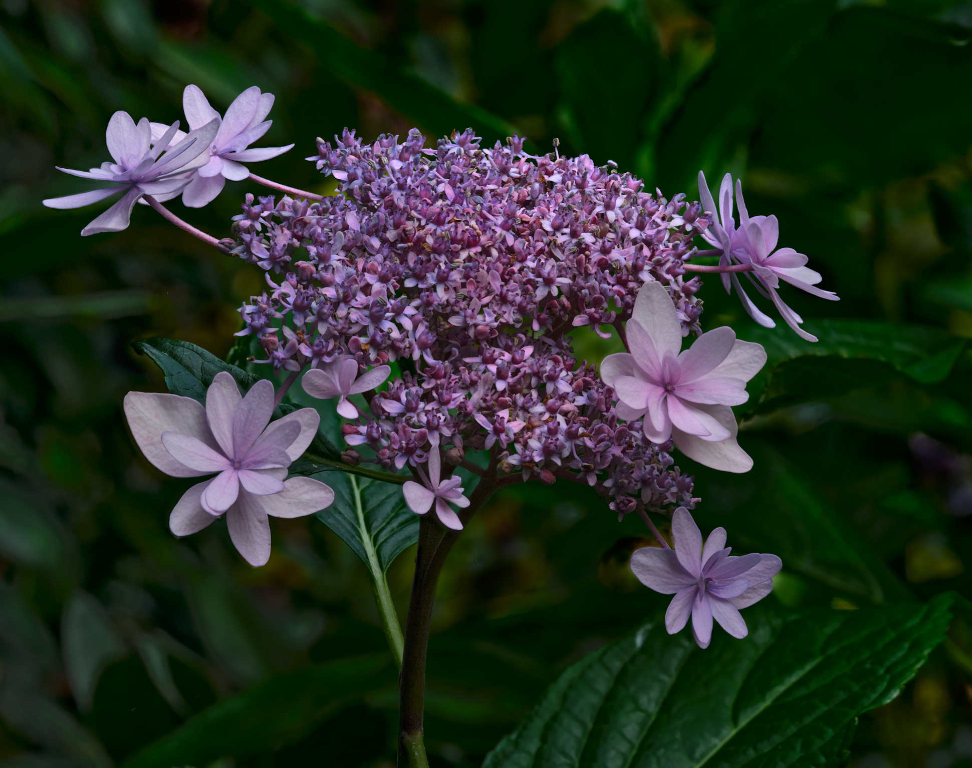
Thank you Judy for your thoughtful edits. I thought about moving the bottom blossom, but felt the compositional triangle was stronger, I do like making the bottom blossom larger though. thanks again |
Sep 9th |
| 75 |
Sep 23 |
Comment |
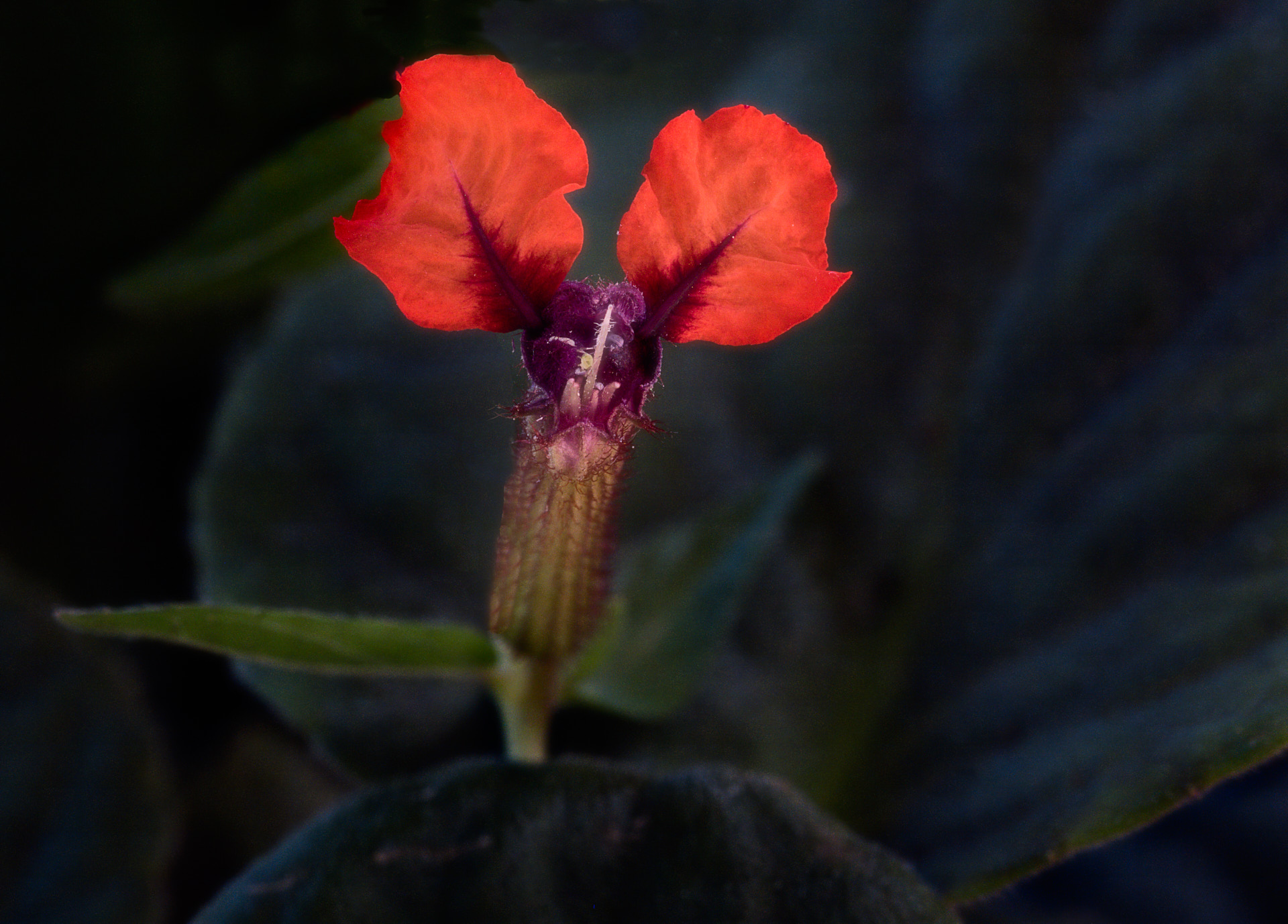
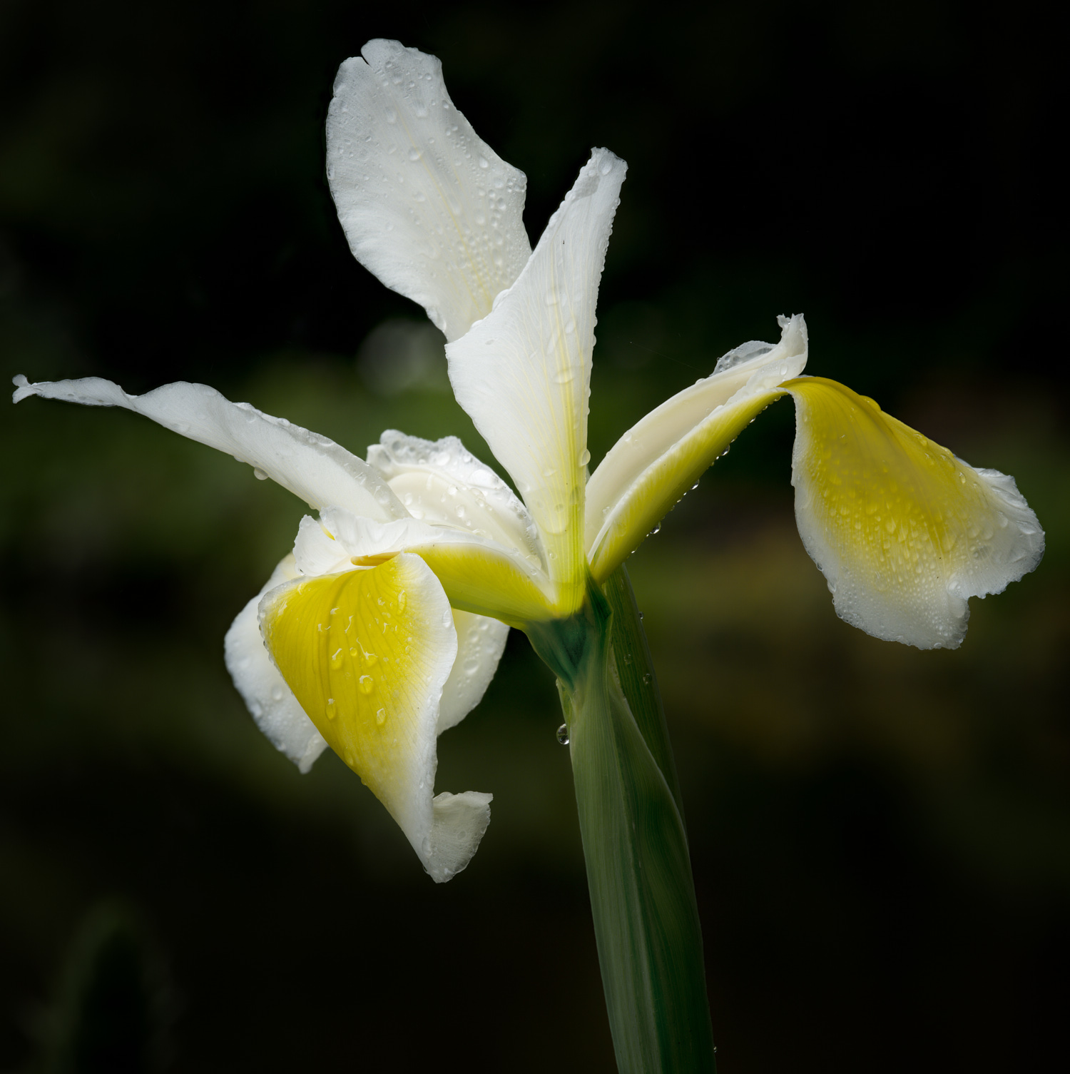
Mo, this is a very creative and fun image. Well executed for exposure and composition. My only critique is the water drops IMO detract from the creative colors you have provided. Really fun image. |
Sep 6th |
| 75 |
Sep 23 |
Comment |
Excellent technical skills demonstrated Ray. I agree with Murphy as I like the original crop and processed with your creative genius. |
Sep 6th |
| 75 |
Sep 23 |
Comment |
I agree with Murphy and would crop out the bottom of the glass so just the bottom of the bloom provides the base of the image. The highlights on the table are also not contributing to the image. The color combo is stunning, well done. |
Sep 6th |
| 75 |
Sep 23 |
Comment |
I like the rose/hydrangea combo Judy, I would never have considered putting these two species in an image, very creative. To me the background is the distraction and could be darkened. I like the crop as is though. |
Sep 6th |
| 75 |
Sep 23 |
Comment |
Very nice composition colors and exposure. To my eye the front of the arrangement might be a tad soft and some selective sharpening might help.
My only critique is the bloom on the right side and it's orientation. Except for the bloom right above it all of the other blooms are oriented either at or 180 degrees from the plane of focus. This one bloom is perpendicular and to me detracts from a very nice arrangement. |
Sep 6th |
| 75 |
Sep 23 |
Comment |
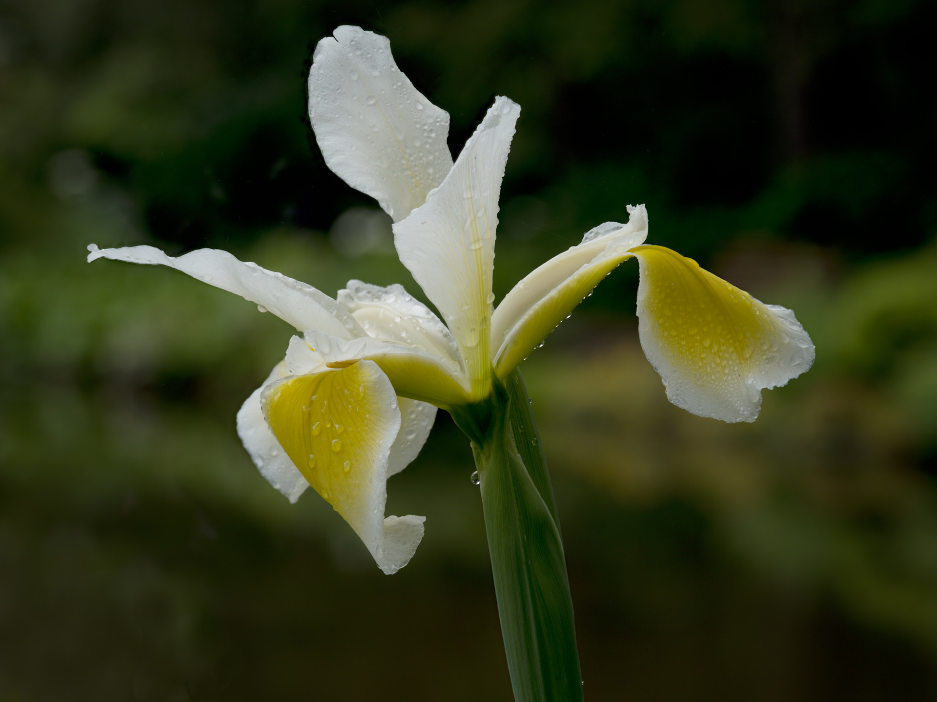
Nice colors and exposure Vincent. I agree with Murphy on the stems w/o flowers as they are a little distracting. Murphy's other comment related to the stem originating from the corner opens up an old debate about the use of corners in composition. I tend to favor the use of corners to start an element, but this has been much debated and often judges will score an image based on how they personally use corners in composition. |
Sep 6th |
6 comments - 1 reply for Group 75
|
| 90 |
Sep 23 |
Reply |
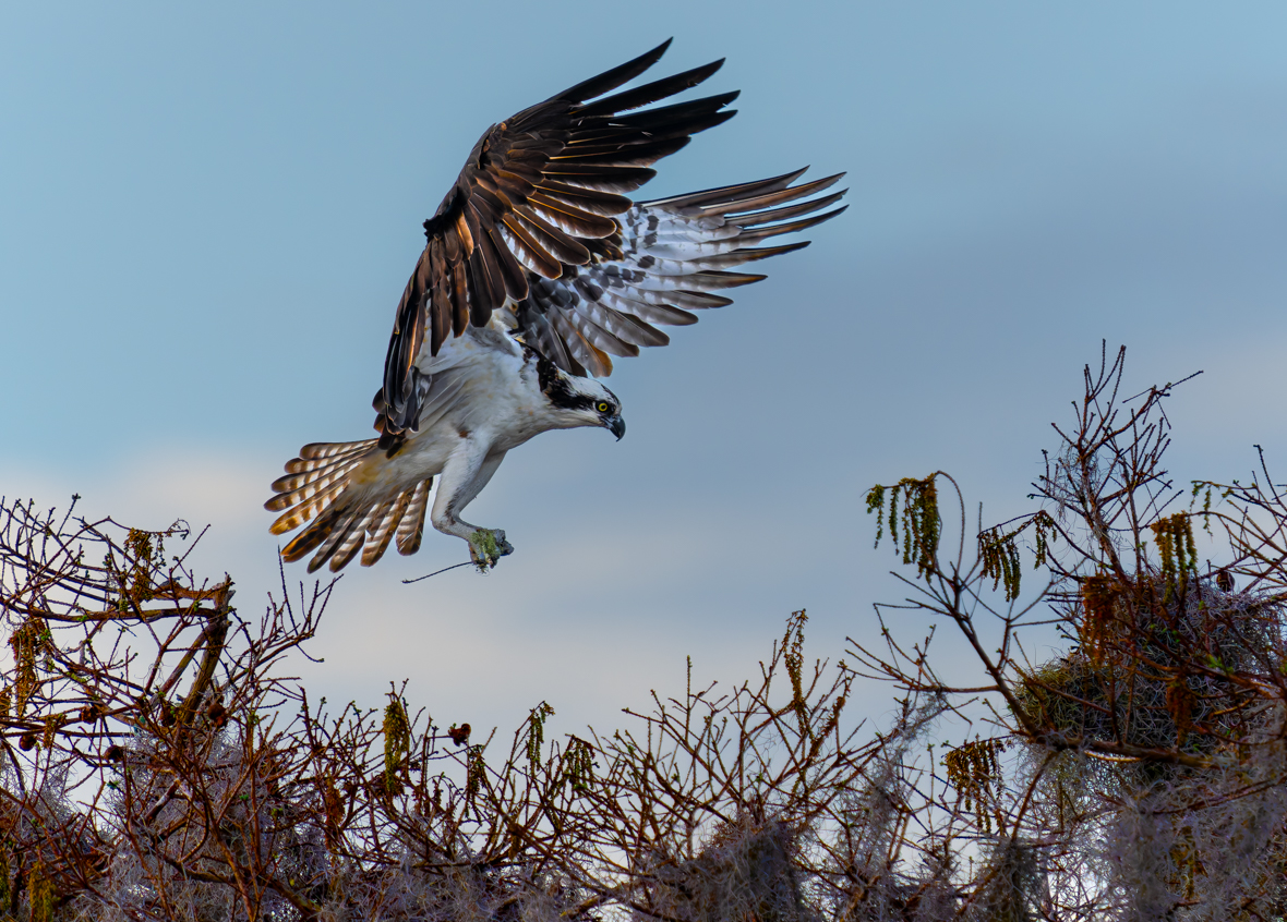
Thank you Tracy. As I recall bird eye focus did not work properly because of the distance and dark color. |
Sep 13th |
| 90 |
Sep 23 |
Reply |
Thank you Tracy. As I recall bird eye focus did not work properly because of the distance and dark color. |
Sep 12th |
| 90 |
Sep 23 |
Reply |
Limitations of Gigapixel |
Sep 8th |
| 90 |
Sep 23 |
Reply |
Limitations of Gigapixel |
Sep 7th |
| 90 |
Sep 23 |
Comment |
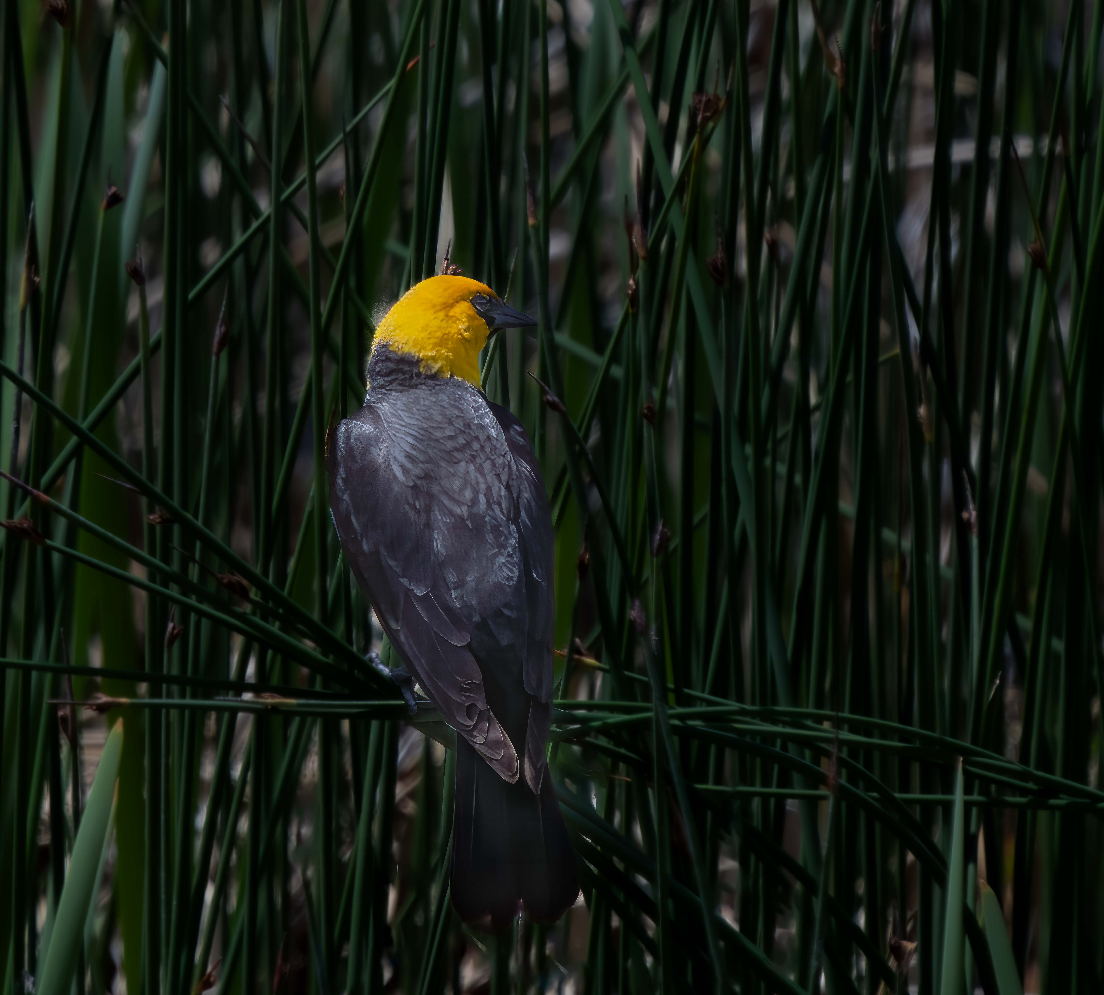
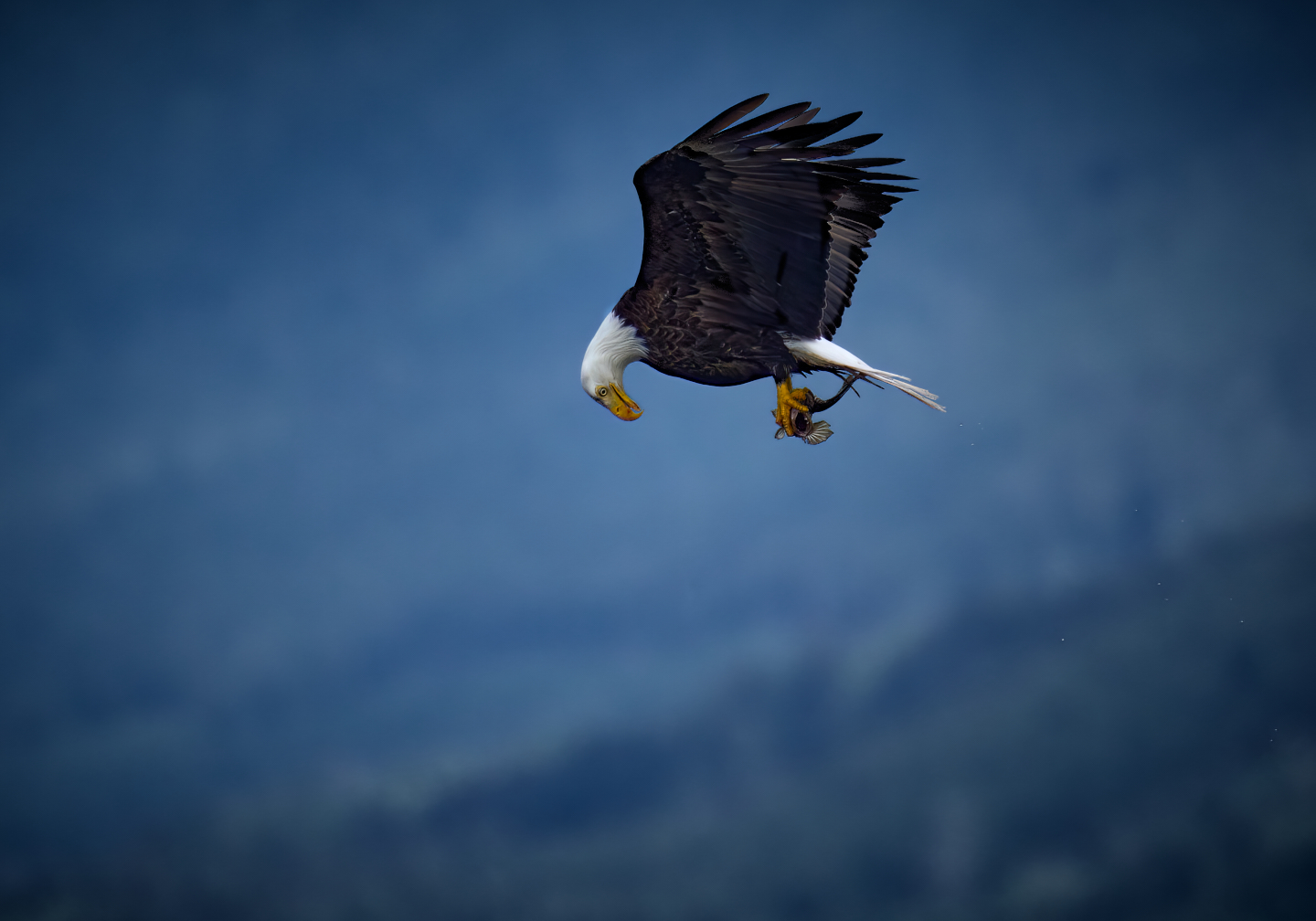
I agree as well. My only critique of a very nice capture is the non-subject areas are a little too contrasty for my taste. I would soften/darken them slightly to show of the glow of the baby birds downy feathers. |
Sep 6th |
| 90 |
Sep 23 |
Comment |
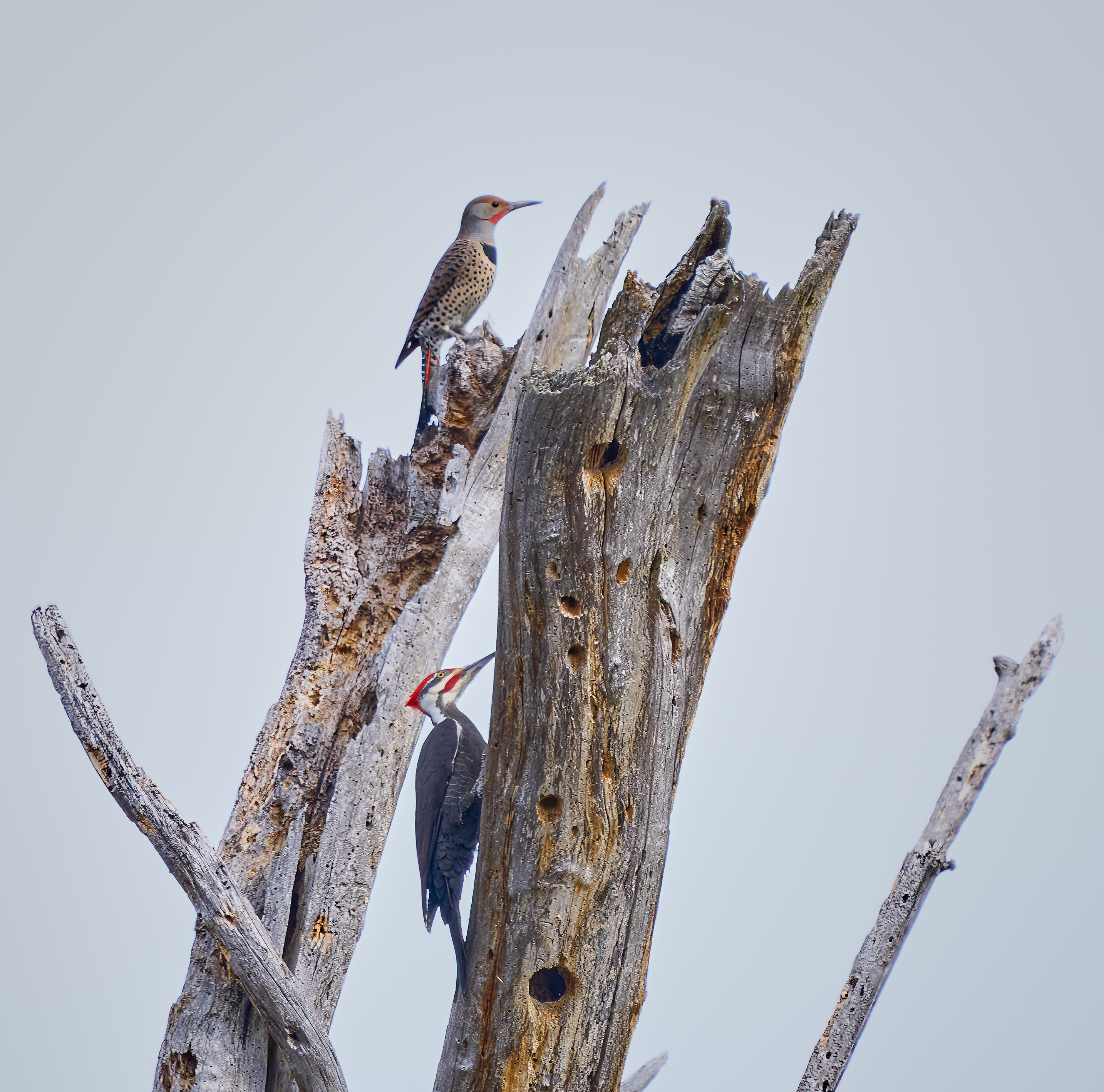
I like the mix of angles in. the image with the intersection of verticals and the diagonal. Maybe a little darkening to the backgroound to better distinguish the subject, but overall very nice. |
Sep 6th |
2 comments - 4 replies for Group 90
|
8 comments - 5 replies Total
|