|
| Group |
Round |
C/R |
Comment |
Date |
Image |
| 11 |
Jul 19 |
Comment |
The lighter lily pads in your "original 2" and Tom's version give best tonal separation between the three main elements in this picture (water, pads, blossom). |
Jul 21st |
| 11 |
Jul 19 |
Comment |
You started with an interesting presentation of a simple subject and made it impactful. Good work! I concur with cropping the gate. |
Jul 20th |
| 11 |
Jul 19 |
Comment |
Thanks for the suggestions. |
Jul 20th |
| 11 |
Jul 19 |
Comment |
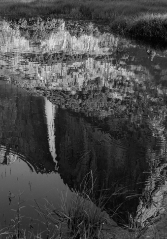
The waterfall is what drew you to the scene, but it gets lost among the many bright details in this wide frame. I suggest a narrow vertical crop and brightening the reflected waterfall. |
Jul 20th |
 |
| 11 |
Jul 19 |
Comment |
A good lesson in how side lighting (and expert processing) brings out texture, a feature that I often overlook in flower photos. Samsung should buy this image to advertise the camera in their phone. |
Jul 20th |
| 11 |
Jul 19 |
Comment |
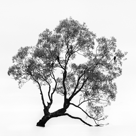
The standard framing of this scene has the classic balance of the two dark forms at the sides and sky and lake textures at top and bottom. With these elements removed there is too much empty space. The sprawling, organic form of your silhouette invites a tight square frame. |
Jul 20th |
 |
| 11 |
Jul 19 |
Comment |
Glad you recognized the monochrome potential in this well composed but washed out color shot. I like Jim's shading, it brings out more texture in the canyon floor. make a large print and display it proudly. |
Jul 19th |
7 comments - 0 replies for Group 11
|
7 comments - 0 replies Total
|