|
| Group |
Round |
C/R |
Comment |
Date |
Image |
| 2 |
Mar 25 |
Comment |
Thank you, Shirley. As I said above to Jim, photo stacking is always an option. One just needs the patience. |
Mar 11th |
| 2 |
Mar 25 |
Reply |
Thanks so much for your comments, Piers. You are correct in that my focus would have been better placed on the veins of the closest petal, rather than on the stamen. I will try the sharpen tool and see what I get. Otherwise, I'll look for another Chinese Lantern to photograph again. This was shot handheld as I walked past it. When shooting flowers, I know that I should spend time with each flower and shoot it from all angles, as well as different focus points. Lesson learned. |
Mar 11th |
| 2 |
Mar 25 |
Reply |
Thanks, Jim, for your observations. I rarely shoot flowers with a smaller f stop as my style is not to have my flowers crispy sharp. I think that takes away from their delicateness. That said, as Piers pointed out, my focus should have been on the veins of the closest petal and not on the stamen and then possibly change my f stop slightly. Otherwise, photo stacking is the only option to still get the bokeh that I wanted. |
Mar 11th |
| 2 |
Mar 25 |
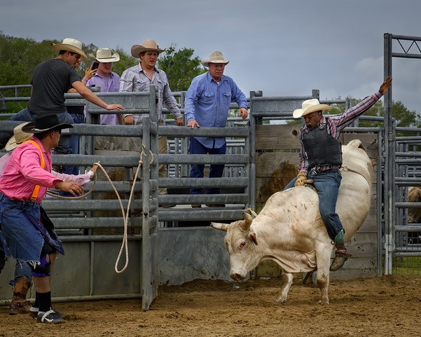
Comment |
You are masterful at shooting people in their moment! This is another great image. My first impression, also, was to darken down the background to remove those light color disruptions. Love your updated version. |
Mar 11th |
| 2 |
Mar 25 |
Comment |
Wow, Stanley, this is a great shot! I love the colorful dress against the black background. My only suggest would be to remove the 'ghost-like' figure on the viewers far left. Because he is lighter than the black, my eye gets pulled away from the dancers. |
Mar 11th |
| 2 |
Mar 25 |
Comment |
Welcome to the group, Yuxin! The colors in your image complement each other extremely well and the side lighting lifted the shadows throughout all the greenery. That said, I agree with both Shirley and Jim. When I look at your photo, I'm not sure what the subject is. Both branches show life and growth, so focusing on just one would have defined your subject. How do you feel about Jim's crop? Does it accomplish what you were looking for in the image you saw? Just as an aside, when photographing something tall, as your branches are, it might be better to shoot it in a portrait orientation. |
Mar 11th |
| 2 |
Mar 25 |
Comment |
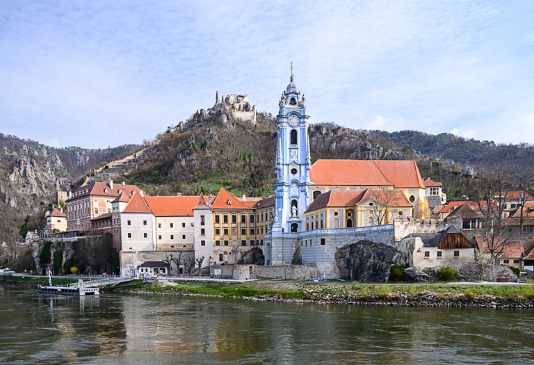
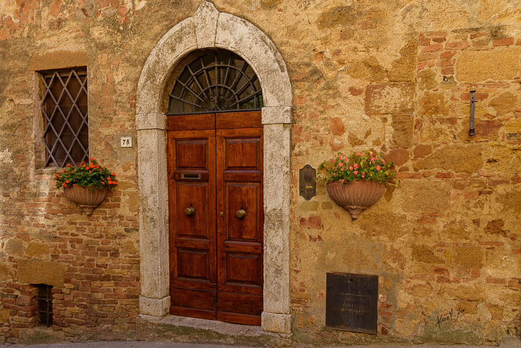
Lucky you, Shirley, not to have any tourist in your photo. At first glance, the yellow buildings jumped out at me and I didn't notice the water. I like your original photo and think that perhaps a B&W might work. I would play around with some dodging and burning to lead the eye more directly to the water. Great job on having straight walls. |
Mar 11th |
| 2 |
Mar 25 |
Comment |
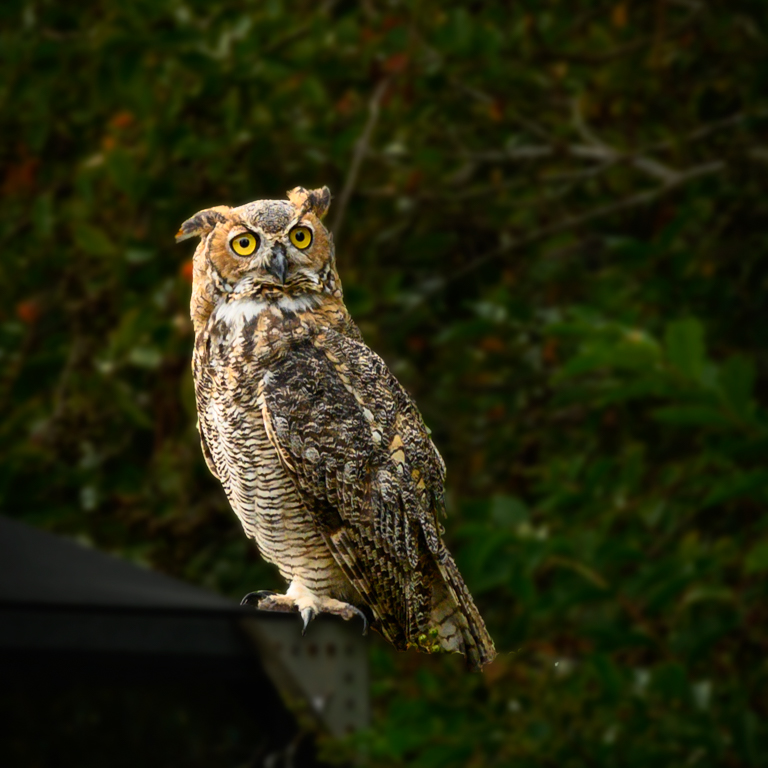
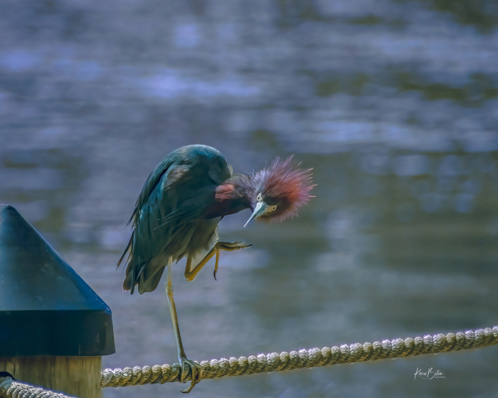
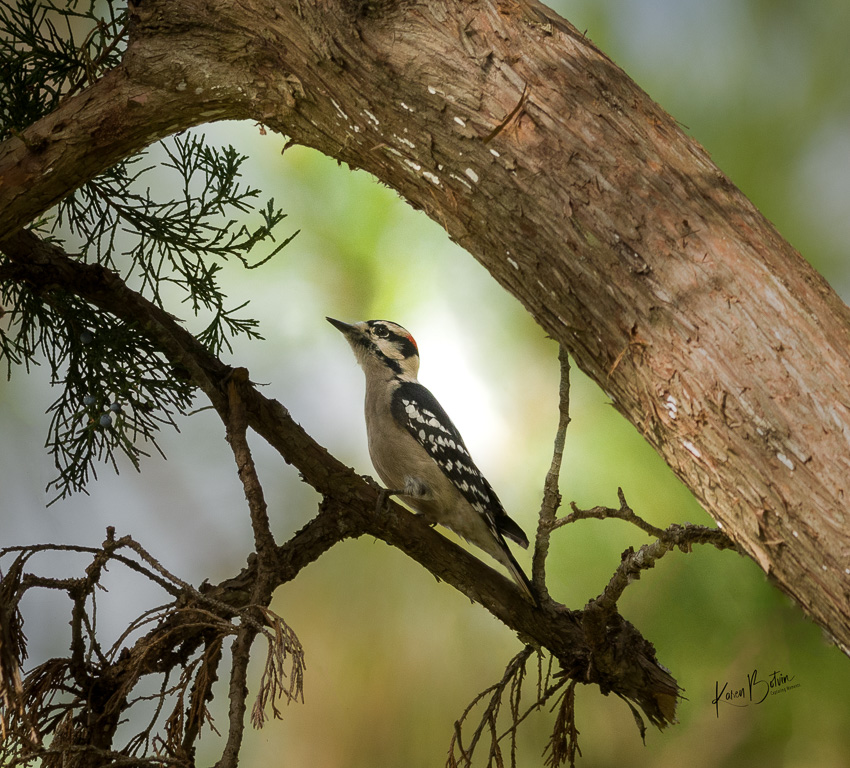
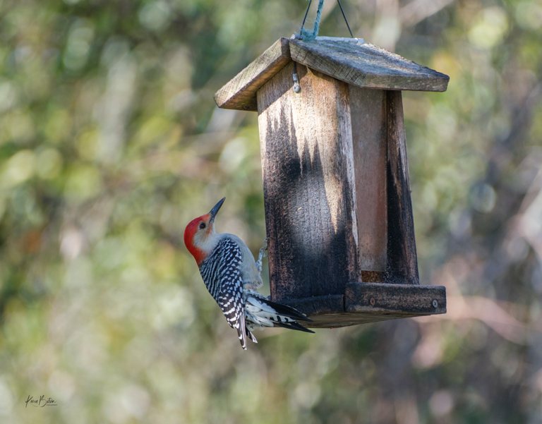
Great capture of a magnificent bird. I, too, have lots of red shoulder hawks in my yard. Their behavior is so fascinating to watch. You managed to get him tack sharp that reveals super details of the bird and its prey. The backgrounds are generally a problem when shooting wild life, but you managed a great image with the close crop. Nicely done, Piers! |
Mar 11th |
| 2 |
Mar 25 |
Comment |
Lovely shot, Jim. The lighting is perfect. I love the ripples and the bubbles around the shell as well as the kind of '>' in yellow on the face of the shell. Nice capture! Good luck with your camera club submission. |
Mar 11th |
7 comments - 2 replies for Group 2
|
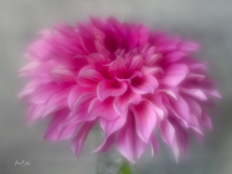
| 6 |
Mar 25 |
Comment |
Nice composite, Melissa, and great imagination! |
Mar 11th |
| 6 |
Mar 25 |
Comment |
Lori, your duck is an American Coot, which is a shore bird that frequently hangs with ducks, although is it is not a duck. It also appears to have some kind of entanglement around its beak, possibly fishing line. As for your image, I like the bubbles, especially the one that's sitting on top of its head. I would drop the highlights a bit on his beak as it appears to be a bit blown out. I like Melissa's crop but the added highlights to its beak just further blows it out and becomes void of any detail. Removing the reflection of the branch is a good idea. Nice capture. |
Mar 11th |
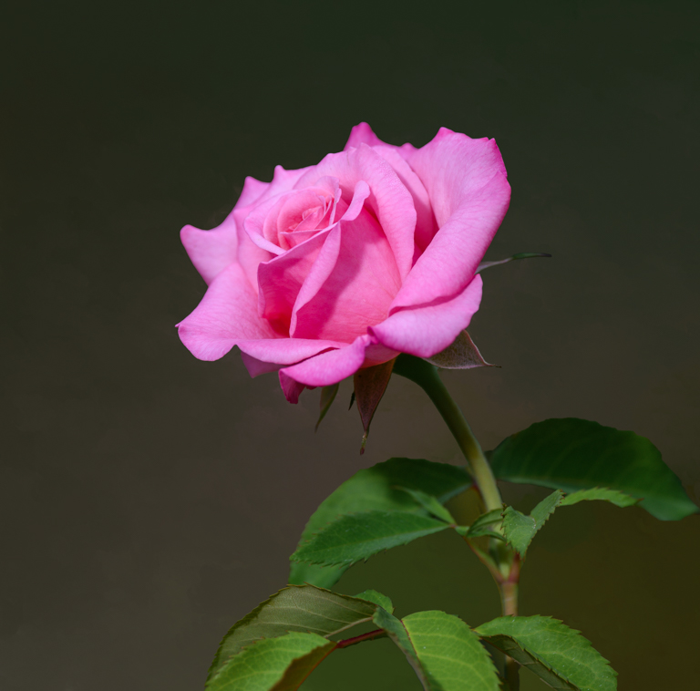
| 6 |
Mar 25 |
Comment |
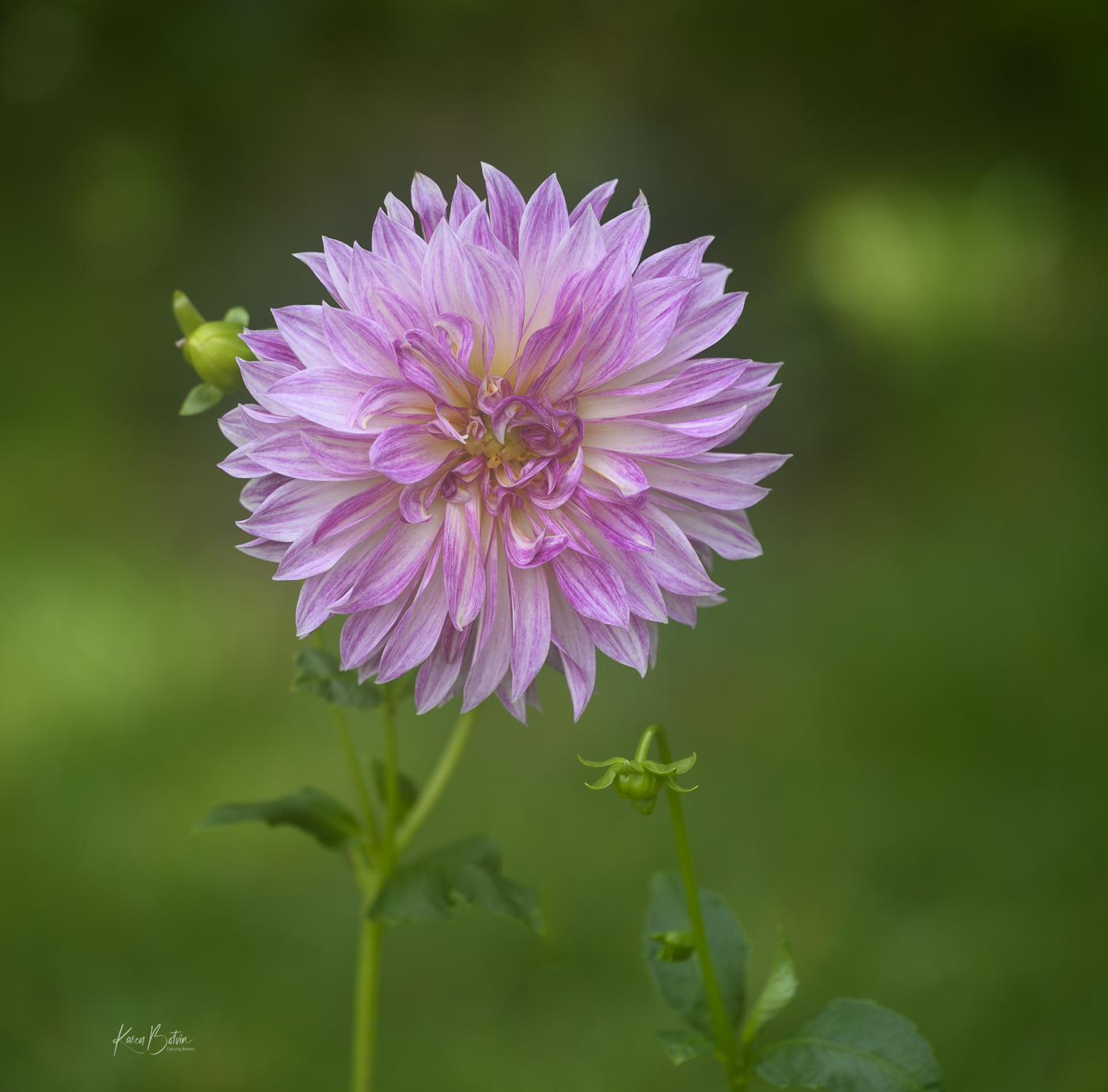
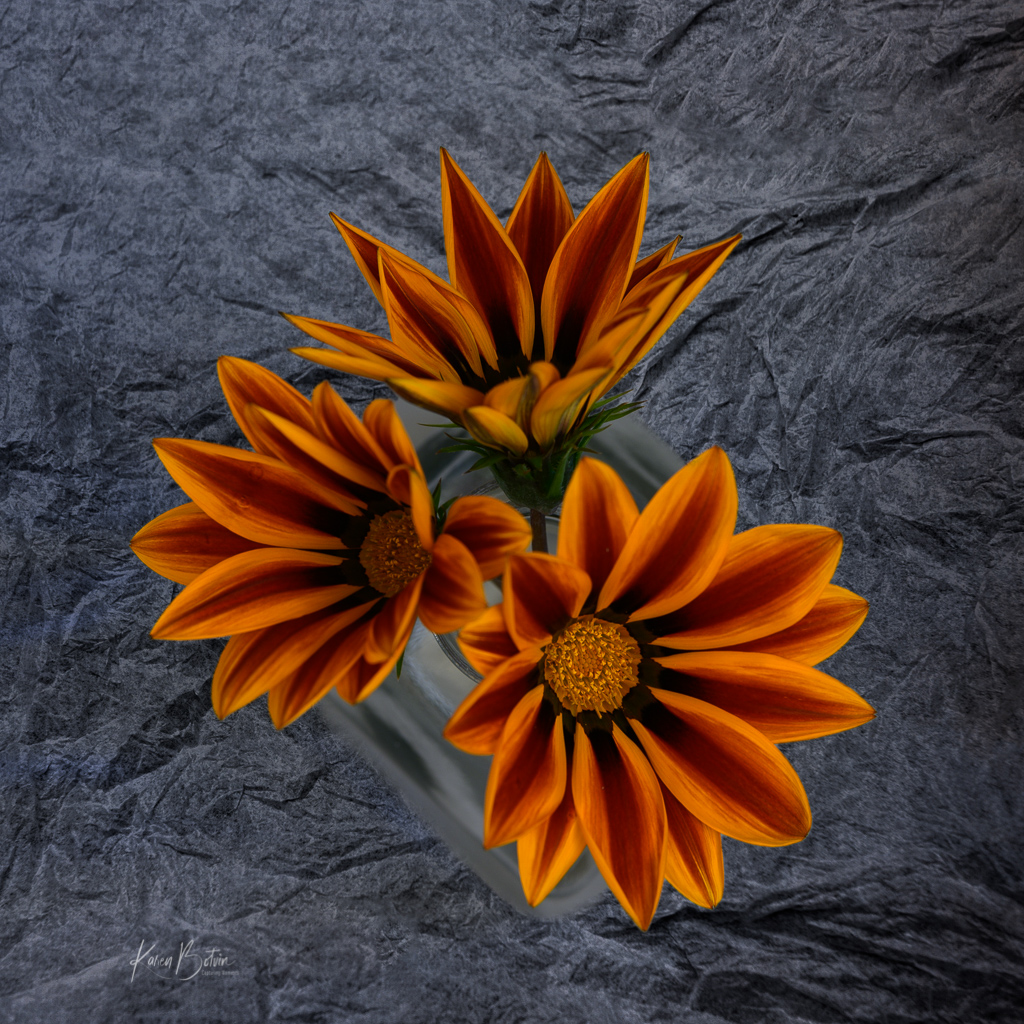
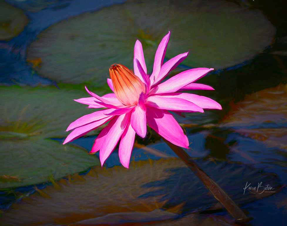
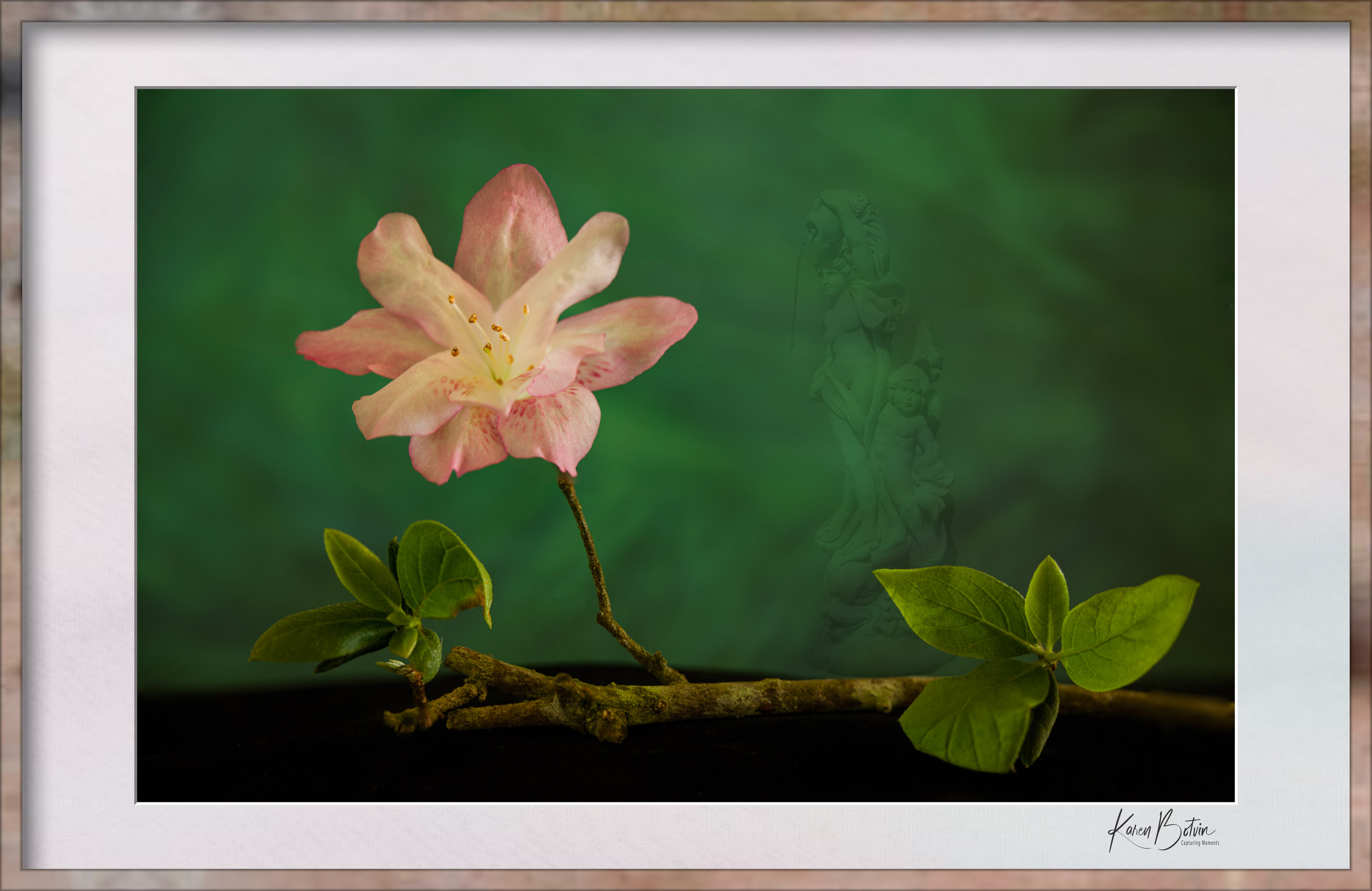
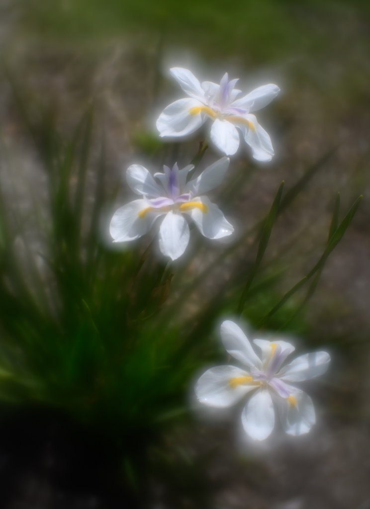
Nice capture, Ruth. The brilliance of the red against the green is very pleasing to the eye. I like the square composition, however, to add a bit more balance to the image, I would add a bit to the top as the top flower is against the edge and the bottom flowers have a good amount of space to the edge. |
Mar 11th |
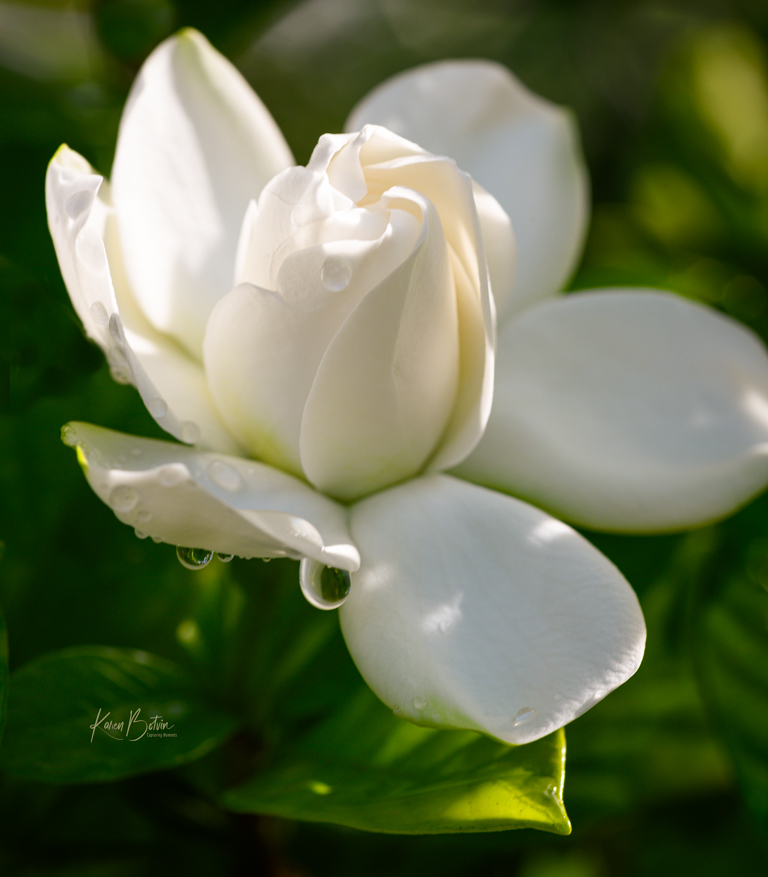
| 6 |
Mar 25 |
Comment |
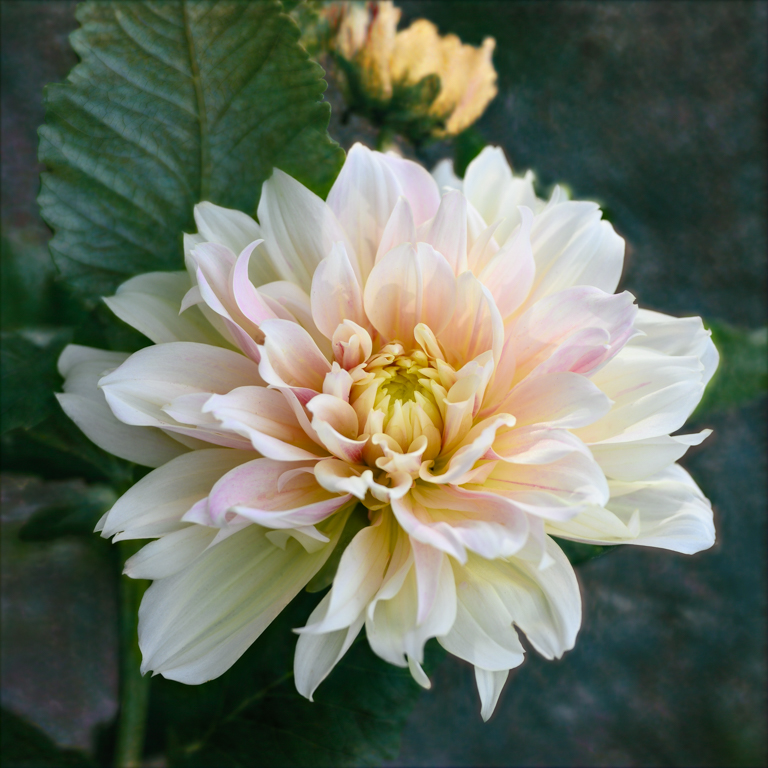
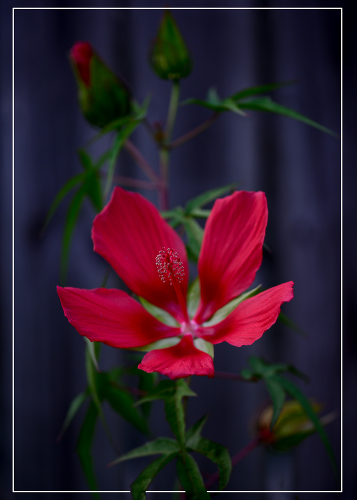
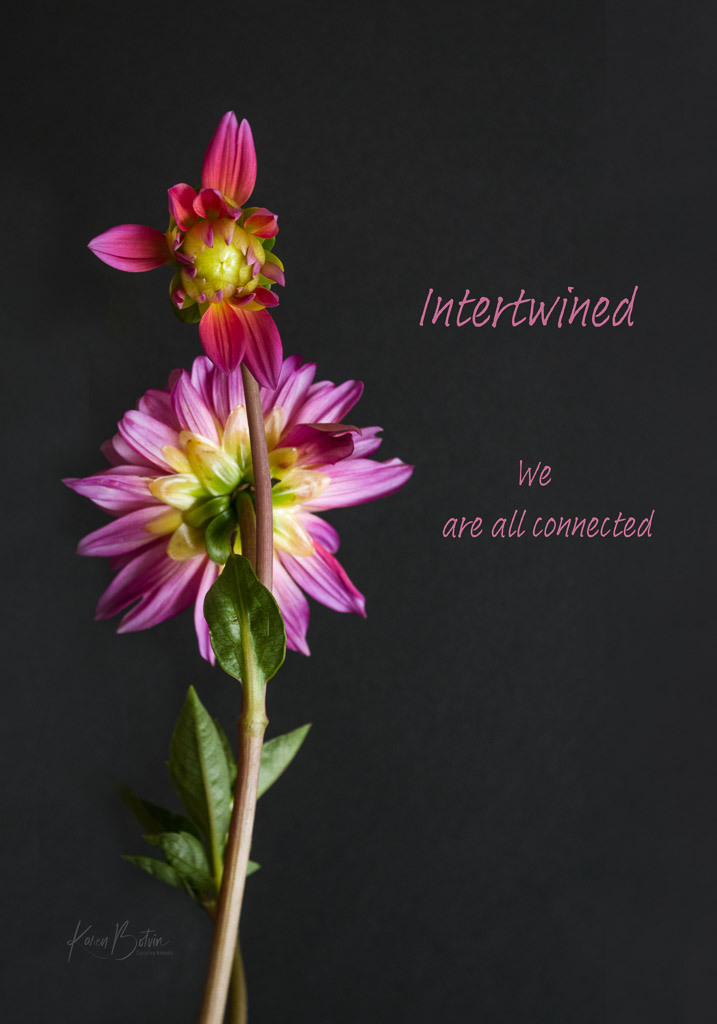
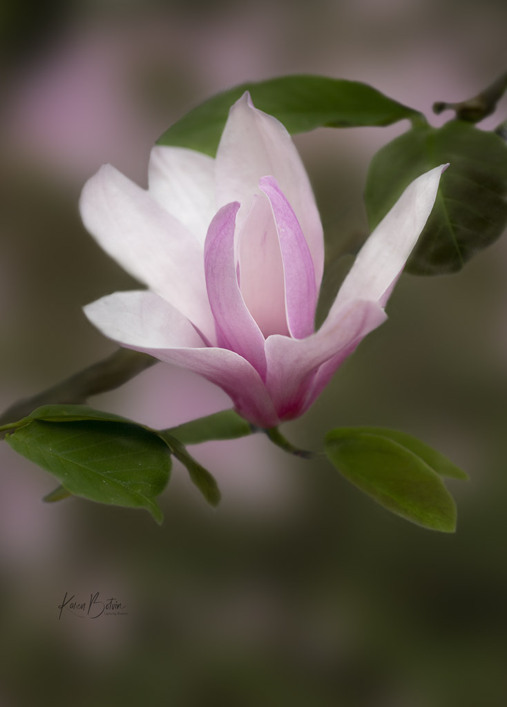
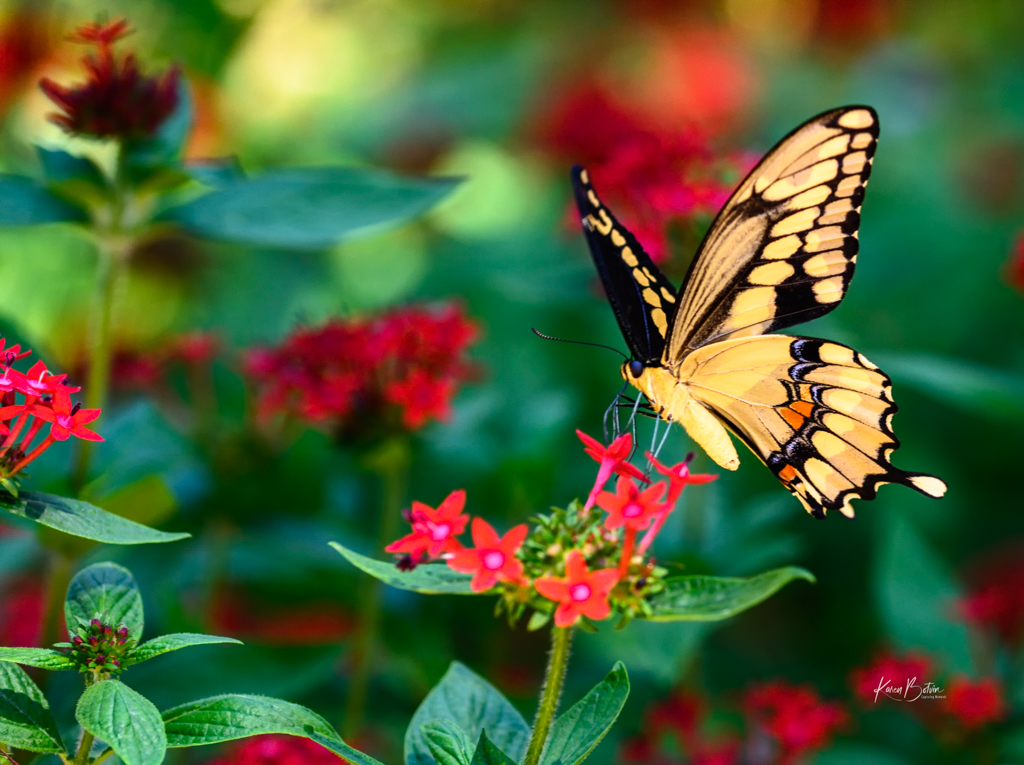
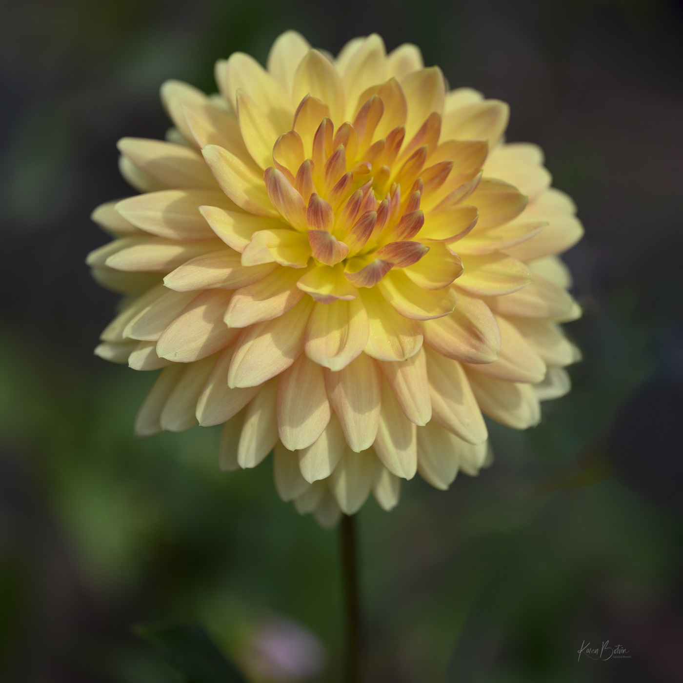
Lovely capture, Charissa! Your focus on the front petals with a slight fall-off is great. My only suggestion would be to add a bit more canvas around the flower. It feels a bit tight in the frame. Nicely done! |
Mar 11th |
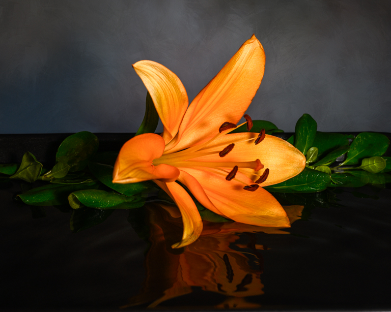
| 6 |
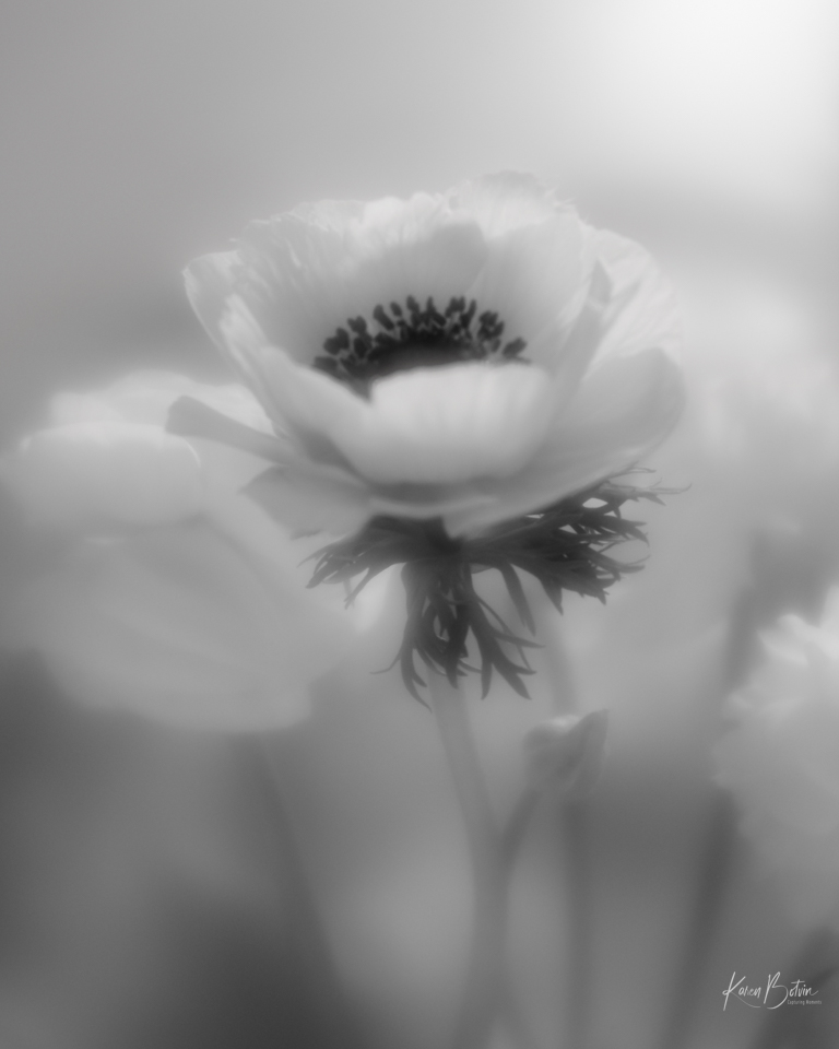
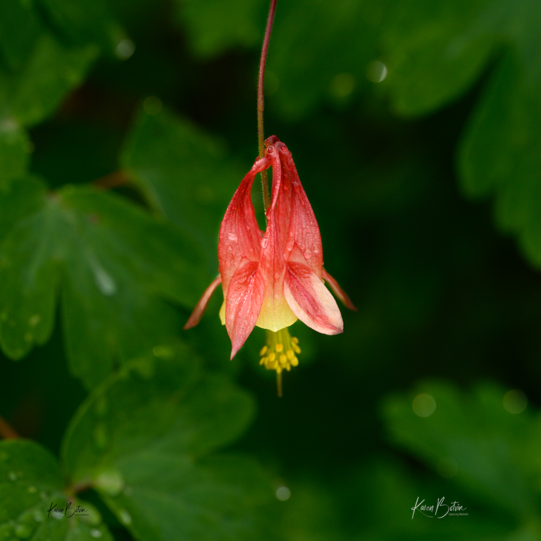
Mar 25 |
Comment |
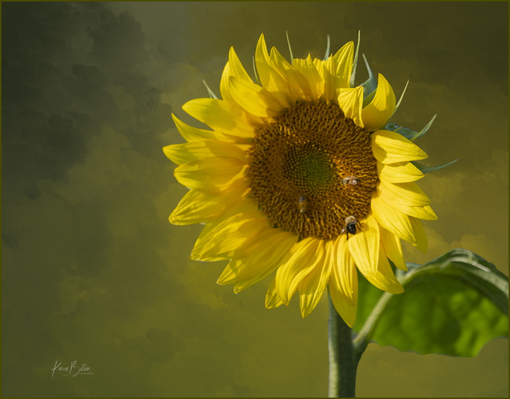
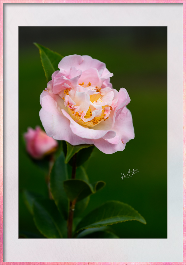
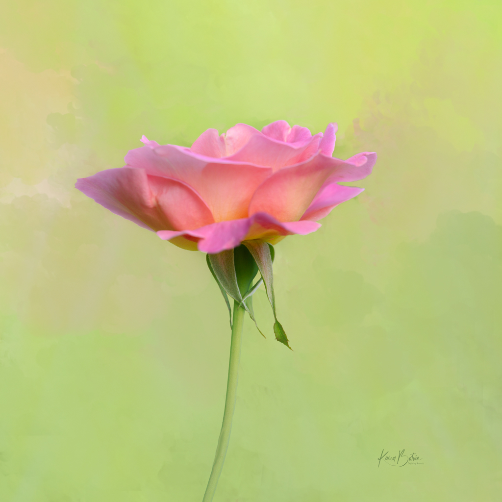
Lovely image as it is, Jim! The color is great and reds are a tough color to shoot. If your f stop would have been smaller, the back petal would have been in shaper focus and the stamen would not have been as showy as it is now. I think it's perfectly captured. |
Mar 11th |
5 comments - 0 replies for Group 6
|
12 comments - 2 replies Total
|