|
| Group |
Round |
C/R |
Comment |
Date |
Image |
| 2 |
Oct 24 |
Reply |
Thanks so much, Martin! Really appreciate it. |
Oct 21st |
| 2 |
Oct 24 |
Reply |
Thanks so much, Jim. I know what you mean about getting frustrated with the settings. It does take some doing to get it all setup correctly for the desired results! |
Oct 21st |
| 2 |
Oct 24 |
Reply |
Thanks, so much, Martin. I am enjoying working with the MIOPS. So many possibilities. I bought some balloons to capture the point at which the balloon filled with water gets popped. We have plenty of lightning here in FL. I just don't have a balcony or some other enclosure where I can see the lightning for the setup and not get drenched in the process. I'm still trying to work that out! |
Oct 6th |
| 2 |
Oct 24 |
Reply |
lol, No, Piers, I did not kick the table to synchronize with my shutter. Using a laser beam above the glass, I dropped the strawberry through the laser line which triggers the camera to fire which triggers my flash. As for the wave to be less stiff, my understanding of how flash works is that you set the camera's shutter speed at the flash's sync speed to only capture the light from the flash. The amount of energy coming from the flash is what freezes the motion. Less energy is more freeze, so I would guess if you apply that theory to your wave question, one would need more energy to get less freezing motion. I haven't tried it because when photographing glass, one needs less energy so not to blow out with reflections. |
Oct 6th |
| 2 |
Oct 24 |
Reply |
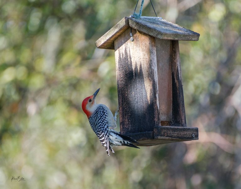
It's a bit better, as the feathers on his face aren't as crispy, but the tell-tale sign of too much sharpening is the halo around the bird and that's still there. Sometimes when zooming that far in, you just can't get away from either the noise or the halo. The only way to tell whether it's too much is to print it and see how the edges of the bird show. Great image all the same. |
Oct 6th |
| 2 |
Oct 24 |
Comment |
Your imagination never ceases to amaze me! What a great composite, right down to standing the current day women on a piece of marble. So yes, pedestal it is for me. |
Oct 5th |
| 2 |
Oct 24 |
Comment |
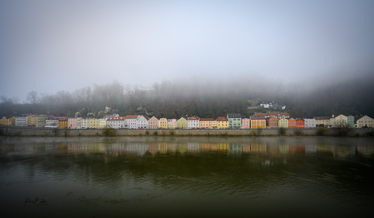
Wonderful moody capture. I can almost feel the trepidation from this surfer. Is it the cold water, the long walk, or just too early? I love the fog and the contrast of the surfer makes the image for me! Great photo! |
Oct 5th |
| 2 |
Oct 24 |
Comment |
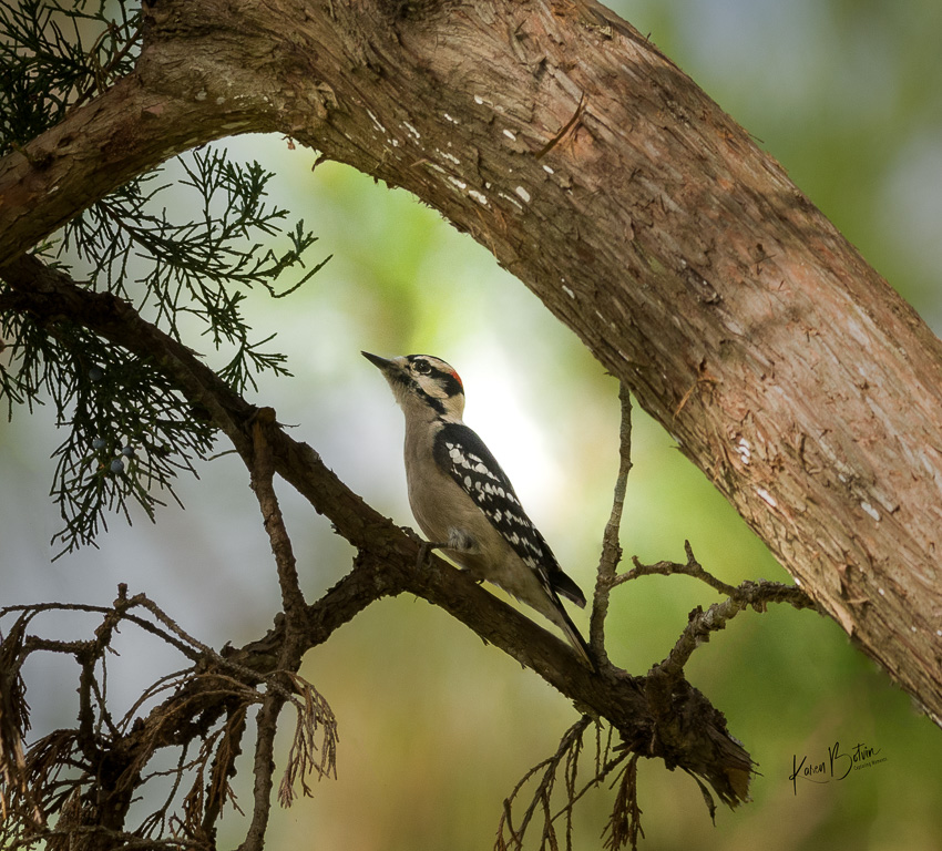
Wonderful capture of this beautiful hawk. We have red shoulder hawks here and I love to watch them soar. I like how you isolated the hawk by cropping in and using the blurred mountain as your background, but I agree with Gordy in that it looks a bit over sharpened. Nice image. |
Oct 5th |
| 2 |
Oct 24 |
Comment |
Another stellar image of a really cool car. I really love your high key editing. It works well and helps to diminish all those reflections. My only suggestion would be to remove those few black marks in the ceiling behind the car along with what looks like a "V". I would leave the black line that leads to the chandelier. Nice job, Jim! |
Oct 5th |
| 2 |
Oct 24 |
Comment |
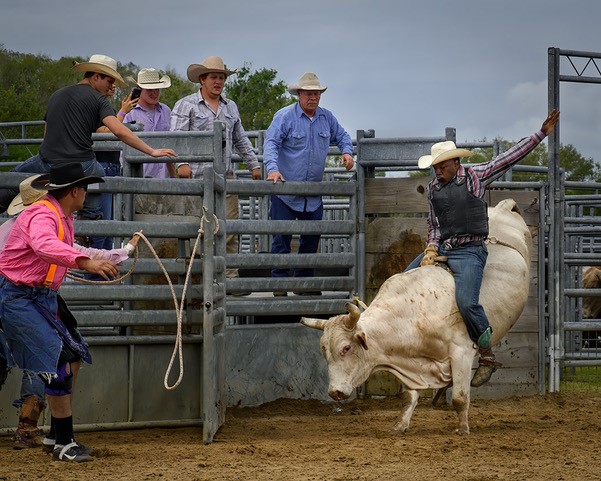
Congratulations, Piers, on your Pelican image in the monthly showcase. Very well done! As for the Harley, I don't care for motorcycles when I'm driving, but I got to admit, there are some beautiful bikes. You managed to capture one of them. Love what you did with your edits, especially the chrome. That little bit of warming really goes well with the root beer! |
Oct 3rd |
5 comments - 5 replies for Group 2
|
| 6 |
Oct 24 |
Comment |
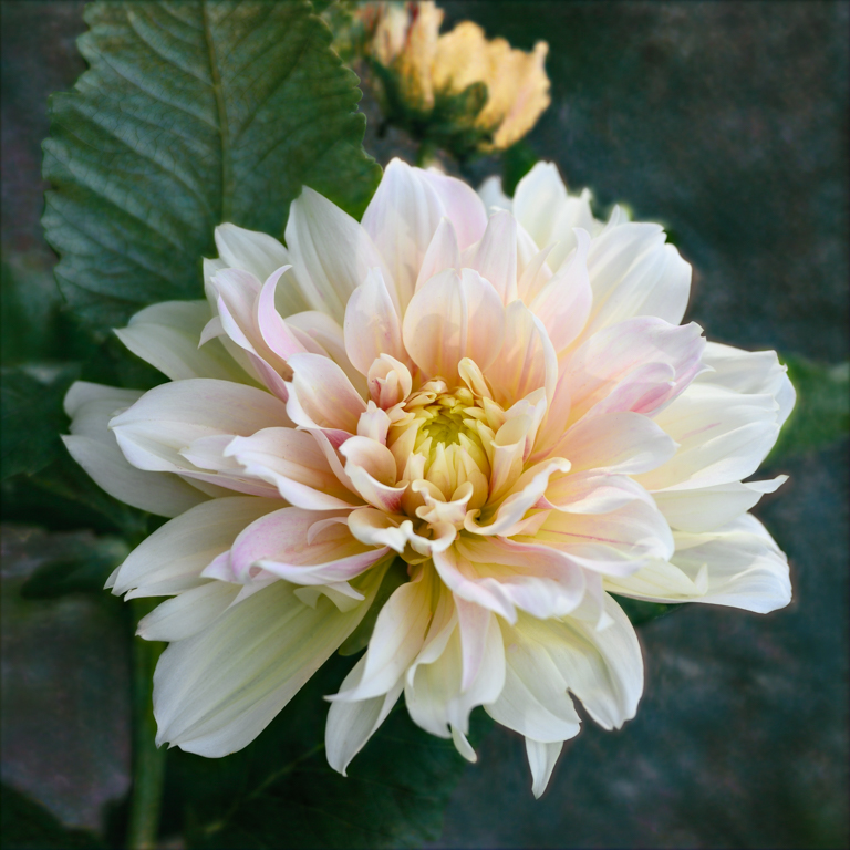
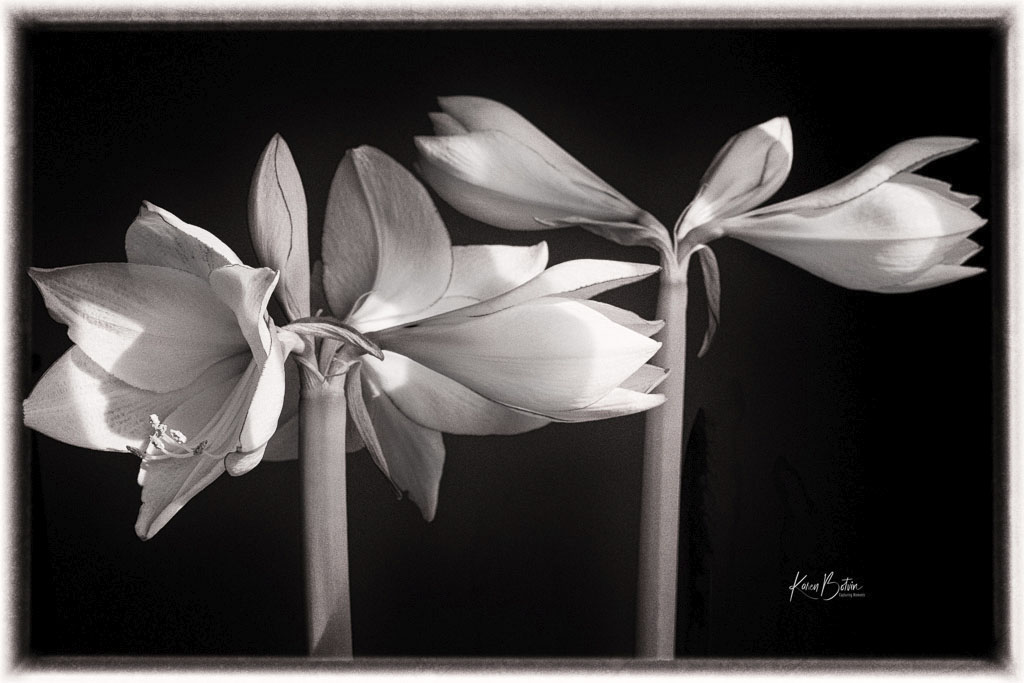
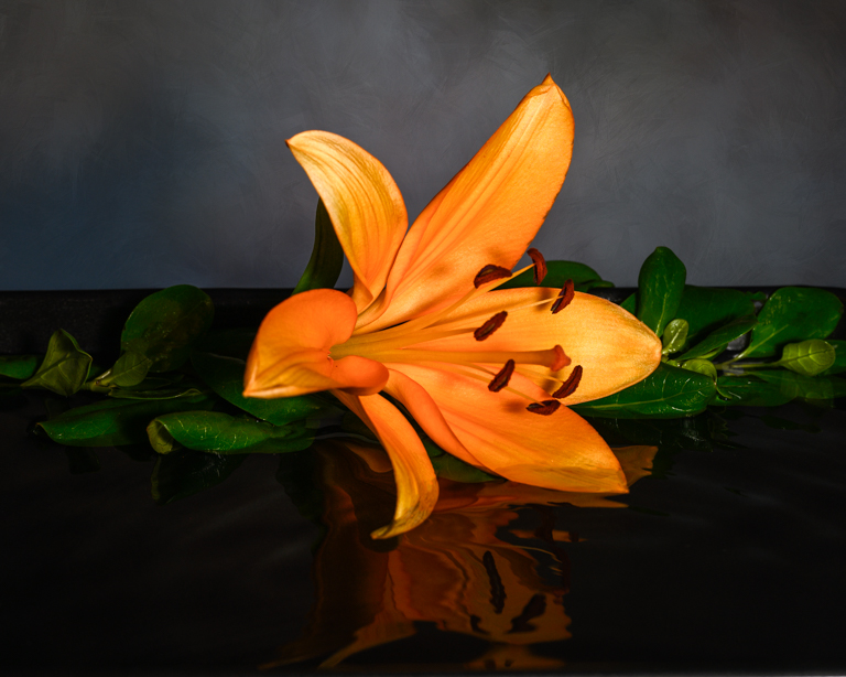
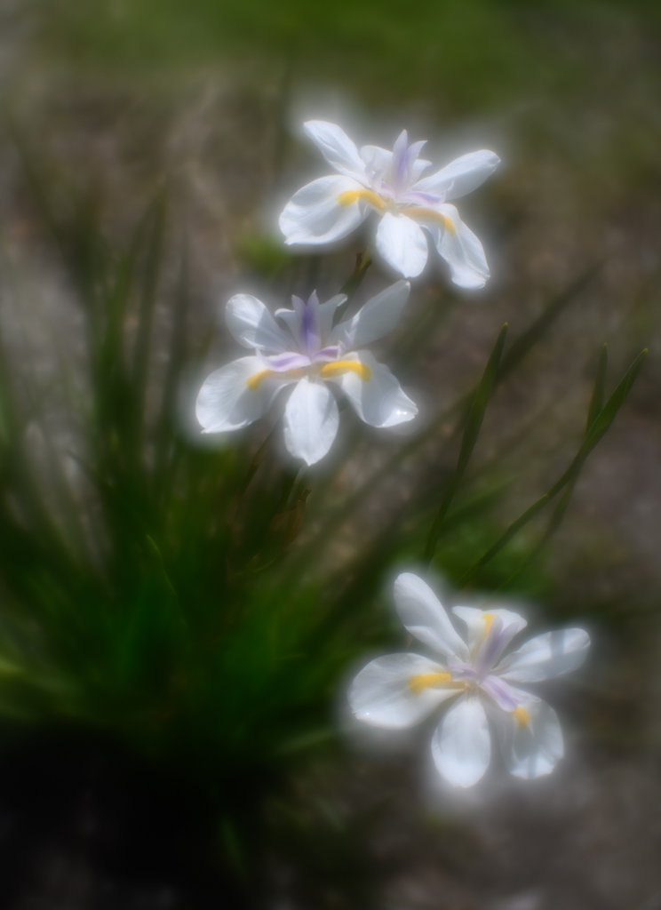
Lovely composition, Charissa! I love the diagonal setting and the slight visibility of the stems which tie one flower to the next. The rice paper is an interesting tough as is the color of it against the vibrant reds in the flowers. At f/22, I would have expected the flowers to be much more sharply focused. Perhaps your focusing mode should have been something different. |
Oct 21st |
| 6 |
Oct 24 |
Comment |
Wow, Jim, are you sure this is a pine beetle? To my eye, you captured the most interesting part of the bug, its wings! When I first looked at your image, I immediately thought of a bug I had never seen before and took the attached image of it with my cellphone while it crawled up the leg of an outside table that I was sitting at. The markings appear the same to me. I was told that this is a wheel bug and its bite is extremely painful. Please look it up and be careful in your wife's garden. As for your image, I like the DOF because it melted the background, except for that one leaf on the left that Ruth referred to. I don't find the green overpowering, but you might want to desaturate it just a bit. |
Oct 21st |
 |
| 6 |
Oct 24 |
Comment |
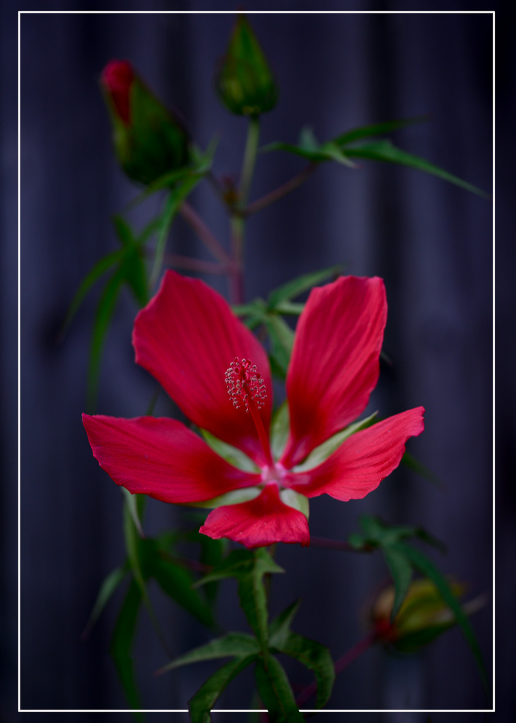
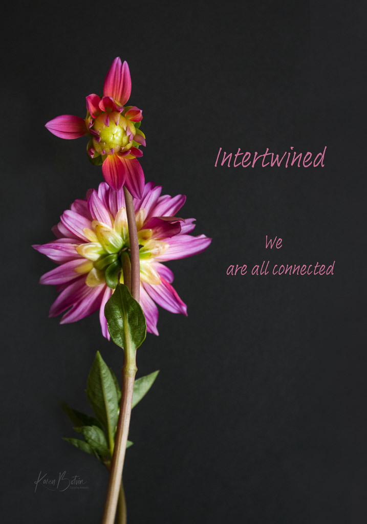
Very interesting composition for a hibiscus! Living in Florida, I've seen a variety of images of these flowers, but never this. Nicely done. I love the contrast of colors, but the bigger bud, to me, is just a tad too bright, especially toward the back where it meets the green. I like your choice of DOF and wouldn't change it, but that's my style. I also wouldn't remove the bottom, right leaf as it brings balance to what would be otherwise right heavy from the bud above. |
Oct 21st |
| 6 |
Oct 24 |
Comment |
The shallots are a very interesting subject. I like the placement of the shallots and agree with Jim that each shows its own personality. To me, I would rather see less foreground in the image and a bit more space on the top of the image. The placement to the black background does not bother me as the shadows create a DOF. Nice job! |
Oct 21st |
| 6 |
Oct 24 |
Reply |
Thanks, Jim! Others seem to think either that the shears don't belong or the red is too strong. The shears stay as it is a part of my story, however, I did look at desaturating the red just a bit. To me, the sunflower is a bright color as is the stem that I cut off. To desaturate the clippers makes it a bit dull and out of place. Thanks for agreeing with my original image. |
Oct 21st |
| 6 |
Oct 24 |
Reply |
Thank you, Charissa, for your comments. Since the red handles are a distracting element, I feel a bit of desaturation of the red will help the image. |
Oct 21st |
| 6 |
Oct 24 |
Reply |
Melissa, thank you for commenting. As I said above to Lori, the shears are a part of the story that I am telling. I think a bit of desaturation will help the handles be less obtrusive. |
Oct 21st |
| 6 |
Oct 24 |
Reply |
Thanks, Ruth. Yes, perhaps a bit of desaturation on the handles would make them less distracting. |
Oct 21st |
| 6 |
Oct 24 |
Reply |
Thank you for commenting, Lori. My vision for this image was to tell a story of how the sunflower got into the vase, hence the cut stem and the shears. So to remove them would not be the story that I intended. Perhaps a bit of desaturating the handle would soften them and not bring so much attention to the handles. |
Oct 21st |
4 comments - 5 replies for Group 6
|
9 comments - 10 replies Total
|