|
| Group |
Round |
C/R |
Comment |
Date |
Image |
| 2 |
Sep 24 |
Reply |
Thanks so much, Martin, for your detailed observations. I really appreciate it as it tells me what I've done well. |
Sep 17th |
| 2 |
Sep 24 |
Reply |
Yes, I like the space much better. |
Sep 11th |
| 2 |
Sep 24 |
Comment |
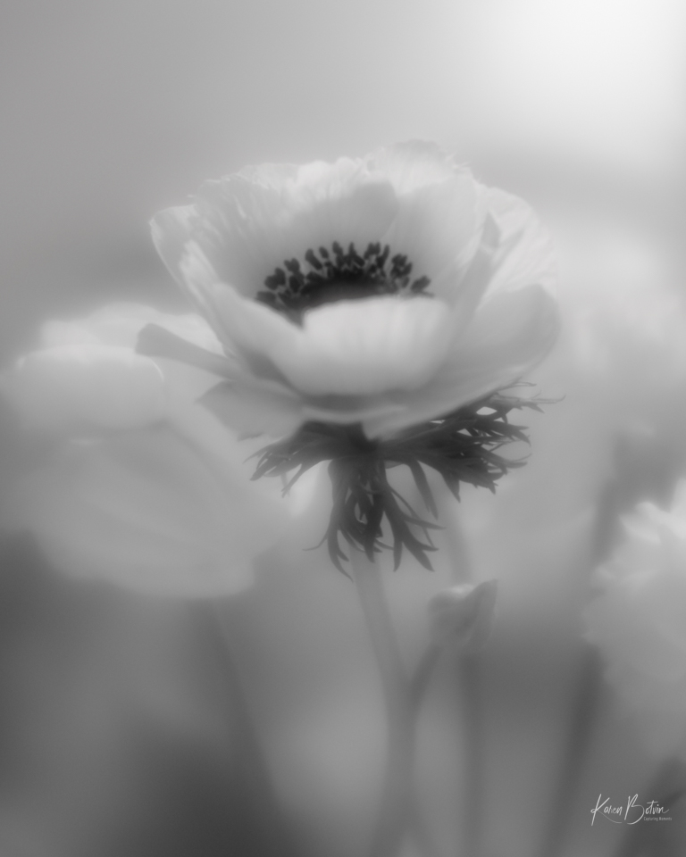
You found a lovely poppy! I love the color and the crispness of your focus through-out. Locally here, we would say you captured a bee-butt. I wish he would have been turned toward the left ever so slightly. I like Tor's suggestion of darkening the background a bit. I would also add a bit of canvas to the bottom so that the bottom petal wasn't kissing the edge of the image. |
Sep 11th |
| 2 |
Sep 24 |
Reply |
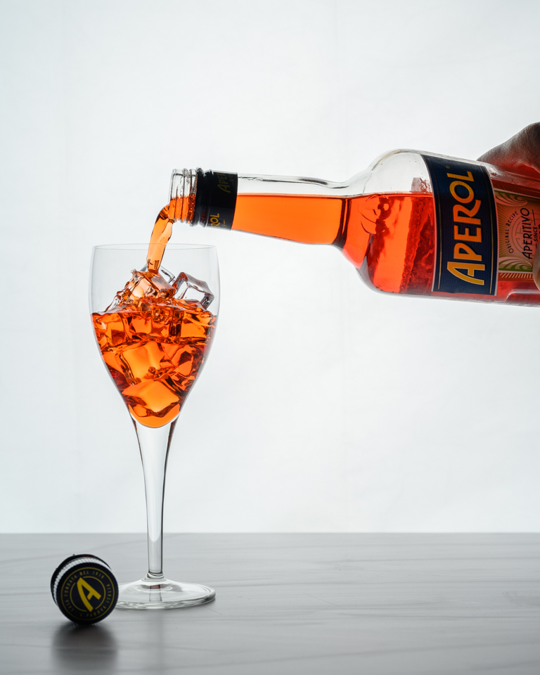
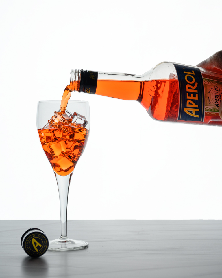
Thanks so much for your comments, Tor. Funny that you would suggest holding the bottle from the bottom thereby removing the human component from the image. As I have been following quite a few food photographers lately, adding a human component seems to be a desired element of food photos. As for the white board to bounce light back into the subject is a great idea and something that I'm learning to incorporate in my lighting setups. I've been using white & black flags as well as mirrors to bounce or shade light. I find working with flash photography to be very stimulating to my thought processes! |
Sep 11th |
| 2 |
Sep 24 |
Reply |
Thanks, Piers, for your comments. No, I did not think about increasing the exposure of the white background, but I did as you suggested and it really makes a noticeable difference. Thanks for the idea! |
Sep 11th |
 |
| 2 |
Sep 24 |
Reply |
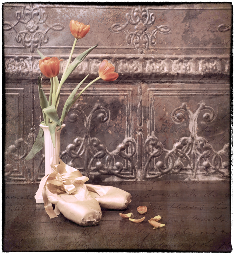
Thank you, Shirley. Actually, I'm pretty much a wine drinker but I wanted to try something different on hot summer days. There are quite a few cocktail recipes on line. I haven't really found one that I like well enough to purchase another bottle but it sure made for a nice bright prop! |
Sep 4th |
| 2 |
Sep 24 |
Reply |
Thanks so much, Jim! |
Sep 4th |
| 2 |
Sep 24 |
Comment |
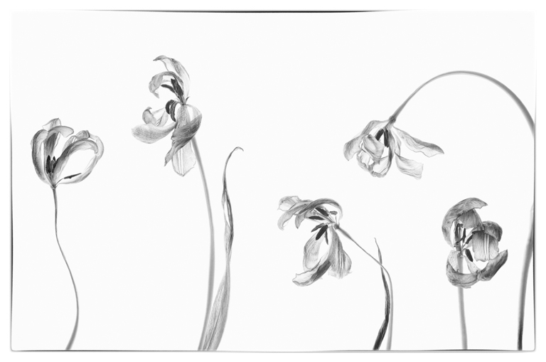
Wow, it sure looks like you used the pencil tool in PS! You took an ordinary portrait and turned it into an image to study. I like the Silver Efex version, but this sketch took it to another level! Well done! |
Sep 4th |
| 2 |
Sep 24 |
Comment |
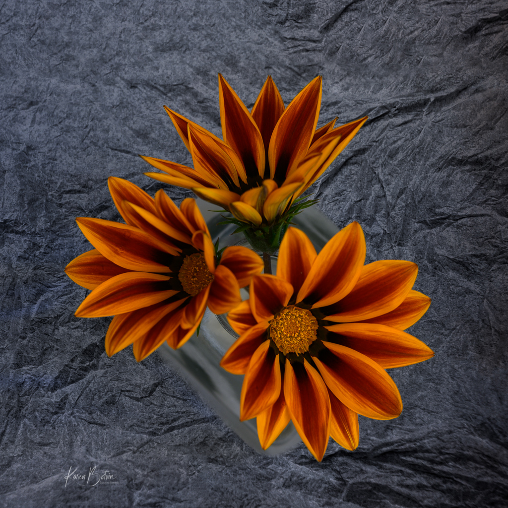
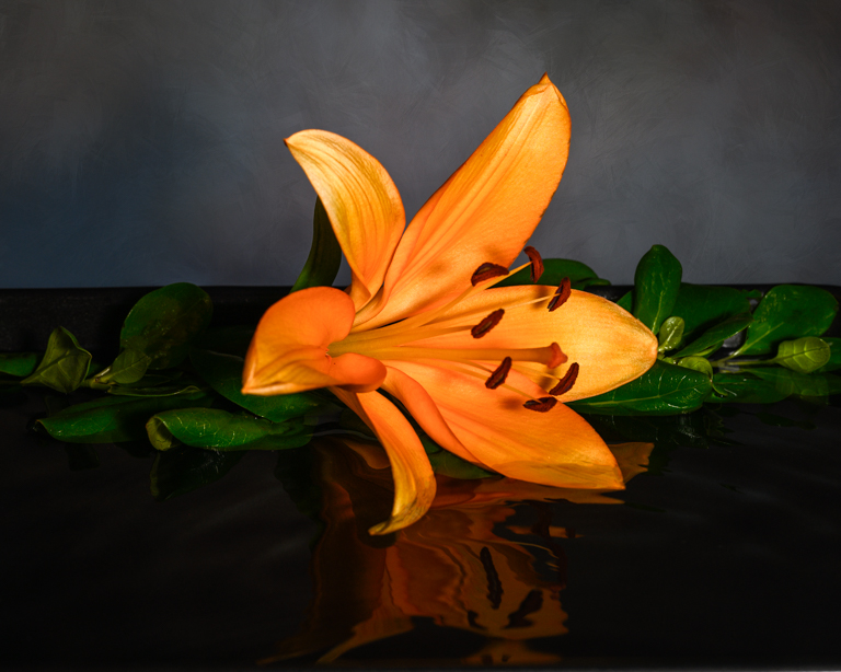
Well, you've done it again! Your images always cause me to stop and analyze what it is I'm looking at. I love the lines and curves and especially the bright colors of red and yellow. The only thing I would change is to remove the bit of Shadow that falls over the yellow at far left. I figured out where it came from, but to me, that break in the yellow is distracting since all other shadows are on the red. Looking forward to more of your images. |
Sep 4th |
| 2 |
Sep 24 |
Comment |
Wow, Shirley, you've captured such a magical moment well worth the bit of uneasiness I'm sure you felt. I like how you edited it to bring out the foreground as the road leads us right into the image. Well done! |
Sep 4th |
| 2 |
Sep 24 |
Comment |
Wonderful cropping idea, Jim! But, I would remove that handle. It pulls my eye away from the middle and I don't think it adds anything to the image. Speaking of scale, I had to google a Cord to see just how bulbous the front of the car really is. Wow! |
Sep 4th |
5 comments - 6 replies for Group 2
|
| 6 |
Sep 24 |
Reply |
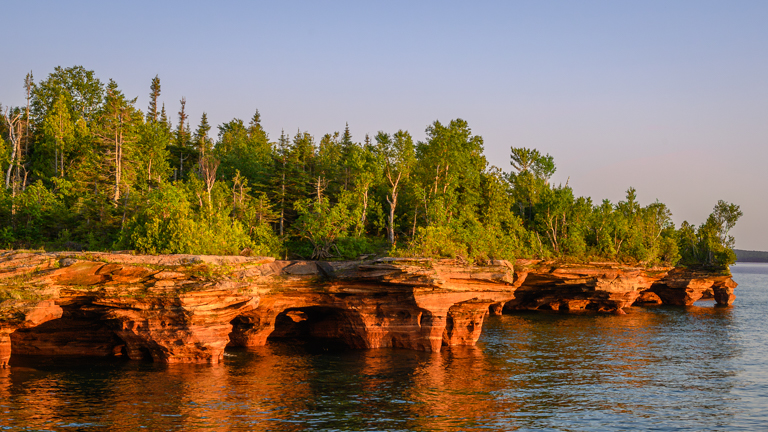
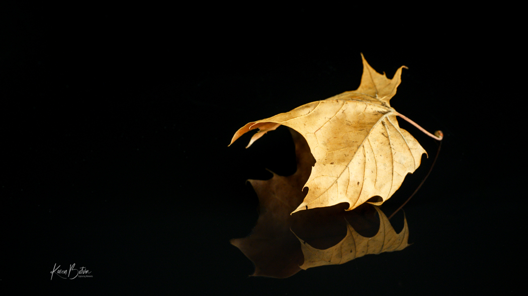
Thanks, Ruth. A fellow photographer in my camera club posted a similar image although his was in portrait orientation so I tried to replicate something similar. I later found out that his was done with some phone app. As for a black background, I'm not sure that will produce what I had in mind. I'm traveling so I don't have access to my files to change the background but will look at it when I get back home. |
Sep 27th |
| 6 |
Sep 24 |
Reply |
Thank you for your comments. I'm traveling so I don't have access to my files to change the background to black. In my mind eye, I don't believe an all black would render the separation that I was looking for. |
Sep 27th |
| 6 |
Sep 24 |
Reply |
Thanks, Lori, for your comments. I'm told there is a phone app that does the ripples for you but that takes the fun out of creating it. |
Sep 11th |
| 6 |
Sep 24 |
Comment |
Very nice composition, Jim. Exposure is great. My only suggestion would be to add a slight vignette to draw the viewers' focus right to those working hands. |
Sep 11th |
| 6 |
Sep 24 |
Comment |
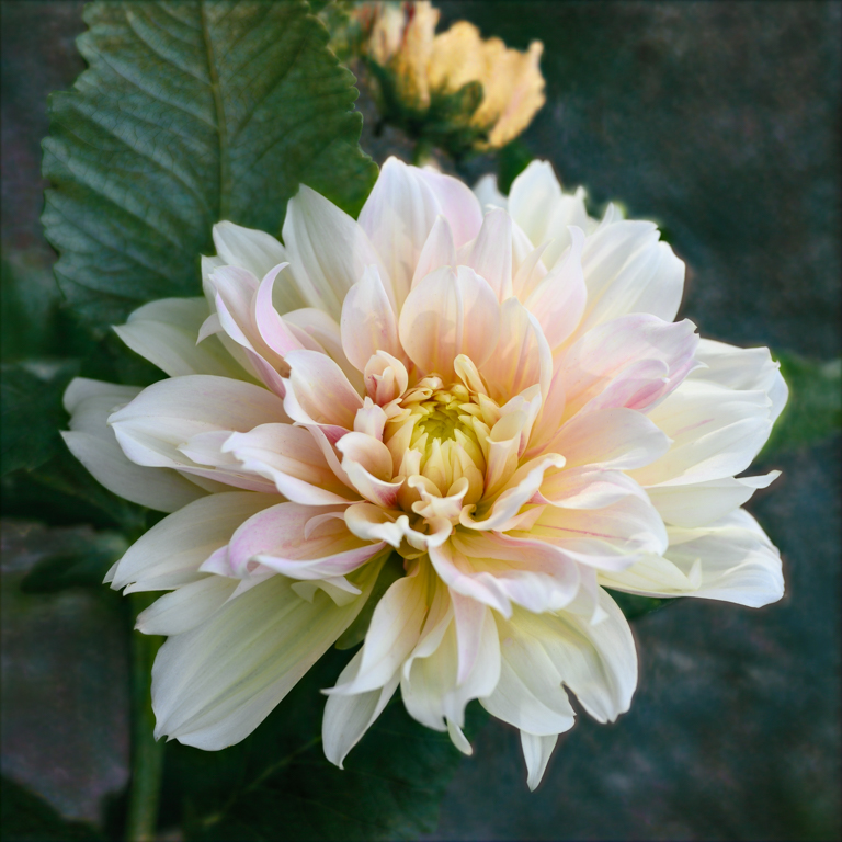
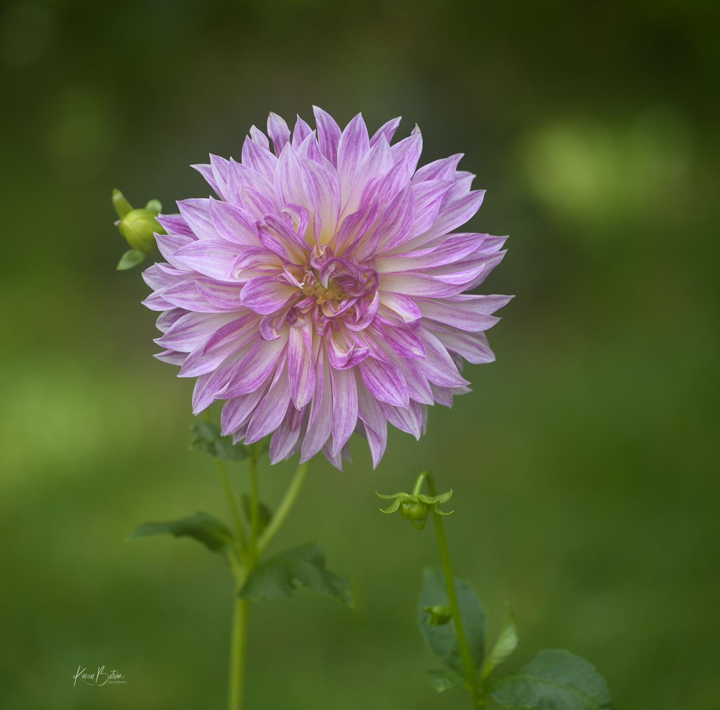
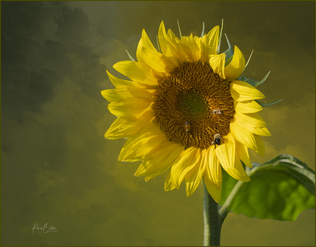
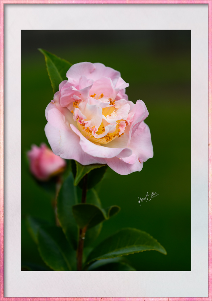
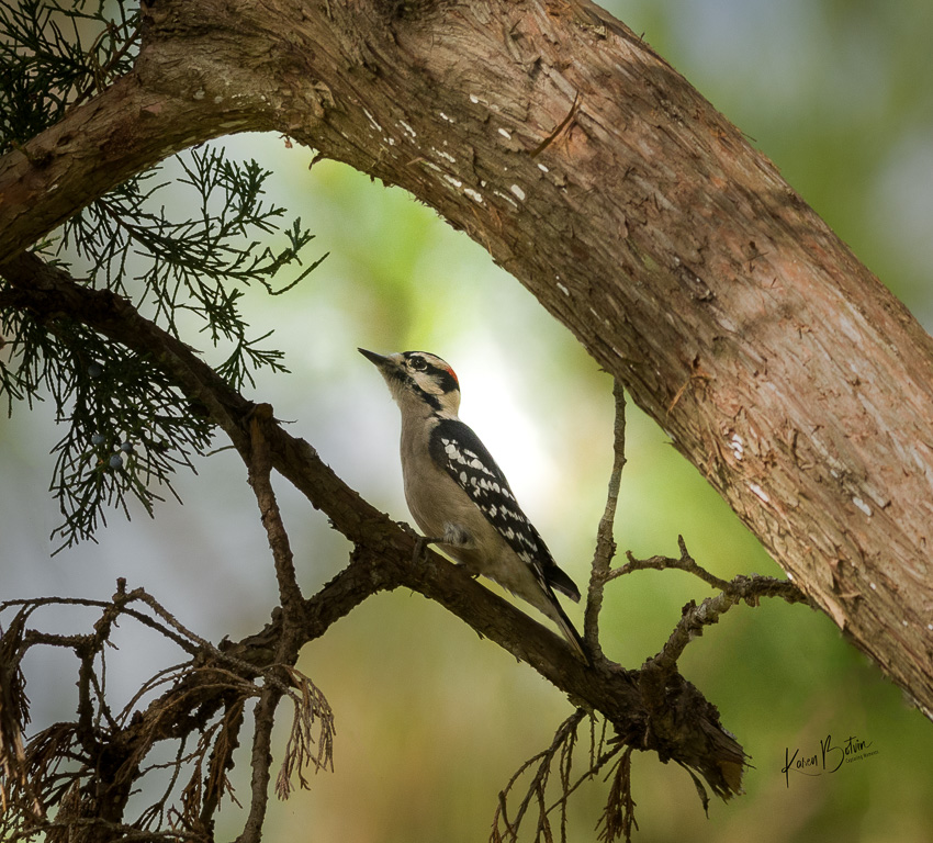
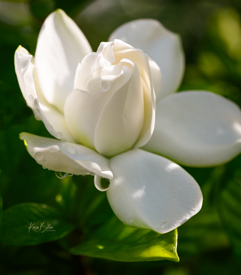
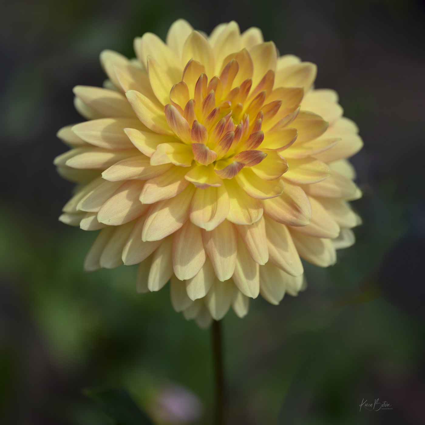
I love Zinnias almost as much as Dahlias and you captured a pretty one! I love the pink color but I do find the background distracting. Too much going on, especially around the top of the flower. With a macro lens at f/10, you're going to have a larger depth of field. I realize that you like your flowers in sharper focus, but, to me, if the flower is the subject, the background shouldn't be competing with it. Personally, I would select the flower, invert the selection so that you have the background selected and darken it down so that it's less noticeable. Just my opinion. Certainly, if your intent was to include the greenery around the flower, then maybe back up a bit more to give more equal space to both. |
Sep 11th |
| 6 |
Sep 24 |
Comment |
Lovely setup and superb lighting! Wonderful image. |
Sep 11th |
| 6 |
Sep 24 |
Comment |
Very nice detail...mission accomplishment! |
Sep 11th |
| 6 |
Sep 24 |
Reply |
Thank you, Melissa! Actually, after the setup is complete, one only uses the eyedropper to create the disturbance in the water. It's really very simple. As for the plain gray paper background, I used that as a part of the setup. In post, I selected the background in Photoshop and inserted the texture which I thought gave the overall image a more polished look. |
Sep 11th |
| 6 |
Sep 24 |
Comment |
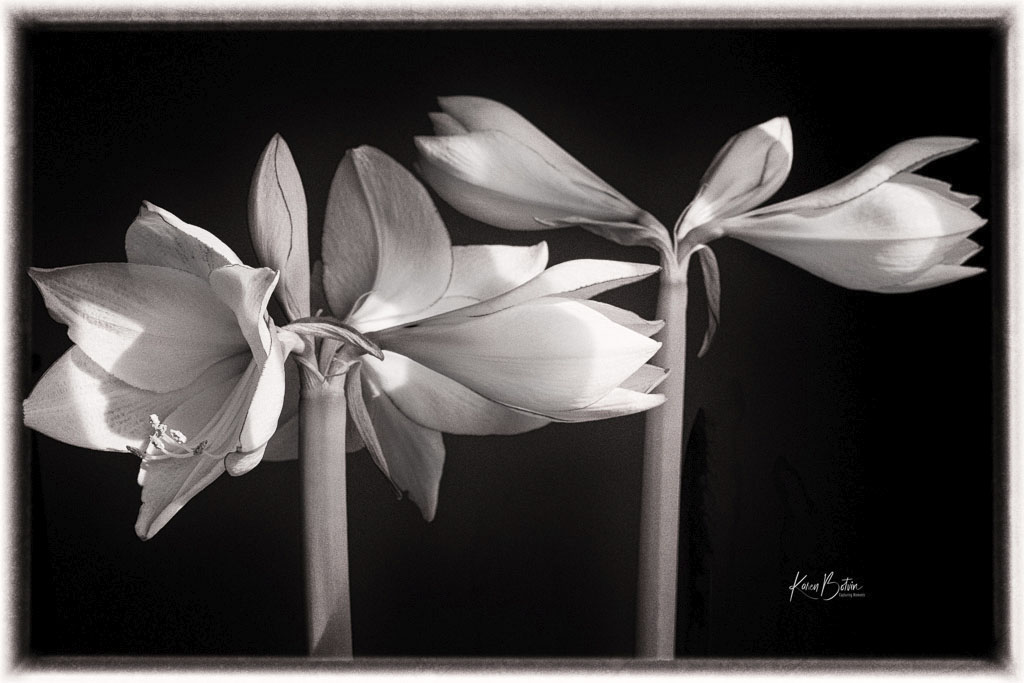
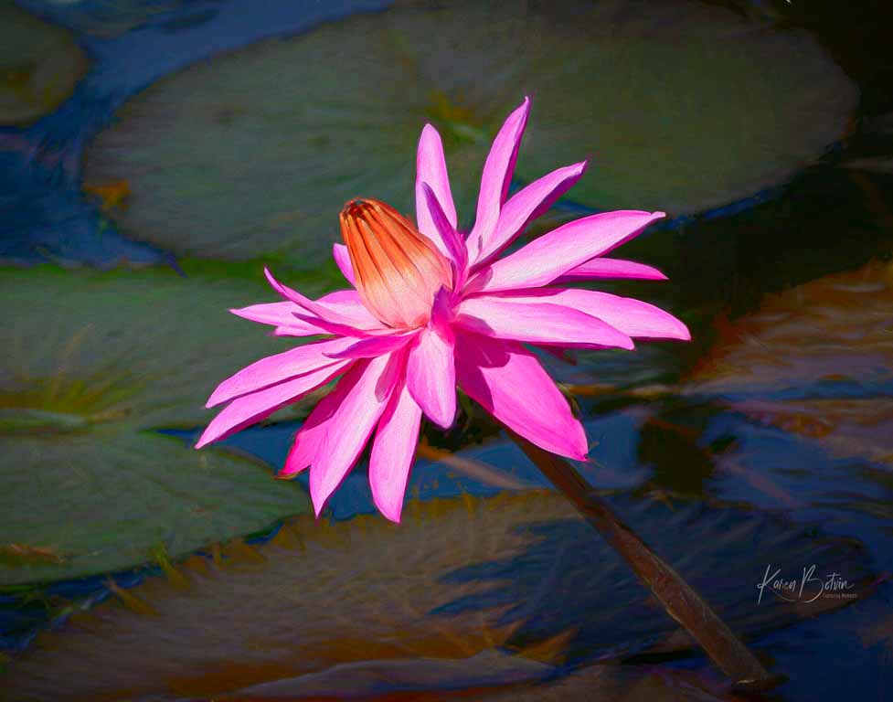
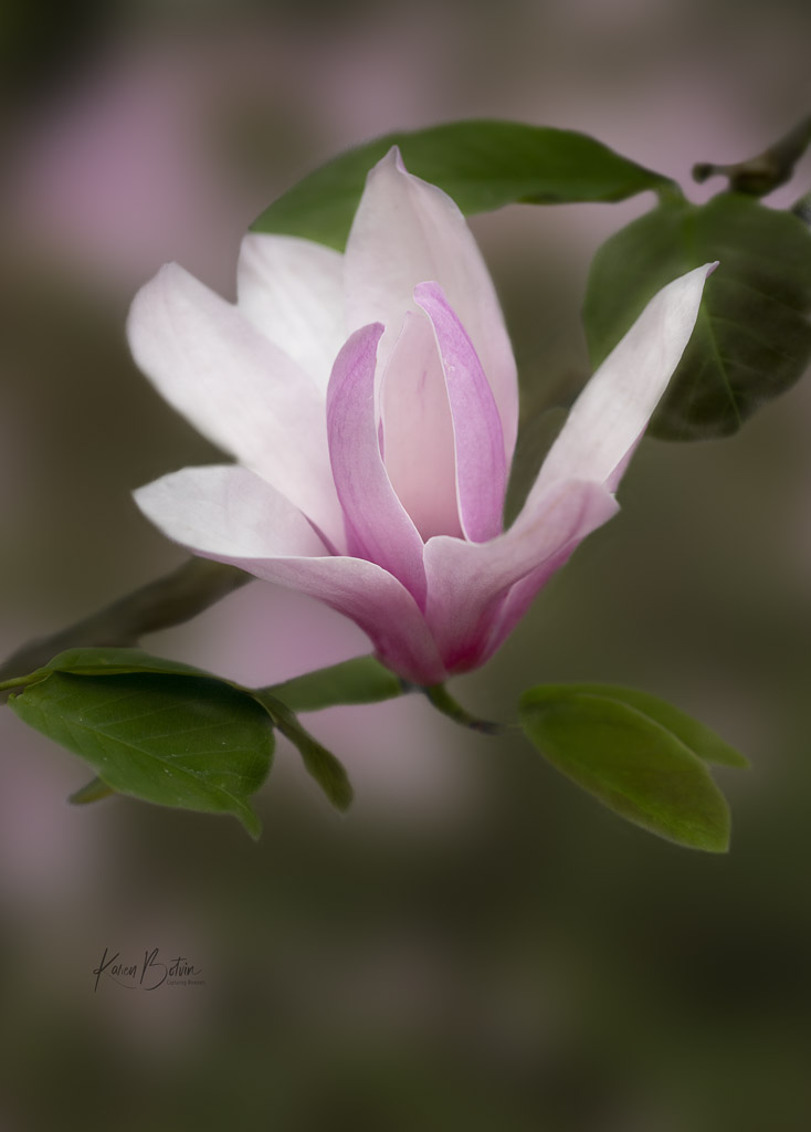
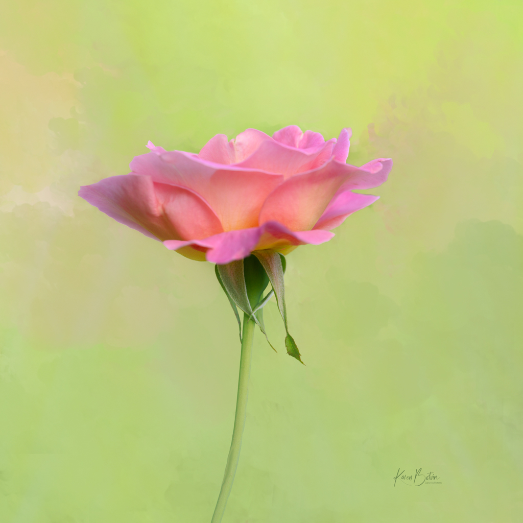
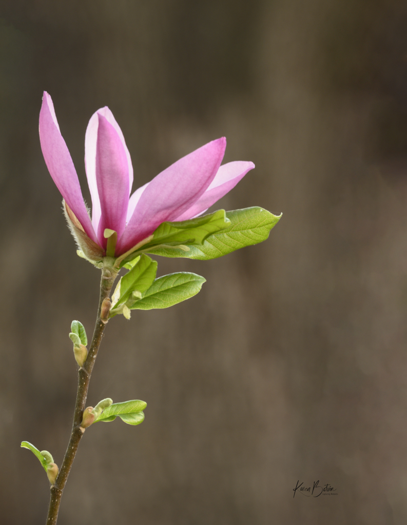
Your image is a bit dark, but I really like the diagonal the flowers form. I can't really tell but it looks like you shot this in portrait mode. I'd be tempted to remove the bud on the lower left and tilt the image ever so slightly to make the diagonal a little more pronounced. I would also lighten up the middle bud a bit more to bring it out of the shadows. I think this image works in B&W but I would lighten it up a bit. |
Sep 4th |
| 6 |
Sep 24 |
Comment |
Amazing what one can create with props. Were they already made-up for the workshop or did you all have to come up with the fake pastry on your own? Nice composition. I like your crop that shows a bit of each pastry. Well done! |
Sep 4th |
6 comments - 4 replies for Group 6
|
11 comments - 10 replies Total
|