|
| Group |
Round |
C/R |
Comment |
Date |
Image |
| 2 |
May 24 |
Reply |
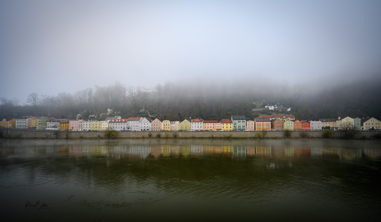
Thanks for your comments, Shirley. I had done a lot of research on how wide the Danube is at certain places and decided that a 24-120mm would do fine. I took that and a 14-30mm for the walks in the different cities and towns. You're right about the changing of lenses. I only tried it once, unsuccessfully, in front of the cathedral in Prague. After that, I only used the wide angle lens when I knew that walks would be in closer to the things I might want to shoot. |
May 23rd |
| 2 |
May 24 |
Comment |
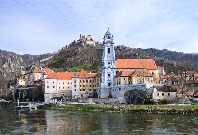
Thanks so much for your comments, Martin. I really appreciate that you can relate to the constraints of making an image like this from a moving boat. And I do agree, it's a decent travel photo. I looked on line at some other photos of this church and am happy with my capture. |
May 16th |
| 2 |
May 24 |
Reply |
Thank you, for pointing out the keystoning on the left. I hadn't seen that before you mentioned it. I will work on that. |
May 16th |
| 2 |
May 24 |
Reply |
Thank you, Piers, for your comments. Personally, I feel there are quite a few implied lines in this image. Although subtle, first the reflection of the tower in the water leading one into the shore, and the dock on the left, also leading into the sidewalk that moves one into the church. Unfortunately, getting closer and going wider wasn't an option from a boat that was moving. I will look at some of my other images for a more zoomed in composition. Thanks again, |
May 16th |
| 2 |
May 24 |
Reply |
Thanks, Jim, for showing me your thoughts in the edit. My style is really less saturation. In fact, I bearly use that slider. Notice too, the white glow around the edges of the mountains against the sky. That is a tell-tale sign of too much sharpening. I appreciate your thoughts and will revisit my image for maybe adding a slight "punch" as you put it. |
May 16th |
| 2 |
May 24 |
Comment |
Great image, Shirley! Our cellphones have wonderful capability if we only take the time to learn them. Where I am in Florida, we only had a partial solar eclipse. I wore my solar glasses from B&H and looked up at it and saw what looked like a crescent moon. Kinda eerie to see! Thanks for showing us the full capture! |
May 14th |
| 2 |
May 24 |
Comment |
Interesting image! Learning to slow down and actually see my environment is an endeavor of mine. I find myself always looking for the spectacular and missing the simple. Your photo demonstrates the simple, yet it is very complex. The tension it causes from its broken and bent pieces draws my attention to wonder through the image to look for the symmetry that my mind knows should be there. Thanks for posting this. |
May 14th |
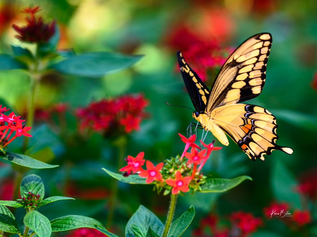
| 2 |
May 24 |
Comment |
Great capture, Piers! I love to chase butterflies, but have never seen a Painted Lady butterfly. Your last edit is fabulous. I love the details of the wing and the tiny hairs on its body. Personally, I would add a bit of canvas to the right side of the butterfly, as it feels a bit cramped to me. |
May 14th |
| 2 |
May 24 |
Comment |
What a fun, very creative image! I love it. The colors are great together. Her red hair and bright red lipstick against the greens��you couldn't have planned it better. Reducing the highlights in the window was a good choice. It brought everything else forward in the image. Nice job! |
May 14th |
| 2 |
May 24 |
Reply |
Try using Image, Canvas, in PS to add more to the left side. Then use the marquee tool to select the added area and use Content Aware, Fill. That might give you a better result. |
May 9th |
| 2 |
May 24 |
Reply |
Try using Image, Canvas, in PS to add more to the left side. Then use the marquee tool to select the added area and use Content Aware, Fill. That might give you a better result. |
May 9th |
| 2 |
May 24 |
Comment |
Beautiful light on the fox. I especially like the rim lighting and how well his face is lit. However, I feel that shot was risky, as wild animals can do wild things in an instance. Here, in Florida, and probably most states in the US, it's against the law to feed wild animals. We had a neighbor rammed by a large buck while he was working in his garden. And we live in a development. Not preaching, just be careful! Great image, Terri |
May 1st |
| 2 |
May 24 |
Comment |
Wow, the lighting is wonderful! I see the rule of odds in that 3 of the birds have the standard yellow head for a brown pelican and one still has a brown head, which is a juvenile. My only comment is to add some of the canvas back to the left side so that the birds have space to travel. If need be, you could crop more off the right side. Great image, Jim! |
May 1st |
7 comments - 6 replies for Group 2
|
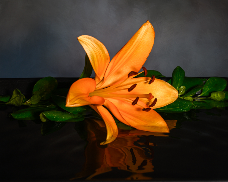
| 6 |
May 24 |
Comment |
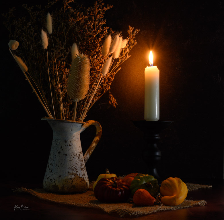
Nice image, Tom. Your exposure is great. Just a few minor adjustments. There are two parallel white lines on either side of the flame that I would try to remove using the stamp tool in Photoshop. I would also add a bit to the left side of the image to make up for the sliver of vessel that was cut off. I think, because it is just a sliver, it's more noticeable that it's not there. There's also a mark in the top right hand side that I'm assuming might be your watermark. Because of its color, it pulls my eye away from your subject. If you can't change the color, I would reduce its opacity so not to be distracting. Just my thoughts! |
May 16th |
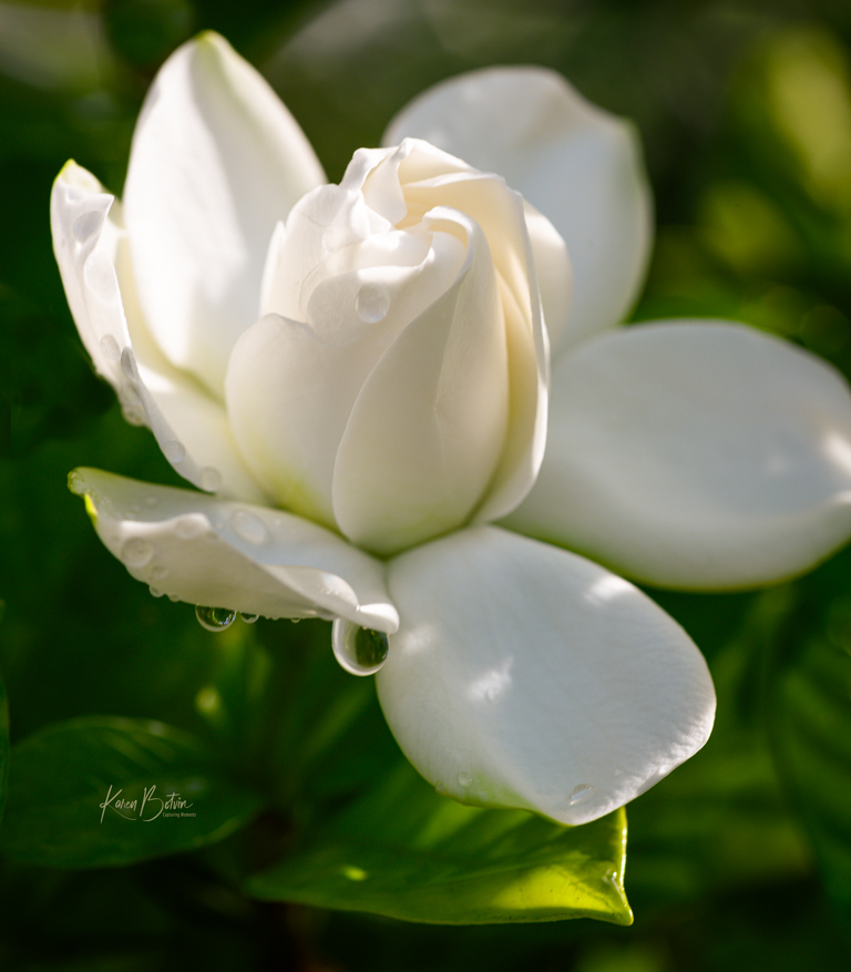
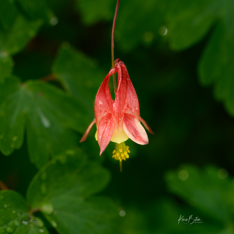
| 6 |
May 24 |
Comment |
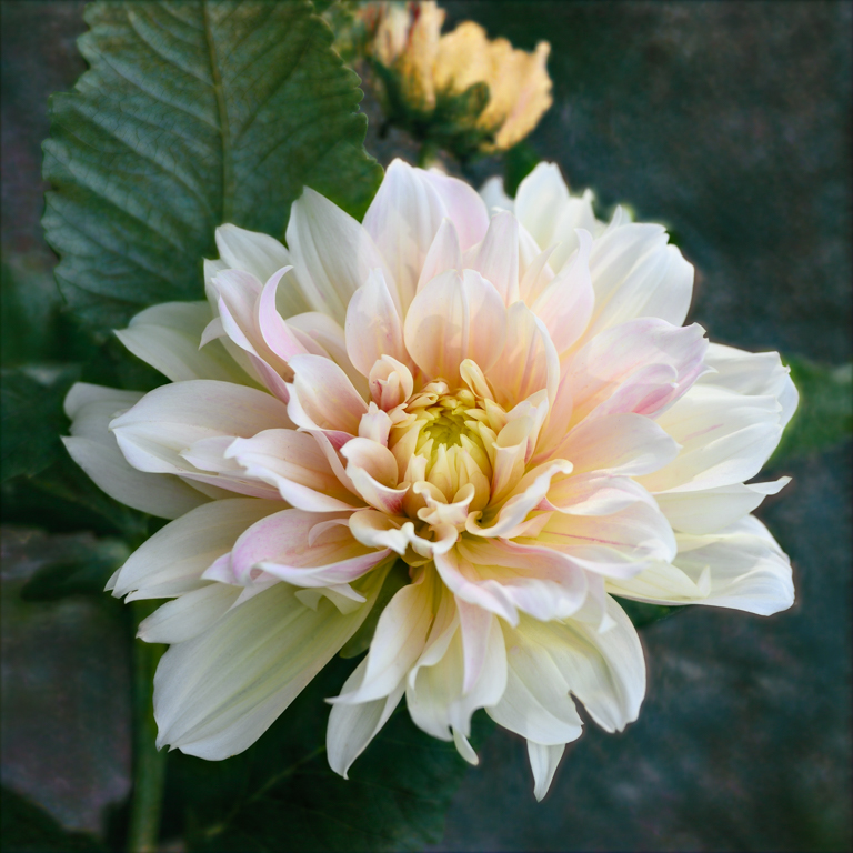
You've captured a beautiful Iris well. The raindrops and exposure highlights the delicateness of the petals. I'm not sure what editing software you use, but I would remove or at least darken the light color of the other buds in the image. One's eye always goes to the lightest parts of an image and once I noticed the ones below the flower my eye jumped to the others taking my focus away from the flower. |
May 16th |
| 6 |
May 24 |
Comment |
Nice bright, almost cheery colored peppers. Great reflections on the foreground, however, a bit too much light as there are quite a few hot spots on the peppers. Perhaps filtering the light a bit more or less shutter time would help. I would also like to see a bit of shadows on the background rather than it all being just a solid black. To me, it would add a bit of separation. Just a personal preference. |
May 16th |
3 comments - 0 replies for Group 6
|
10 comments - 6 replies Total
|