|
| Group |
Round |
C/R |
Comment |
Date |
Image |
| 2 |
Apr 24 |
Reply |
Thanks, Terri! |
Apr 30th |
| 2 |
Apr 24 |
Reply |
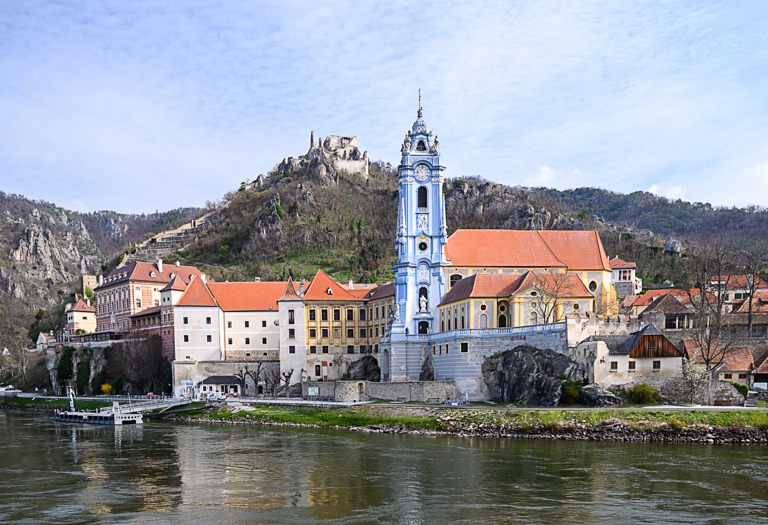
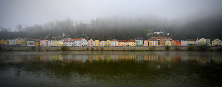
Thanks Tor, I do like the more panoramic view that Jim suggested as well. I played around with everyone's comments and really like the outcome. See my revised image below in my response to Lance. |
Apr 16th |
| 2 |
Apr 24 |
Reply |
Thanks Lance, for stopping by and commenting on my image. I've tried the 16:9 and 16:10 crop but it takes too much of the image away for my liking. I like the more panoramic view. I played around with everyone's' comments and here's what I came up with. I really like this! |
Apr 16th |
 |
| 2 |
Apr 24 |
Reply |
Thanks, Martin. To me, if I add too much saturation it takes away from the misty feel. I will play around with it some more and see what I come up with. I do like more of the panoramic view that Jim suggested. See my final under my response to Lance. |
Apr 16th |
| 2 |
Apr 24 |
Reply |
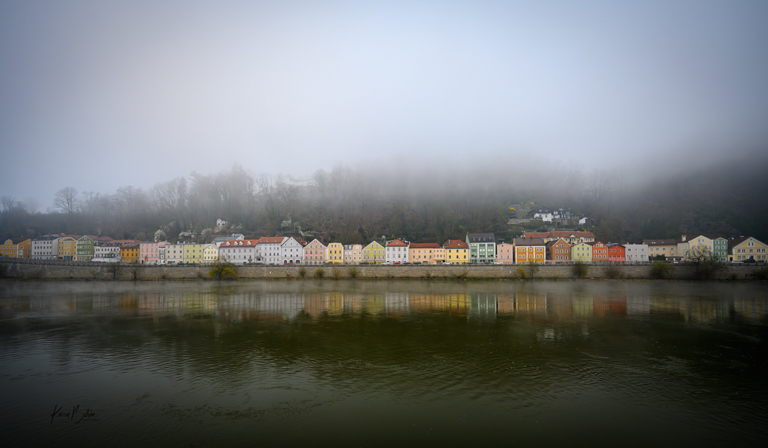
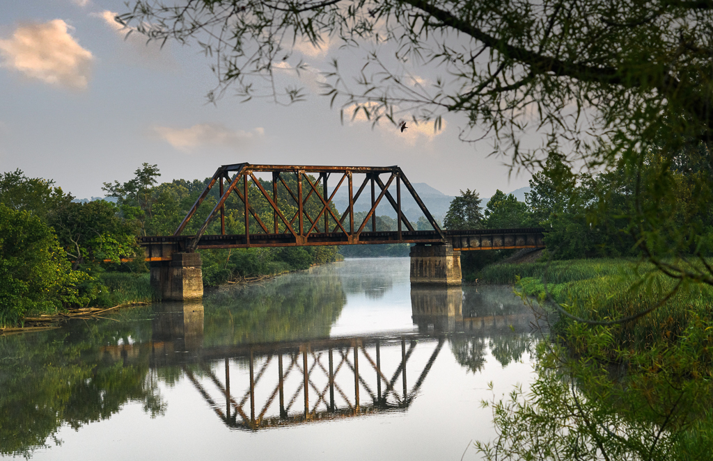
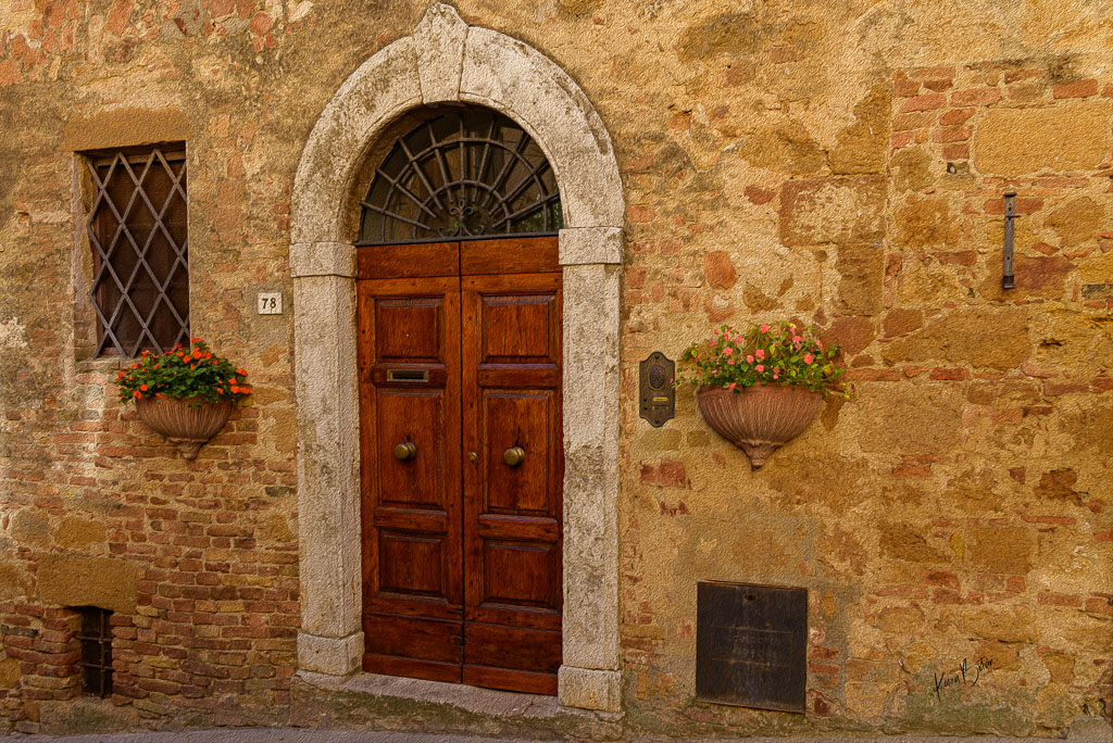
Thanks, Piers, I agree with the cropping of the sky and the water. My thoughts on the focus of this image was the colorful line of buildings, their reflections on the water and the fog in the background. |
Apr 6th |
| 2 |
Apr 24 |
Reply |
Thanks for your comments, Jim. Point taken regarding the sky and the water, however, the repetition of the colorful buildings and their reflection and fog in the background was the point of the image. |
Apr 6th |
| 2 |
Apr 24 |
Comment |
Wow, Martin, great shot and timing! I guess his tongue is out in anticipation of the drink he was about to get. The reflection of the bat on the water is perfect! I Like Piers' suggestion to add a linear gradient to the image to direct the light. |
Apr 6th |
| 2 |
Apr 24 |
Comment |
First, I like the color version better than the B&W. I think it provides more separation around the veil of her hat which gets a bit lost in the B&W. I agree with Jim on the placement of her left hand. If only she would have laid it on top of the couch instead of behind it. The floor boards don't seem to line up and look like 2 images may have been seamed together. And lastly and most significant to me, the model appears to be looking into space rather than connecting with anything. I'm sure you realized a lot of these issues yourself. |
Apr 6th |
| 2 |
Apr 24 |
Comment |
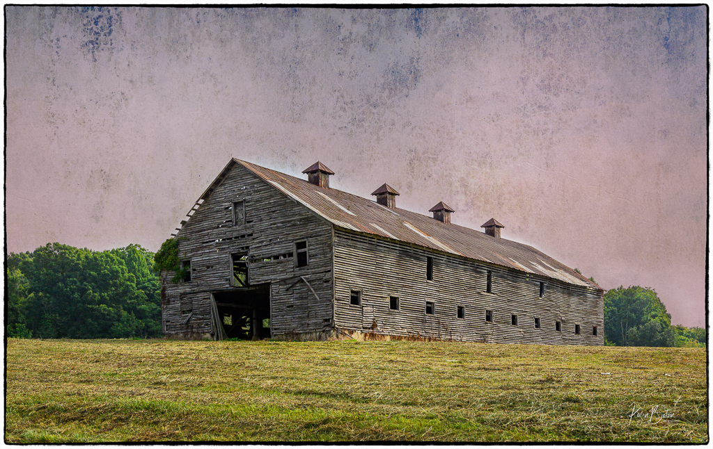
Sorry to hear that you got COVID twice! To me, this image is all about lines, patterns, and repetitions. Your perspective is spot on. If you're after an image of a building, I would desaturate the sky a bit more. But I like the idea of an abstract by cropping out the sky altogether. Nice image! |
Apr 6th |
| 2 |
Apr 24 |
Comment |
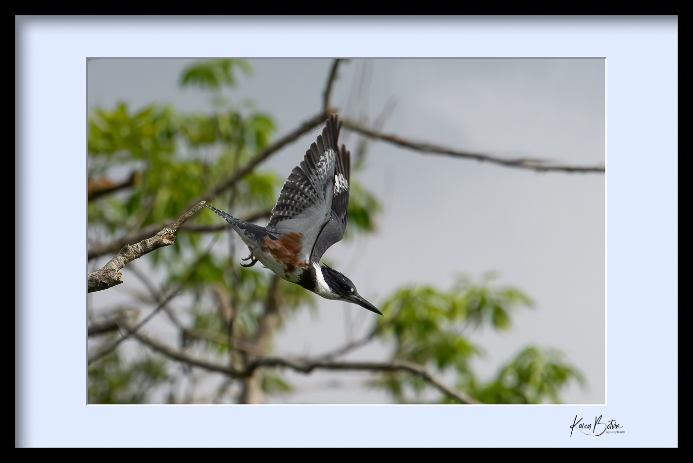
Perfect timing in catching this bird's wings spread evenly opened and the tail fanned. You've cropped it squarely in the middle as the bird is flying directly toward you. I don't do much B&W, but I feel as though this bird needs a bit more shadowing. Maybe on the tail and a bit in the lower half of its wings. Just a thought. Very nice capture. |
Apr 6th |
| 2 |
Apr 24 |
Comment |
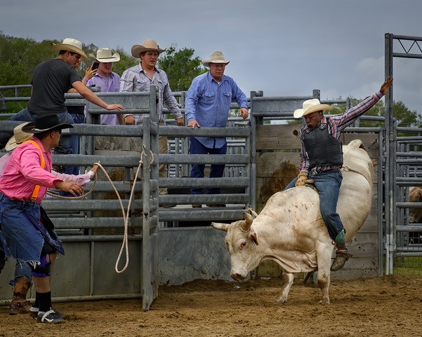
Perfect timing for the symmetrical positioning of the family walk! These birds are so cool to watch. I love the rim lighting on the 2 colts. I would try to dodge & burn some of the areas around the birds to add some definition to the path and to also adjust some of the glare. When you cropped the top you left a bit of a black band from the shadows in the original. I would stamp that out a bit. Great timing, Jim, and very cute image! |
Apr 6th |
5 comments - 6 replies for Group 2
|
| 6 |
Apr 24 |
Reply |
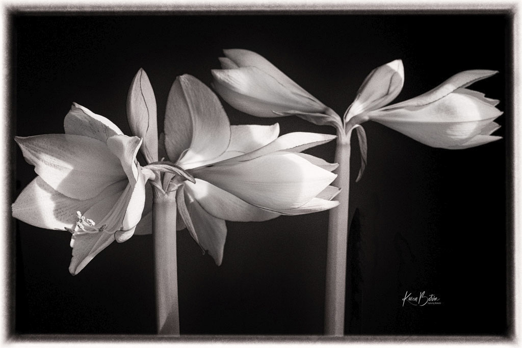
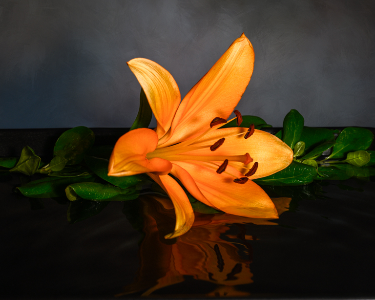
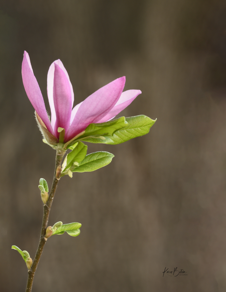
Thanks, Charissa, for your comments. This Lensbaby is the Composer Pro with the Soft Focus II optic. Not sure if you're familiar with Lensbabies, the Composer Pro has different optics that one can insert. It also can be tilted to direct the focus at a given area thereby softening the other areas. If you've never used the CP and you decide to invest in one, I would suggest you start with one of the Sweets (available in 35, 50, and 80mm) and don't tilt the lens until you learn how to focus it. They are completely manual lenses and take some practice. |
Apr 30th |
| 6 |
Apr 24 |
Reply |
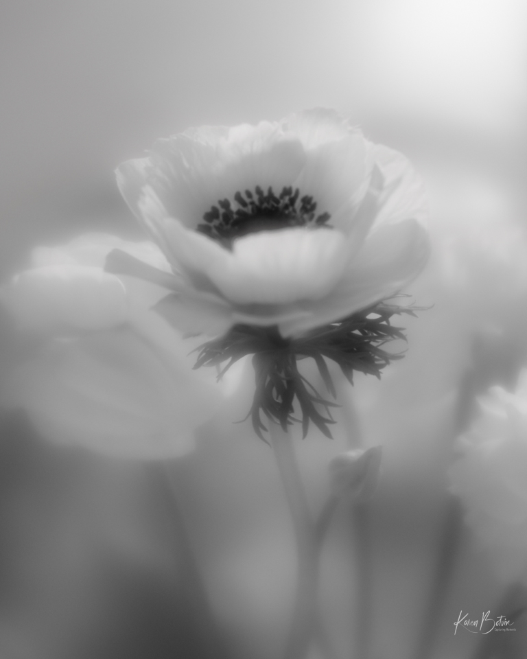
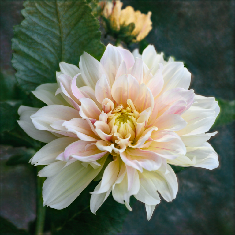
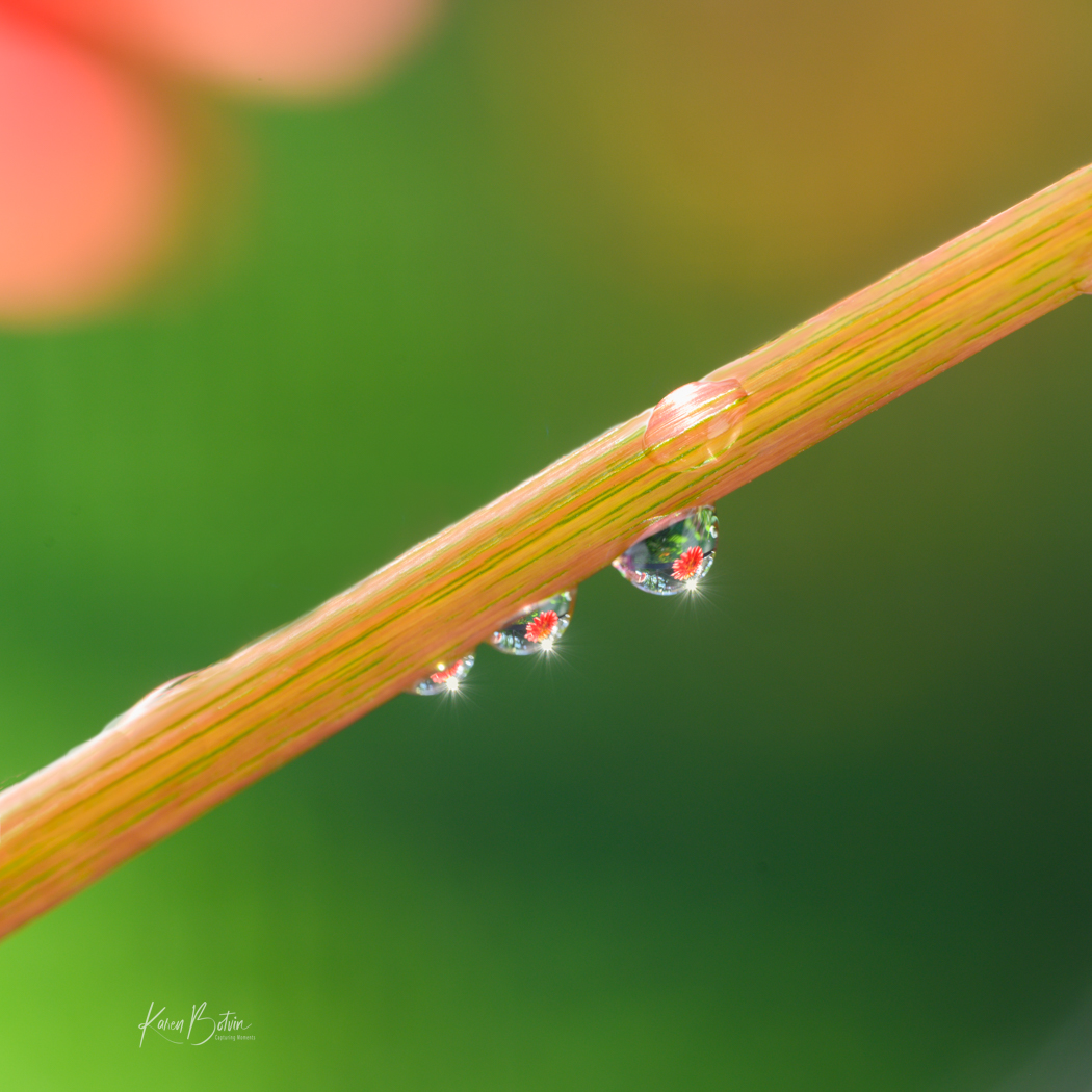
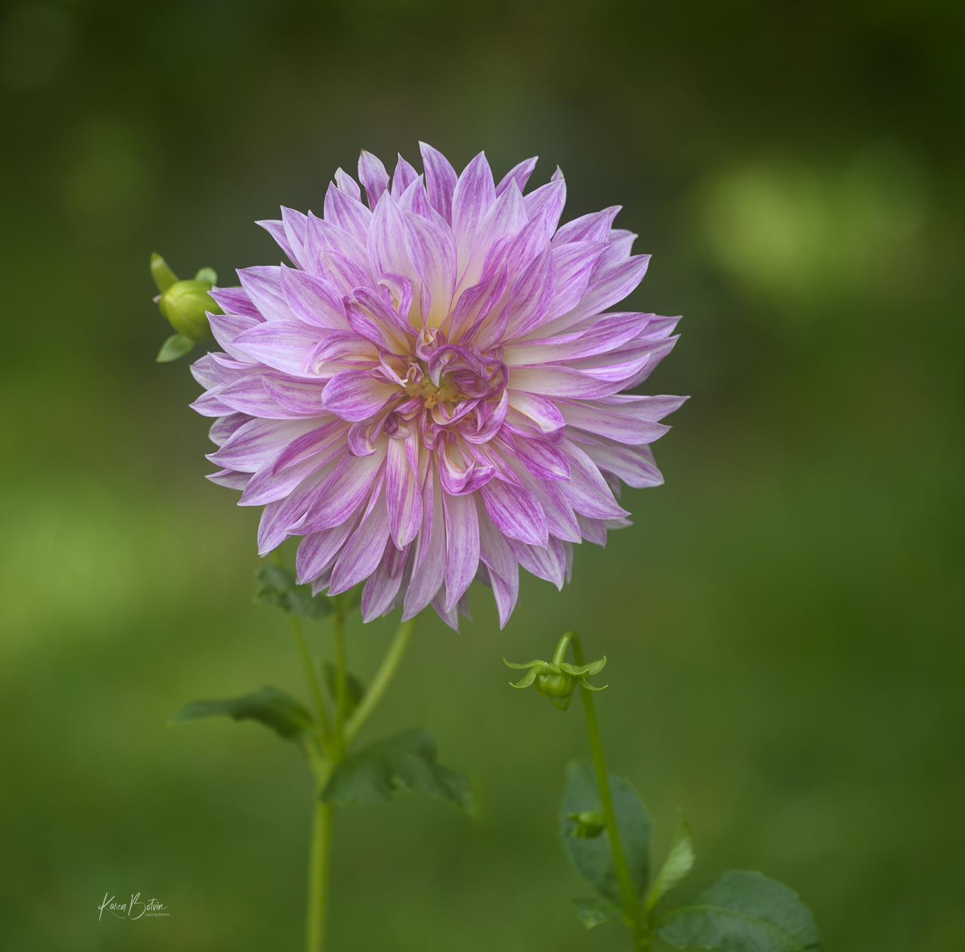
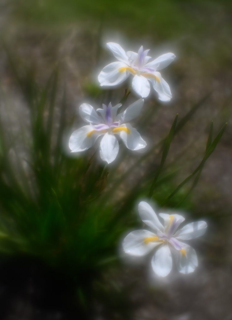
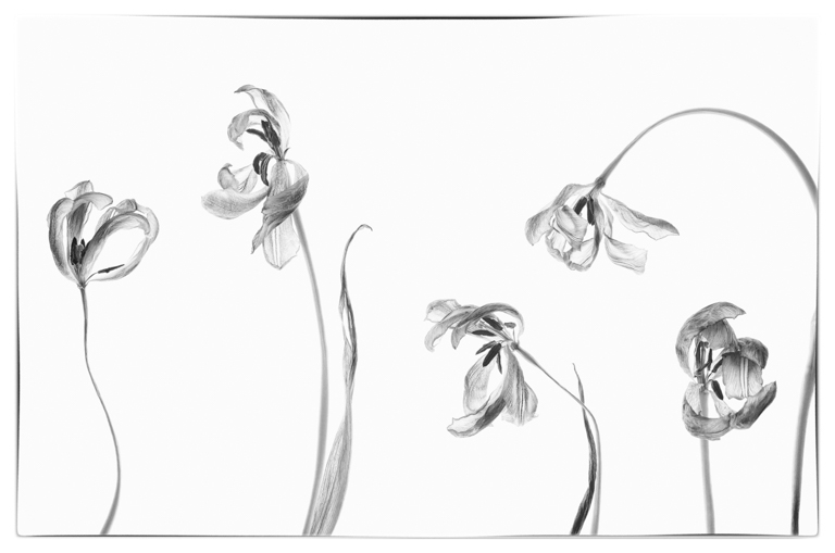
I know what you mean, Jim. I actually have a love/hate relationship with these lenses, although I have most of them. When they work and provide what one was envisioning, they really are winners! I prefer my flowers to have a softer glow or painterly look to them, but I do like some of them to be sharper than others. I find that these lenses are better used outside in a garden as the bokeh and glow comes alive in the natural light. They are certainly harder to select if you want to put just the flower on a separate layer. I'm glad that you are open to a bit of variety. Thanks for your comments! |
Apr 30th |
| 6 |
Apr 24 |
Reply |
Thank you, Ruth. I will experiment some with the crop. |
Apr 30th |
| 6 |
Apr 24 |
Comment |
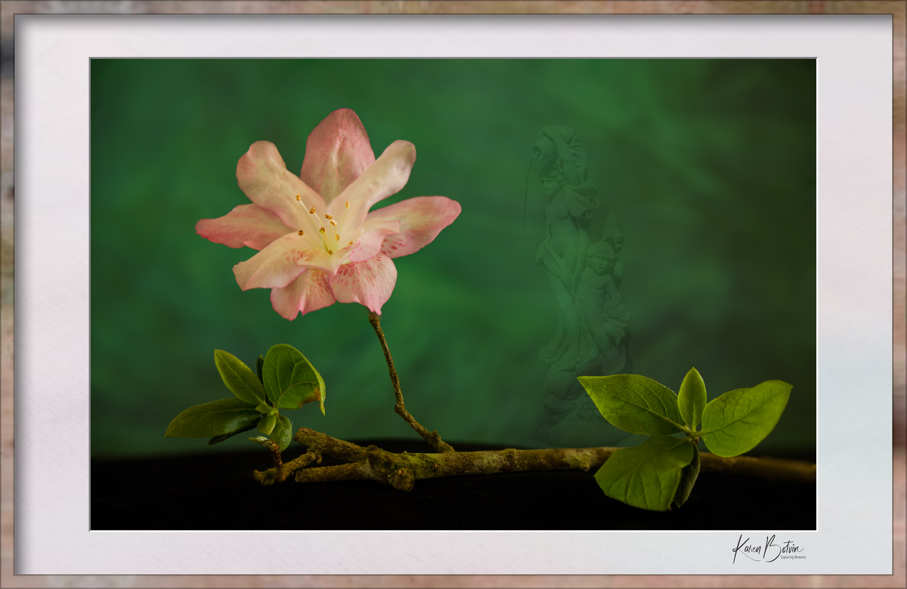
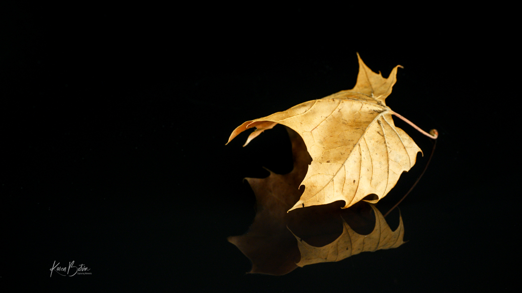
Living in Florida, I naturally see many of these and they are a difficult plant to capture at the right time. They seem to bruise easily and get full of blemishes. This one is rather interesting in that the wilted leaves seem to be happening in some kind of symmetrical order in the back. Nice capture! |
Apr 16th |
| 6 |
Apr 24 |
Comment |
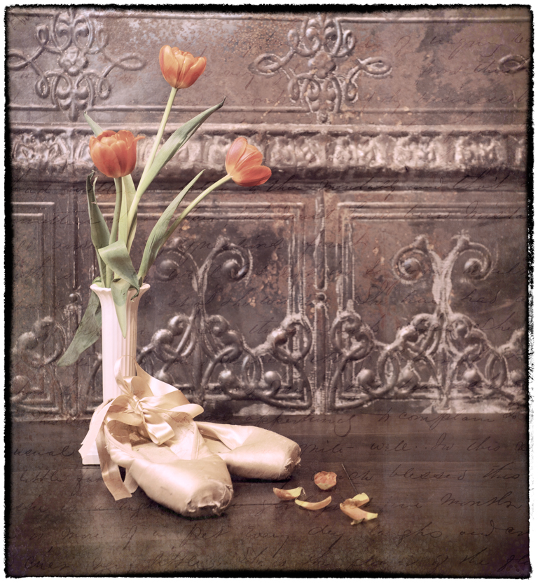
Nice job with the light painting! I think it strikes the perfect mood for a pair of old shoes. My only suggestion would be to add a bit more light to the left shoe near the top where it meets the background to give it a bit more separation. You gave me an idea to try my hand at light painting an ole pair of white baby shoes. If it works out, I'll post at another time. |
Apr 16th |
| 6 |
Apr 24 |
Comment |
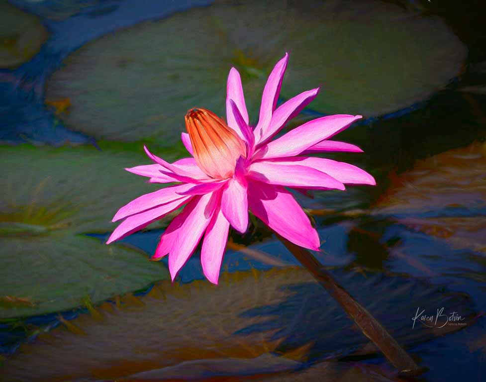
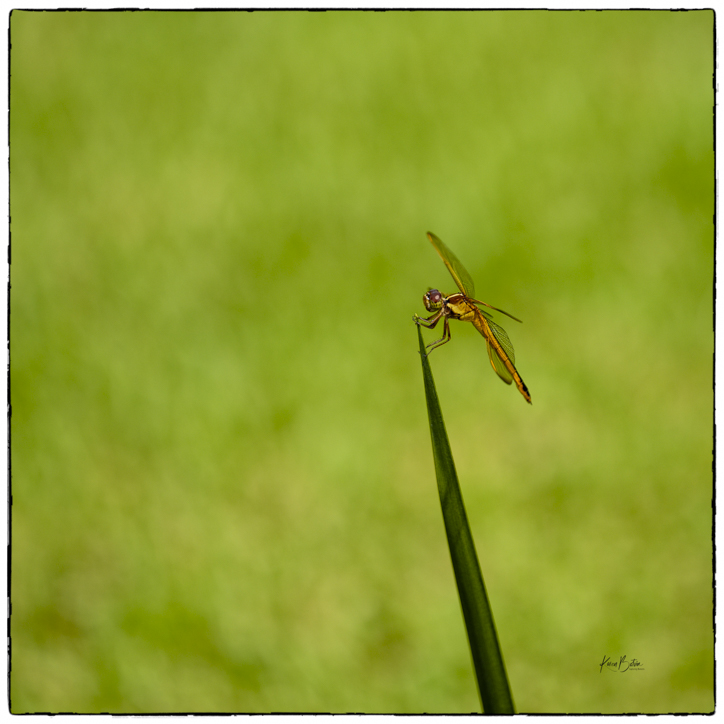
Very nice image! I can almost feel its pleasure as it sails effortlessly through the water. My only suggestion would be to apply a linear gradient to the water to dampen down some of the glare. Great capture at just the right time. |
Apr 16th |
| 6 |
Apr 24 |
Comment |
Oh my, Jim, she's beautiful! Her very expressive eyes and those symmetrical dots on her nose��makes me just want to pick her up and snuggle. Thanks for posting her photo. She made my day! |
Apr 16th |
4 comments - 3 replies for Group 6
|
9 comments - 9 replies Total
|