|
| Group |
Round |
C/R |
Comment |
Date |
Image |
| 2 |
Nov 23 |
Reply |
Hi Jim, yes, I do prefer the water darkened down a bit but it looks as though you may have sharpened it as well which is causing him to look a like he's pasted there. Maybe try to soften his outside edges a tad. |
Nov 10th |
| 2 |
Nov 23 |
Reply |
Hi Jim, yes, I do prefer the water darkened down a bit but it looks as though you may have sharpened it as well which is causing him to look a like he's pasted there. Maybe try to soften his outside edges a tad. |
Nov 9th |
| 2 |
Nov 23 |
Comment |
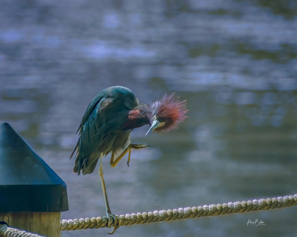
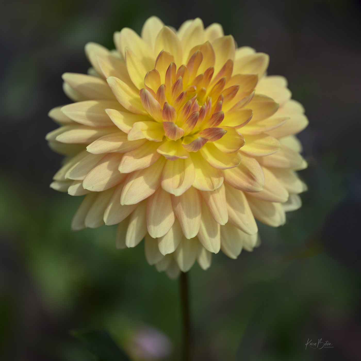
I think I've seen this guy walking on the ocean side of FL! LOL! Your exposure is spot on and the image is nicely composed, however, when I first looked at this photo it felt like it was shot too close. I think Martin hit on the reason I felt that way in that the image is very busy. I agree that I don't miss the tail feathers of the parrot on the viewer's right. To me, I go right to the jewel in the pirate's eye and then down through the image. I look at this image as a portrait taken as a full frontal. If you see him again, I would try to get him to turn a bit toward the viewers right. As for the water, I would darken not lighten and add a bit of blur. Welcome back to FL. |
Nov 5th |
| 2 |
Nov 23 |
Comment |
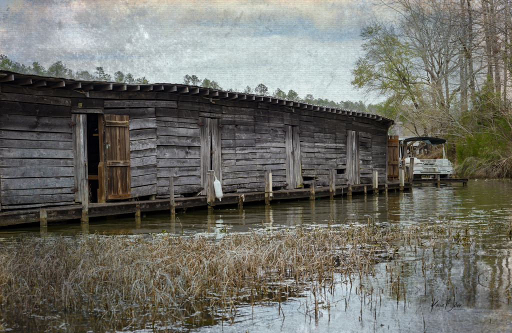
Wow! I love the moodiness of this image. It reminds me of the cops and robbers movies from long ago. You've created a very believable story here. The lighting is perfect. I like your choice of flipping the image and also the film noir theme. Great job! |
Nov 5th |
| 2 |
Nov 23 |
Comment |
What a fun image! I like that you continued to move around and managed to get that spike at just the right spot! I probably would have walked right by this opportunity thinking it was too busy, but you were able to isolate the billboard and make a story from it. I do agree with Shirley that you might darken down the right side and top edge a bit. Also, I would try to remove or darken the street lamp on the left. Bravo on your sense of humor! |
Nov 5th |
| 2 |
Nov 23 |
Comment |
Fantastic car image! I love your editing to deepen the red and eliminate most of the glare from the fenders without causing it to become that ugly gray. I like your crop and didn't notice that the fender had been cut-off because, to me, the focus is on that fabulous grill and headlights. I like the color version much more than the B&W as I came wander around all the details of the car. Great Image! |
Nov 5th |
| 2 |
Nov 23 |
Comment |
Wow, Shirley, what a difference you made with this image. The golds and blue are so complementary, but I agree with Piers in that I think the blue could be a little less saturated. You didn't say anything in your description regarding the splash of white, but like Martin, since your original doesn't show that area being highlighted, I'll assume that was a part of your creation. Nicely done. |
Nov 5th |
| 2 |
Nov 23 |
Reply |
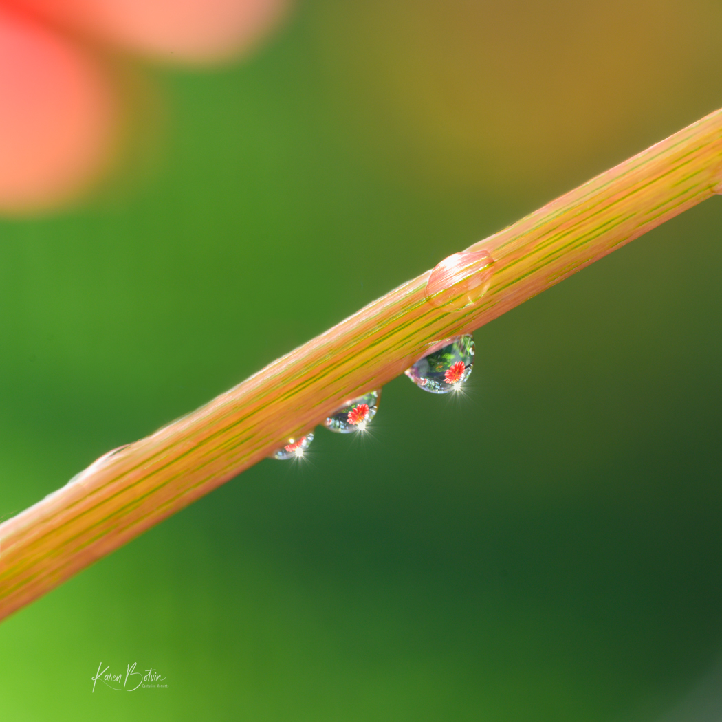
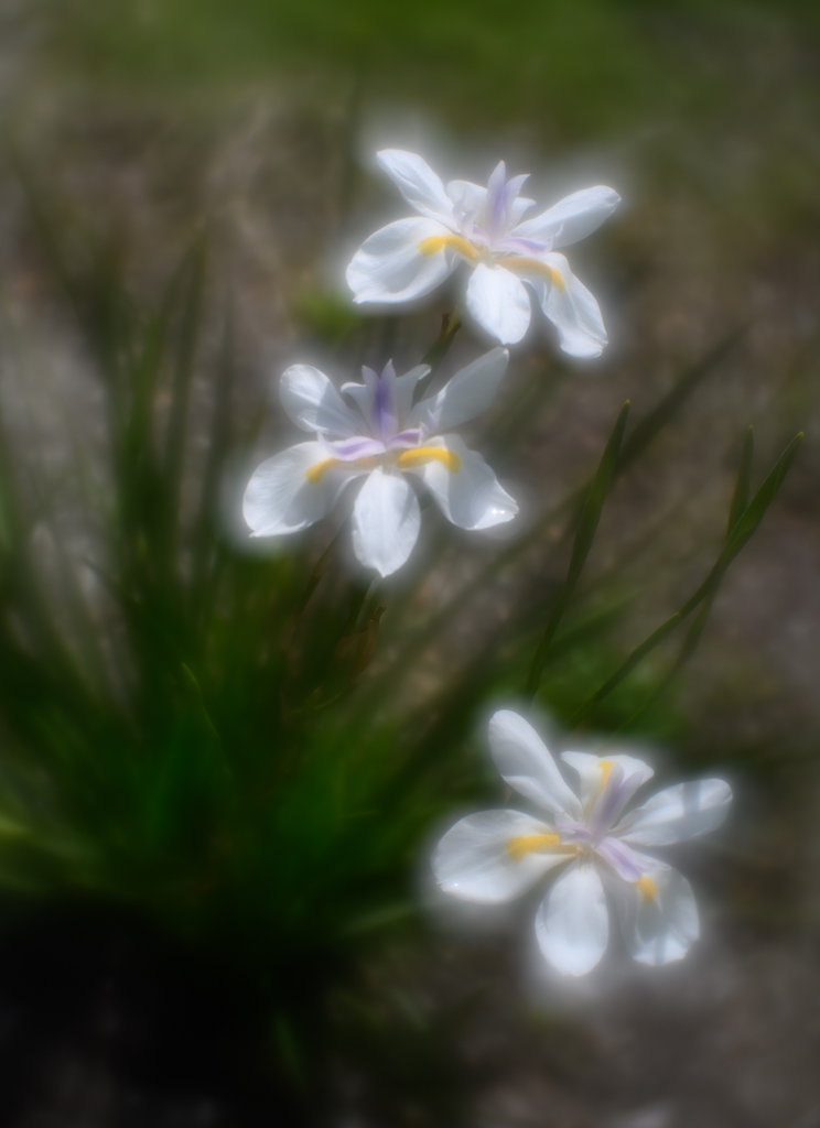
Thanks so much for your comments. I'm glad it's getting praise as I was really happy when I finally got to this shot and not only had the flowers in the water droplets but also the sunbursts. As to Piers' comment regarding that pesky triangle, I should have caught that because I know that the Raynox has the tendency to vignette the edges because it's smaller than the lens. I need to learn to edit my images then let them sit for a few days. Then when I come back to them, hopefully I can look at them with refreshed eyes. |
Nov 5th |
| 2 |
Nov 23 |
Reply |
Thank you, Piers for your comments. Vignetting is something that I understand and know it draws the viewer to focus on the subject, but somehow I forget to use it at the most critical times. I guess I get too focused on other things in my image. I must make a mental note to always explore it at the end of my edits. As for that pesky triangle, I should have seen that and fixed it in PS. The Raynox creates a vignette similar to using a cropped framed lens on a full frame camera. When I set my camera to 1x1 format, I can usually avoid it. Thanks for pointing it out. |
Nov 5th |
| 2 |
Nov 23 |
Reply |
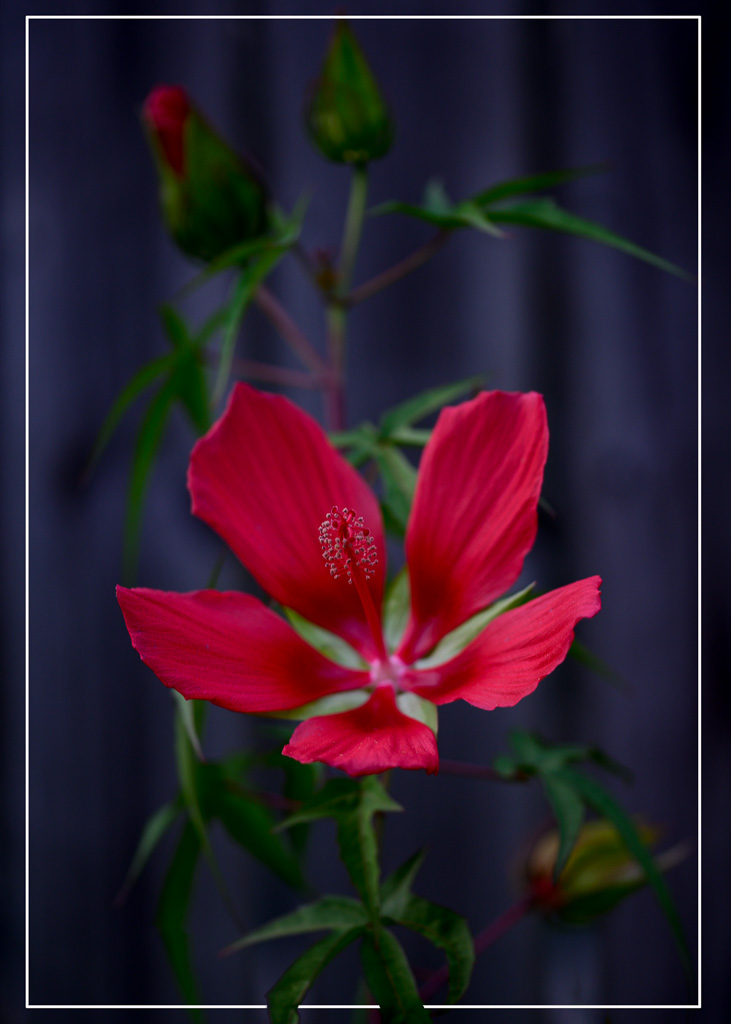
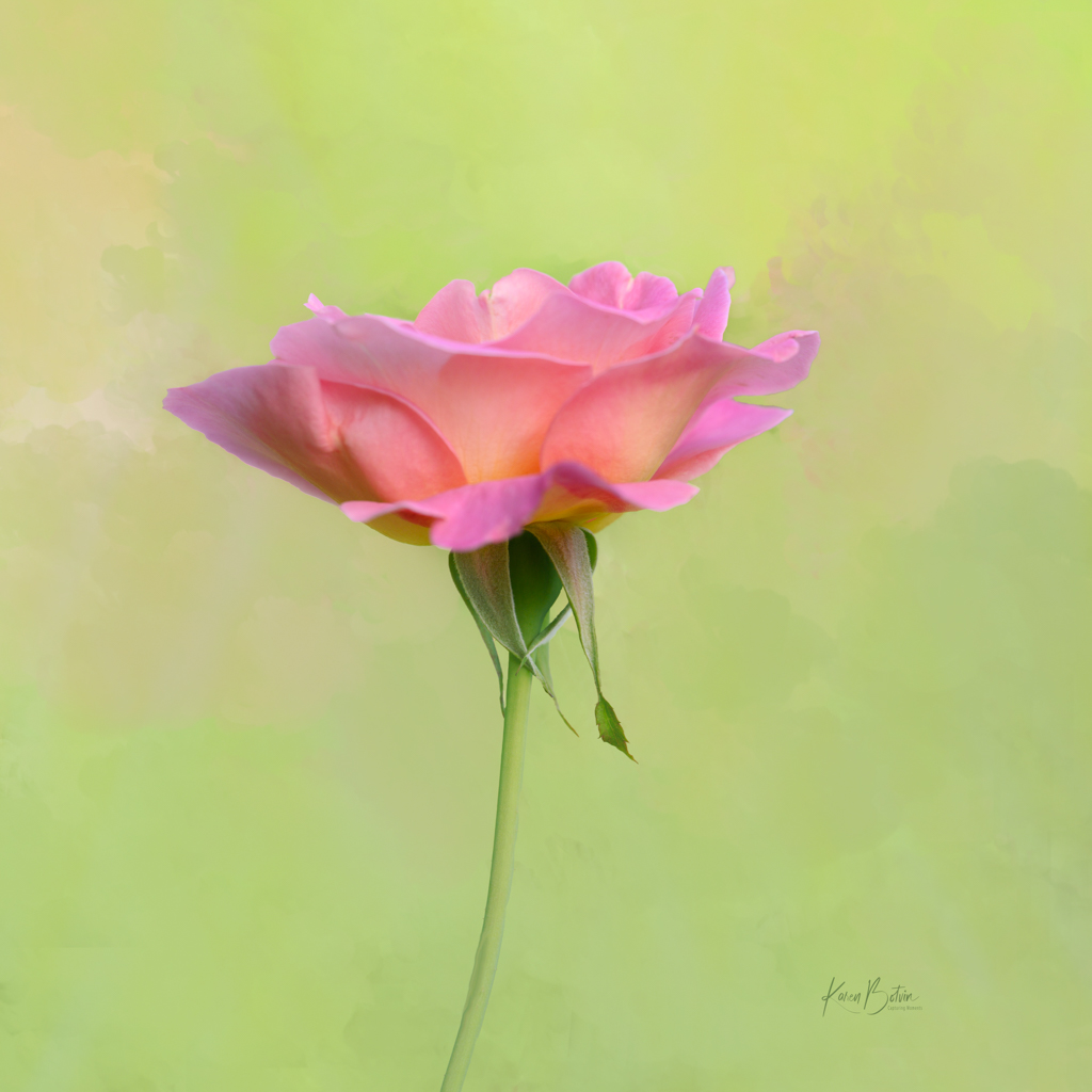
Thank you so much for your comments, Shirley. Being mostly a flower photographer, I follow numerous flower photographers and the number one thing they all teach is to never put the stem coming from any corners. Guess it's one of those "so-called" rules. Perhaps Martin's comment is why...to give breathing room to the stem. |
Nov 5th |
5 comments - 5 replies for Group 2
|
| 6 |
Nov 23 |
Reply |
Thank you for your comments, Doris. |
Nov 25th |
| 6 |
Nov 23 |
Reply |
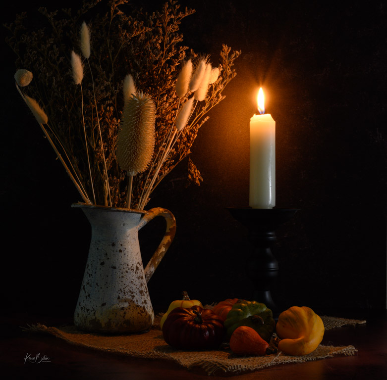
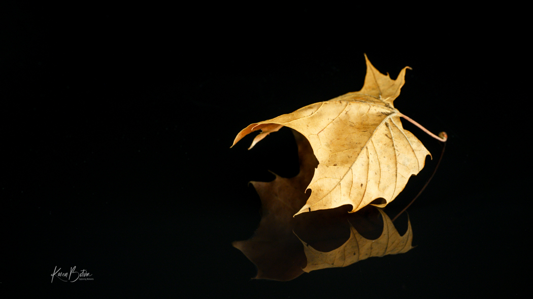
Thank you, Jim for your kind words. This is only one leaf sitting on a high gloss black surface. The only lighting used was natural window light. |
Nov 25th |
| 6 |
Nov 23 |
Reply |
Happy Thanksgiving to you Charissa, and thank you for your comments. My setup was very simple. Just a high gloss black surface which gave the one leaf its reflection. Glad you liked it. |
Nov 25th |
| 6 |
Nov 23 |
Comment |
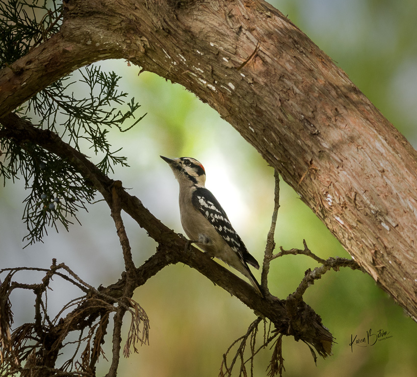
This is a great cellphone capture. I, too, like to see images of folks working with their hands, but I just never seem to get the right angle of view. You managed that very well. |
Nov 12th |
| 6 |
Nov 23 |
Comment |
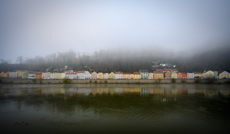
Love the patterns and textures in this image. Maybe consider adding a vignette to keep the viewer's eye from wandering outside the rim of the manhole cover. I will be in Passau in mid March for a river cruise. |
Nov 12th |
| 6 |
Nov 23 |
Reply |
Yes, much more pleasing to my eye! |
Nov 10th |
| 6 |
Nov 23 |
Comment |
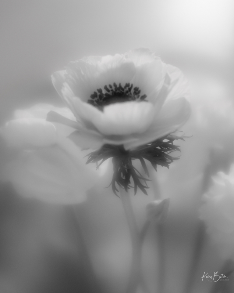
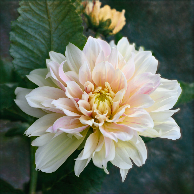
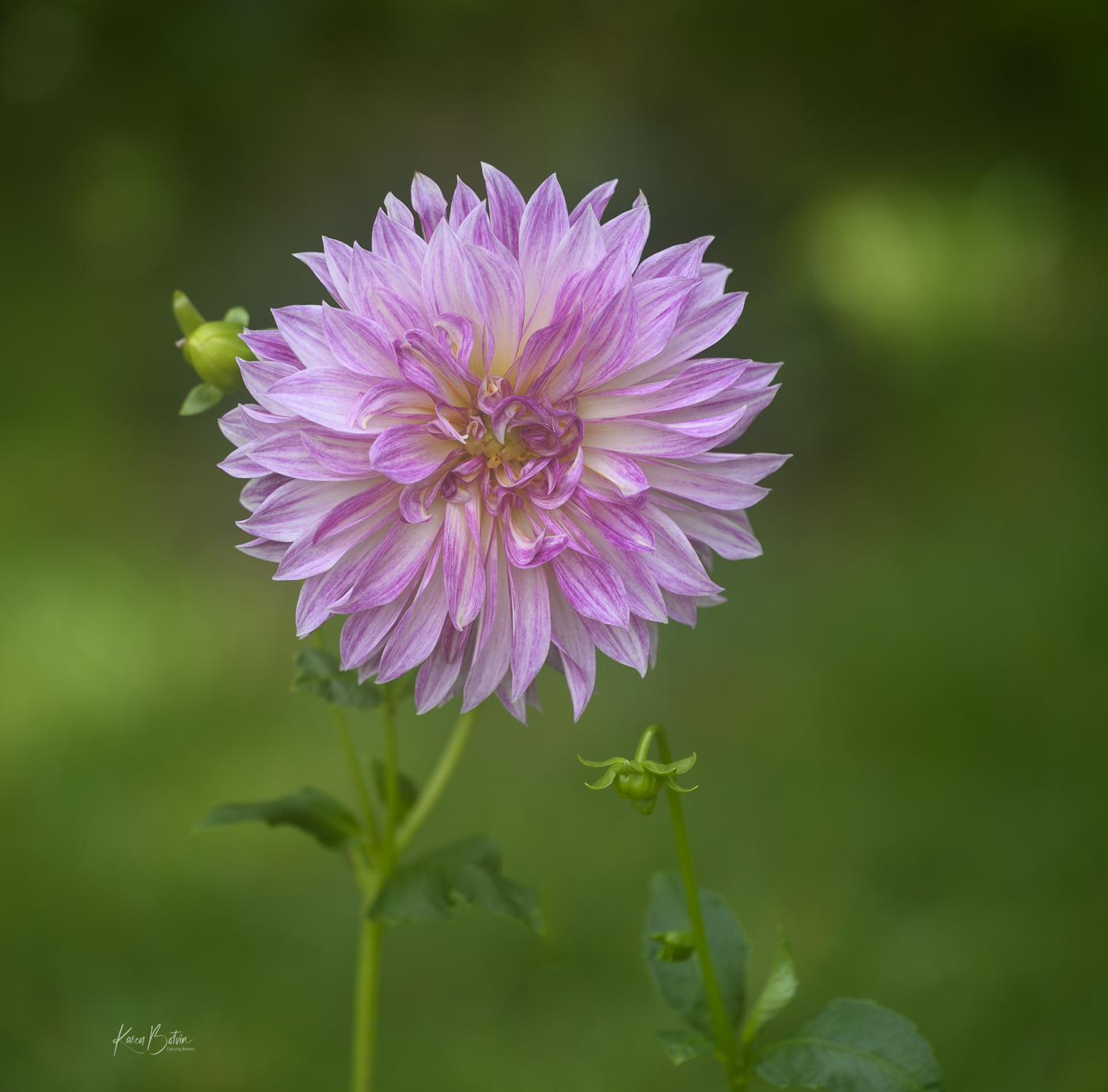
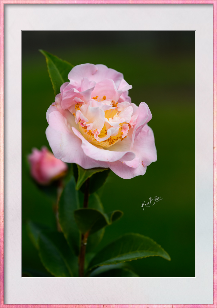
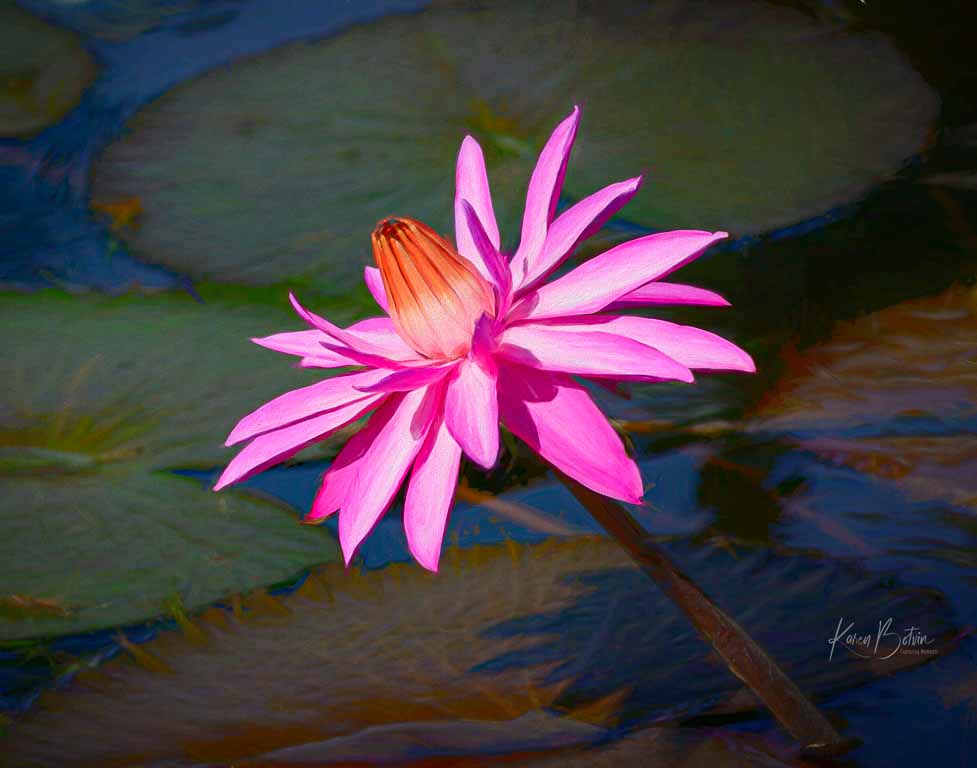
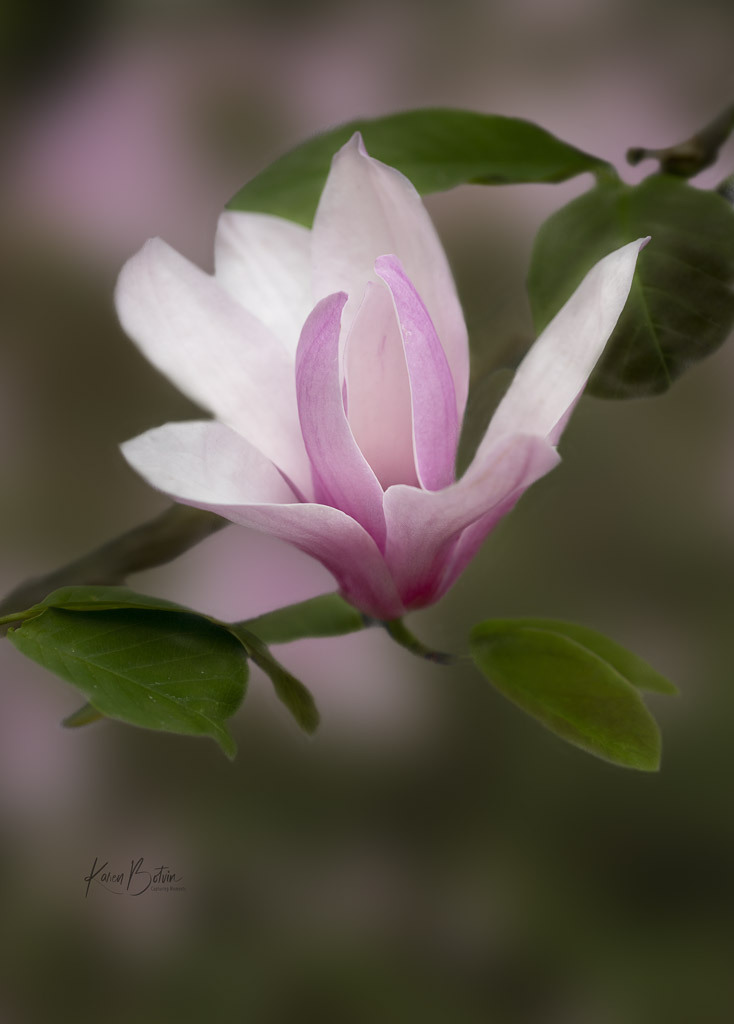
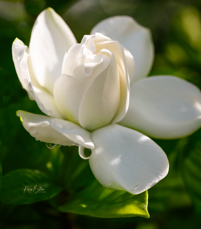
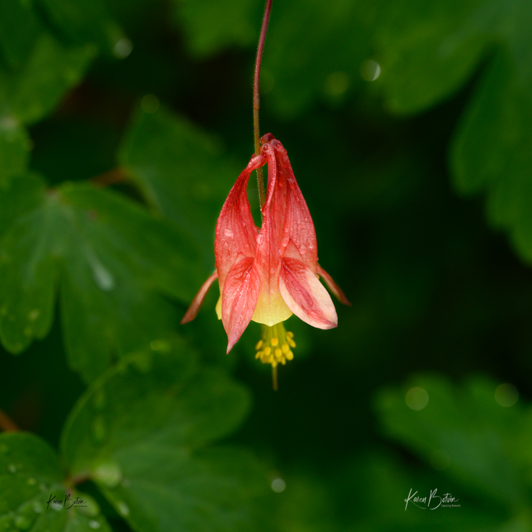
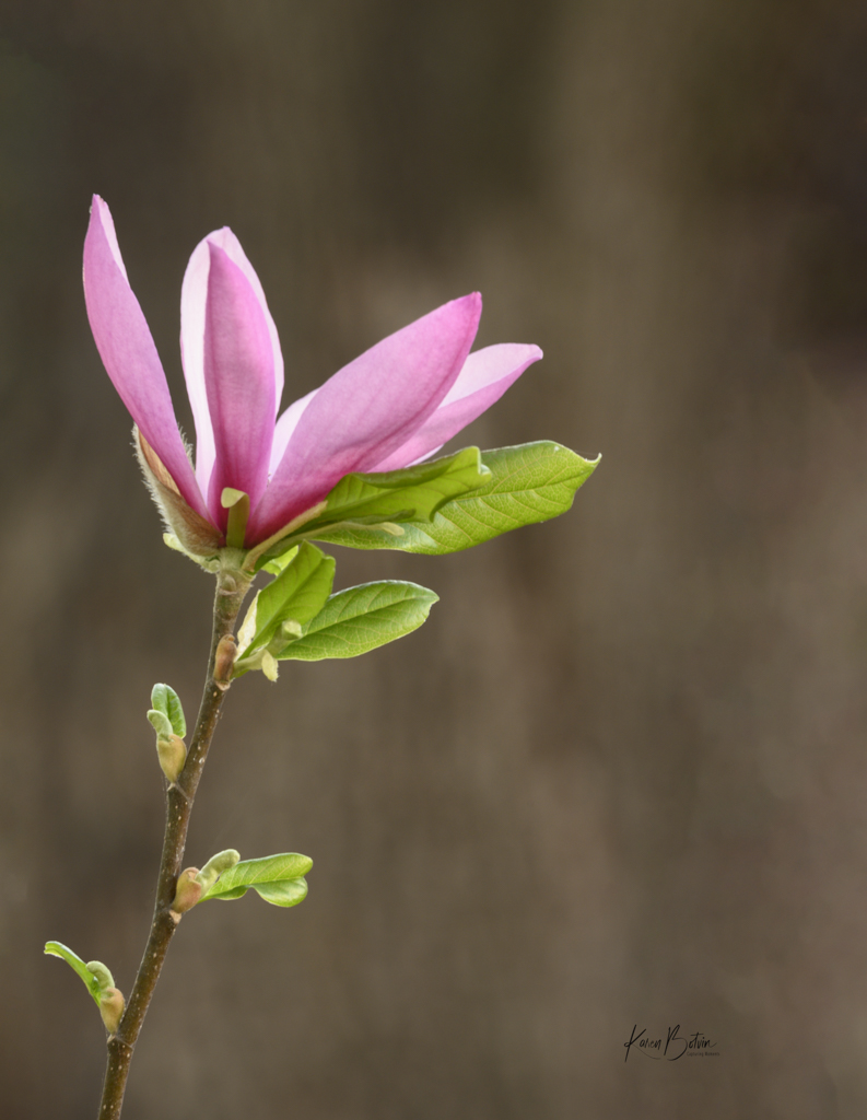
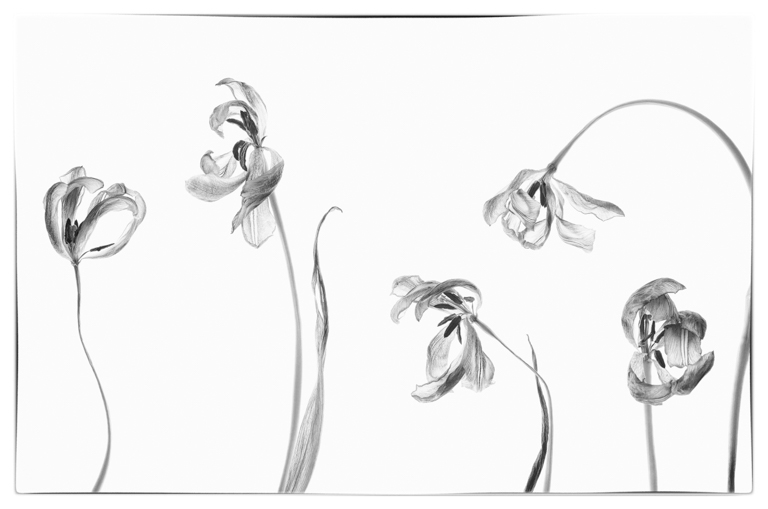
What a kaleidoscope of colors! Shooting flowers with a very shallow depth of field calls the viewers eye to the area that's in sharpest focus while the rest of the image fades in the background. In this image, the leaves with their tiny hairs appears to be the subject. I do like the positioning of the bud, however, I feel the background overpowers the bud. Maybe consider desaturating it a bit and darkening it to give some separation to the bud. |
Nov 10th |
| 6 |
Nov 23 |
Comment |
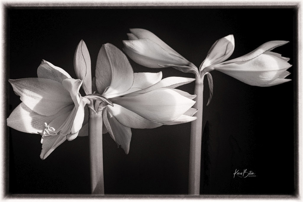
What a fun image, Charissa! I love the hints of pink among all the shades of green. With all its lines and textures, you managed to get the one plant centrally located. Bravo! |
Nov 10th |
| 6 |
Nov 23 |
Reply |
Thank you, Ruth, for your comments. |
Nov 9th |
| 6 |
Nov 23 |
Reply |
Yes, much more pleasing to my eye! |
Nov 9th |
| 6 |
Nov 23 |
Comment |
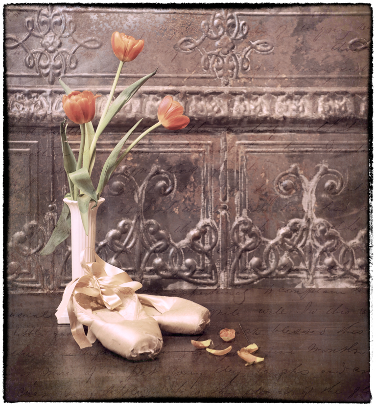
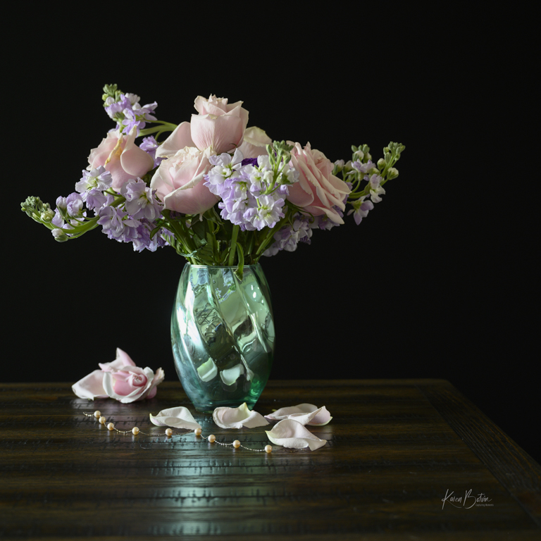
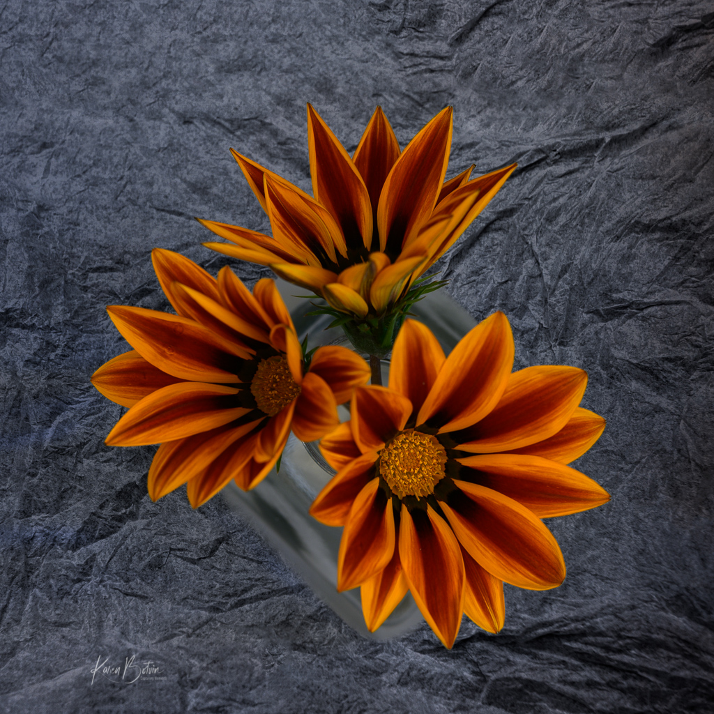
Interesting image, Ruth. I like all the different directions that the stems are going. It adds interest to the image. Your choice of vase is the inverse of the stems above and a very good choice. Your lighting is good, but I would lighten the image a bit more and possibly move the vase a bit to the viewers left to get it out of center. Nice capture. |
Nov 5th |
5 comments - 6 replies for Group 6
|
10 comments - 11 replies Total
|