|
| Group |
Round |
C/R |
Comment |
Date |
Image |
| 2 |
Sep 23 |
Reply |
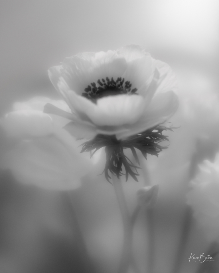
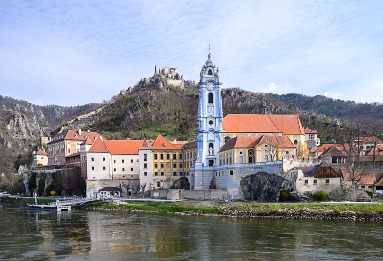
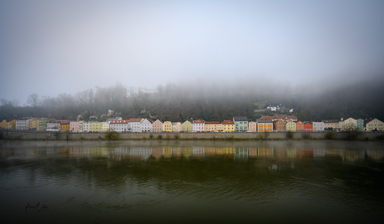
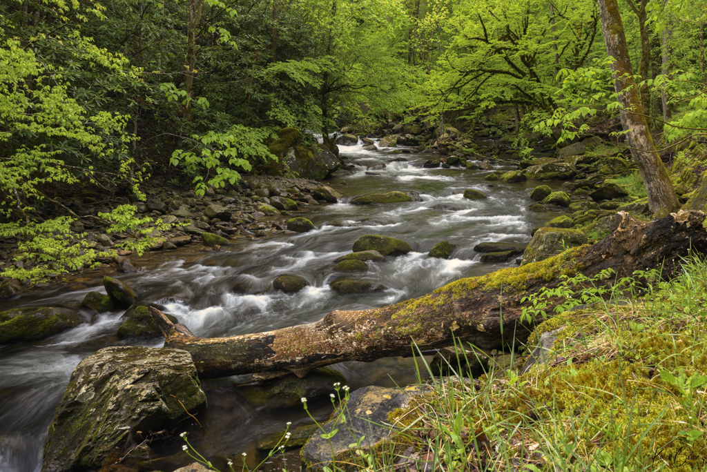
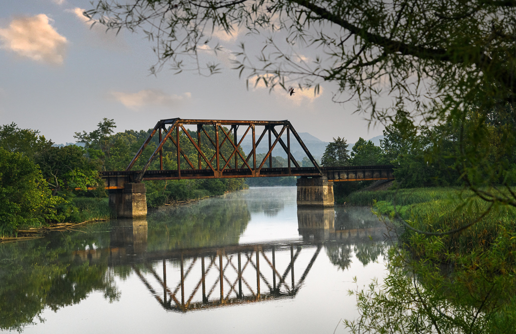
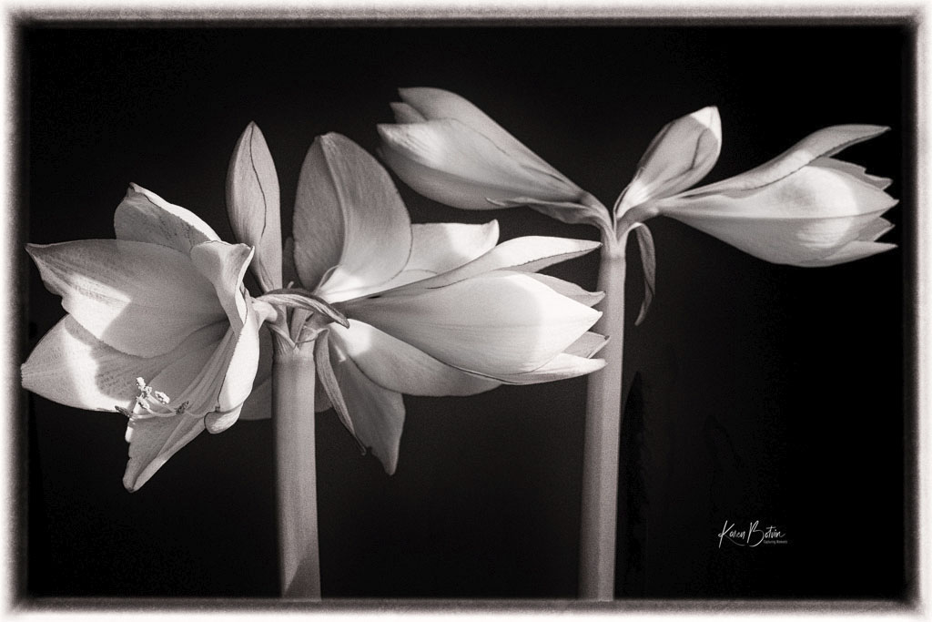
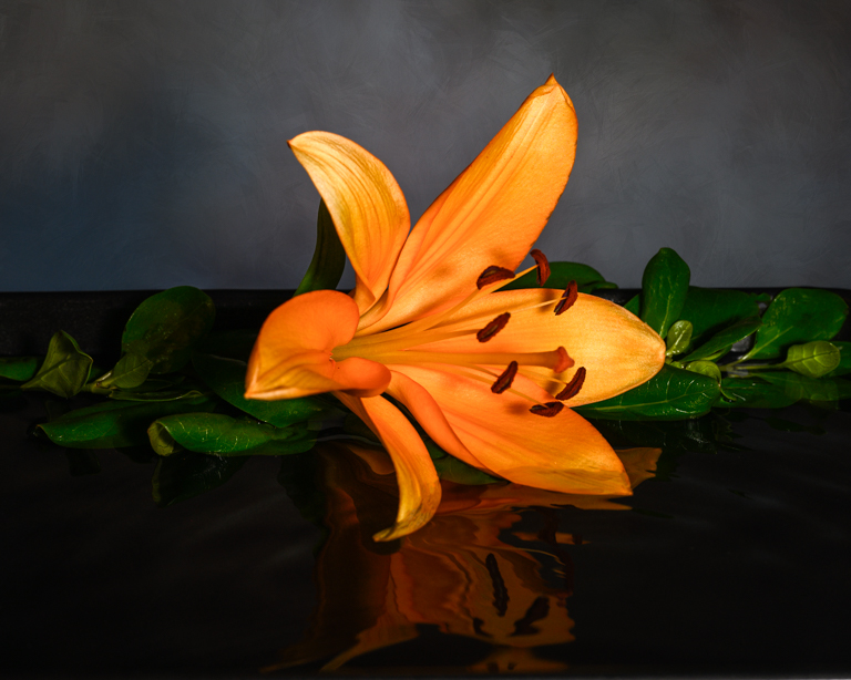
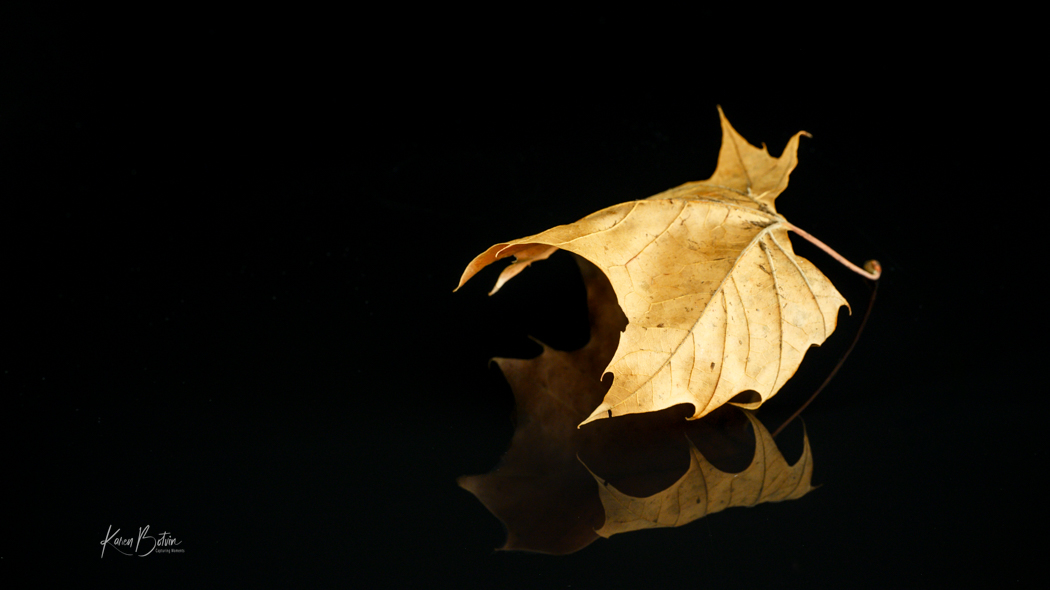
Thanks, Shirley, for your comments. The downed tree or no tree...I go back and forth on it as well. I think I like the longer view of the stream in the downed tree image, but I like the clearer view of the second image without the tree. |
Sep 8th |
| 2 |
Sep 23 |
Reply |
Thanks, Martin. I can see the difference, although subtle, it does make the image more dimensional. Thanks, also, for the YouTube link. |
Sep 8th |
| 2 |
Sep 23 |
Reply |
Thanks so much, Martin. I have labored over this image for months thinking there's just not that "Wow" aspect I was hoping it would have. I think you may have something with your idea of it being flat. I took the image into Skylum's Neo and applied a sun ray and although it's better, it is tricky to get the right amount of light coming from the correct direction. Will have to play around with it some more. Thanks again. |
Sep 7th |
| 2 |
Sep 23 |
Comment |
Thanks, Jim! I had already darkened that bottom rock but I could probably use the clone stamp to move around some of the highlighted areas. As for smoothing out the water even more, I did shoot all the water images with multiple shutter speeds and I really didn't like to see the water so smooth that all the details in the water disappear. The Smokies are certainly worth a trip in different seasons to see how the landscape changes. |
Sep 5th |
| 2 |
Sep 23 |
Reply |
Thanks so much, Piers! We had a great time in the Smokies. So much to photograph there. I just might make it there again next Spring. As to flipping the image, I will try that and see whether I like it better. |
Sep 5th |
| 2 |
Sep 23 |
Comment |
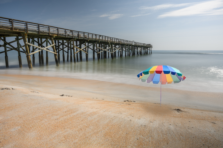
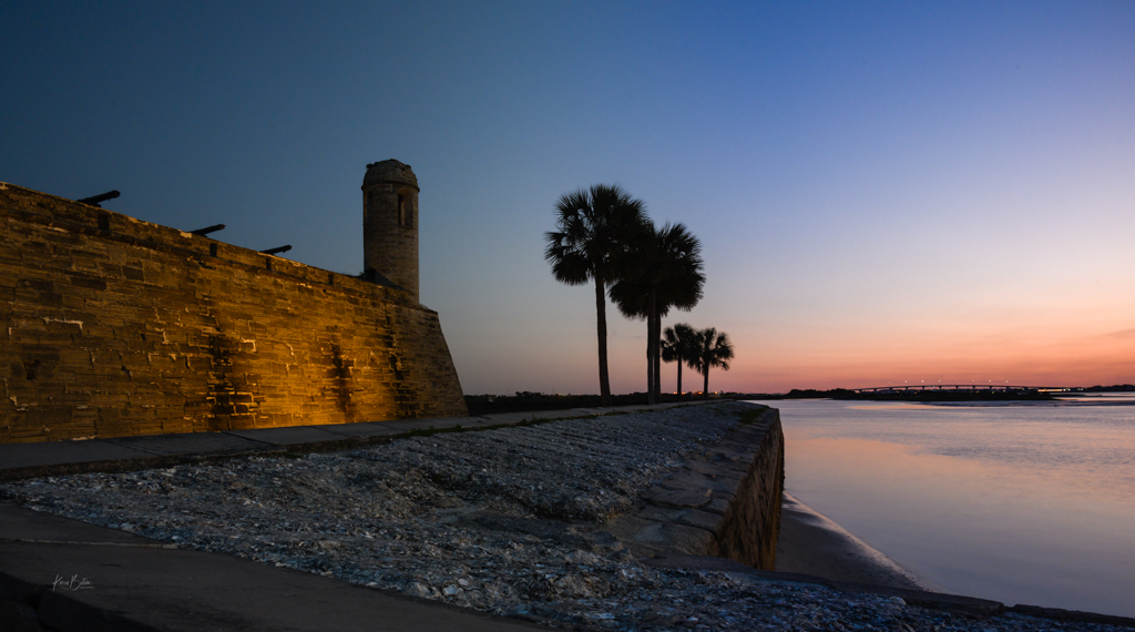
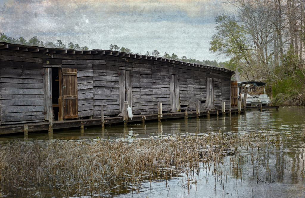
Another stellar image, Martin! This lighting is superb. I really like the original before all the editing. I hear what you say regarding the current fashion, however, your entire image is made up of warm colors so adding the gray sky makes it look out of place to my eye. I would tend more towards a little darker blue and maybe add some magenta if you want it to look closer to dusk. But because the light is so bright on the rocks and the boat sheds, I would not go too dark. Only after you settle on the darkness of the sky should you adjust the lighting on the sheds and stones. But after all, the reason this area caused you to want to photograph it was the wonderful lighting on those areas, so you must keep that in mind. If I go back to your original, I would crop at the orange boat on the right and maybe only an inch or so on the left to give the pier a bit of space and perspective. I like how you moved the seagull back away from the roof line. What an interesting image to edit many different ways depending on your mood. |
Sep 2nd |
| 2 |
Sep 23 |
Comment |
Welcome to the group, Terri. Legend has it that seeing a praying mantis can be a sign of good luck and fortune! Hope you have both.
You note that this image is straight out of camera. Do you typically use any kind of editing software to develop your images? I love the orange glow in this image, however, I wonder if you could add a bit of gradient to it so that it wasn't a solid color. The sharpness and details in the front leg of the mantis is great, but as I move down it's back there becomes less detail. In post, I would isolate the mantis and lift the shadows on him a bit, especially up around his head and eyes, as he appears to be looking right at you. Or if your preference was to capture a silhouette of him since he was backlit, I would darken him down a bit more than he is. Just a picky thing of mine, are those few dust spots at the top left right near his antennas. Nice first image in our group. Looking forward to more of your work. |
Sep 2nd |
| 2 |
Sep 23 |
Comment |
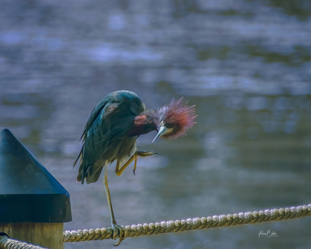
Great Blue Heron's are fairly gentle birds. They typically claim one area as home. We have lots of them in FL. Although this guy was far across the pond, you captured a great shot. He looks so tranquil standing there. I like that you capture his reflection, but I'm not sure what happen to his head's reflection. To me, that is very un-natural and a distraction in the image. I find myself consistently going down there to see why his head is so out of shape. Perhaps the little water ripples are causing it. Whatever the reason, I think, I would try to fade out the reflection somewhat so it wasn't so prominent in the image. Hope you get to go back and try again. You'll probably find this same fellow around the same location. |
Sep 2nd |
| 2 |
Sep 23 |
Comment |
The first thing I noticed was this snake's eye! Great editing. Love all the patterns and scales on this guy. I also like that you kept the DOF small enough so that the rear coil of the snake is slightly out of focus. To me, that feels as though he could go on and on. And I agree that the subtle color variation presents better than just B&W. Shouting anything behind plexiglass can be difficult. Nice work!
|
Sep 2nd |
| 2 |
Sep 23 |
Comment |
This little girl is adorable. I really like the movement in the image. Looks like she was having a ball with the foam. To my eye, the suds look a bit blown out. Not sure if you could turn down the highlights/whites a bit. Also, because of your crop, you went with a square. I think adding a bit more canvas to the viewer's right would take her out of dead center and give her a bit more room in the direction she is facing. Bet her parents would love a copy of your image. Very nice! |
Sep 2nd |
| 2 |
Sep 23 |
Reply |
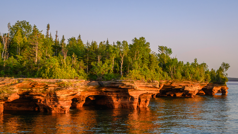
Welcome to the group, Terri. Thank you for your comments. I hear what you are saying regarding the fallen tree. I really was back and forth with it in my own thoughts and decided to leave it. Perhaps I should darken it down a bit and it might stop the block. Here's another view from just up the path a bit. To me, the first image provides a smoother flow of the water. This image almost feels too close. |
Sep 2nd |
 |
6 comments - 5 replies for Group 2
|
| 6 |
Sep 23 |
Reply |
Thank you, Jim. So glad this image evoked pleasant memories for you! |
Sep 26th |
| 6 |
Sep 23 |
Reply |
Thank you, Ruth for your comments. |
Sep 26th |
| 6 |
Sep 23 |
Comment |
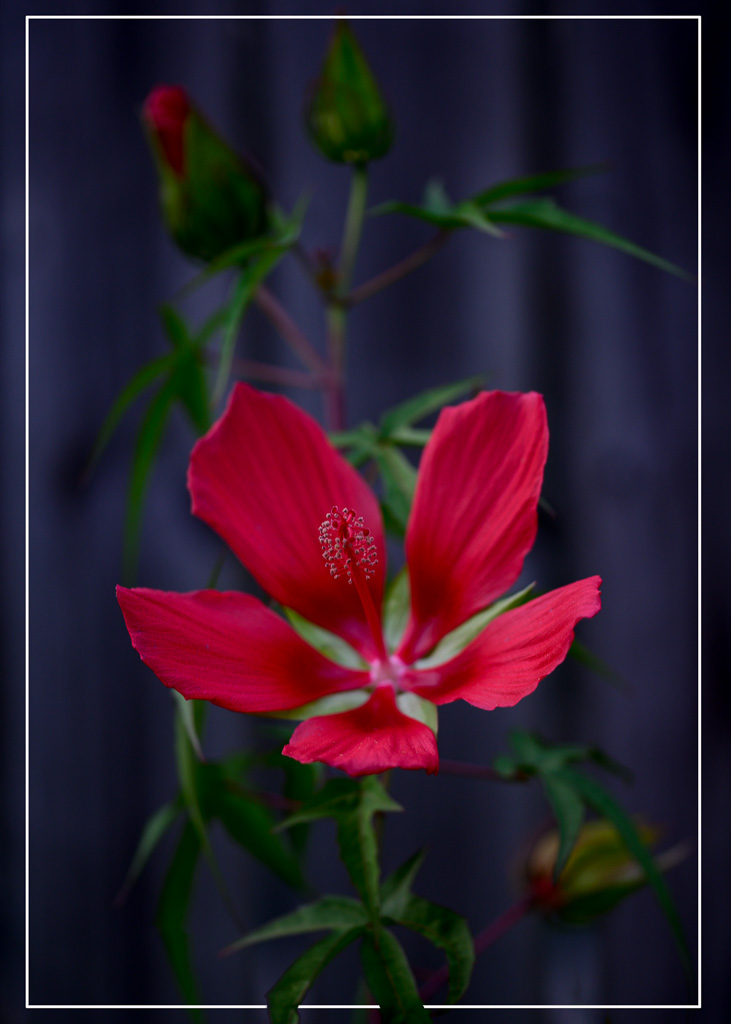
Jim, your hibiscus is tack sharp all around. Hibiscus' are a tough flower to get the exposure right because of all their folds and s. You managed to get it looking great. I always struggle with the hot spots on their edges. At an aperture of f/13, your background might be a bit busy as the bud behind the flower attracts my attention as does all the lines and patterns in the green foliage. I would suggest maybe darkening down the bud a bit more or maybe even clone it out completely. Did you know that the hibiscus is a favorite of deer? I have one planted at my front door that the deer frequent fairly regularly. It hasn't been able to bloom in over 2 years but I keep it there hoping they stay away from my other flowers. |
Sep 19th |
| 6 |
Sep 23 |
Comment |
Ruth, you've accomplished the minimalist look on a high key background. As Doris said, I would move it to the left just a bit to get it off the edge but I'm okay with it in the top third. If you wanted to play around with composition, you could try flipping it horizontally so that the shells would be on the right. Nice image. |
Sep 19th |
| 6 |
Sep 23 |
Comment |
Doris, the bud of your day lily is tack sharp. I really like it against the green bokeh. I wonder if you would have moved just a bit to the right whether your whole background could have been that green background. As green is a complimentary color to yellow, it gives a pleasing look to the eye. |
Sep 19th |
| 6 |
Sep 23 |
Comment |
Thank you, Doris, for your comments. I shot this image handheld. The only time I use a tripod to walk on the beach is to do sunrises or midday long exposures with HD filters. Yes it is a big heavy lens and, in fact, I just sold it and replaced it with Nikon's 100-400 f/4 with 1.4 extender. Doesn't get me quite to 600 but it's not nearly as long or heavy. I wouldn't call myself a bird photographer but I do have a few cute ones that fit the close-up category that I can post as we go along. |
Sep 19th |
| 6 |
Sep 23 |
Reply |
Thanks, Charissa for your comments! As one can tell from the shadow of the bird that is was very early morning, hence I guess, the blue tone. Until you mentioned it, I didn't even notice the blue tone. Good observation, I will adjust it. |
Sep 7th |
| 6 |
Sep 23 |
Comment |
Nice photo, Charissa! I like the composition and especially how you arranged the flowers in the vase to have separation between each of them. Aside from wishing to see it in color, my only suggestion would be to add a bit of canvas to the top of the image to give the flowers some breathing room and also to balance it more with the space below the plate. You don't say much about what you envisioned when making this image so I'm not sure whether your intention was to reflect the shadows on the backdrop. If I were making this image, I would have moved the entire screen forward a bit to have less shadows on the backdrop, but that's just a personal preference. |
Sep 7th |
5 comments - 3 replies for Group 6
|
11 comments - 8 replies Total
|