|
| Group |
Round |
C/R |
Comment |
Date |
Image |
| 2 |
Aug 23 |
Reply |
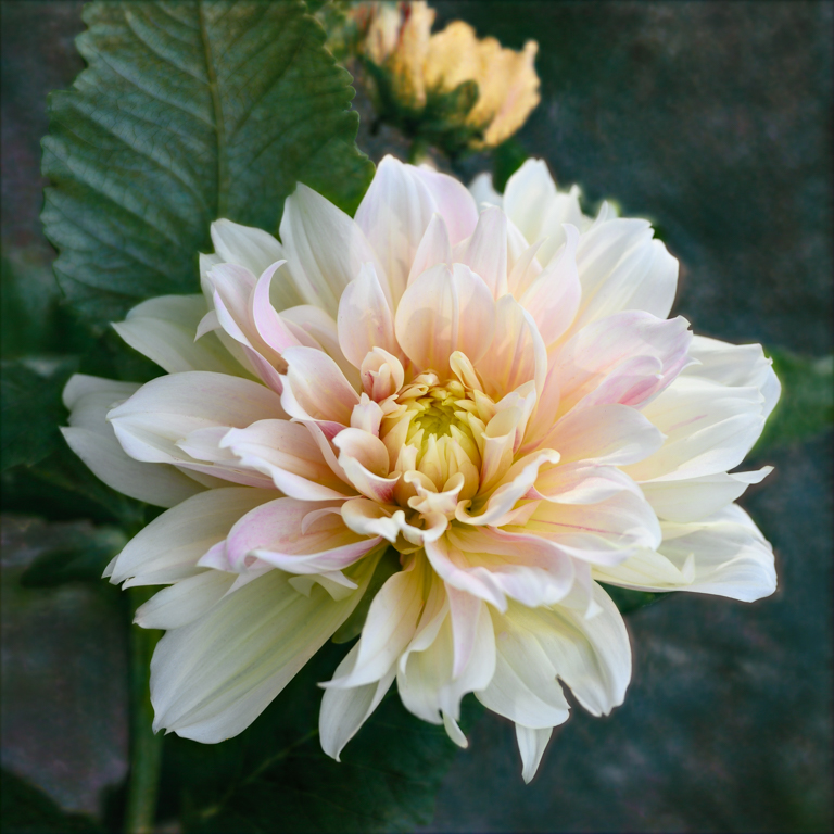
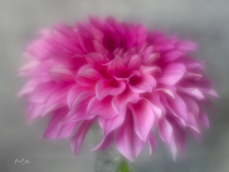
Thanks, Wanda, for stopping by and commenting on my dahlia image. It's great to hears from others in a different group. Means a lot! |
Aug 12th |
| 2 |
Aug 23 |
Reply |
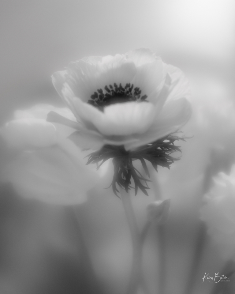
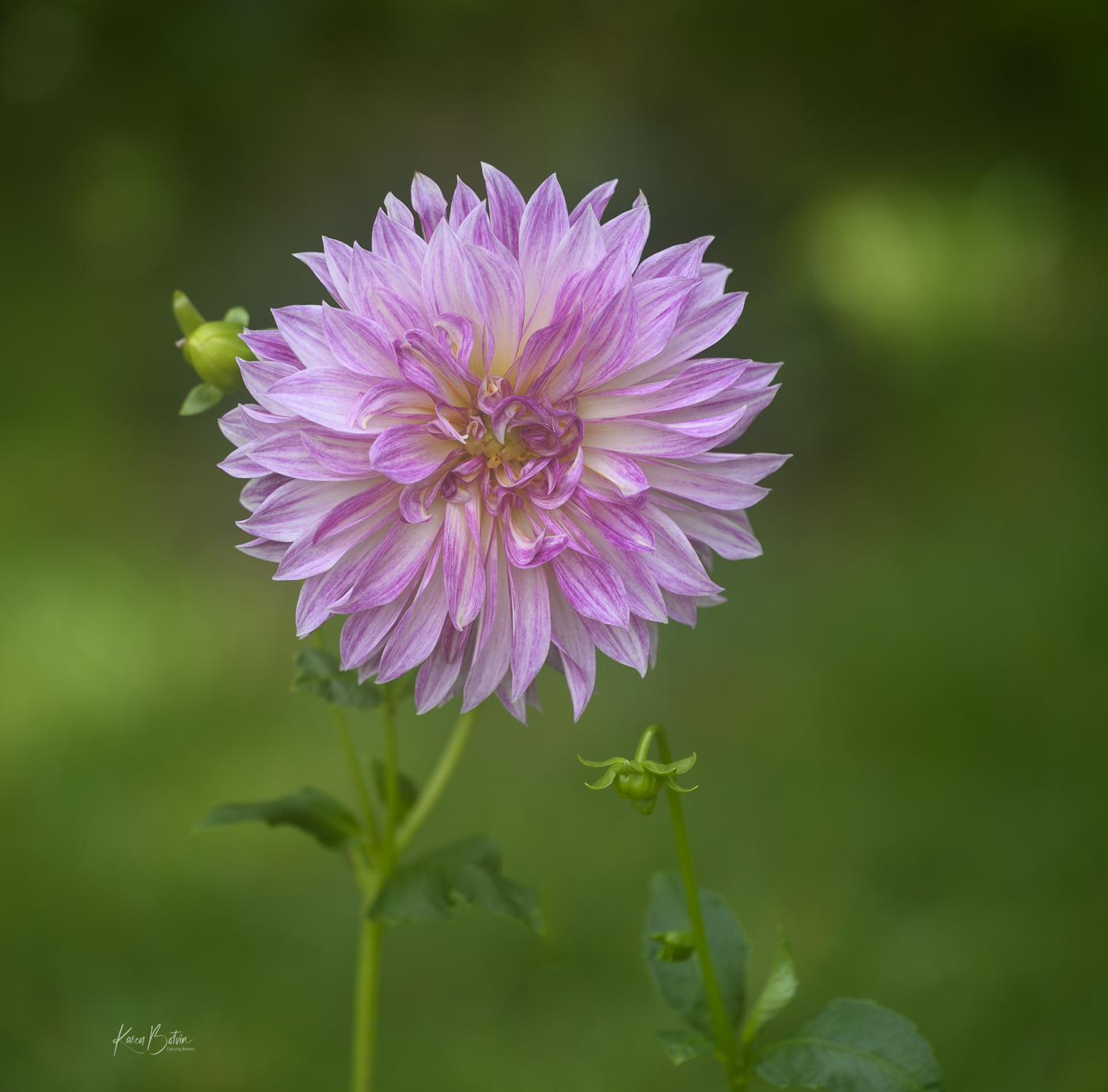
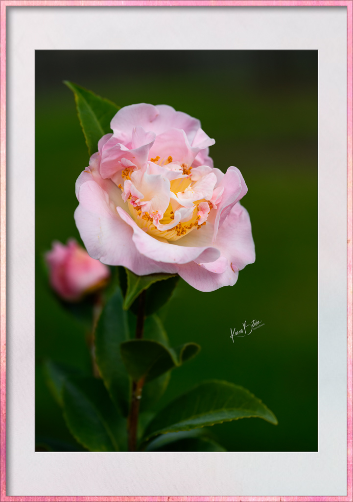
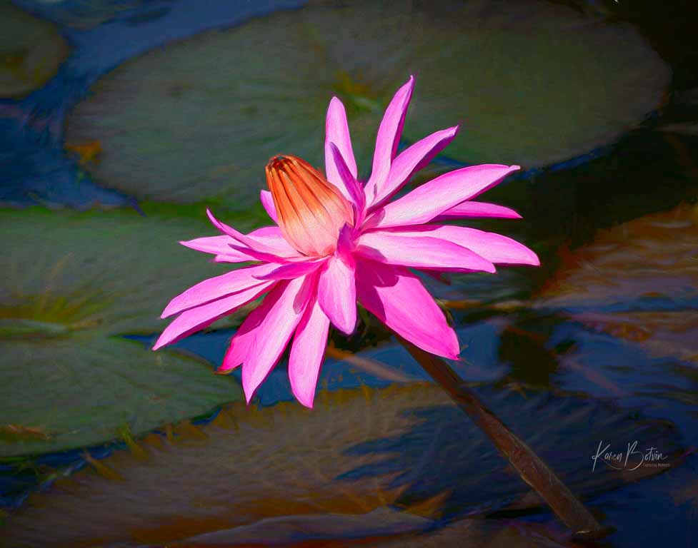
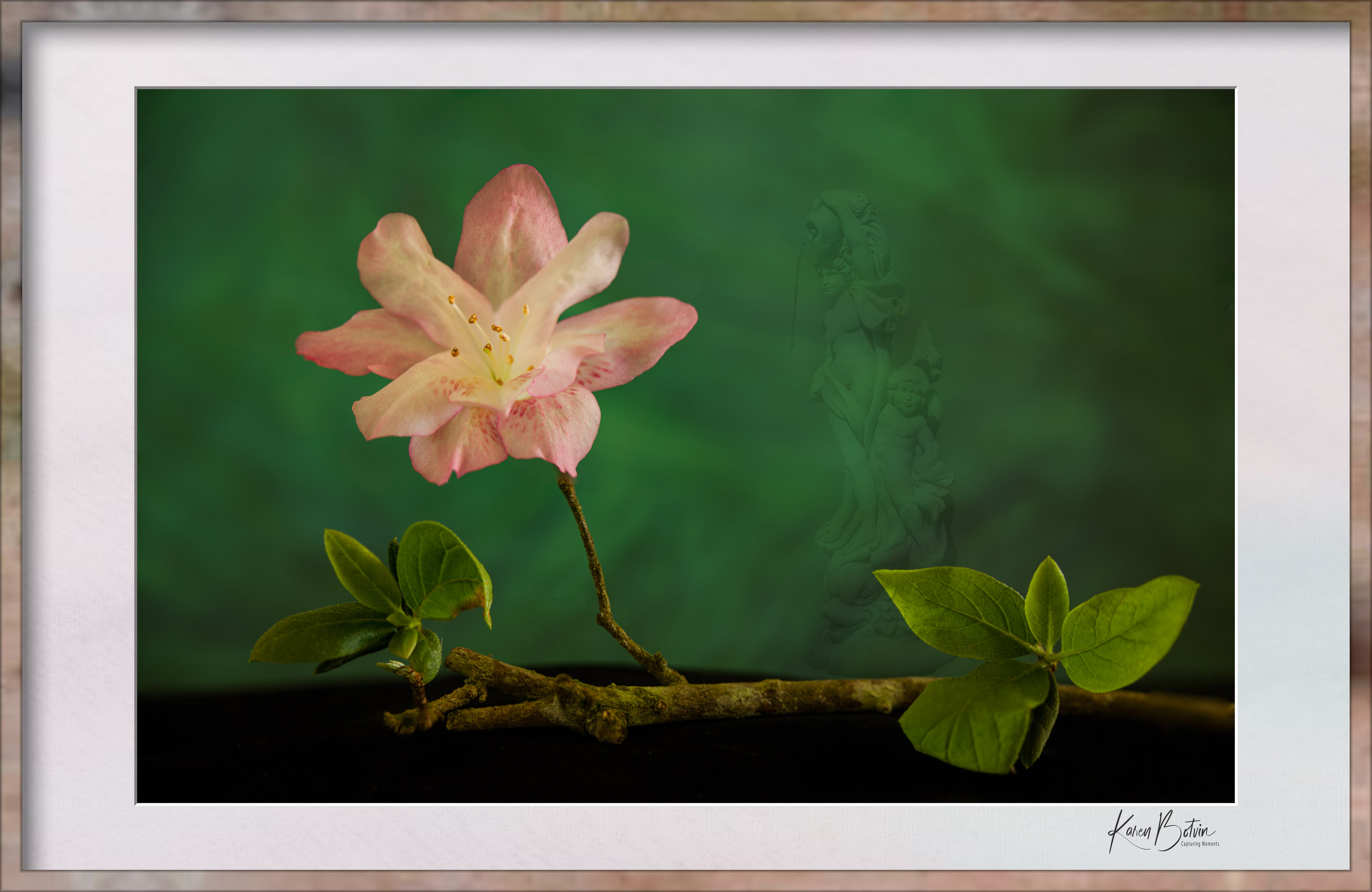
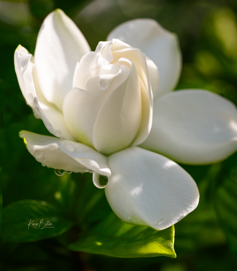
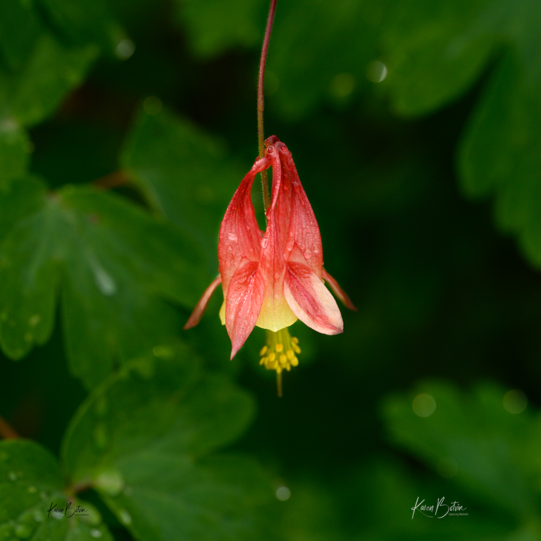
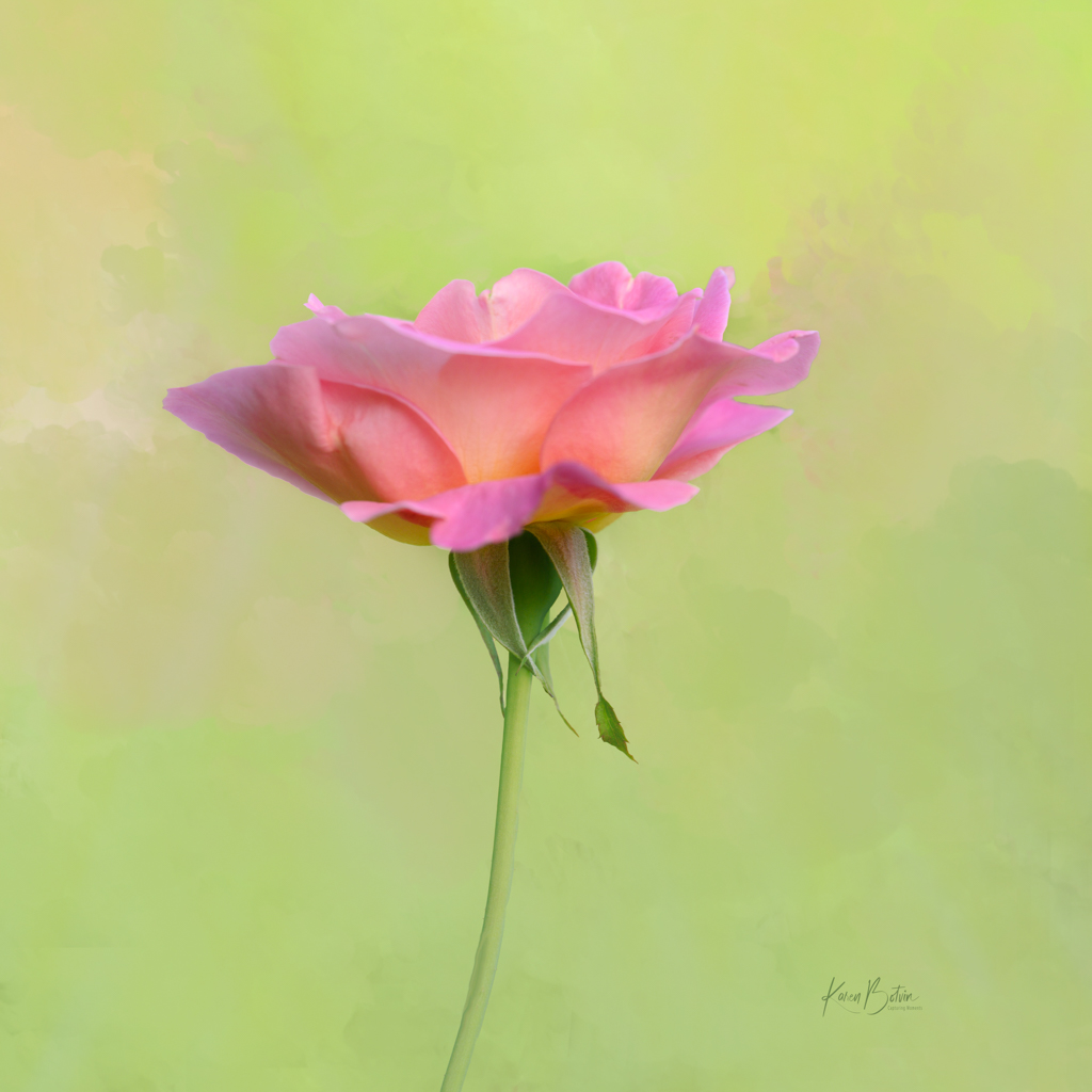
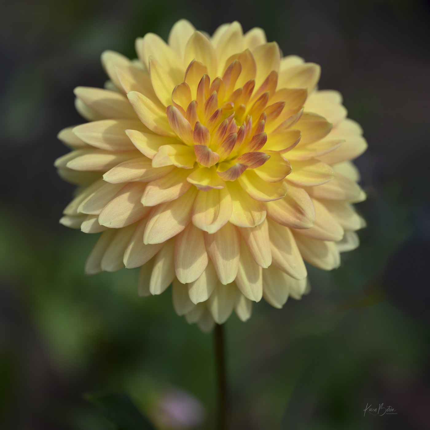
Thanks so much, Martin, for bringing me back into the group. It's like coming home to family! This image was made hand-held so no photo stacking. I was just lucky enough to have the main bloom and the 2 buds close enough depth wise to get all three in focus. To your comment on the bottom bud, I actually lighten it up a bit in post, but I can see your point and will reduce it. Thanks for your comments! |
Aug 12th |
| 2 |
Aug 23 |
Reply |
Thanks for your welcome and comments on my photo, Shirley. Means a lot to me. |
Aug 12th |
| 2 |
Aug 23 |
Reply |
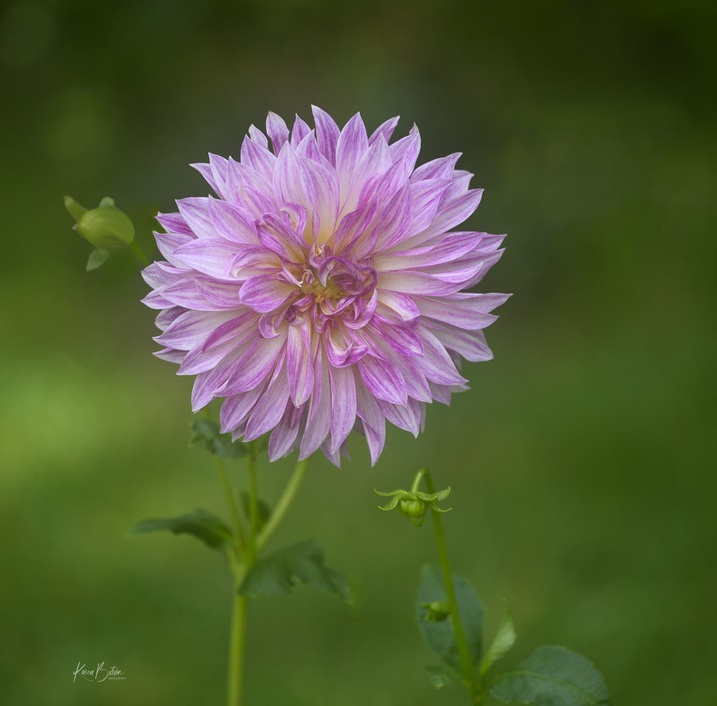
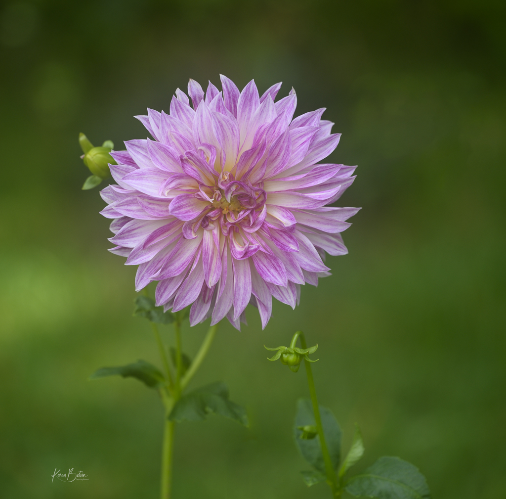
Thanks, Piers, for the suggestions! See the improved version above. |
Aug 4th |
| 2 |
Aug 23 |
Reply |
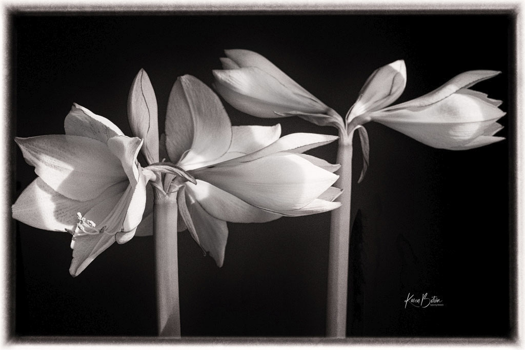
You guys are killing me! Lol! Ok, I reworked the bud on the left and I must admit, it feels more balanced. Thanks for all the suggestions. |
Aug 4th |
 |
| 2 |
Aug 23 |
Reply |
Thanks, Jim, for the welcome back! I took Piers' advise and cloned out the light bokeh on the right and darkened down the left bud. Take a look above. As to your comment on the f-stop choice, I do tend to shoot more wide open than closed as I prefer a softer focus around my subject. I will, on occasion, close down if I want more in sharper focus. Although this was shot with a straight macro lens, I often shoot with some very creative lenses, such as Lensbabies, vintage Helios, and Meyer Optik. My preference as a flower and nature photographer is to add some creativity and/or dreaminess to my images rather than a documentary portrait of my flowers. Thanks for your feedback. |
Aug 3rd |
| 2 |
Aug 23 |
Reply |
Thanks so much for the constructive feedback, Piers. I edited the final with you suggestions and like the outcome. What do you think? |
Aug 3rd |
 |
| 2 |
Aug 23 |
Comment |
Martin, converting this to B&W was a smart choice. It has an almost grungy feel. This gentleman's hair, his hands, and his expression tells me he's spent many years playing that accordion. Although I generally like to see the surroundings, your chopping works well to keep the viewer's eyes on the player instead of the distractions around him. The only thing I might suggest is to tone down and possibly blur out the "Sun" sign to the viewers' right and the gentleman sitting behind him to the left. Otherwise a great image. |
Aug 2nd |
| 2 |
Aug 23 |
Comment |
Great field trip! I have tried capturing the Milky Way in the past and it really is more difficult than it looks. You did a great job eliminating the light pollution from the nearby houses. Your choice of 15 seconds kept all the stars fairly circular, instead of light streaks. I like that you included the surroundings in silhouette in the foreground. Very nice touches, Shirley! |
Aug 2nd |
| 2 |
Aug 23 |
Comment |
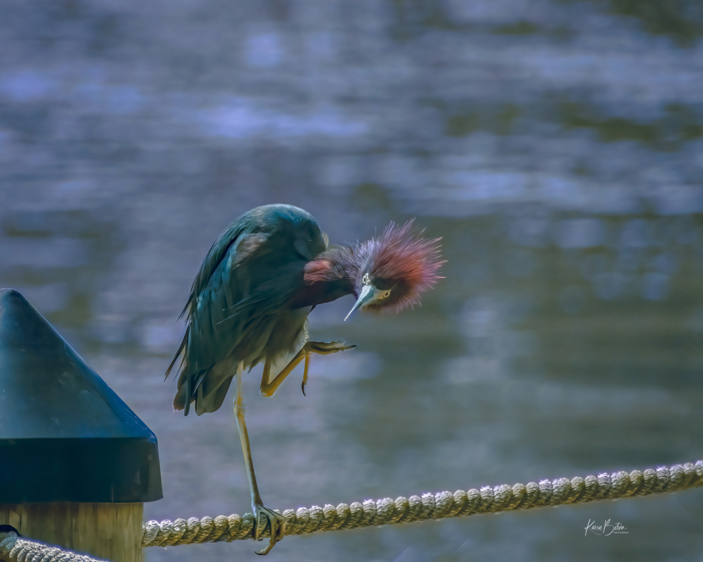
Hi Piers, I like the original photo. The heron is in sharp focus and he's caught a meal. Is the final image a composite of the original or a different photo altogether? I'm not sure what to make of the story. I'm assuming the heron flying in stole the fish, but since the fish is not visible in the second heron's bill, I'm just confused. Your very fast shutter speed at 1/4000 sec afforded you very sharp images at f/8. Nice captures. |
Aug 2nd |
| 2 |
Aug 23 |
Comment |
Very colorful photo, Jim! You didn't say whether this was one of your skies or one of PS' skies, but none-the-less, a great choice. It certainly adds dimension to your image and has just the right amount of clouds to make it feel natural. Your grandsons look like they are having a wonderful time. Nice save of an otherwise drab background. |
Aug 2nd |
4 comments - 7 replies for Group 2
|
| 6 |
Aug 23 |
Reply |
Thanks so much, Ruth. I'll look at possibly desaturating the green just a bit. |
Aug 22nd |
| 6 |
Aug 23 |
Reply |
Thank you, Doris, for your kind remarks! |
Aug 22nd |
| 6 |
Aug 23 |
Comment |
Great story, Jim, one that seems to resonate with folks, as I've seen this kind of lock display on footbridges a number of places. The way you captured the diagonal railing with all the locks, leads the viewers eye right through the image. If you use any editing apps on your phone, I might suggest reducing the highlights on the walkway. Nice capture with your cellphone camera. |
Aug 12th |
| 6 |
Aug 23 |
Comment |
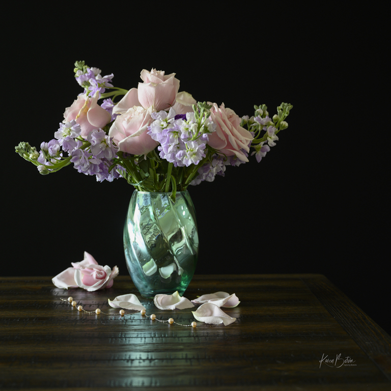
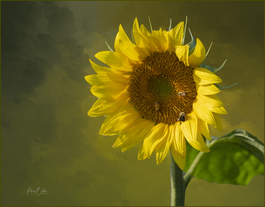
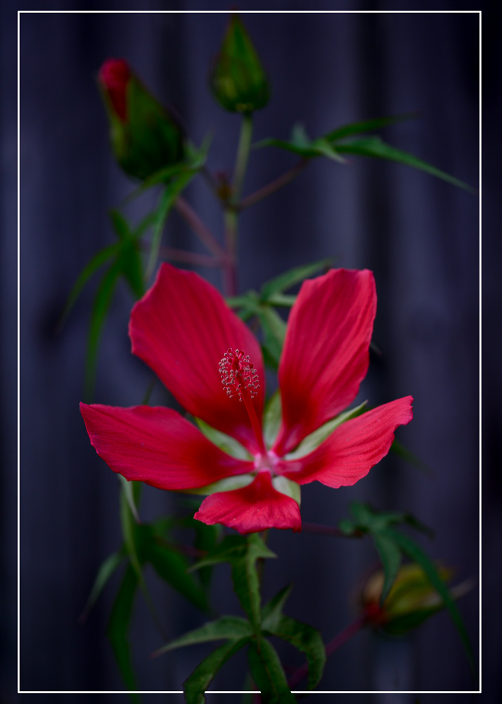
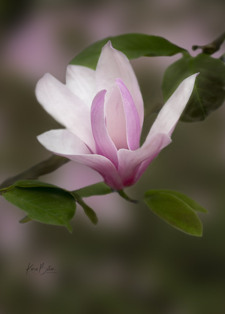
Hi Ruth, great image! I love the composition and the backlighting of the petals. You did a good job at darkening down what could have been a distracting background. My only suggestion would be to maybe lighten the shadows of the center of the flower a tad to show a bit of detail. Nicely done! |
Aug 12th |
| 6 |
Aug 23 |
Comment |
Hi Doris, nice simple image. I like the triangles the the different textures create. And like you, I'm more than ready for some cooler weather. I like the way the plastic bag over the newspaper is pulled down revealing some of the title story below, but not enough to give the full story. It leaves the viewers to wonder about just what the story is. Nicely done! |
Aug 12th |
| 6 |
Aug 23 |
Reply |
Thanks so much, Lance for your detailed comments. Really appreciate it! |
Aug 6th |
| 6 |
Aug 23 |
Comment |
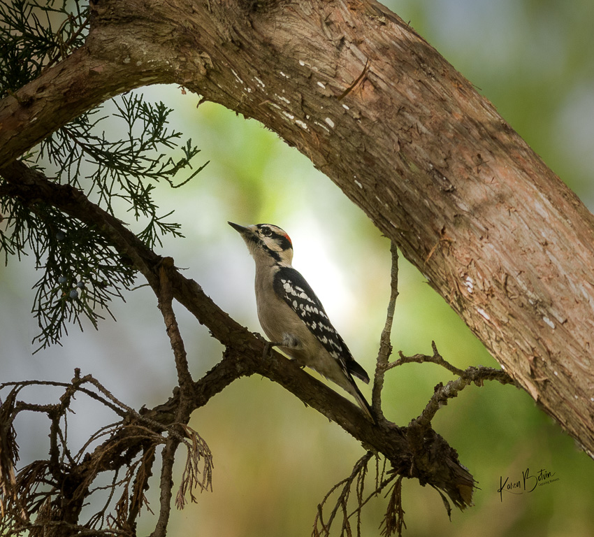
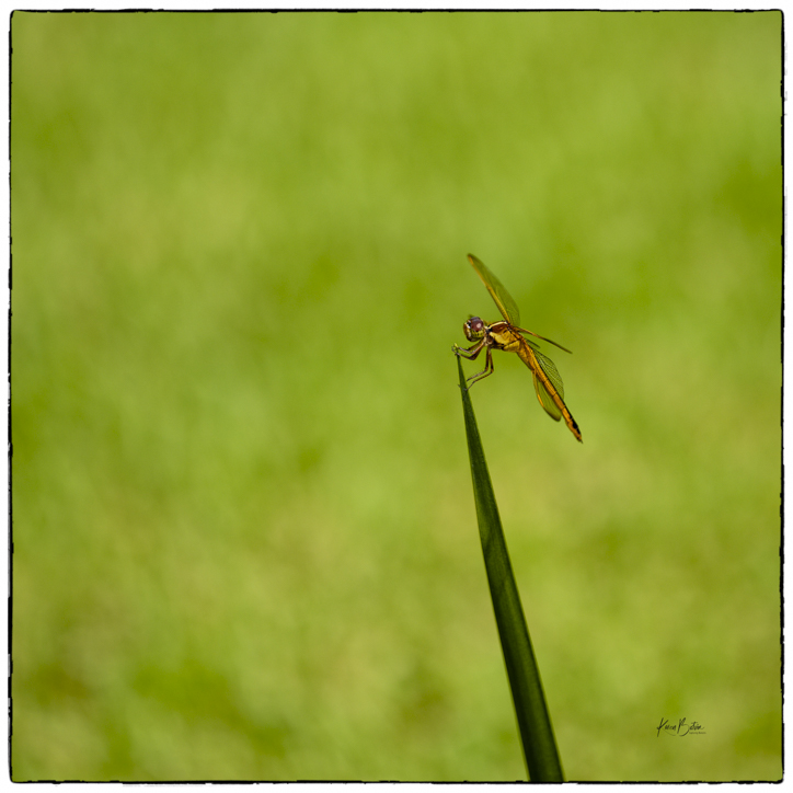
Thanks, Charissa, for your feedback. My intention in making this image was to demonstrate how a tiny damselfly manages to hang on to a narrow leaf and just blow freely in the wind. I think this image captures that. My focus was not to document the details of a damselfly, although if you were to see this image full size the wing structures are clearly visible, so therefore a tighter crop would not accomplish the free-flowing movement I wanted to convey. Thanks again for commenting. |
Aug 4th |
| 6 |
Aug 23 |
Comment |
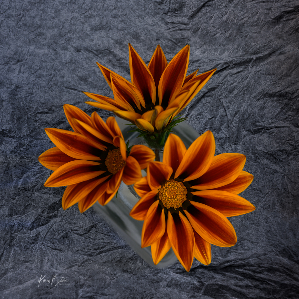
Wow, Charissa, these zinnias seem to be at the prime of their life (bloom). I like your composition in that you included the 3, an odd number, in the holder and the first seen before the eye wonders down to the 2, making it 5-also an odd number, lying across the bottom. I wonder if the flowers that you chose to cut would have been better to have been further along in the life cycle to make for a more somber effect? I agree that the aqua base is rather bold and perhaps overpowering the flowers, however, I think I would have either changed the color of the base to something more subdued or lighter in color, cropped the lower inch of the base off, since it's not adding to the image and thereby making less of it, and kept the flowers in color or if you wanted to stay with the somberness, using a variety of flowering stages, maybe from prime to decaying. That's the beauty of flower stills. Creativity could be endless! |
Aug 3rd |
5 comments - 3 replies for Group 6
|
9 comments - 10 replies Total
|