Activity for User 1268 - Karen Botvin - kbotvin@ptd.net

avatar
Avatar

Close this Tab when done


421 Comments / 327 Replies Posted
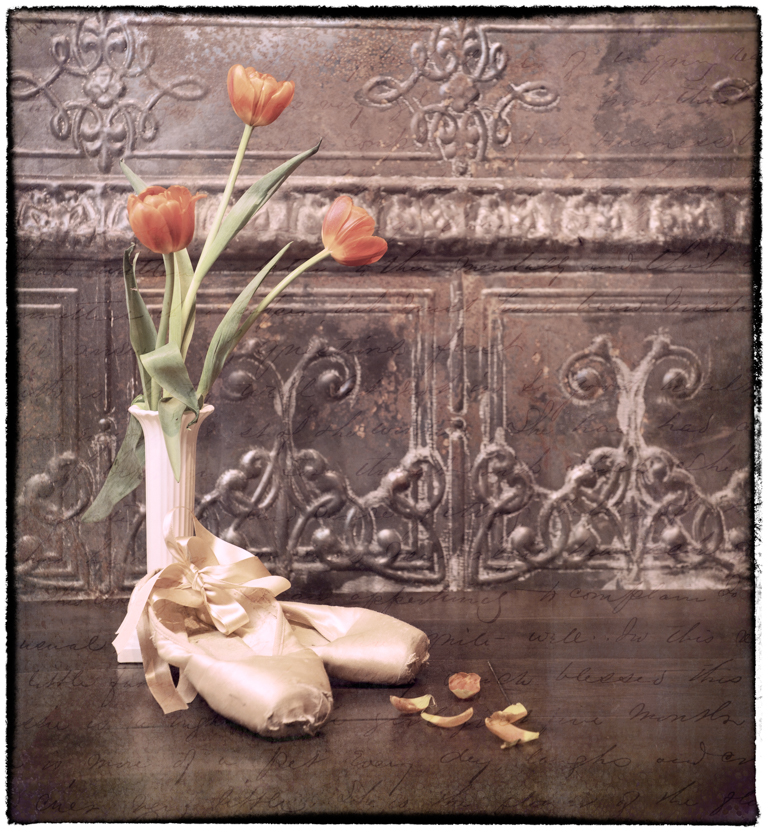
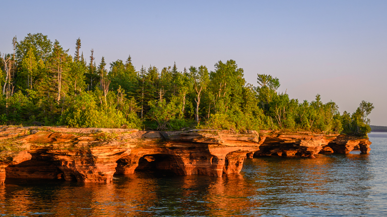
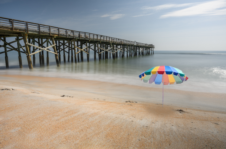
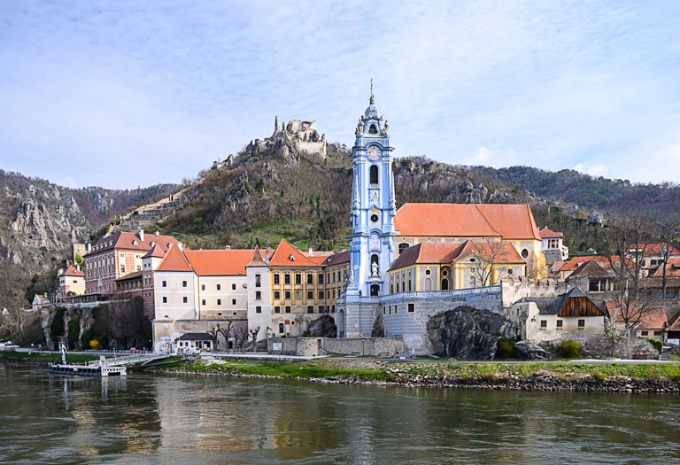
  = Current Round   = Previous Round
Group Round C/R Comment Date Image
2 Oct 22 Reply I moved the candle only on this one, which I think I like it better. Oct 7th
2 Oct 22 Reply Thanks for your comment on spacing, Piers. I've recreated the still for spacing purposes only. The lighting is different because of the time of day. I shot these with a 70-200mm lens at 78mm, f/22, at 1.6 sec. Bear in mind that I'm working on a setup of 1:1 and therefore I have my camera also set at 1:1 image size. What do you think of these? Oct 7th
2 Oct 22 Reply Yes, I like the crop better and I can see how getting rid of that twig might make her look like she's floating. Was just a thought. Oct 6th
2 Oct 22 Comment Perfection! I love everything about it! Story, lines, diagonals, so well done! Bravo! Oct 6th
2 Oct 22 Comment Wow, Piers, what a unique pose with its neck extended and its wings almost circular. He looks as though he's either using his wings to make his way through the water, or he just landed. At any rate, nice capture. From what you detailed in the description, you put a lot of work into the edits and have a wonderful outcome. The reflection, the whites and the water color all work well in this image. I do like the additional space on the bottom as Shirley suggested but I also agree with you that the egret needs more forward space, in part because of that pose. It just feels like he's really trying to move swiftly through that water after his next meal! Oct 6th
2 Oct 22 Comment If you have learned how to use Photo Pills, I would love for you to pass on some lessons to me. I got the app about 2 years ago and fool around with it periodically until I get frustrated and just move on. As for your image, I agree with the others that the bottom half of the image is nonessential to your subject and distracts. Although, my first impression was that the moon is too close to the buildings. I like Martin's placement as it provides a triangle that is pleasing to the eye. I might also crop up a bit higher, actually to the wires because that white blob is distracting. Or perhaps you might darken that area down as Jaqueline suggested. I love how you captured those buildings! Oct 6th
2 Oct 22 Comment Great shot, Shirley! I love how you cropped and edited the image. I think I would have removed the twig that's behind the bird's tail as well, since the entire bird is sharp. To me, Jaqueline's added space just made the image wider. I think Piers' idea was to go higher and I agree that since his beak is pointed up, additional space above the bird would give the bird a bit more reach. Great catch of a beautiful little bird! Oct 6th

4 comments - 3 replies for Group 2


4 comments - 3 replies Total


86 Images Posted

  = Current Round   = Previous Round
Group 02

Apr 26

Mar 26

Feb 26

Jan 26

Dec 25

Nov 25

Oct 25

Sep 25

Aug 25

Jul 25

Jun 25

May 25

Apr 25

Mar 25

Feb 25

Jan 25

Dec 24

Nov 24

Oct 24

Sep 24

Aug 24

Jul 24

Jun 24

May 24

Apr 24

Mar 24

Feb 24

Jan 24

Dec 23

Nov 23

Oct 23

Sep 23

Aug 23

Oct 22

Sep 22

Aug 22

Jun 22

May 22

Apr 22

Mar 22

Jan 22

Dec 21

Nov 21

Oct 21

Sep 21

Aug 21

Jul 21

Jun 21

May 21

Apr 21

Mar 21

Feb 21

Jan 21

Nov 20

Oct 20

Sep 20

Aug 20

Jul 20

Jun 20

May 20

Apr 20

Mar 20
Group 06

Jun 25

Apr 25

Mar 25

Jan 25

Dec 24

Nov 24

Oct 24

Sep 24

Aug 24

Jul 24

Jun 24

May 24

Apr 24

Mar 24

Feb 24

Jan 24

Dec 23

Nov 23

Oct 23

Sep 23

Aug 23

Jul 23
Group 18

Jul 25

Jun 25

Close this Tab when done