|
| Group |
Round |
C/R |
Comment |
Date |
Image |
| 2 |
Apr 22 |
Reply |
Will do, my cell is 610-698-0650 so when you see it come in you'll know it's me. |
Apr 18th |
| 2 |
Apr 22 |
Reply |
Ok, I just signed up for Lisa's class on Wednesday. I'll see you there. |
Apr 17th |
| 2 |
Apr 22 |
Reply |
Yes, I am going to the BirdingFest. Wednesday only to maybe sell some equipment and get my mirrorless camera cleaned. I have a workshop on Thursday afternoon and field trip to do night sky on Thursday night and an early Sunday morning walk around St Augustine. It's generally well attended! |
Apr 14th |
| 2 |
Apr 22 |
Comment |
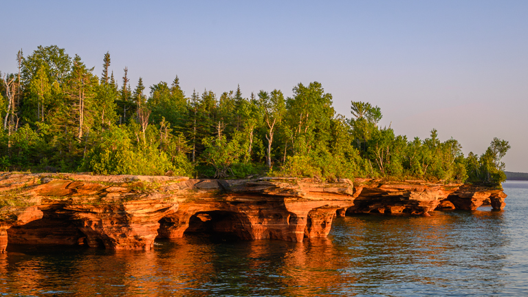
Great imagery, Jim! I'm just not sure how you got to your final image from the 3 originals. Maybe it's just me that's confused so my comments are directed solely on your final image. I like your lighter version compared to Stuart's darker version. I do find myself trying to pull the image more to the right, like to stand it up more. I think Piers suggestion of black & white is worthy of a try but I would suggest a lighter less saturated version of B&W as opposed to something too contrasty. At any rate, your description of the museum is enticing. |
Apr 13th |
| 2 |
Apr 22 |
Comment |
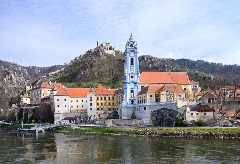
Love this image, Martin. The composition is wonderful because the beauty surrounding the church, adds to the image. I find the image to be a bit too sharpened. Especially around the areas of transition from the ground to the water and at the right side of the church where it meets the sky and mountain. It almost looks a bit "Cut & Paste". Beautiful location. |
Apr 13th |
| 2 |
Apr 22 |
Comment |
Great image, Jacqueline! My first reaction is that it needs addition space on the left side of the lighthouse. When looking at your edits, I do like the rich colors, but I still feels as though it's tilting off to the left, especially the smaller structure to the right of the lighthouse. By desaturating the image a bit as Martin has done, to me, it doesn't feel so weighted to the left. Looks like a great location. |
Apr 13th |
| 2 |
Apr 22 |
Comment |
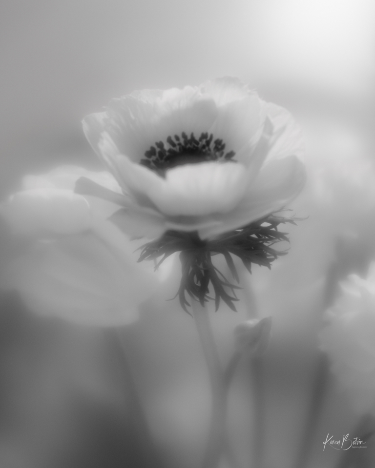
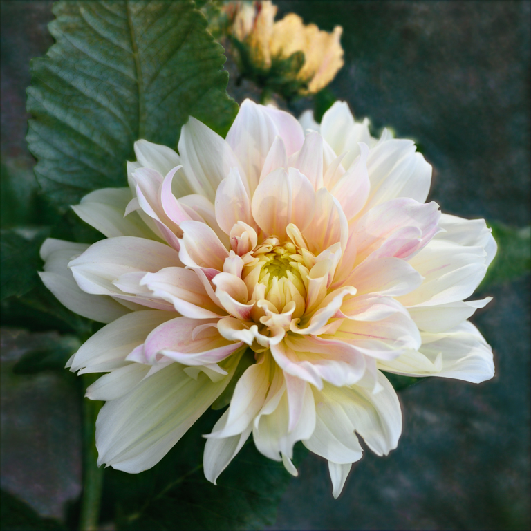
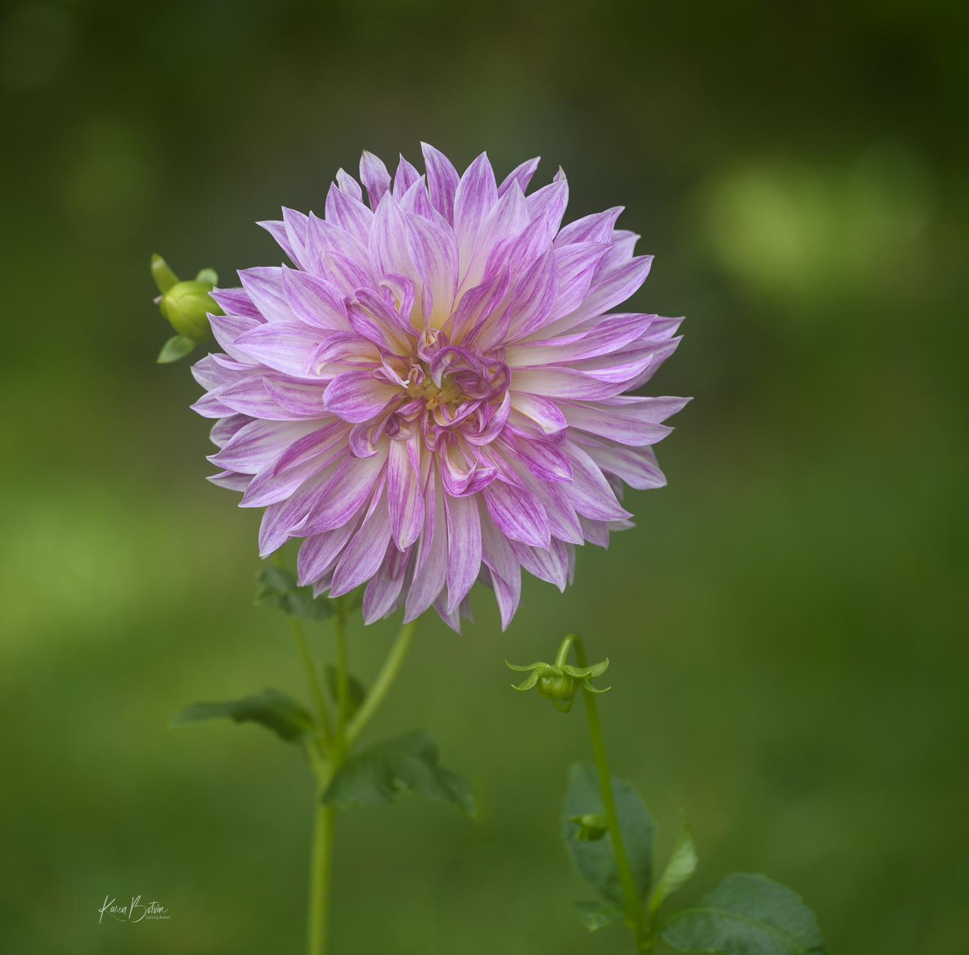
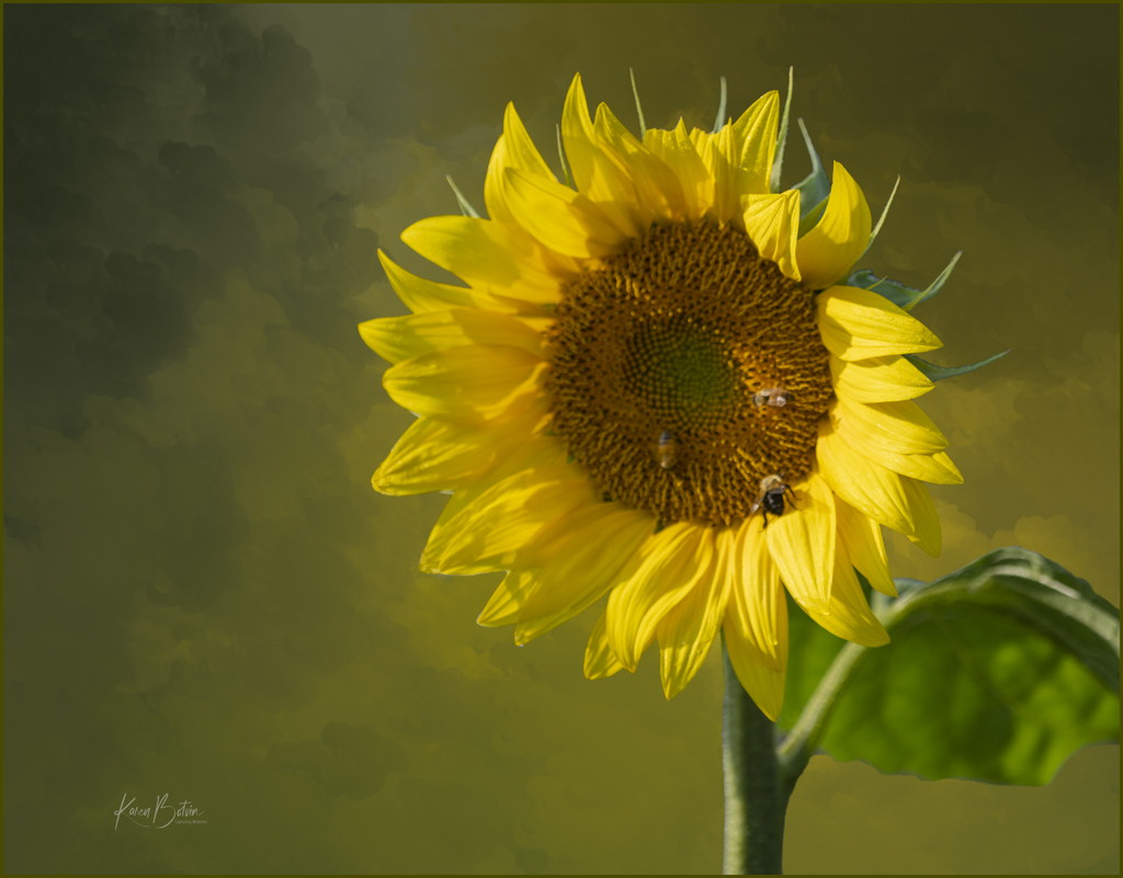
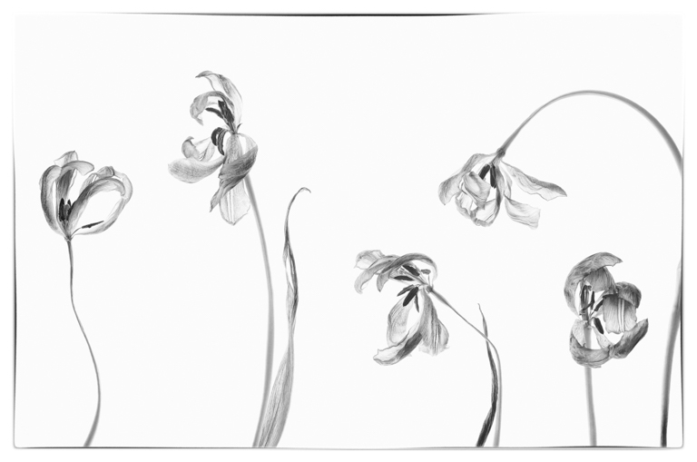
Wonderful Spring flowers, Shirley! I love to see fields of tulips. I agree with others that the background is distracting. I like Stuart's change, but you could try water or a more muted grassy background. Personally, I think that Bev's edit is too flat and too light in color. You may want to desaturated the reds ever so slightly as the overlapping of the petals is really dark almost black and it detracts from the rest of the flowers. Great image, Shirley! |
Apr 13th |
| 2 |
Apr 22 |
Comment |
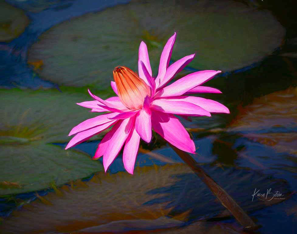
Great image, Piers! I love water lilies. Putting the flower on the third line makes it an excellent composition. My only comment is that I'd try to remove the bud and stem to the right of the flower. To me, it's right on the edge and isn't adding anything to the image. I also like the border. |
Apr 13th |
| 2 |
Apr 22 |
Reply |
Thanks, Martin, for the comments on the sky. I agree with you about the texture of the overlay on the sky. I played with it some more, but I think that sky's got to go. I'll work on it some more, maybe replacing the sky with something less busy. |
Apr 13th |
| 2 |
Apr 22 |
Reply |
Thanks so much, Shirley. This kind of image is new territory for me but I thought it was a fun image to work with. Take a look at my edited version. I think the sky is a distraction. Maybe I'll try replacing it with something less busy. |
Apr 13th |
| 2 |
Apr 22 |
Reply |
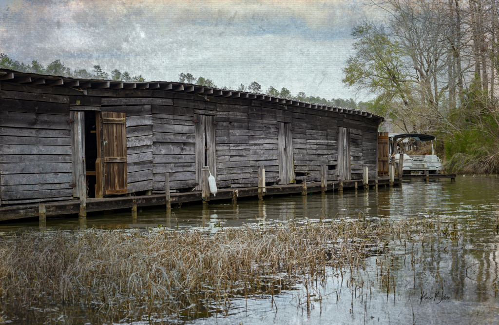
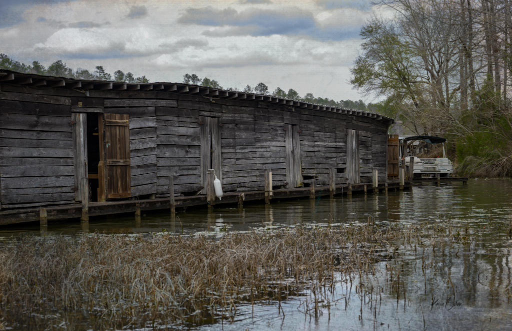
Thanks, Piers, for your comments. This actually is still in use as boat storage, so there is a narrow walk around down to the end where it's a bigger platform and the boat that's docked. I reworked the grunge texture removing some of it from the sky. I may have to still play with it some more based on Martin's comments. |
Apr 13th |
 |
| 2 |
Apr 22 |
Comment |
Thanks so much, Bev, for stopping by and commenting on my image. I really appreciate the feedback! |
Apr 5th |
6 comments - 6 replies for Group 2
|
6 comments - 6 replies Total
|