|
| Group |
Round |
C/R |
Comment |
Date |
Image |
| 2 |
May 21 |
Comment |
Wow, Martin, you took an image, as you say, "with very little going on" and made something very dramatic. How creative! Nice work! |
May 6th |
| 2 |
May 21 |
Comment |
Jacqueline, this is a great shot of a Canadian Goose. I love the rim lighting on the right wing. I think the hardest part of shooting birds is getting a background that is not too distracting. As Shirley said, you could always replace the background with something less distracting, but with this image you may be able to use the radial filter in Lightroom to highlight the bird and darken the background enough for it to fade away. |
May 6th |
| 2 |
May 21 |
Comment |
Hung, I agree with the others...this is a great image and one you should be very proud to have made such a great capture. I agree with Martin's edits and I would add just a bit of negative space to the top of the image. |
May 6th |
| 2 |
May 21 |
Comment |
Shirley, great image! I love how you were able to capture the propellers in motion. I agree that 3 planes is better than 4. Sky replacements can be tricky if the light and shadows don't match the subjects'. I think I like your sky better than Piers' as I don't feels as though the planes are competing against the clouds. For me, the big white puffy clouds pull my eyes all over the image and away from the planes. |
May 6th |
| 2 |
May 21 |
Comment |
Piers, I love this bridge and everyone's comments made it a little better. The only thing that really bothers me is that concrete bridge abutment. If you go back to shoot it again, try to position yourself to eliminate that. I don't think cropping it out will work, but with time and a bit of patience, you may be able to clone it out. Really nice image! |
May 6th |
| 2 |
May 21 |
Comment |
Jim, I think Martin was on my same wavelength in that you need to have some kind of separation. But, I would do the opposite, darken down the outside area a bit and lighten through the gate. Of course, that would all depend on what's the most important part of the image. And then that speaks to it having too many places to look. In my experience, if a judge can't figure out where to look at a glance, they keeping walking. |
May 6th |
| 2 |
May 21 |
Reply |
Thanks so much, Shirley. I appreciate everyone's comments. I have made some changed to my original based on Martin's feedback; just changed them up a bit to be more my style. |
May 6th |
| 2 |
May 21 |
Reply |
Thanks, Jaqueline, the club shoot was really fun. Where are you in PA? I am originally from the Lancaster area and will be coming that way in Sept. |
May 6th |
| 2 |
May 21 |
Reply |
Thanks, Piers. I've adjusted the crop to put her more on the thirds line. |
May 6th |
| 2 |
May 21 |
Reply |
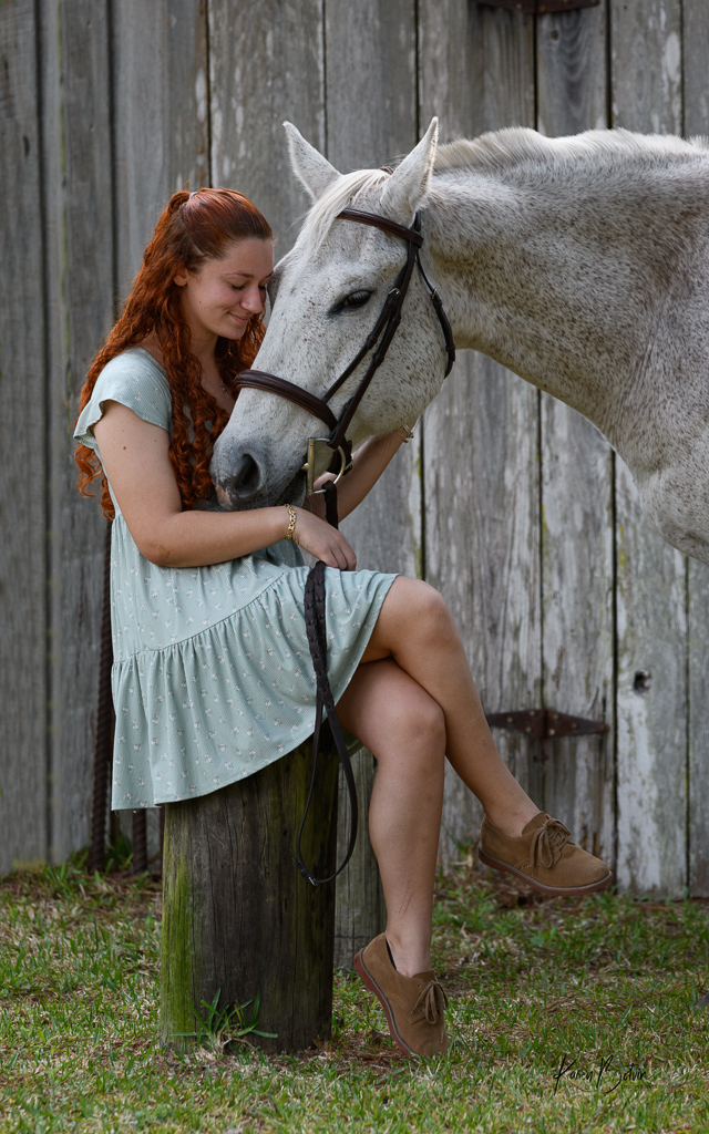
Thank you, Martin, for the suggested edits. I agree the crop is too tight. There was an old wagon wheel behind her that I tried to get rid of but in the process made it too close. I made my own adjustments based on your feedback, which I really appreciate but changed up more to my style. I feel in your adjustments to her face, it made the whole image too light except for the vignette. My style of vignette is much more subtle. I prefer to have a slit one to pull the viewer into the middle of the image but not so much as one can see all the dark corners. Thanks again for the great feedback. |
May 6th |
 |
6 comments - 4 replies for Group 2
|
| 6 |
May 21 |
Comment |
Hi Dick, This is a beautiful capture of a Fuchsia. I love the dreamy background and the composition is suburb. My only suggestion would be to consider darkening the few leaves off on the left and maybe even removing the one on the very top left edge. My eye keeps drifting over to the left side and I want to linger on the branch with the hearts! Well done. |
May 6th |
1 comment - 0 replies for Group 6
|
7 comments - 4 replies Total
|