|
| Group |
Round |
C/R |
Comment |
Date |
Image |
| 2 |
Jan 21 |
Comment |
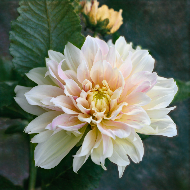
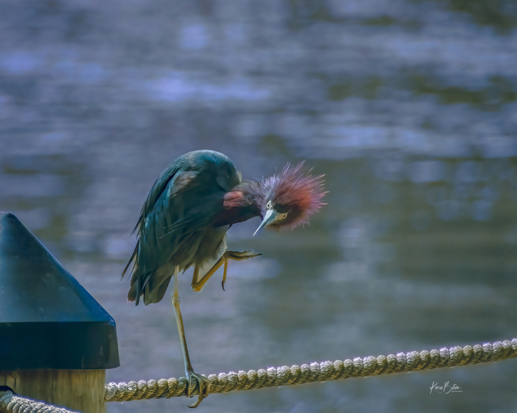
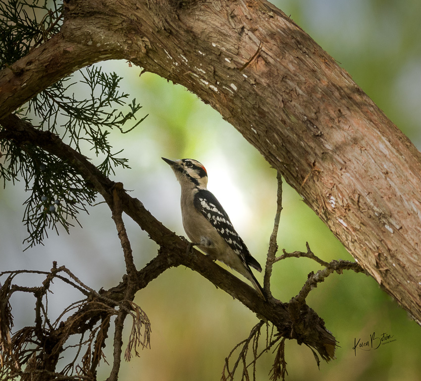
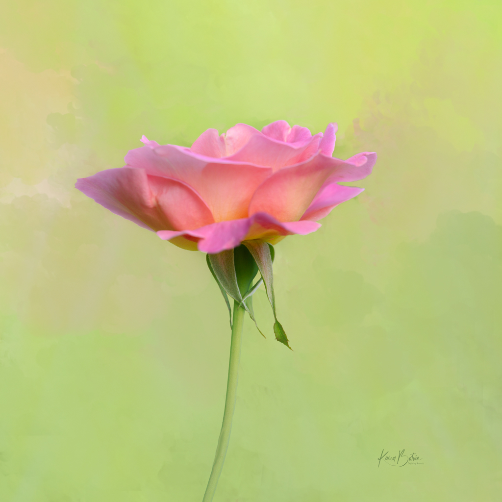
Wow, Martin, this is a lovely image. I like the edits you've made based on others' suggestion. The only thing I would add, there are 3 light twigs coming in on the right bottom I would remove. Otherwise, a beautiful image indeed! |
Jan 18th |
| 2 |
Jan 21 |
Comment |
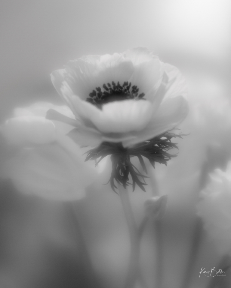
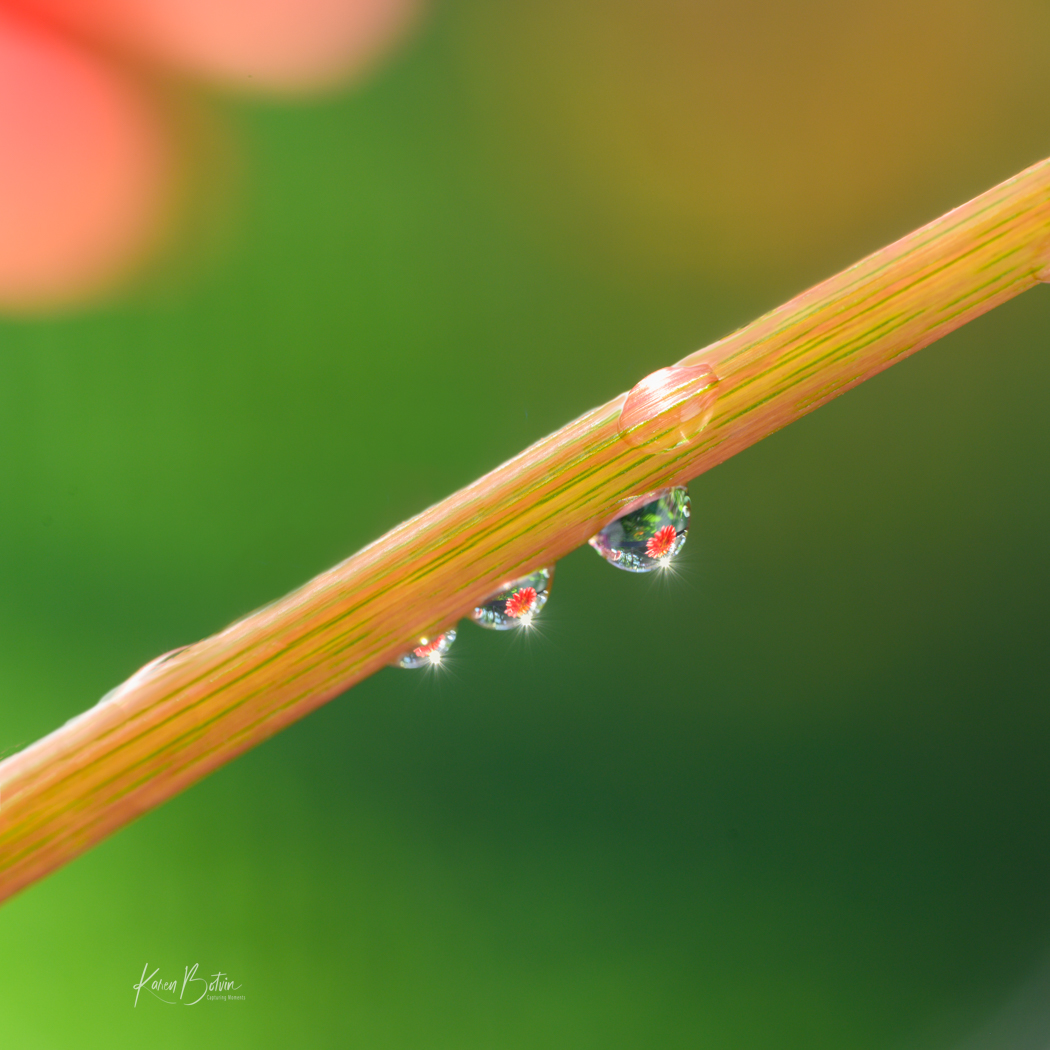
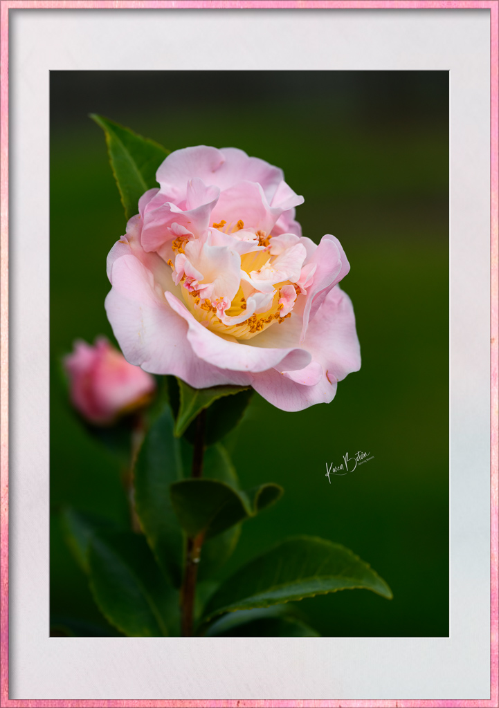
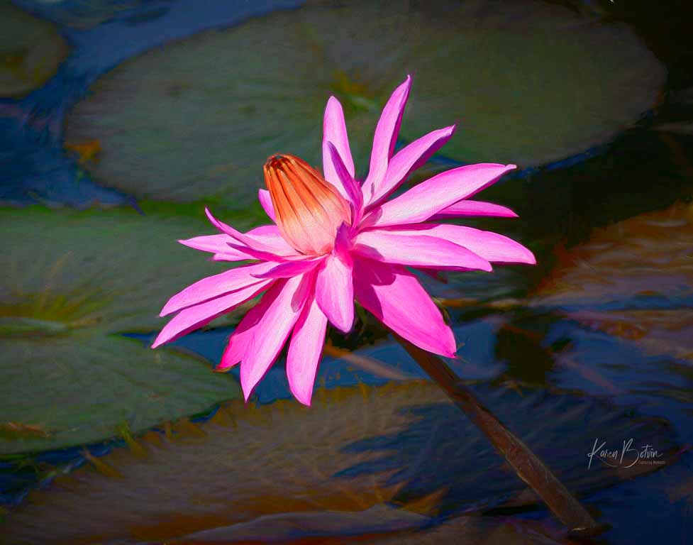
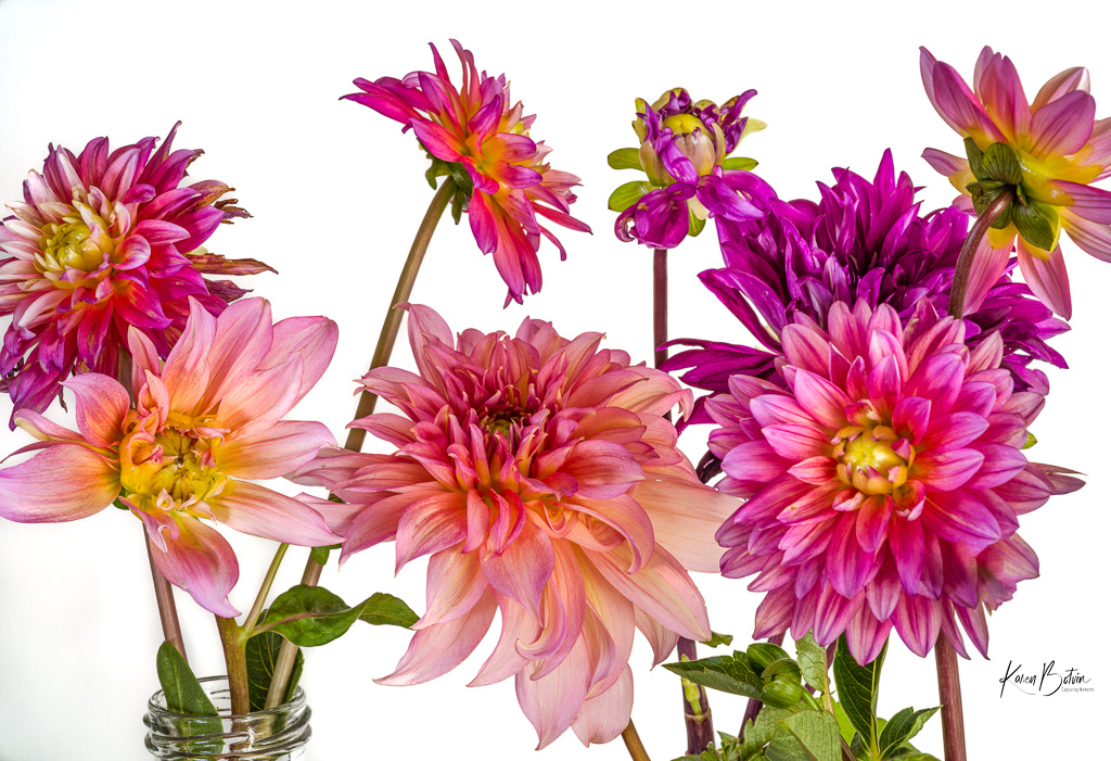
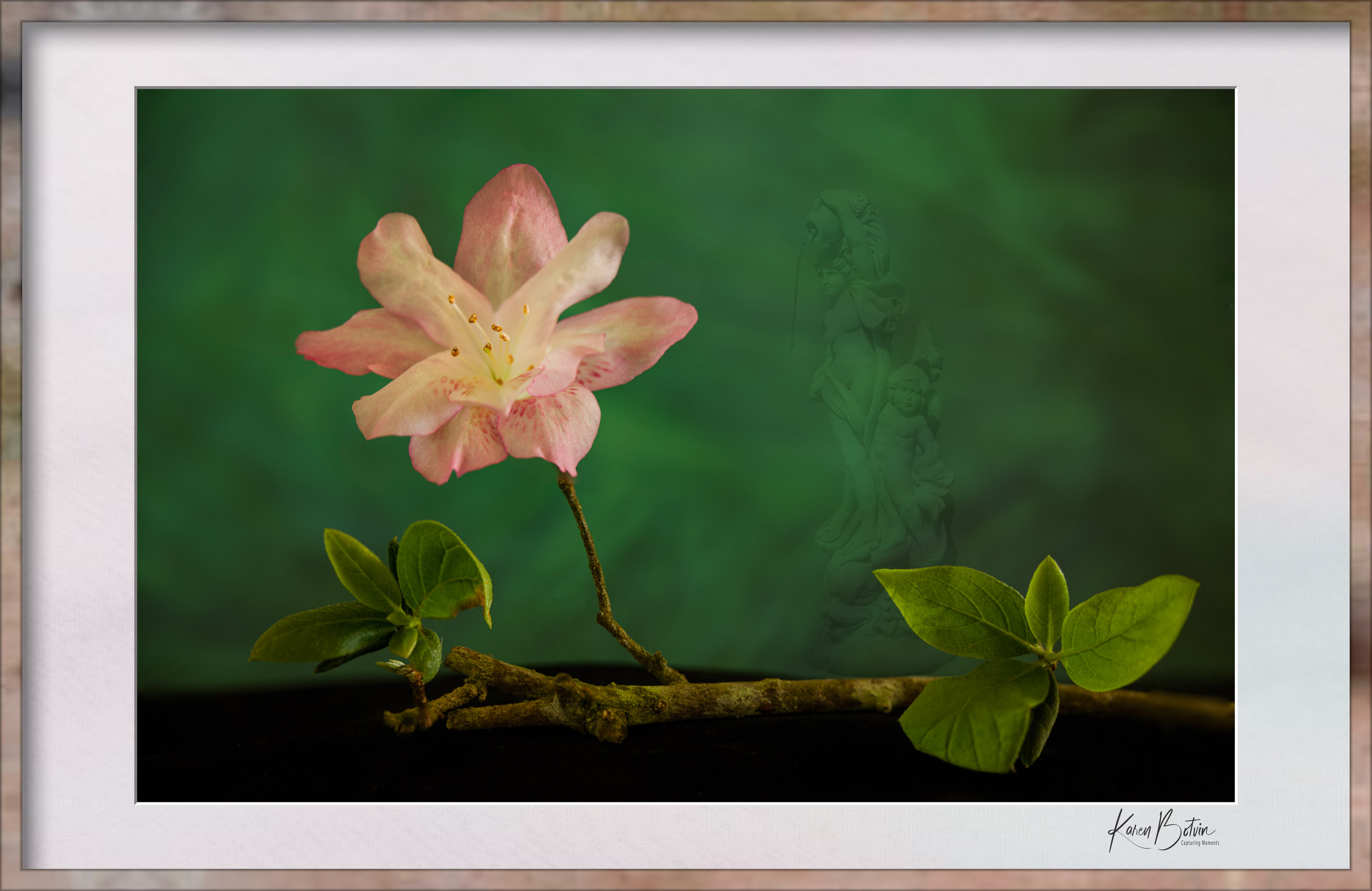
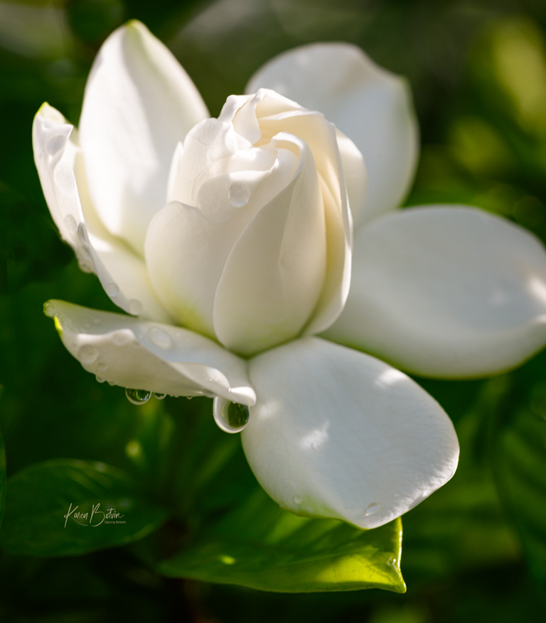
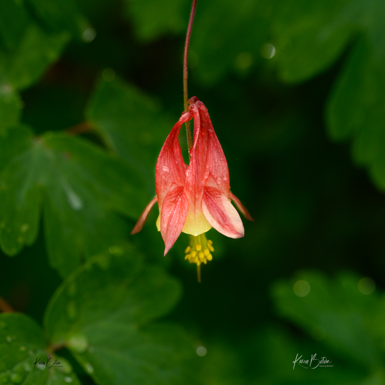
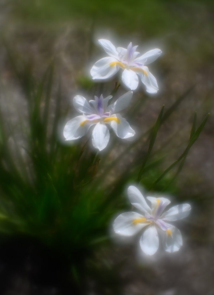
I love photographing flowers, too, Jaqueline. Editing them can be tricky. Since PS added a select subject tool a few updates ago, I find it does a pretty decent job most times. For those things it missed, I add a mask to the selection after I have it on its own layer and either add back or remove any unwanted details. Another way to add layers without having to make a selection is to just add it on top of the original image and play around with the blending modes and opacity until you find something you like. Happy editing! |
Jan 18th |
| 2 |
Jan 21 |
Comment |
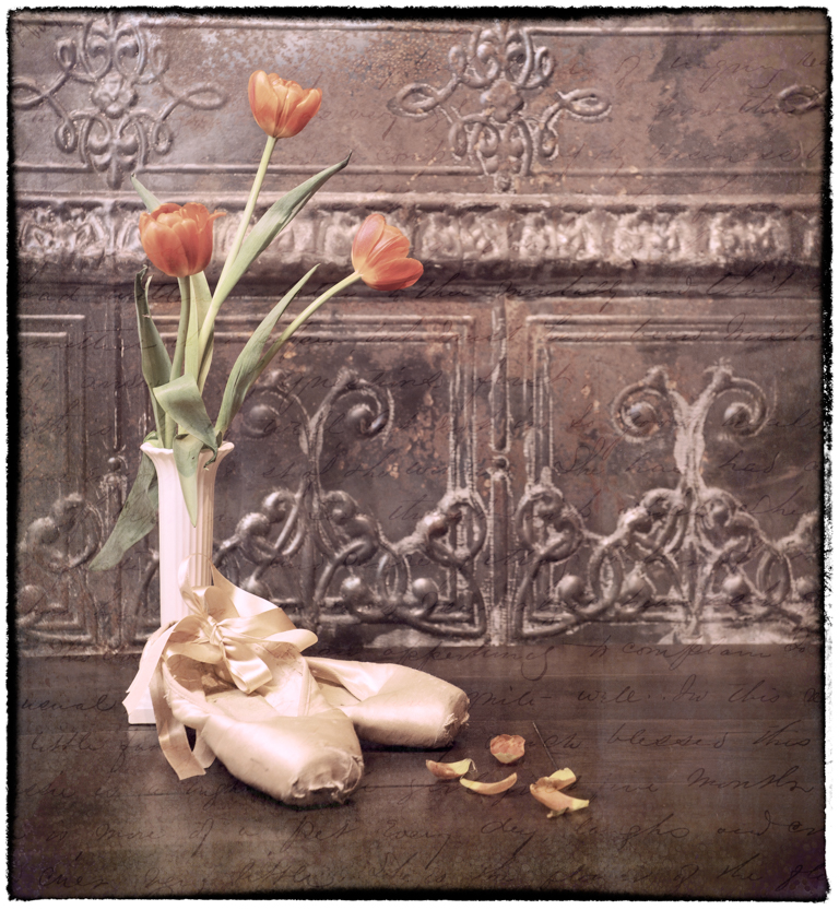
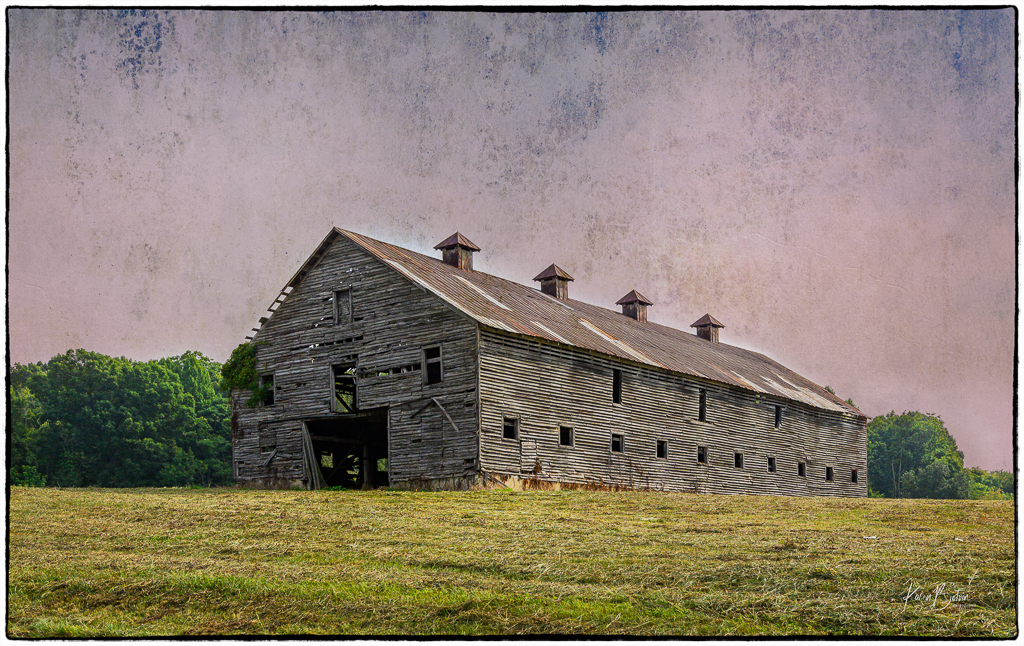
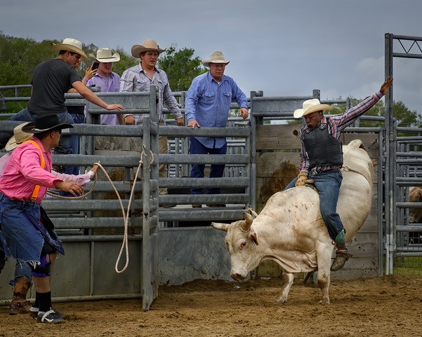
Beautiful work on bringing out all the rusty colors in this truck, Shirley! The edits to the sky suggested by Piers was my only thought. I actually prefer the unflipped version as it feels more natural to me as to how I would walk up to this vehicle. I get the left to right thing, but there's also something to front to back, in my opinion. Nice job! |
Jan 18th |
| 2 |
Jan 21 |
Comment |
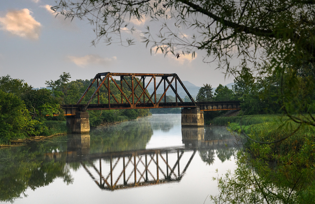
Great image, Piers! I love the lighting and the reflections on the water. I think that Shirley's suggestion of cropping up from the bottom has improved the image by moving the horizon line from the middle of the photo. As for the heaviness on the left, I really don't feel that as much. I prefer some open space on the right as it gives me some space to wonder what might be around that jet of land. Just my opinion. |
Jan 18th |
| 2 |
Jan 21 |
Reply |
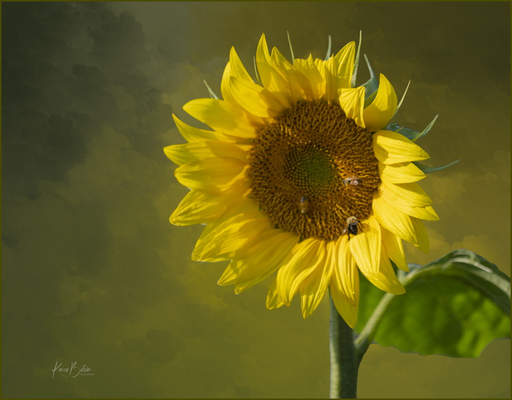
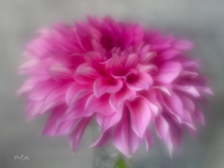
Thanks so much, Jim, for your comments. It seems the consensus of this particular texture is that it distracts from the subject more than it embellishes it. I need to go back and rework it. |
Jan 18th |
| 2 |
Jan 21 |
Reply |
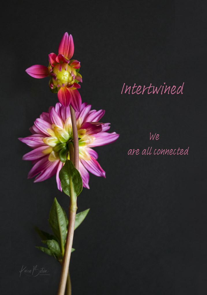
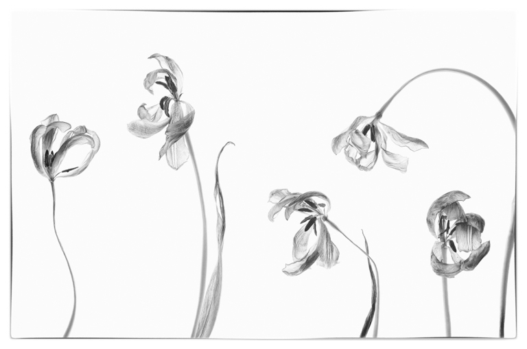
Good point, Jaqueline, in identifying the fascination with the background and it distracting from the flowers. I do need to play around with the texture and see if I can make it less pronounced. Thank you for your comments. |
Jan 18th |
| 2 |
Jan 21 |
Reply |
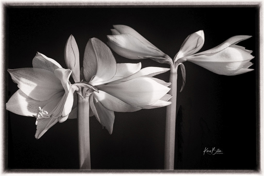
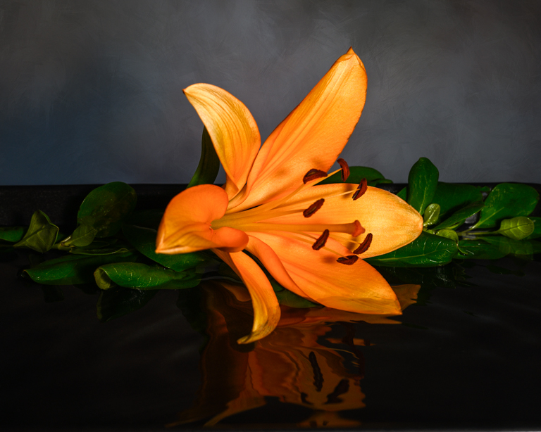
Thank you for your observations of both backgrounds, Piers. I agree with you that each evokes a different feeling. The gray background is too plain for my tastes. Perhaps it's because when I took this image, I had already planned on applying a texture. Perhaps I need to revisit my textures. |
Jan 18th |
| 2 |
Jan 21 |
Reply |
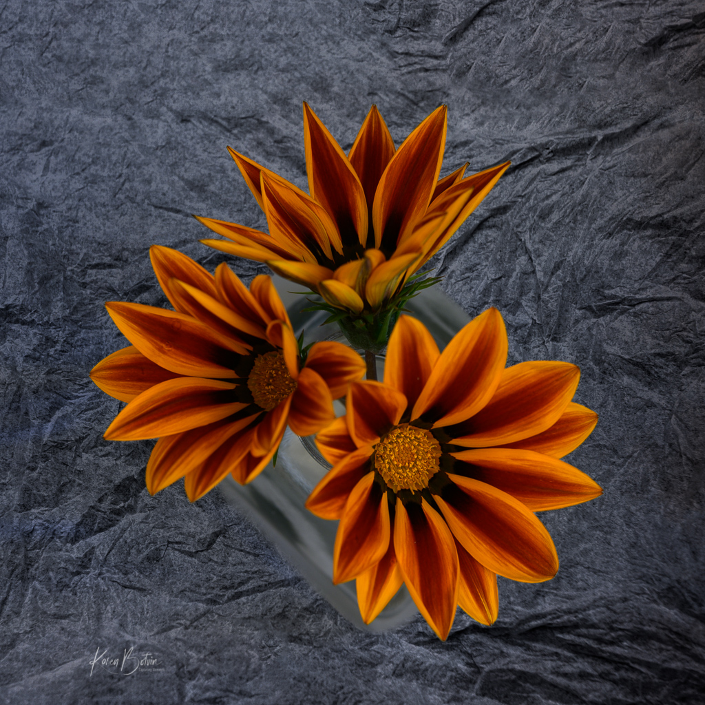
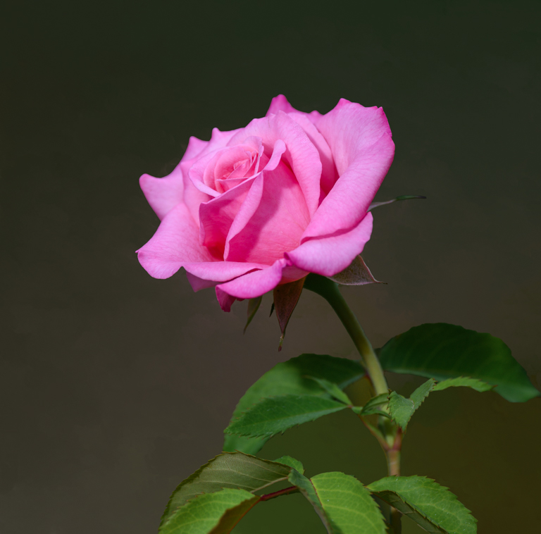
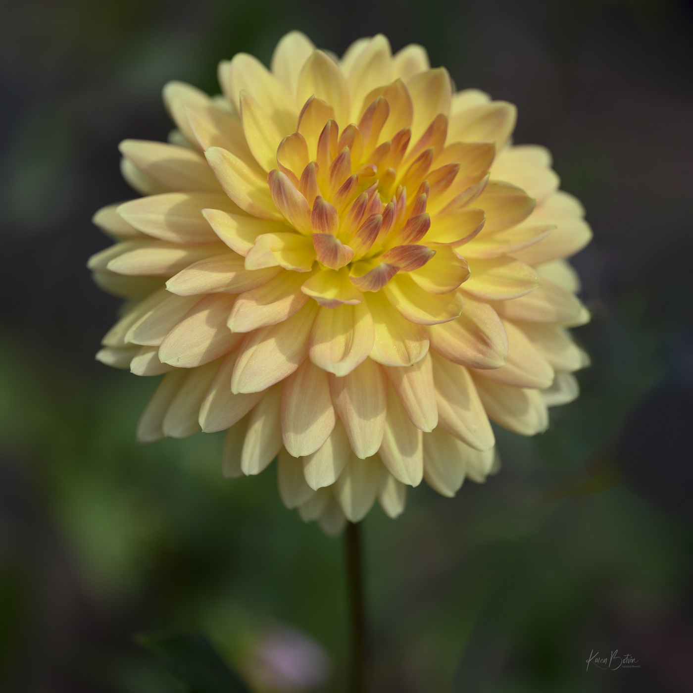
Thanks so much, Shirley, for your comments on this image. I'm still tossed on whether or not I like the texture. I intentionally shot these flowers on a gray background because I was going to add a texture. In my wildest dreams, I wouldn't have picked this black crinkled up paper but when I added it, it seemed to pop. Maybe I need to work on it some more. |
Jan 18th |
4 comments - 4 replies for Group 2
|
4 comments - 4 replies Total
|