|
| Group |
Round |
C/R |
Comment |
Date |
Image |
| 83 |
Mar 21 |
Reply |
Dianne, thank you. Yes, I need to re-take this image and keep all suggestions in mind.
|
Mar 16th |
| 83 |
Mar 21 |
Reply |
Dirk, thank you. It is the composition that caught my eye. Now, to do it again. |
Mar 16th |
| 83 |
Mar 21 |
Comment |
Jose Luis, you have made a very strong image further strengthened by a great sky, moody lighting, interesting subjects, and a beautiful reflection. You've really captured the architectural details (enhanced by the reflection) and the picturesque vines on offer in this colonial district. There are vehicles parked at the base of the church and there is a guy standing on the sidewalk proving that you don't live in a ghost town. Not living in a ghost town, traffic and people are always a dilemma in how to incorporate or exclude. A minor suggestion: For the guy, I think if he is in the photo that there should be a little more space around him as his elbow runs into the side of the photo. Lovely image. |
Mar 16th |
| 83 |
Mar 21 |
Comment |
Lance, I agree that each image "prick" viewers in completely different ways. In the cropped image, the cross on the left almost frames the chapel in the distant right. They work together to create a story of a not forgotten graveyard surrounding the relics of a mission church.
The un-cropped image shows the cemetery and the mission chapel in its natural, harsh environment with the inclusion of the hills/mountains in the background right. The chapel bell tower set between the two foreground crosses creates a nice triangle that leads the viewer into the scene. There is more information to digest in the un-cropped image and another story to tell. |
Mar 16th |
| 83 |
Mar 21 |
Comment |
Dianne, You have captured "a beautiful street, emptied of most people on a hot day." The parts of the photo that appeal to me is the light reflected off the windows and how beautifully these several buildings, with their different decorative facades, mesh together to create this passageway. The many textures of the buildings and the stone walkway are visible because of the emptiness. As far as "hot" the person walking is dressed in summer clothing, the sky has no clouds, and the reflected sun indicates a sun high in the sky in order to shine into such a narrow passage. The woman walking is incidental to the composition. My suggestion is to darken the street to separate it from the gray shades of the buildings. This will also allow the reflected window light to pop much like Jose Luis did in his version of your image. As the sky has no interest, perhaps lightening it slightly might work. |
Mar 16th |
| 83 |
Mar 21 |
Comment |
|
Mar 16th |
| 83 |
Mar 21 |
Comment |
Wow, what a great experience and photo. The whole scene is wonderful, but the main focus, to me, is the lead car with the smoke spewing from it. The smoke highlights this racer and separates it from the pack. I agree with Lance that the blown-out sign in the background should be darkened slightly to keep the viewer's eye focused on the action on the track. Well done! |
Mar 16th |
| 83 |
Mar 21 |
Comment |
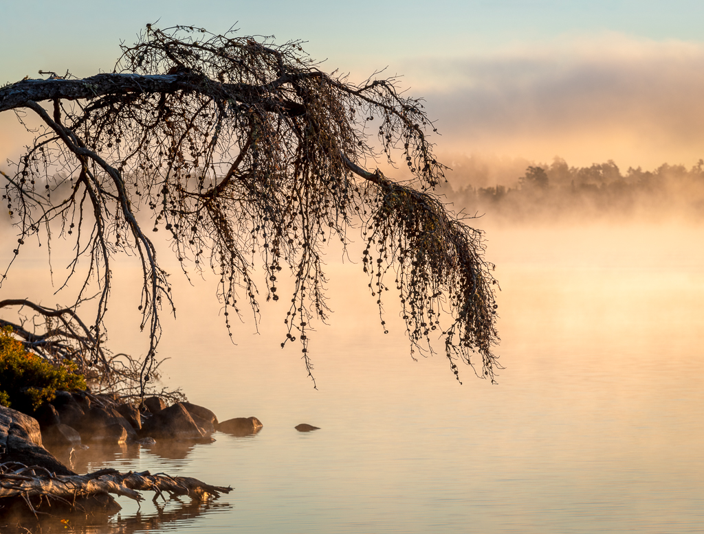
Debasish, I like the minimalism and the subject of your image. It's the sparseness of the composition that compels me to look around, but the darkness of the rocks is so heavy my eye stays there. The rocks in Lance's version allow my eye to move up to the foggy horizon. Further, the fog darkest at the perceived horizon, progressively lightening, allows the eye to move up beyond the rocks. |
Mar 16th |
| 83 |
Mar 21 |
Comment |
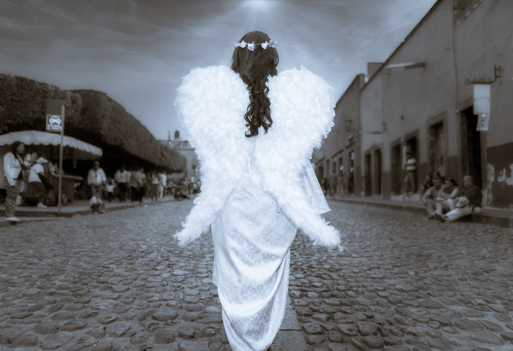
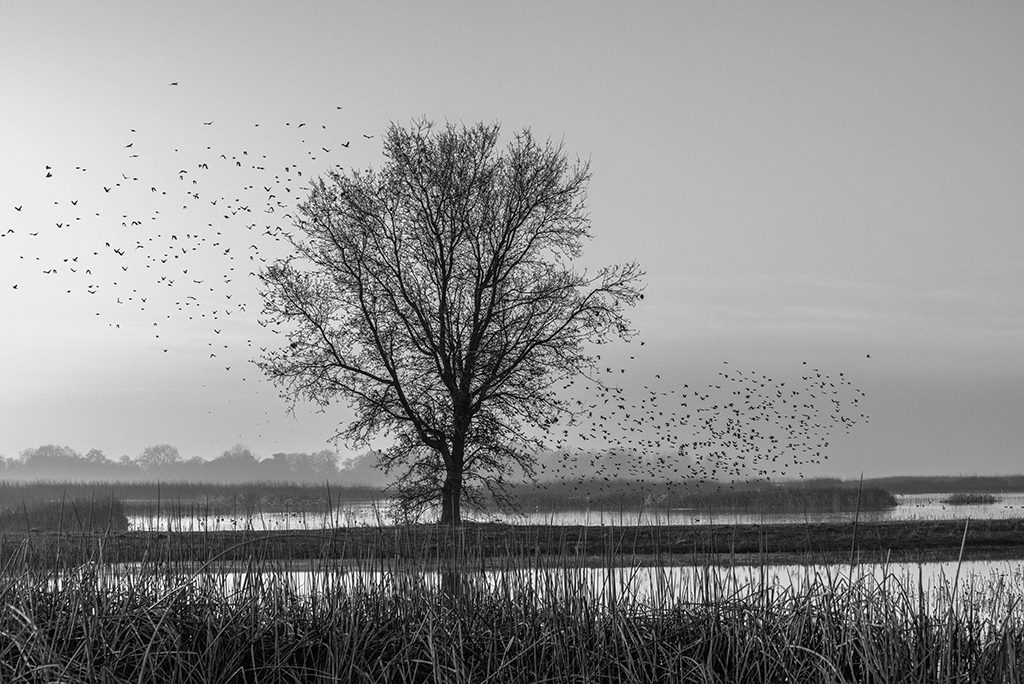
Lance, your critique left me with a lot of questions. I am confused by the posterization comment. "Original 2" (1 original.jpg) is actually the original, unaltered photo. "Original" is the resulting photo (2 intermediate.jpg) I adjusted to arrive at what I thought were the correct exposure adjustments (exp -21, 0 contrast, highlights -71, shadows 0, whites +43, blacks -32), for this color photo. Even with these adjustments, the histogram moved left but mostly had the same shape. The B&W (3 final.jpg) was converted from the final color image (2 intermediate.jpg) titled here as "original" and except for the green-gray slider moved downward, no other changes were made post conversion.
I do know that at that ISO it is grainy and perhaps that contributed to the issue you see in the sky. Or maybe it is the decrease in highlights while added white for brightness. I do need to go back and try it again with a better camera and better light. Thanks for the critique.
|
Mar 13th |
7 comments - 2 replies for Group 83
|
7 comments - 2 replies Total
|
