|
| Group |
Round |
C/R |
Comment |
Date |
Image |
| 83 |
Feb 21 |
Comment |
To all, thanks for the welcome and the helpful suggestions. |
Feb 27th |
| 83 |
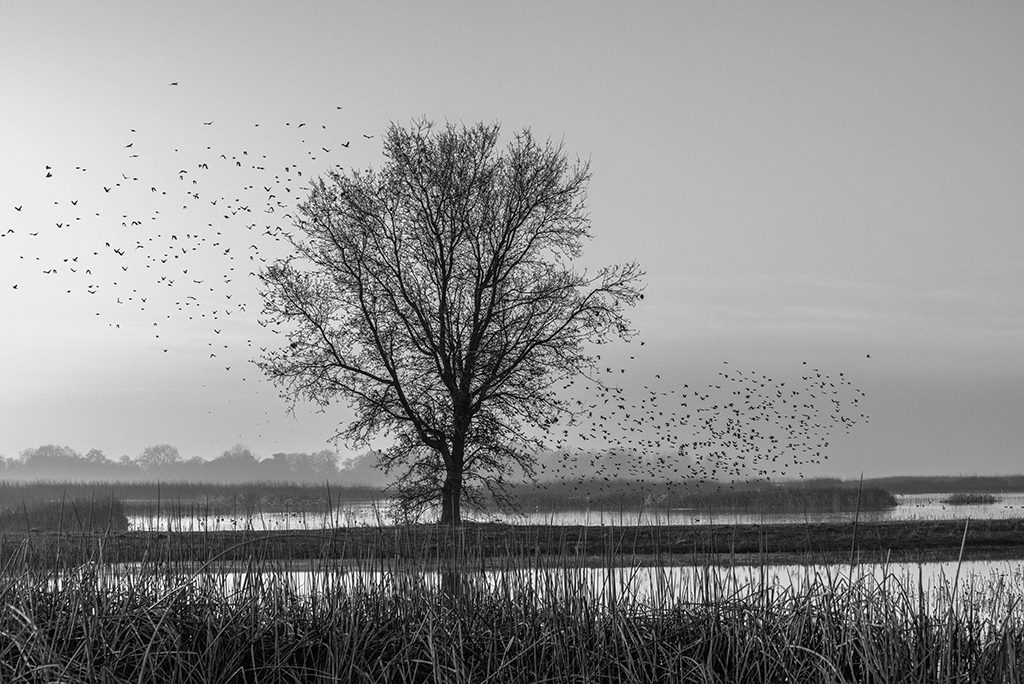
Feb 21 |
Reply |
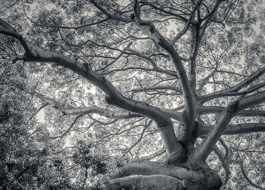
Lance, I do like the delicate laciness of the tree, but to my eye the overall image is too medium gray. My eye leans toward a little more contrast but perhaps not as much as is present in my final image. I reworked it beginning with the color image on which I reduced the contrast (-13), converted to B&W in LR, and made some minor exposure changes to get an image with less contrast but with, hopefully, a full range of gray shades. Not sure if I achieved it in this latest image, but I have something to aspire to. Thanks for the tips. |
Feb 27th |
 |
| 83 |
Feb 21 |
Comment |
Lance, both portraits are as lovely as the models. In #1 the girl's expression, the backlit hair, and the sunlight spreading over the girl's face give the portrait a dreamy, restful feel. In contrast there is nothing dreamy or restful about #2. She is a busy girl with an impish expression. Your photographic treatments and final prints suit each subject perfectly.
My only suggestion is that perhaps #1 should have a little less haze on the face and in the lower right. |
Feb 25th |
| 83 |
Feb 21 |
Comment |
Jose, A lovely seascape well composed. The 1/5 sec shutter captured the waves fluidity and softness while also freezing them so they don't just disappear into complete softness. From the sharpness of the grains of sand to the dark, brooding sky all shades of gray are well rendered in your image. Nice. |
Feb 19th |
| 83 |
Feb 21 |
Comment |
Joe, very nice image. The IR really brought out the clouds and also the structure of the greenery surrounding the lighthouse. The shape and IR effect on the greenery introduces the suggestion of motion in the image. The walkway and rail provide an entrance into the image. Nothing about the image is static. It feels and looks like a storm is brewing. |
Feb 19th |
| 83 |
Feb 21 |
Comment |
Dirk,
Thank you for providing the explanation of how you made this image. I imagine there was significant trial and error before you arrived at the final product and perhaps more complicated than your stated steps imply. Anyway, the image looks sophisticated and polished. The progression of the citron slice splashing into the martini glass is interesting and well captured. In the B&W conversion it is the way the splashes progress that draw my eye. In the duotone color image, it is the color that takes center stage. |
Feb 19th |
| 83 |
Feb 21 |
Comment |
Debasish,
Your composition of just a portion of the rose leaflets is pleasing with the small slice of the two upper right leaflets balancing out the larger larger leaflet running to the lower left. There are interesting aspects to both images. The sepia-toned image appears much more abstract. The water droplets are quite pronounced and my eye is drawn to them almost at the exclusion of the supporting leaflets. In the color image it is the subtle, pleasing colors that draw my attention. The water droplets are secondary to the color palette. Which you chose depends on the statement you want to make about the image. |
Feb 19th |
6 comments - 1 reply for Group 83
|
6 comments - 1 reply Total
|