|
| Group |
Round |
C/R |
Comment |
Date |
Image |
| 77 |
Nov 20 |
Comment |
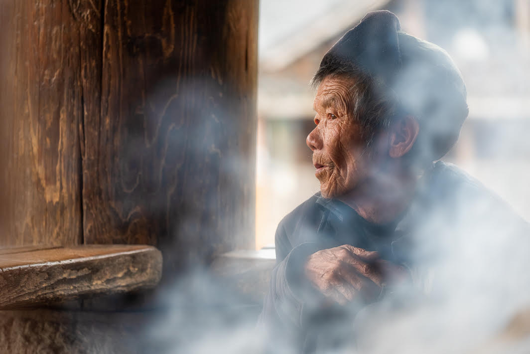
Linda, You have handled a difficult, high contrast, photo subject very well. I like how your neighbor's tree branches and leaves really embrace/frame the moon. The reflected moonlight lends a nice edge light to the leaves and branches so they aren't simply a dark silhouette. The way the moon is darker in the center (perhaps that is the face of the moon) and at the circular edge makes the moon look flat and more like a plate. To keep the moon round, the center should be lighter and gradually darker toward the edge. |
Nov 25th |
| 77 |
Nov 20 |
Comment |
Mary, I agree with the others with how lucky you were to have such a becoming young woman wade into the lake while you had your camera. It is a beautiful image. I like the color image, but I also like the variations by Georgianne, Witta, and Connie. Because your composition has such great bones, it lends itself to many different interpretations. Removing the bridge and it's reflection needed to be done as it was distracting and did appear to be a hat. In Georgianne's rendition I like the way the landscape on the right mimics the woman's body shape kind of like a dancing partner. Georgianne has lightened the surrounding landscape and the woman becomes much more the focus of the composition. In Witta's version I like the way the slight pink of the skin has warmed the image but prefer that the surrounding landscape be lighter and secondary to the woman. Connie's version is also lovely and sets a different mood to the composition. Once again the landscape is lighter and a better dance partner for this woman. Well done and so many possible versions. |
Nov 25th |
| 77 |
Nov 20 |
Comment |
Georgianne, Your final image looks very much like a drawing, a quick sketch. Until I read your description mentioning "applied an Opalotype Chiffon preset with a Green filter and blue paper" my eye did not pick up any color because it is so very subtle. If instead of a black and white sketch you want a little more color I think Witta's version showing some color saturation of the water works well. I can see your image as part of an exquisite set of note cards. |
Nov 25th |
| 77 |
Nov 20 |
Comment |
Denise, I like your industrial abstract image. The two colors, red and orange, together are my favorite combination so this really catches my eye. While I like your quick edit, I also like Linda's version with the flipped composition and more saturation/contrast that brings your eye to the door as a point of focus. In your image, he two colors are very balanced in intensity. The additional contrast will make it pop. |
Nov 25th |
| 77 |
Nov 20 |
Comment |
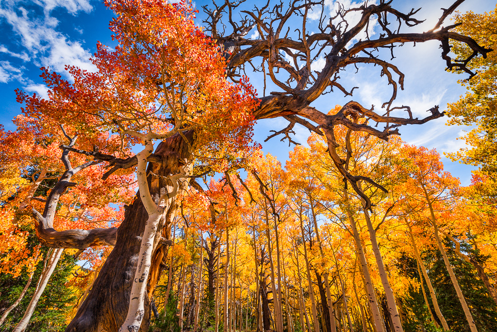
Connie, Your simple composition and the sunlit gold say fall. I prefer the gold tones as opposed to the reds for this small branch of leaves. Because the background is not in focus, allowing more of the tree trunk's texture into the image does not distract from the leaves. Or, you can do as others have suggested and pretty much completely separate the leaves with a darker background. To my taste, both alternatives work as does removal of some of the lower left leaves. You could print each alternative and all would be stunning with those beautiful leaves. |
Nov 18th |
| 77 |
Nov 20 |
Comment |
Witta, I enjoy viewing this photo. I like your finished result with the warmth of the "harvest moon" colors and your creative vision. Well done! |
Nov 18th |
6 comments - 0 replies for Group 77
|
6 comments - 0 replies Total
|