|
| Group |
Round |
C/R |
Comment |
Date |
Image |
| 77 |
Sep 20 |
Reply |
Interesting suggestion. I'll give it a try. Thank you. |
Sep 25th |
| 77 |
Sep 20 |
Reply |
So glad you're safe. |
Sep 25th |
| 77 |
Sep 20 |
Comment |
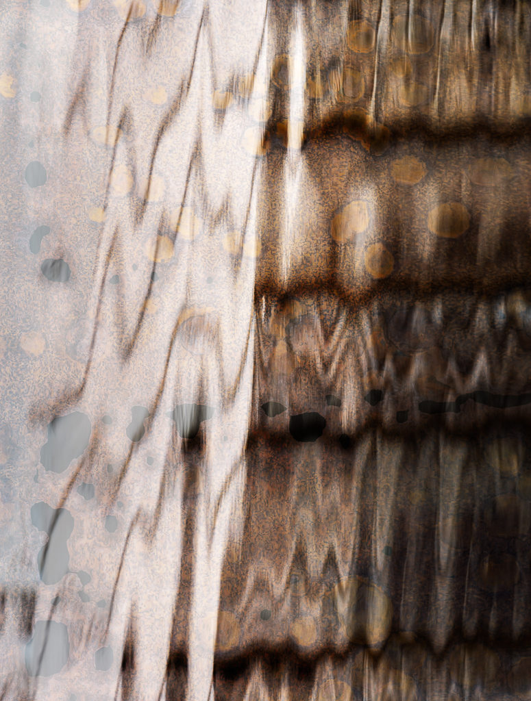
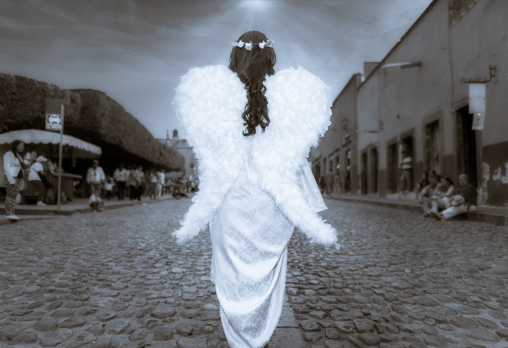
Thanks for all the suggestions. This was not a model. The angel was in a Holy Week parade. As I was watching the parade I realized that if I got close enough to her, she blocked out all the stuff that was ahead of her. I may have gotten too close but I might have need to get that close to eliminate other distractions. Not sure.
1. I do like the way when Stephen flipped the background, the angel seems to be floating along a narrow path on the pavement, but I don't like the repetition of the buildings and the spectators.
2. It doesn't bother me that spectators aren't looking at her because she has suddenly appeared on earth (my interpretation).
3. I should attempt to remove the signs as they also bothered me - good point.
4. Floating above the cobblestones would improve the image, I'll give it a try.
5. God rays emanating from the angel would add to the surrealism. I'll try it.
Thanks for all the suggestions. I have a lot to work on to improve this image. |
Sep 10th |
| 77 |
Sep 20 |
Comment |
Denise, I appreciate your inspiration and interpretation of your image of your hibiscus flower. I also like the post processing restraint as you began with a beautiful image. I like the crop and the final image. The leaf above the flower doesn't distract and I like the thin green line of the leaf as it s up and separates itself from the flower. You could try darkening or desaturating that leaf, but that might distract from the naturalness you managed to preserve. Well done. |
Sep 10th |
| 77 |
Sep 20 |
Comment |
Bunny, Lovely composition from the beginning. Good idea to crop the right slightly to get rid of the distracting white spaces. The path leads the viewer into the image to the light. It is a very inviting image without the feel of imminent disaster. |
Sep 10th |
| 77 |
Sep 20 |
Comment |
Mary, You've pulled together different components to tell a story or imagine a story. Viewers have a lot to linger over and ponder when they see your image. Like Connie, I do think the hand is a little too blue. I like Connie's crop, but also like Witta's version and crop. In Witta's final, the resulting image still tells a story, and the viewer's eye bounces between the ring, the book, the mysterious flame, and the lacy edge to her dress. The hand looks more natural but still mysterious. So, my suggestions are to crop the right and remove some of the blue tone. Otherwise, fantastic and interesting image. |
Sep 10th |
| 77 |
Sep 20 |
Comment |
Connie, I like your image and your post processing. Your final image has such a lovely glow to it. It is a beautiful still life. BTW, I do not find the images disparate. The washboard, the spool, the ewer all compliment and serve as support pieces for the magnolia flowers. The washboard is naturally leaning back on the background and together with the spool they balance the flowers. Lovely. |
Sep 10th |
| 77 |
Sep 20 |
Comment |
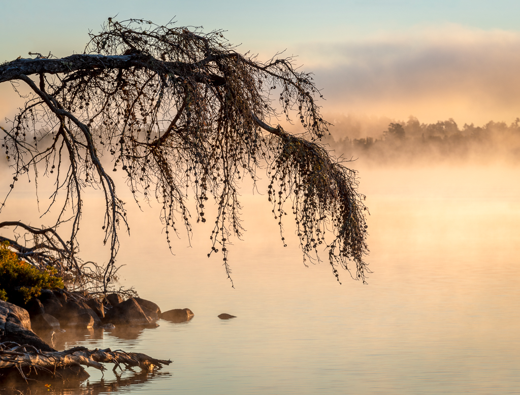
Witta, there is a nice juxtaposition between the spit of the island running to the left of the image and the boat's wake spreading to the right of the image providing balance to the composition. Your post processing work does indeed give the image an early morning feel, but the top of the image seems different than the bottom. Did you apply the presets differently on top and bottom? The top portion has the foggy feel to it, but to my eye, that is absent on the water below the island. |
Sep 10th |
| 77 |
Sep 20 |
Comment |
Georgianne, At first glance your image reminds me so much of the wool yarn paintings that I saw in Kyrgyzstan. Your swampy texture is very much like that textile. The color palette is eye catching and pleasing. The lighter background borders around the roses do so much to bring the roses forward and frame the floral display. You might try lightening the dark stem area at the bottom of the image a little to continue that framing. Another suggestion is to paint out a little more of the texture from the two roses on the right side. Your finished image is really lovely. |
Sep 10th |
8 comments - 2 replies for Group 77
|
8 comments - 2 replies Total
|