|
| Group |
Round |
C/R |
Comment |
Date |
Image |
| 77 |
Aug 20 |
Comment |
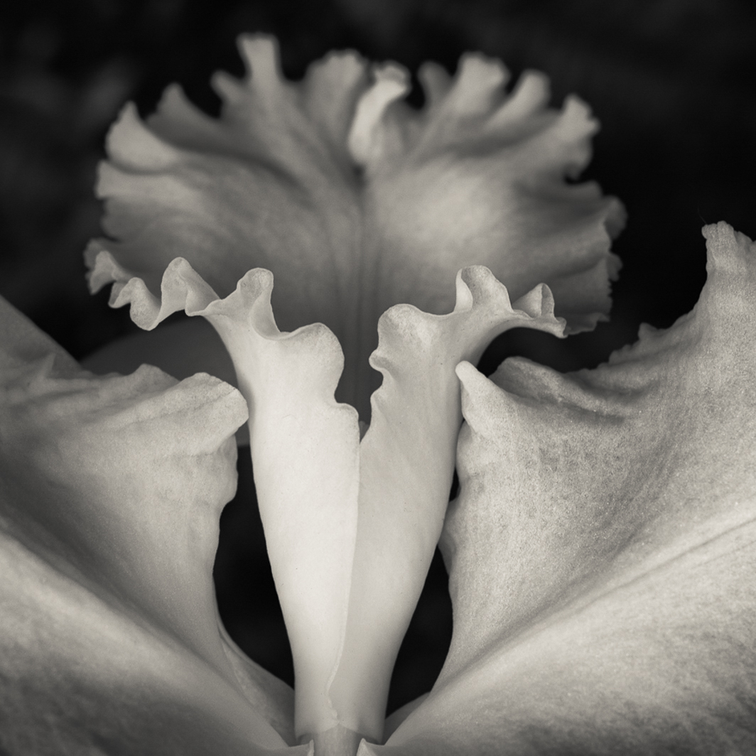
Denise, Your image is beautiful and I can see why you were attracted to this flower. It has so much movement and does look like a dancer's skirt. As I scrolled down the screen to look at the comments of others, your image was cropped by the scroll. To my eye, I liked the cropped image which deleted the upper part of the flower and made it more abstract. To that end, I reworked your final image in LR. I made a square crop, flipped the image vertically, put a darkening gradient on the now lower petals to suggest three dimensionality. The final image is more abstract and the out-of-focus petals have a lovely movement that seem to dance into the background. I used a light sepia toning on the highlights (highlights hue 52, sat 14; balance -16). Finally, I adjusted the exposure slightly to brighten the image after toning. |
Aug 9th |
 |
| 77 |
Aug 20 |
Comment |
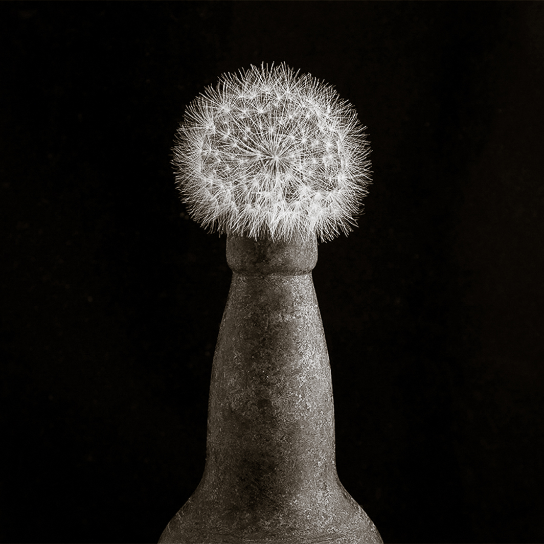
Bunny, Beautiful monochrome treatment with every shade from white to black rendered. I must admit that when I first saw your image, I did some anthropomorphizing of the shape. The first thing that popped into my head was penis. Yes, the shape is suggestive of that body part, but the tilt (both up or down) also suggests a penis. With that in mind, I tried something else with your image. I converted to B&W in LR (not as well as you did), adjusted exposure, left the bottle and seed pod upright but gave it a square crop. I also warmed up the shadows (balance +25; shadows hue 46, sat 23). I think that leaving the shoulders of the bottle in the composition makes the viewer less likely to anthropomorphize the shape. |
Aug 9th |
 |
| 77 |
Aug 20 |
Reply |
Georgianne, thanks for the links. I have no knowledge of this technique and look forward to giving it a try. |
Aug 9th |
| 77 |
Aug 20 |
Comment |
Using the same adjustments, I also made a slightly toned image with warm highlights and cool shadows: Highlights hue 52, sat 20; balance -50; shadows hue 227, sat 10. |
Aug 9th |
 |
| 77 |
Aug 20 |
Comment |
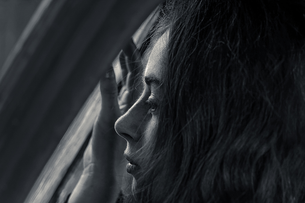
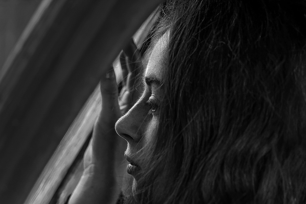
Mary, I really like this image: the backlighting, the diagonals in the composition, the subject's expression. The color image is beautiful with the reds of her hair and the red repeated in the window frame, but as a monochrome it is even more striking.
To my eye and my display, the blacks are too dark and disguise most of the vertical lines. Using your original image I imported it to LR adjusted the exposure, converted to B&W. In the B&W menu I lightened the reds so the texture of her hair was more visible and darkened the aqua blue slightly so that upper left corner was less bright. I also used a gradient from the upper left corner down to the end of the window frame to further darken that triangle. I increased the whites so the lovely backlighting along her profile was more apparent. I removed one hair strand that was highlighted on her arm.
This is really a wonderful image in every way. Great shot.
|
Aug 9th |
 |
| 77 |
Aug 20 |
Comment |
Connie, I always like to know more about where/when a photograph was taken. Thank you for including the history of the house and explaining why you made this image the way you did. I do like your texture treatment giving the photograph the feel of a needlepoint creation. At 78% you have created a needlepoint but still allowed the other textures in the room to show through: floor, bookcases, fabric texture of the pillows, and the basket.
I often seem to get in too close to my subject and later wish I had allowed more space around it. I agree with Witta that you could use content-aware scale to add a little breathing room around the basket.
The colors are muted and peaceful as is the composition. Very nice.
|
Aug 9th |
| 77 |
Aug 20 |
Comment |
Witta, Excellent candid shot. You caught her frowning in the middle of a thought. I prefer the tone of the middle image. It always seems to me that toning reduces the highlights and overall contrast. For that reason I prefer Georgianne's version which really makes this little girl glow separating her from the background. Even her arms and the book stand out. She does look like a school teacher about to present a lesson. Leave in the strands of hair on her face. The image with the book has a story whereas the portrait is just a lovely portrait.
Your triptych of the portrait image is nice, but as you pointed out you have only one version of the girl. This is a great tool to pull out another time. This might work with the two right images in your triptych with the girl in back to back portraits. |
Aug 9th |
| 77 |
Aug 20 |
Comment |
Georgianne, The focus and composition are spot on. Your subject flower though lovely was made even more attractive by your edits. In particular, darkening the background and later applying the Van Gogh Topaz filter makes it appear that there are many more agapanthus in the background. I, too, appreciate your tip about using a color adjustment layer to color the blown out petals.
The texture should be removed from the foreground petals as it makes them look past their prime even though many of the blooms have yet to open.
I believe the brown bit of vegetation is not a brown petal but the enclosing "womb" that encased the flower before it opened. I feel that it could stay or go depending upon your vision. Either way, well done. |
Aug 9th |
7 comments - 1 reply for Group 77
|
7 comments - 1 reply Total
|