|
| Group |
Round |
C/R |
Comment |
Date |
Image |
| 77 |
Jul 20 |
Reply |
Witta, I took a look at the Fluidity show. You're in very good company there. Your piece fits perfectly. I know you intended this, but every time I look at your Dancing Forks, I do see graceful dancers. My suggestion is to keep entering it because what you've created is so unusual. You might try working on companion pieces with knives, spoons, or other utensils. Congratulations on your acceptance into the show and best wishes for further acceptances. |
Jul 17th |
| 77 |
Jul 20 |
Comment |
Witta, your dancing forks image is so fun and creative. Congratulations and well done. What are your plans for it? |
Jul 17th |
| 77 |
Jul 20 |
Reply |
You made me smile |
Jul 6th |
| 77 |
Jul 20 |
Reply |
Connie, as I was reading through all the tips for creating a border, I too, thought expanding the canvas in PS was the easy way to go. |
Jul 6th |
| 77 |
Jul 20 |
Comment |
Denise, there are so many ways to go with your image. The rose and the way you lighted it is quite lovely, and you kept the amazing texture of the rose petals. I really like the way you lightened the entire composition in your second post. The rose with the dark green texture has an overall delicacy to it.
I did feel that the stem should either be extended for a vertical composition or removed completely for a square crop.
You've created a very versatile image. Dark background or lightened background, texture or plain background, square, horizontal, or vertical. All work because your rose is perfect. |
Jul 6th |
| 77 |
Jul 20 |
Comment |
Bunny, I must say that your composition and colors are exquisite. As a minimalist, I prefer the background as is. The subtle darkening at the bottom of the image and the reflection gives the composition weight and grounds the still life.
I find still-life photography difficult because, in my hands, the composition often looks contrived. Yours does not. The components compliment each other. Really lovely. Fix the tilt and you're good to go. Beautiful. |
Jul 6th |
| 77 |
Jul 20 |
Comment |
Mary, It's a wonderful idea to document both this particular era where nothing is normal as well as how you and your husband are coping and managing. Your image with its extreme lights and darks is quite eye catching. The white-hot areas really shouldn't be toned down too much because they are white hot. Showing them in that state attaches danger to what Pete is doing.
Pete's body and his face protector in their darkened state acts as a bit of a frame within a frame moving the viewer's eye to the what the arm is working on. Georgianne's crop that removes the face shield and Pete's body creates an abstract image. Both are interesting but the one you chose depends on the memory you are preserving.
Like Connie, I'd love to see the finished couch. |
Jul 6th |
| 77 |
Jul 20 |
Comment |
Connie, Very nice. I like your "new, improved" version but prefer the older image. The flower bouquet in the first image really pops. I agree you must crop the upper portion to rid the image of the two light, incomplete beams that show up in the upper left and upper right corners. Additionally, cloning out the black thing and cloth that is hanging on the door is preferable to cropping the right side of the image. I suggest burning in the bottom right brick floor to keep the viewer's eye from landing there. |
Jul 6th |
| 77 |
Jul 20 |
Comment |
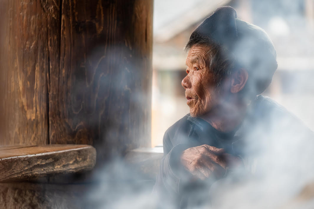
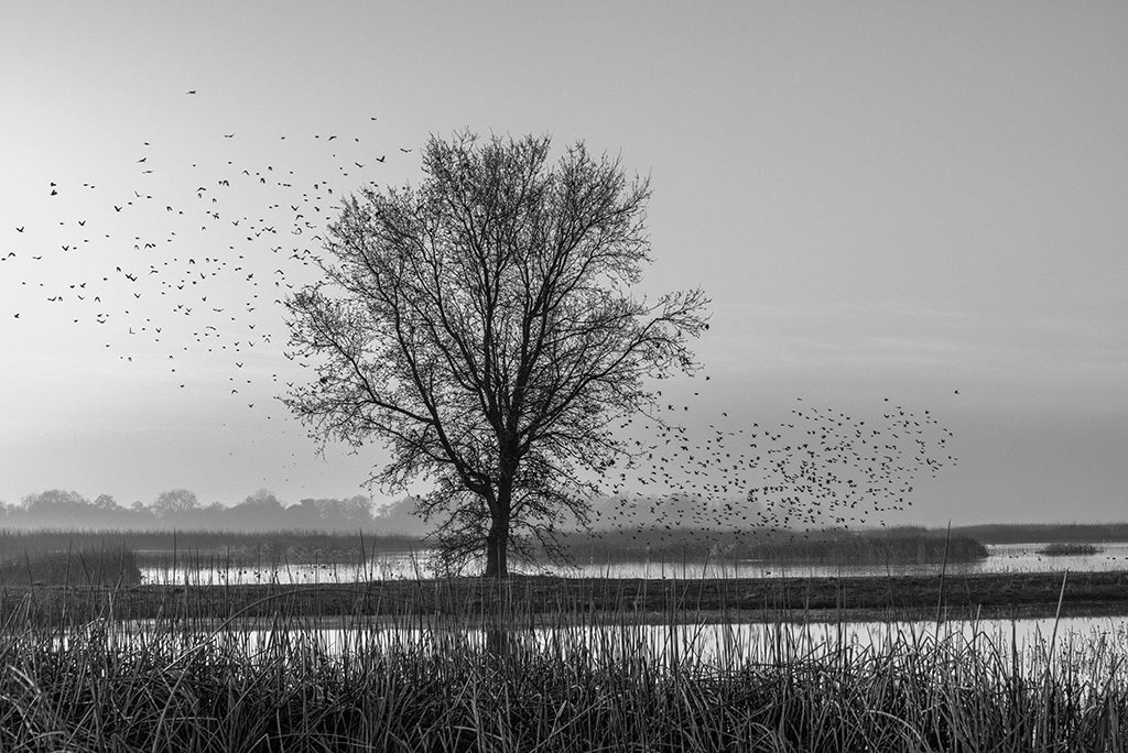
Witta, your final image has such a lovely feel to it. I like Connie's poetic description of what she saw in the photograph. It doesn't look abandoned to me. It is so peaceful sitting in the surrounding landscape. I like the original image dimensions which allow the house to be almost dwarfed by the overgrown landscape. The monochrome treatment gives it a timelessness and brings out all the cloud features that were not apparent in the color version. |
Jul 6th |
| 77 |
Jul 20 |
Comment |
Georgianne, Your final image is beautiful. I don't think I would ever tire of looking at it. I'm sure your friend will cherish your gift. I have no criticism of your image. I like the reds and the stained glass colors and shapes that show up on the stem. It is all very painterly as was your goal. I agree with Connie that you know how to use the tools in your photographic toolbox. I often photograph textures but leave them as stand-alone images. I have so much to learn about combining them with other images to make something unique. |
Jul 5th |
| 77 |
Jul 20 |
Reply |
Bunny, I visited Rhyolite many years ago. Perhaps I'll get there again. It is another amazing spot in the desert. |
Jul 5th |
| 77 |
Jul 20 |
Comment |
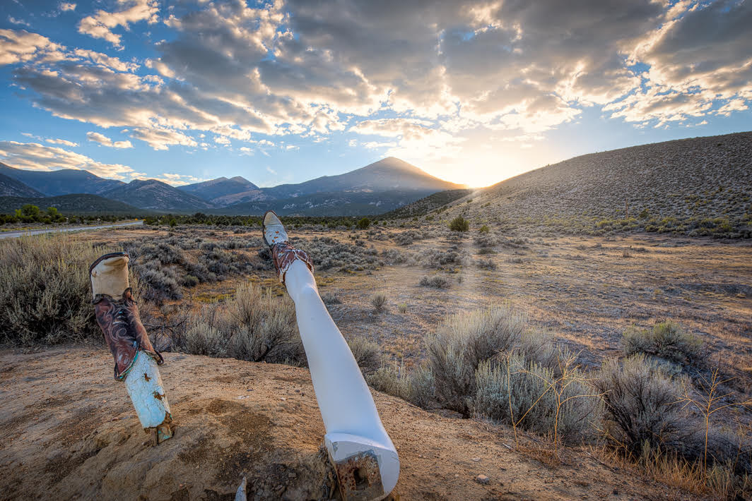
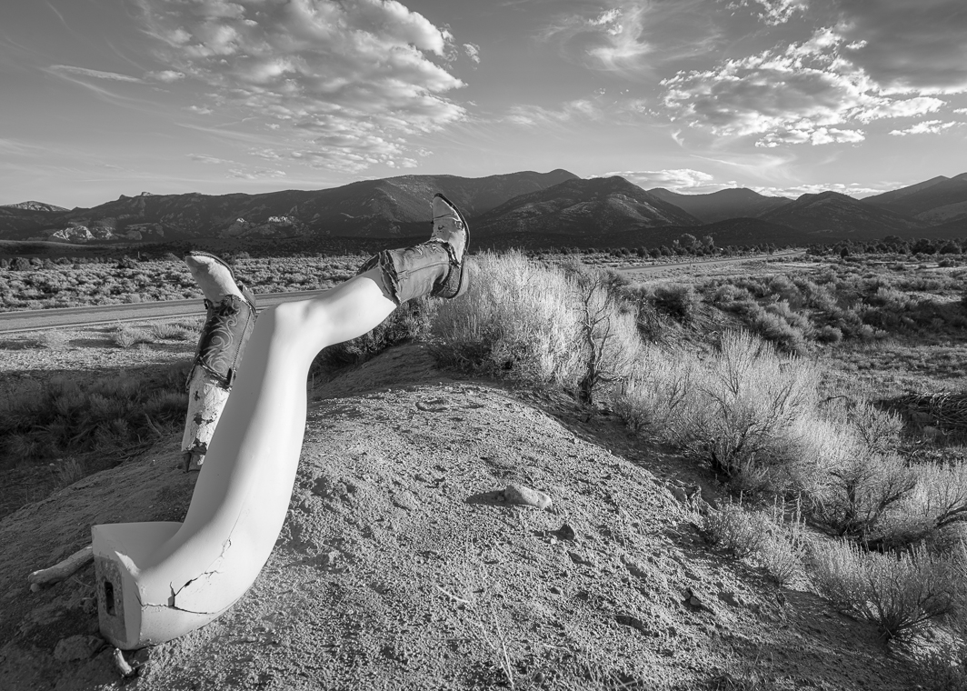
And, the B&W version that avoids the setting sun altogether relying on balance from the line of sage brush that grows over the grave toward the legs. Next time |
Jul 5th |
 |
| 77 |
Jul 20 |
Comment |
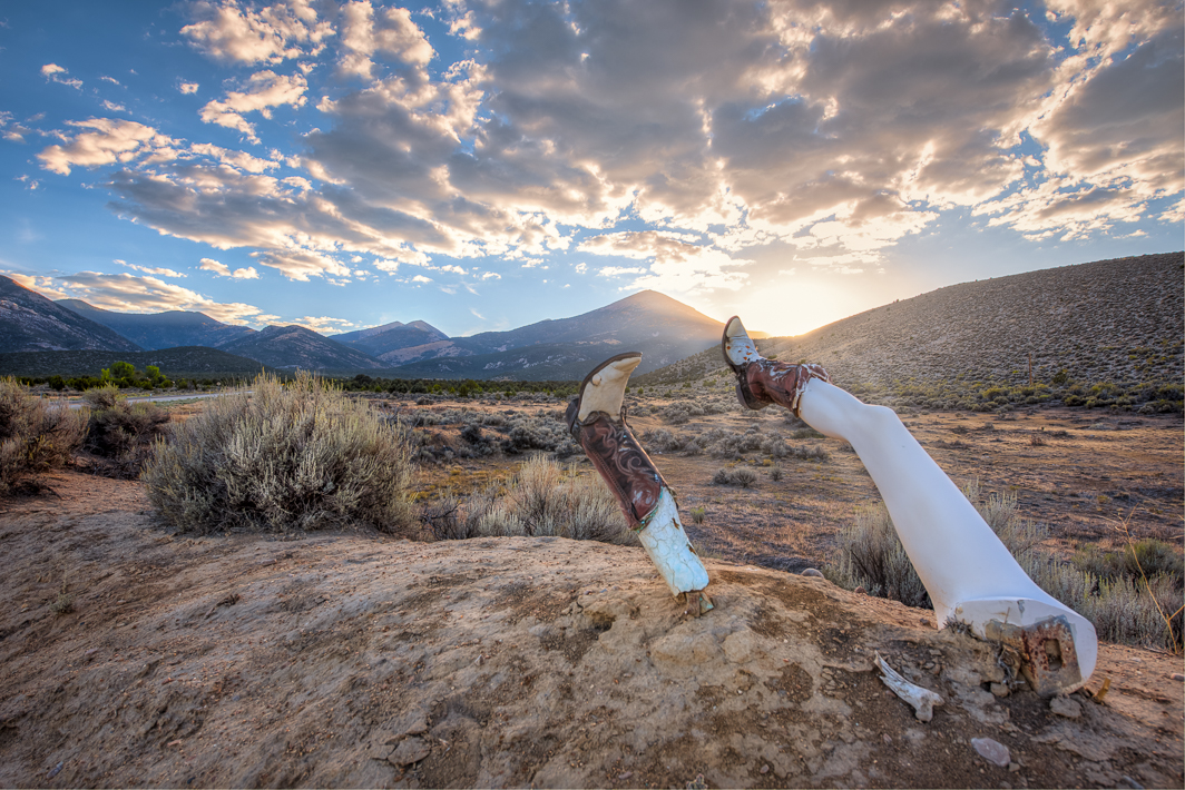
It seems it is unanimous that this image doesn't work. I like the legs with the landscape because they were so quirky and incongruous in a mostly stark landscape. I added the sunrays to give the image balance, but it still didn't feel right. Thanks for the critique. I have two other versions of this composition. The first one has the legs entering the composition from the right side and the legs point more toward the setting sun. It has a better balance to it but I need to re-shoot at this location again. |
Jul 5th |
 |
9 comments - 4 replies for Group 77
|
9 comments - 4 replies Total
|