|
| Group |
Round |
C/R |
Comment |
Date |
Image |
| 77 |
Jun 20 |
Reply |
Georgianne, thanks for the suggestion about removing the other signs. I agree. I guess sometimes I just need permission to make major alterations. It really is better without the distractions of the wires, the hotel and street signs. |
Jun 12th |
| 77 |
Jun 20 |
Comment |
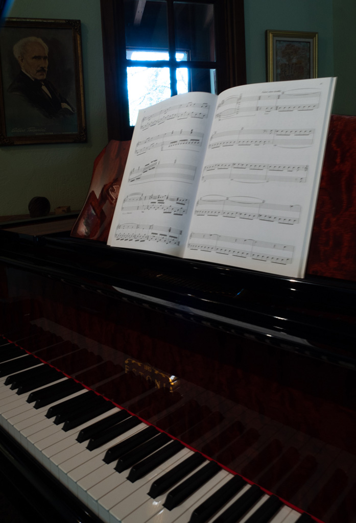
Bunny, Very nice "portrait of a person without the person". All of the various components are pleasing to my eye. I like the treatment on the sheet music and the way you have been able to lighten the overall image and fix the window view. The window and its view and really the entire composition looks like a painting. It has an ethereal feel to it. The piano with its spectacular wood grain is so lovely now that it can be seen.
I wonder if you might take a photo of the composer's portrait from the same angle but higher up and place it on top of the image thereby removing the original. That way the most obvious keystone effect would be gone. It is only the angle of that portrait that I find disconcerting. Using your original image in PS I did a perspective transformation to straighten the left portrait. Unfortunately, that treatment cuts into the fullness of your composition. |
Jun 12th |
 |
| 77 |
Jun 20 |
Comment |
Mary, Looks like you're working on an interesting MMA training series. My take is much the same as Witta's comment. I like the motion on the hero, but it should be removed from the woman holding the pads who doesn't seem to be moving. It's also a good suggestion to desaturate the busy top she's wearing. Well done. |
Jun 12th |
| 77 |
Jun 20 |
Comment |
Connie, Both images are lovely. I like the bright edges on the tulip petals as it does separate the flowers from the background. I like the way you removed the original background from the tulips. I don't think using the sunflower image as the background flatters either flower image. As some of the other members have suggested, why not use a simple texture behind the tulips.
The sunflower is very soft and does not stand out from the background. It might be worth trying to increase the contrast in the flower to provide some separation from the background. Also, a tighter, perhaps square crop would be flattering. |
Jun 12th |
| 77 |
Jun 20 |
Comment |
Witta, My eye is often drawn to this type of image with lots of lines and contrast. I think it works very well in B&W. My suggestion is to exclude the sky rather than darken it. I really like Bunny's crop which makes the bridge with all its texture, lines, shadows, and highlights the focus of the image. I realize that you went for a high-contrast image, but to my eye, the softer contrast allowing more mid-tones makes the image shine. |
Jun 12th |
| 77 |
Jun 20 |
Comment |
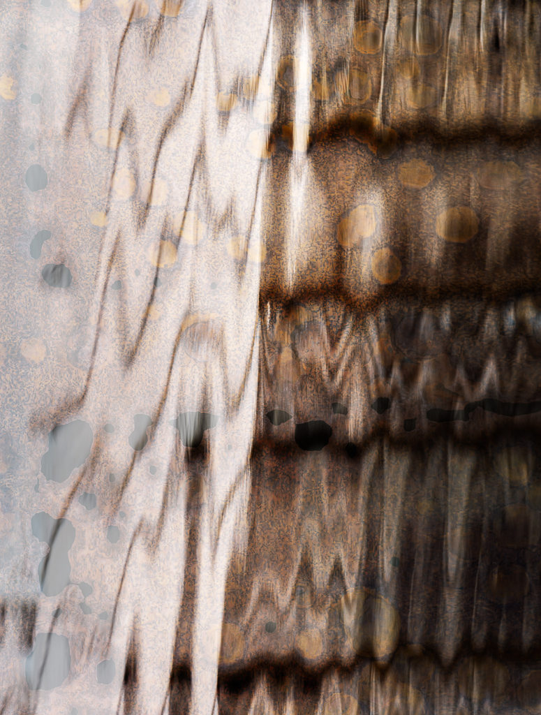
Georgianne, The resulting image is an impressive display of imagination and skill in putting two diverse images together and making them even more cohesive with a texture overlay. The color of the whole image is very pleasing. I especially like the paint layer that added rust and gold to the wheel.
I think because the child is such a modern looking boy, that perhaps removing some of the texture opacity from him might be in order. I like the band-aid on his finger. Another suggestion is to reduce the vibrancy of the red portion of his shoes because that color jumps out to me. I like the part of the texture that makes it look like he has mud on his heels and shoes. Well done. |
Jun 12th |
5 comments - 1 reply for Group 77
|
5 comments - 1 reply Total
|